Education · Ireland
SETU External Branding Programme
- Client
- South East Technological University
- Location
- Waterford, Carlow and Wicklow
- Completed
- 2022–2026
- Sector
- Education
- Scope
- Phase 1 external branding packs for Carlow, Waterford and Wicklow · Building identification panels in powder-coated aluminium · Bilingual campus entrance totems and freestanding monoliths · Campus orientation lecterns carrying bilingual maps · Printed facade and window vinyl, including the Arena · Removal of the previous institute identities, manufacture and installation
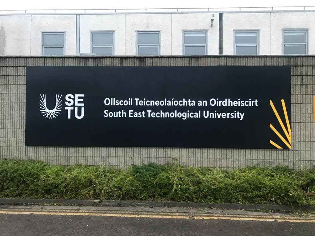
Waterford Institute of Technology and Institute of Technology Carlow became one university overnight. The external signage had to say so campus by campus, in Irish and English, and the previous identities had to come off the walls first.
University established
Waterford sites within 3 km
Arena facade vinyl
Flat-cut lettering
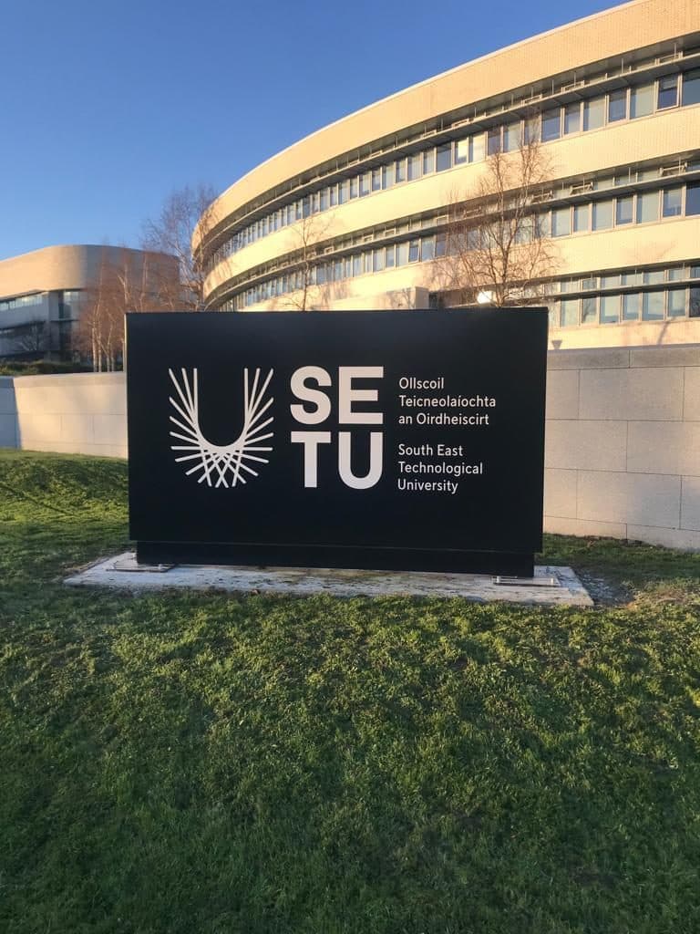
On 1 May 2022, Waterford Institute of Technology and Institute of Technology Carlow stopped existing. In their place stood South East Technological University, with campuses in Waterford, Carlow, Wexford and Wicklow. A university exists on paper from the moment the order is signed. On the ground it exists when the buildings say so.
Removing a name is half the job
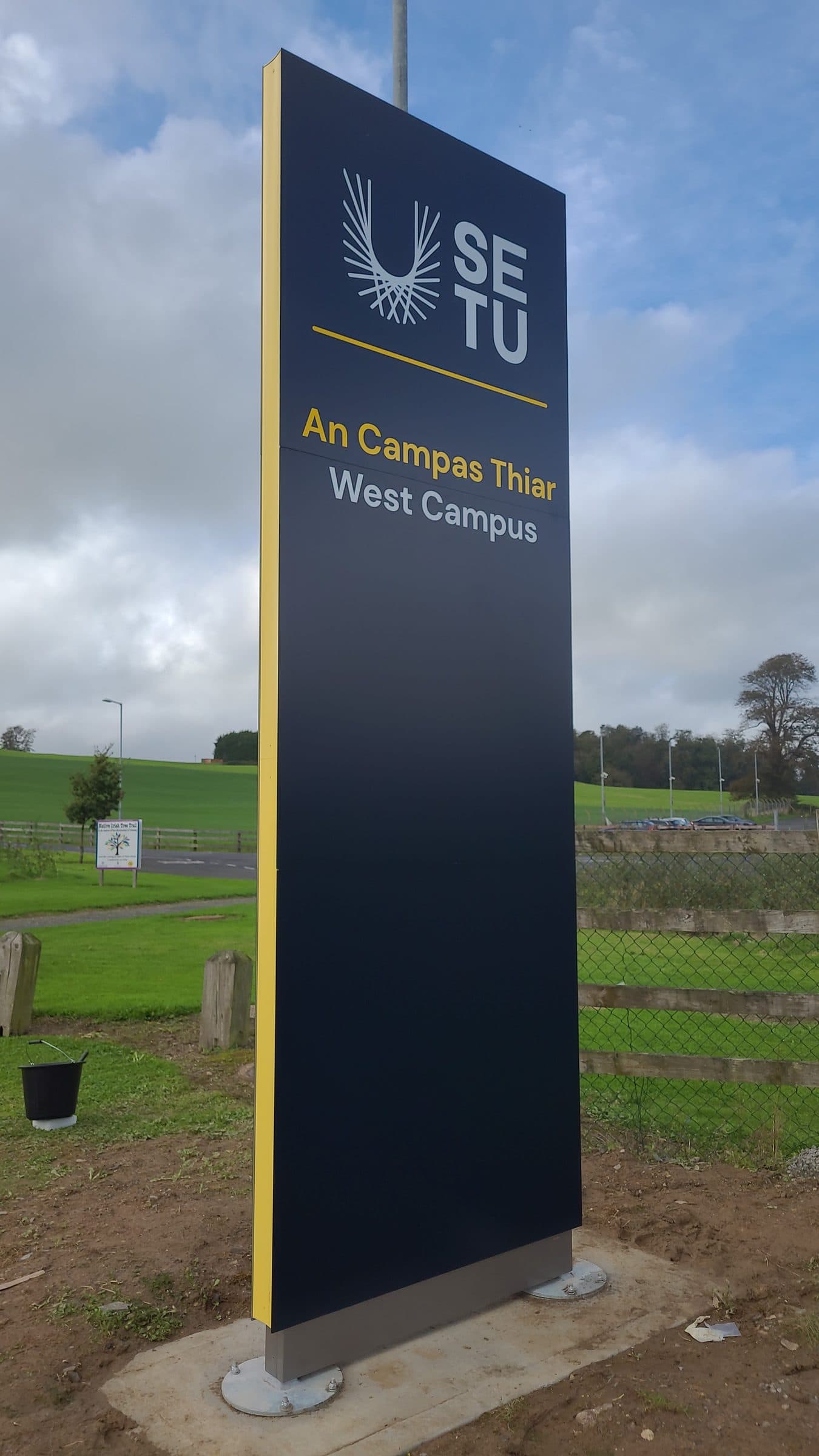
The Phase 1 drawing packs for Carlow, Waterford and Wicklow were issued within a day of each other in August 2022. Waterford alone has five sites inside a three-kilometre radius, so the same decisions had to hold across a city. The packs set the work out sign by sign: 3 mm aluminium panels powder coated to Pantone 7547C, held 10 mm off the wall on plastic spacers, countersunk face fixings through the logo and welded studs behind the smaller text. Entrance totems were drawn at 3.6 m, built on a steel internal structure and set on base plates. And on drawing after drawing, under the specification, the same short instruction: existing logo to be removed.
Eighteen months after the university changed its name, the drawing still called it the existing WIT Arena wall.
Irish first, and not as a courtesy
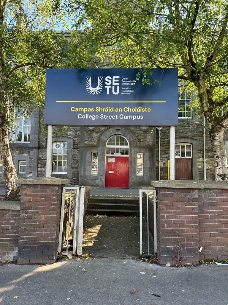
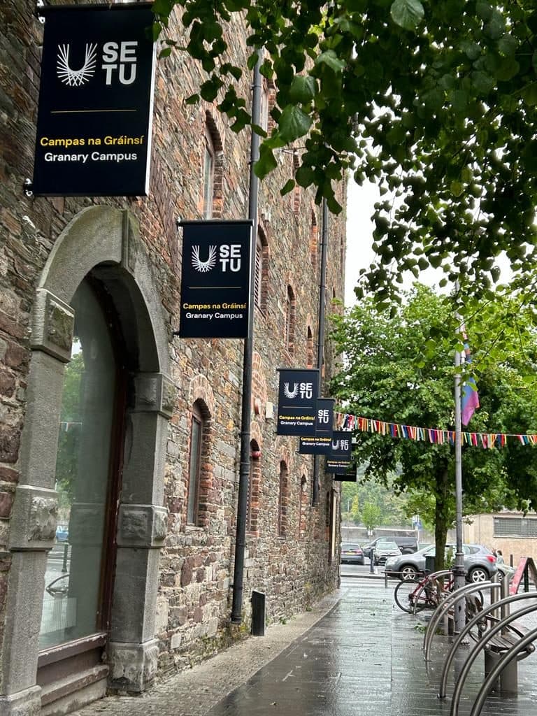
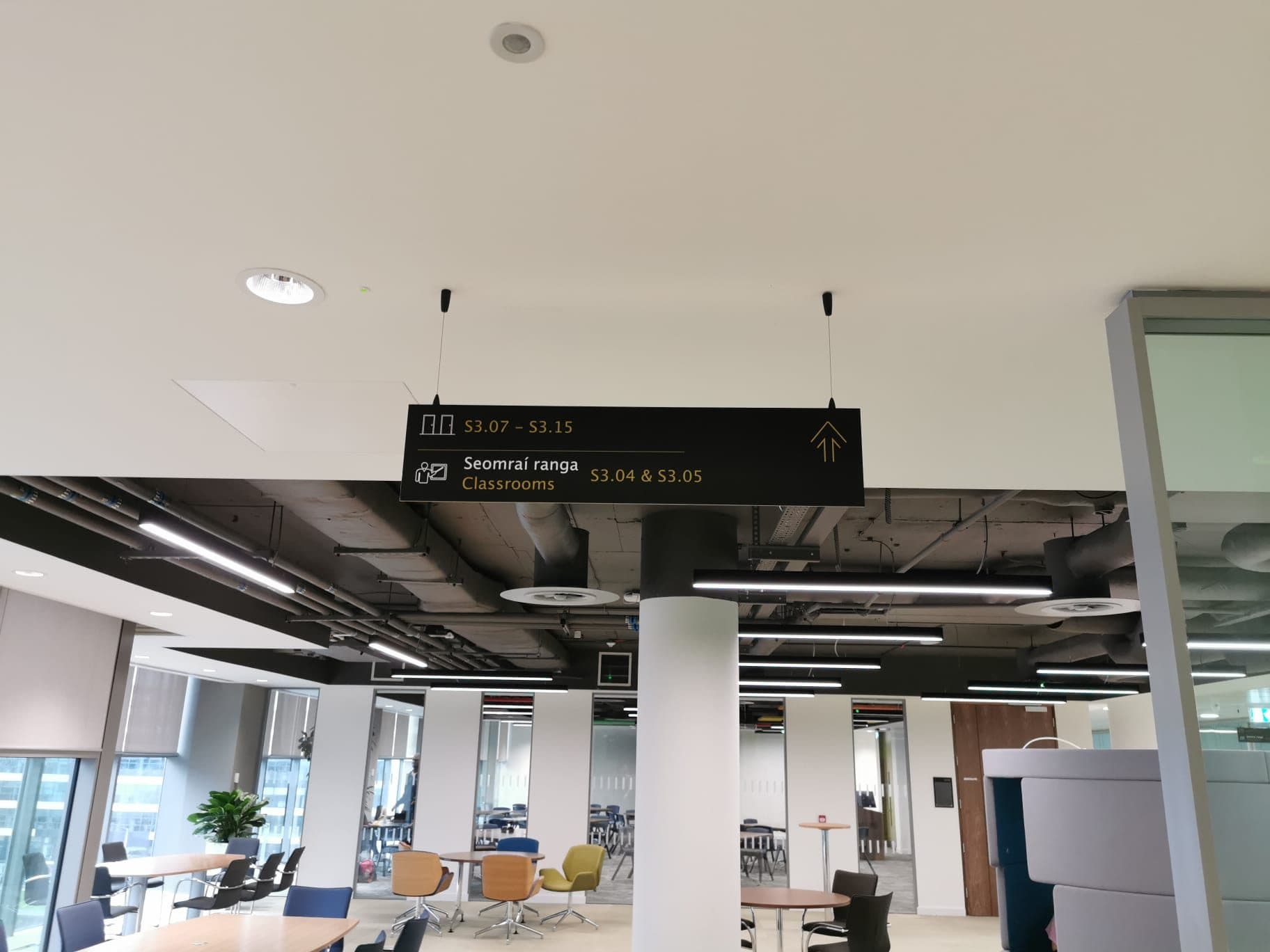
SETU is a public body, so the Official Languages Act applies to every sign it puts up: the Irish text appears first, at equal size, prominence, visibility and legibility with the English. That is an instruction about typography rather than a gesture. The campuses read accordingly: Campas Bhóthar Chorcaí above Cork Road Campus, Campas Shráid an Choláiste above College Street Campus, Campas na Gráinsí above Granary Campus, An Campas Thiar above West Campus. The building names carry the same pairing, An Príomhfhoirgneamh above Main Building, Leabharlann Luke Wadding above Luke Wadding Library.
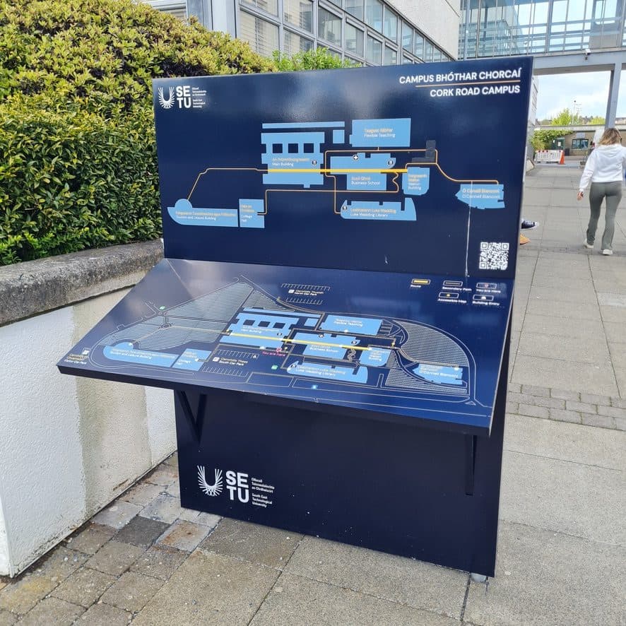
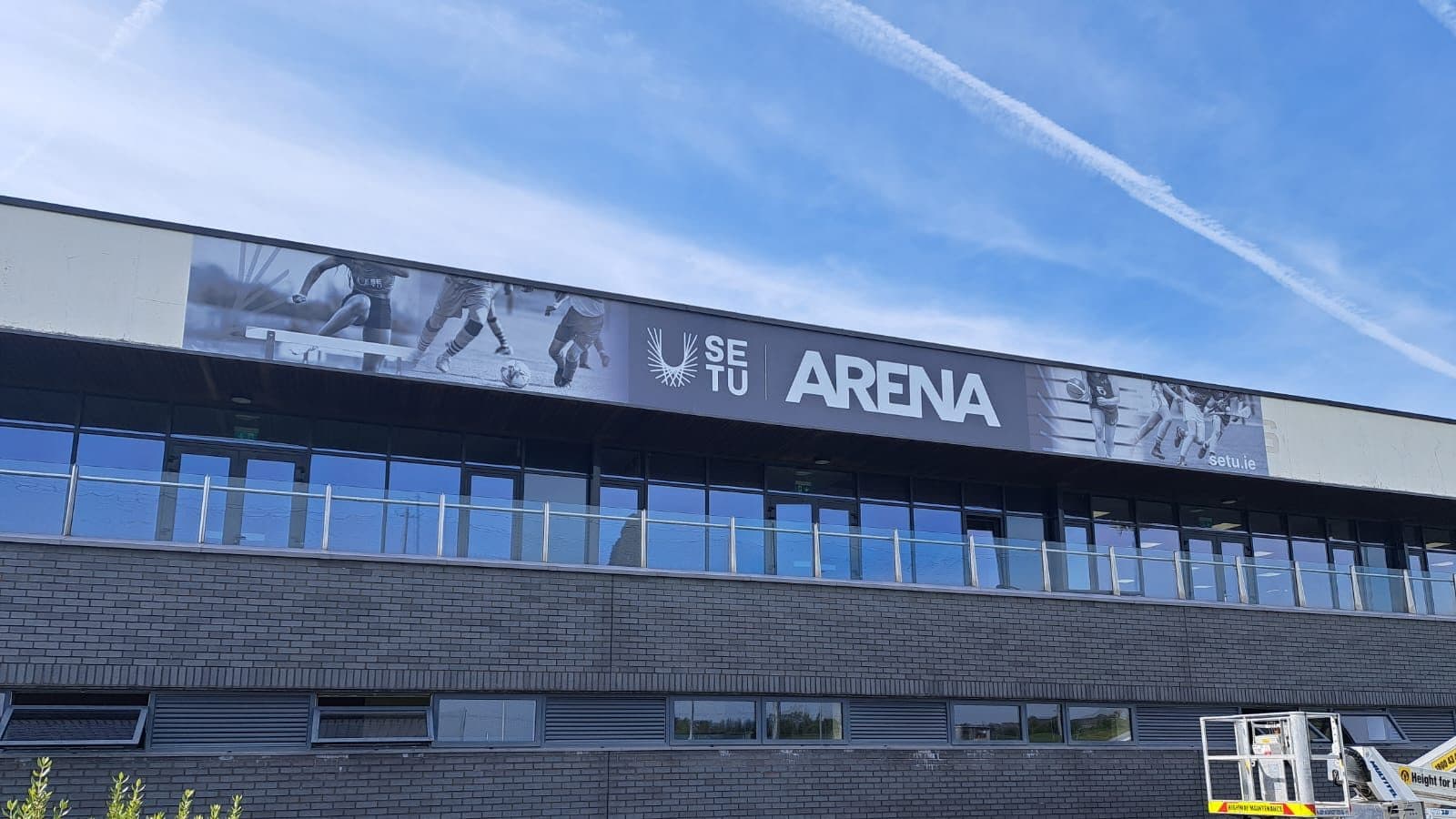
On the orientation lecterns that pairing has to survive at map scale, where the type is smallest and the reader is standing still with somewhere to be. The Cork Road lectern sets the campus plan in pale blue on navy, picks the primary route out in yellow and the secondary paths in grey, marks a you-are-here, and carries a QR code in the corner for the version that travels in a pocket. The work did not stop at the first rollout: in January 2024 the Arena took flat-cut aluminium letters 1,141 mm high and a printed and laminated vinyl 28.8 metres long, and further packages for Carlow followed in 2026.