Skip to content
Wayfinders
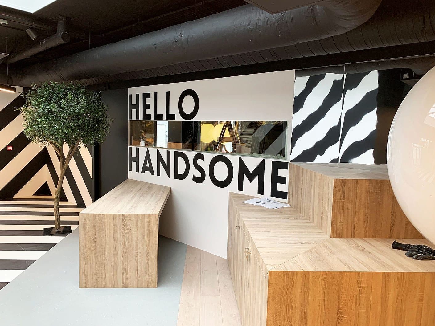
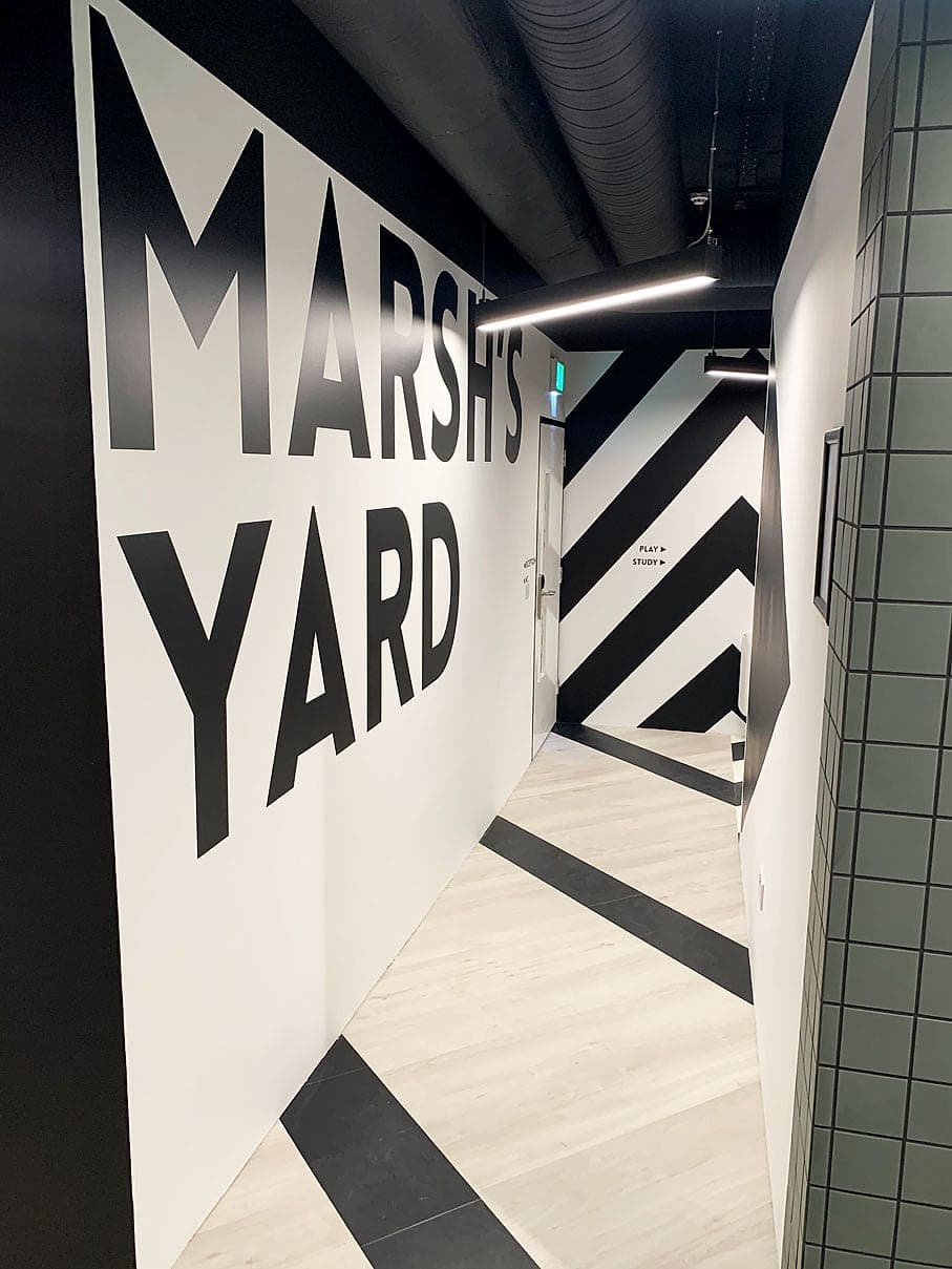
Supergraphic wall naming Marsh's Yard at Hatch Student Accommodation, Dublin: metre-high black lettering with chevron wall and floor graphics carrying movement through the corridor

03Space that speaks.

Environmental graphics

Feature walls, super-graphics, donor recognition and placemaking, designed as part of the wayfinding system rather than as standalone branding.

In short

Environmental graphics are the large-scale layer of a wayfinding system: supergraphics, murals, feature walls, floor graphics, glass manifestation and donor recognition. We design them with the signage, from the same strategy, palette and type, so they become the landmarks people steer by. A ward found by its mural, a floor by its numeral, a yard by its name.

Environmental graphics are part of the wayfinding system. Murals, super-graphics, heritage and donor recognition, and feature moments give a place its character and help people remember where they are.

Designed to belong to the space, not be applied to it.

01Why it matters

The problem this solves

01

People navigate by landmarks

Listen to anyone giving directions indoors: past the big mural, left at the red desk. Room numbers come last, if at all. A landmark only works if it is visible from the routes that matter, easy to describe over the phone and singular, so we design them into the wayfinding strategy on purpose instead of leaving them to chance.
02

Every question the building answers is a sign you don't need

Long corridors that all look the same, floors that repeat, a junction with nothing to remember it by: those are the places where arrows multiply. Graphics give a repetitive building a memorable structure, and the signage system can then stay small and calm.

03

Identity at full volume, inside one system

Signage carries a brand at its most disciplined. Environmental graphics are where the display face, the full-strength palette and the wit belong. Because both are drawn by the same designers from the same rules, the feature wall and the door sign read as one place.

04

The standards still apply

Glazing needs manifestation a person with low vision can see. Lettering still needs contrast, and in a public body the Irish still comes first. Graphics never cover statutory or tactile information, and they never stand in for it.

02How we do it

Step by step

The same sequence on every project, run by our own teams, so nothing falls between packages.

  1. 01

    Find where the building is silent

    From the strategy and the journey walks, we mark the places where the architecture says nothing: long runs, repeated floors, lift lobbies that all look alike, thresholds between zones.

  2. 02

    Choose the landmarks

    Each one has to be visible from the main routes, nameable by the people who use it and used only once. Two identical murals are worse than none, because a landmark that repeats stops being a place and becomes a pattern.

  3. 03

    Develop the graphic language with the signs

    Palette, typography, motifs and zone colour are set alongside the sign family. Zone colour goes onto the building itself, a lift core or a bulkhead, at a scale no small panel can reach, and the signs confirm it.

  4. 04

    Resolve materials and scale

    Printed and laminated vinyl, cut vinyl lettering, flat-cut aluminium letters, painted aluminium profiles, etched and frosted films. Everything is set out against the real elevations, mullions and services, because a graphic that meets a socket or a mullion where the drawing assumed a clear wall is the cheapest thing on a project to get wrong.

  5. 05

    Check it against the standards

    Manifestation bands, contrast pairings and bilingual content are checked before artwork is approved, on the same sign-by-sign review as the rest of the package.

  6. 06

    Make and install with the signage

    Graphics are produced and fitted on the same programme as the signs, by our own installation teams, so the walls are finished once.

How we work, stage by stage →

03What you receive

Deliverables

What lands on your desk, ready to price, approve and build from.

  • Graphic concept tied to the wayfinding strategy and zoning
  • Supergraphic, mural and feature-wall artwork at full scale
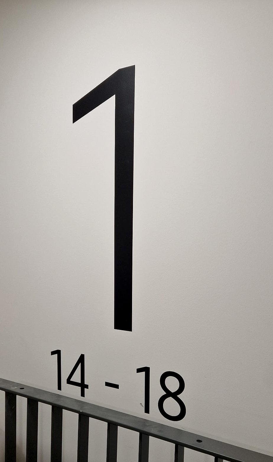
  • Floor and level identification graphics, including large-format numerals
  • Glass manifestation design, set out to the required heights
  • Donor recognition, heritage and interpretive displays
  • Setting-out drawings against real elevations, mullions and services
  • Material and finish specification
  • Installed graphics, on the same programme as the signage

04Standards

Compliant by default

The standards and regulations this work is designed to. Compliance is the baseline, not an upsell.

Technical Guidance Document M (Part M)
Glazed screens and doors need manifestation a person with low vision can see, typically two bands at roughly 850 to 1,000 mm and 1,400 to 1,600 mm above floor level.
BS 8300-2
Any lettering that carries information still needs a light-reflectance difference of 30 points or more against its background, however large it is.
Official Languages Act 2003
In a public body, Irish and English appear together in the graphics as well as the signs, in the same colours and the same weight.

06FAQs

Common questions

Something else? Ask us directly.

What are environmental graphics?

Environmental graphics are graphics applied at architectural scale: supergraphics, murals, feature walls, floor graphics, large-format numerals, glass manifestation and donor or heritage displays. In our work they are always part of the wayfinding system, designed to help people recognise where they are and remember the way.

How do environmental graphics help wayfinding?

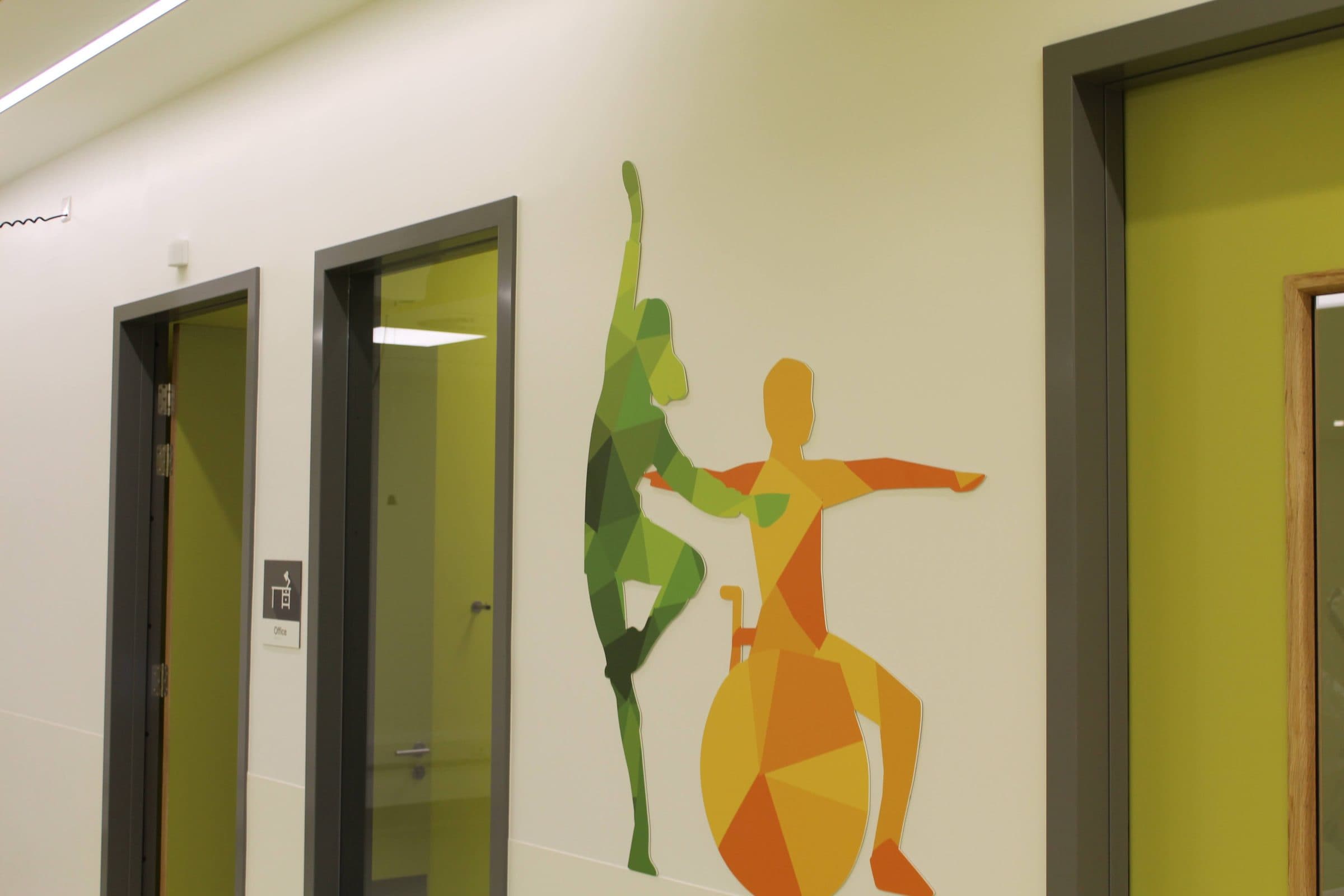
They give people landmarks, which is how most of us navigate indoors. At the National Rehabilitation Hospital, basketball courts drawn across a corridor wall and a piano keyboard 3,423 mm long tell a patient what a room is from the far end of the corridor, long before any text can be read.

Do you design murals or branding on their own?

No. We do wayfinding and nothing else, so we design environmental graphics as part of a wayfinding system, from the same strategy, palette and typography as the signs. That is what lets a feature wall work as a landmark and not just decoration.

Can graphics replace signs?

Only some of them. Graphics can take over a lot of orientation work and reduce the number of directional signs, but statutory and fire-safety signage, tactile and braille information, and a clear sign at a genuine decision point still have to be there.

What materials do you use for environmental graphics?

It depends on the wall and the life it will lead. We use printed and laminated vinyls, cut vinyl lettering, flat-cut aluminium letters, painted aluminium profiles and etched or frosted films. At the National Rehabilitation Hospital none of the therapy-space graphics are printed vinyl: they are 3 mm aluminium, painted and flush-mounted.

Do glass walls need manifestation?

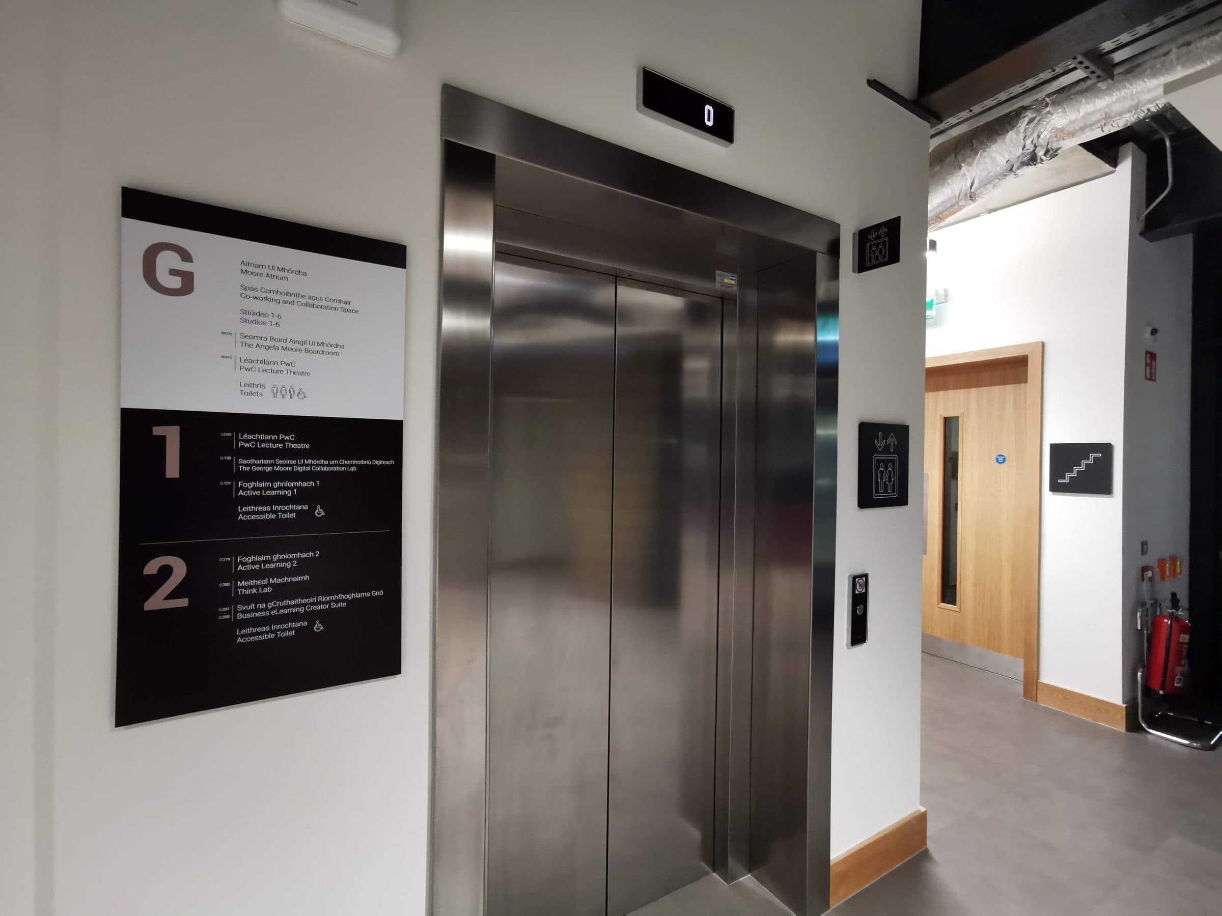
Yes. Under Part M, glazed screens and doors need manifestation that a person with low vision can see, usually two bands at about 850 to 1,000 mm and 1,400 to 1,600 mm. We design it as part of the graphic scheme; at the UCD Moore Centre for Business the studio glass carries bilingual phrases in Irish and English.

How do you approach graphics for a children's hospital?

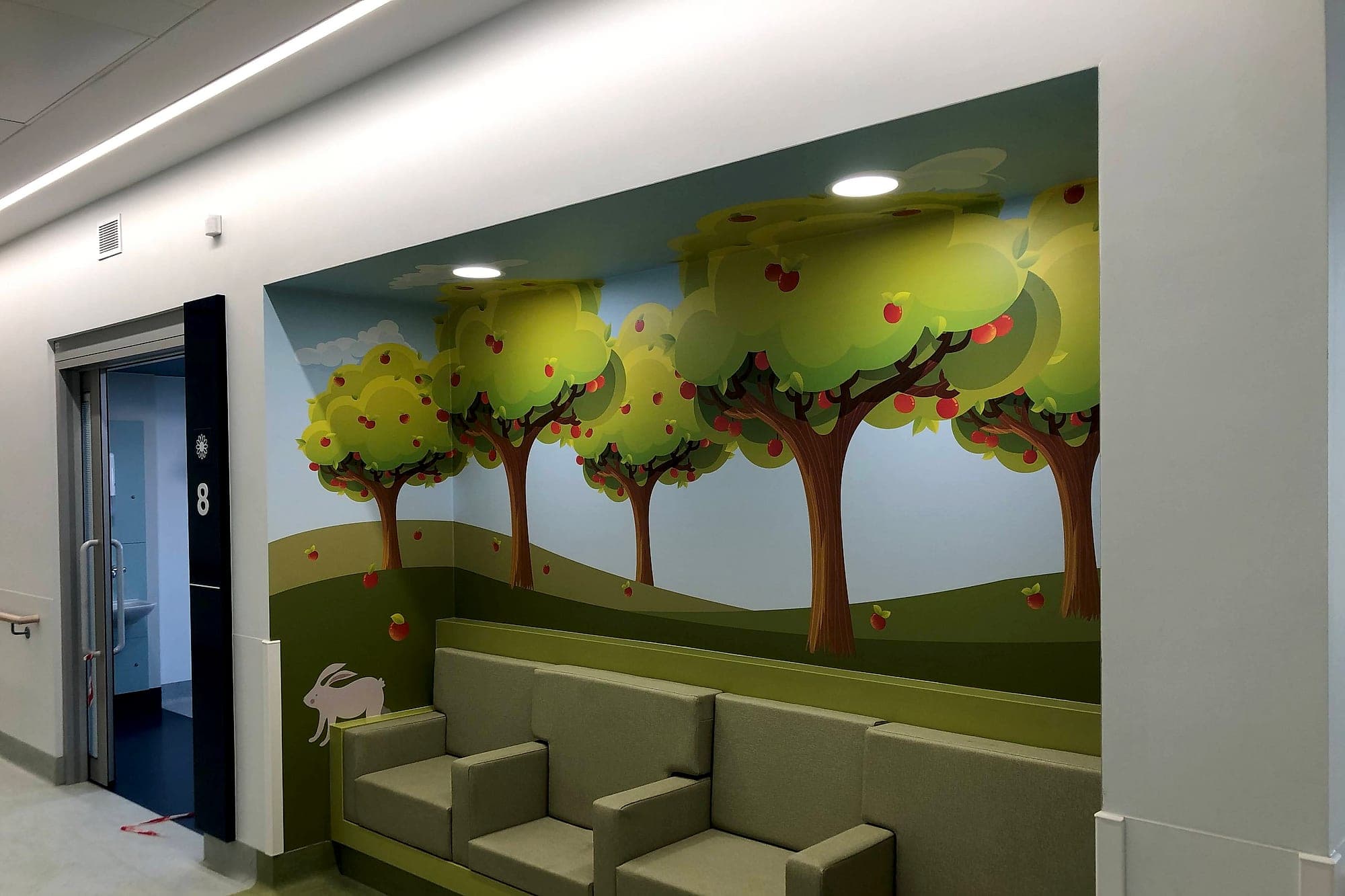
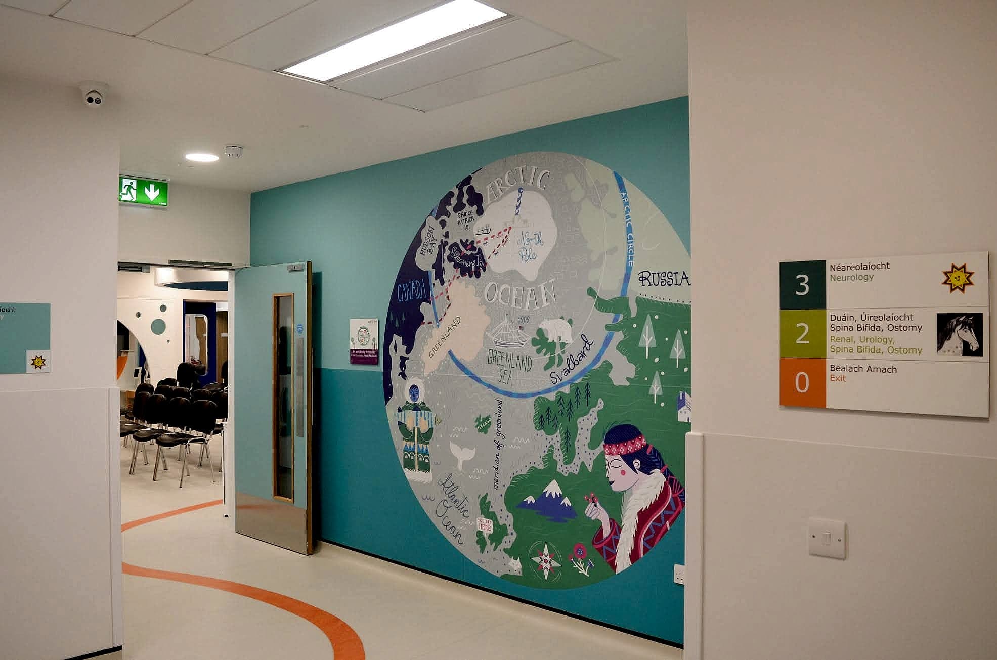
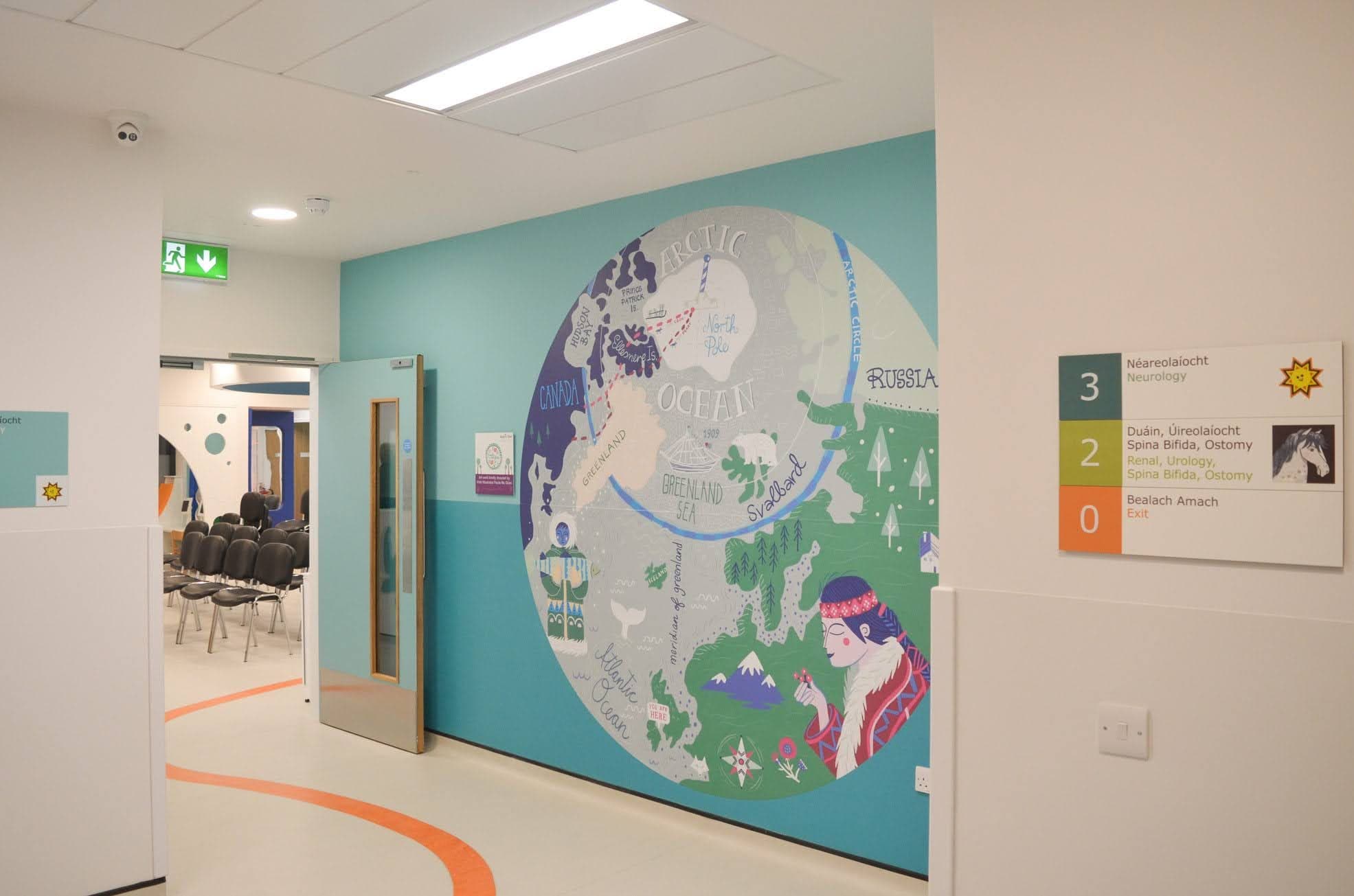
We design for two readers at once: an adult under stress and a child who may not read yet. At Temple Street Children's Hospital the signs take the department's animal and landscape motifs as content: a sun for level 3, a horse for level 2, a clownfish on a consulting-room door. A child told to look for the fish has been given a route.

Environmental graphics

Talk to a specialist about your project.

Approvals cut from months to days, typically around 20% off the wayfinding package, and one supplier from design to installation.