Skip to content
Wayfinders
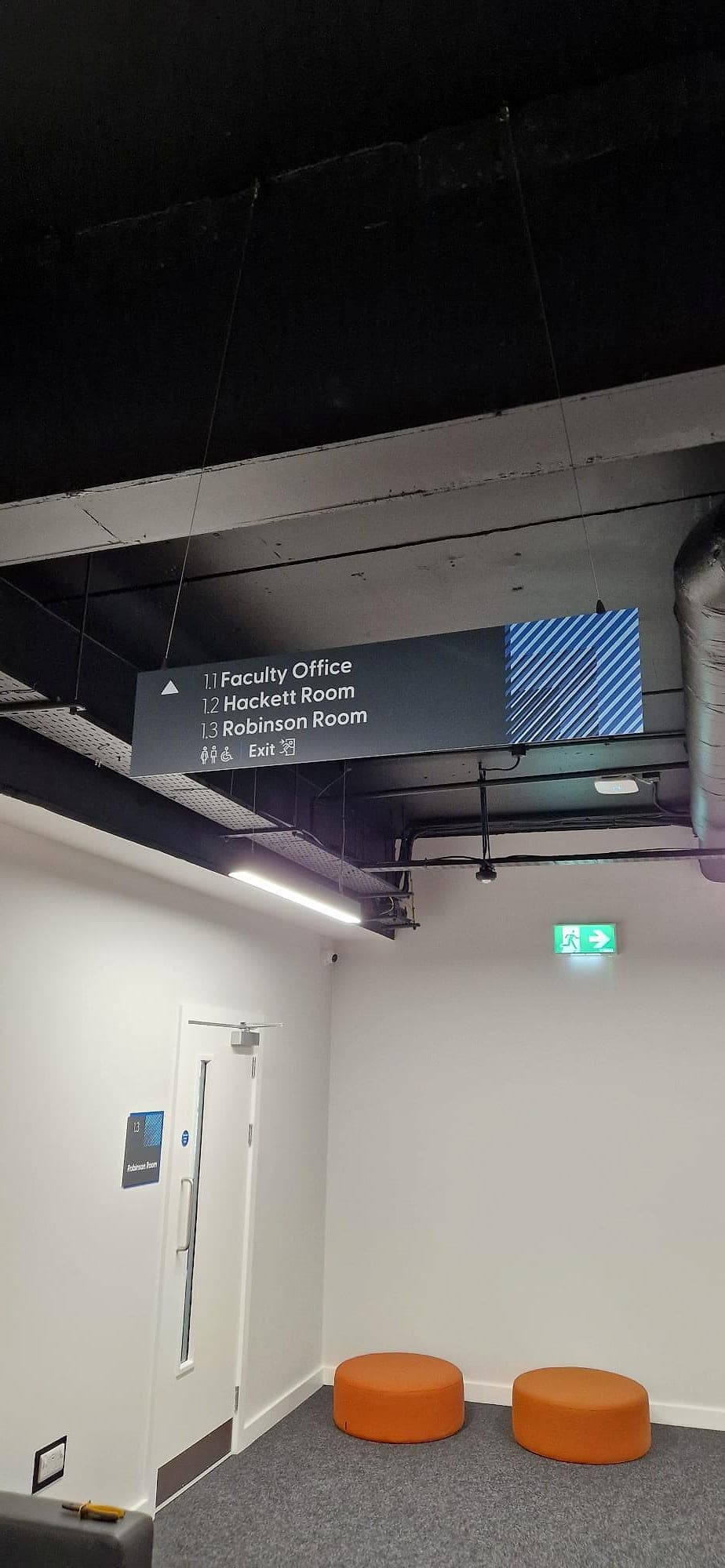
Suspended directional wayfinding sign at a corridor junction in CCT College Dublin, listing three numbered destinations (1.1 Faculty Office, 1.2 Hackett Room, 1.3 Robinson Room) with an arrow, toilet and accessibility pictograms, and the matching numbered door sign on the room below

02Designed to be followed.

Wayfinding & signage design

In-house architects and graphic designers develop the complete sign family: legible, accessible and designed around the building and the client's identity.

In short

Wayfinding design turns the strategy into a sign family people can follow: types, sizes, typography, pictograms, colour, contrast and materials, resolved as one system across a building or an estate. Our own architects and graphic designers draw it to complement your architecture and identity, to Part M and BS 8300 by default, with every sign approved individually.

We design wayfinding systems that work with the architecture and the client's identity, so the sign family sits naturally in the building and reads effortlessly.

Typography, iconography, colour, contrast and materials, resolved as one system across the whole estate.

01Why it matters

The problem this solves

01

Legibility is measured

A sign is glanced at mid-stride, at an angle, often by someone late or anxious. So we size type as x-height in millimetres from the real viewing distance, set destinations in mixed case, and check every colour pairing for a light-reflectance difference of 30 points or more. Candidate faces get printed at full size and read on the wall before anything is specified.
02

A family of types, drawn once

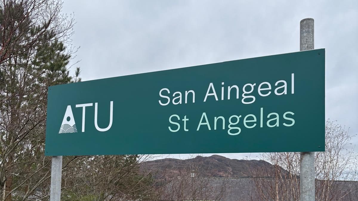
Each sign type is drawn once and then placed, which is how a campus ends up looking like one decision instead of thirty. At ATU St Angela's in Sligo the external pack ran to eight type families across 33 drawings, every material and fixing specified to the same level of detail.

03

Your identity, without breaking the standards

The brand leads where it carries best: colour, character and materials. Contrast, case and size belong to the standards. We set that boundary in writing, and on many schemes we write the signage chapter of the brand guidelines ourselves, so the argument happens on paper before tender and not on site.

04

Approvals that move

Designers talking to designers is why packages move. Every sign is reviewed on our own platform, with comments on the sign itself rather than in an email chain. Approval averages 1.8 design rounds across all our projects, and approvals are cut from months to days.

02How we do it

Step by step

The same sequence on every project, run by our own teams, so nothing falls between packages.

  1. 01

    Start from the schedule

    Design begins with the destination schedule and the sign locations from the strategy, so every face we draw is answering a question somebody actually asks at that point in the building.

  2. 02

    Define the sign family

    Identification, directional, informational and regulatory types, each doing one job. We set the sizes, proportions, mounting methods and the kit of parts they share, so a directory, a door sign and an exit sign read as one system.

  3. 03

    Set the typography

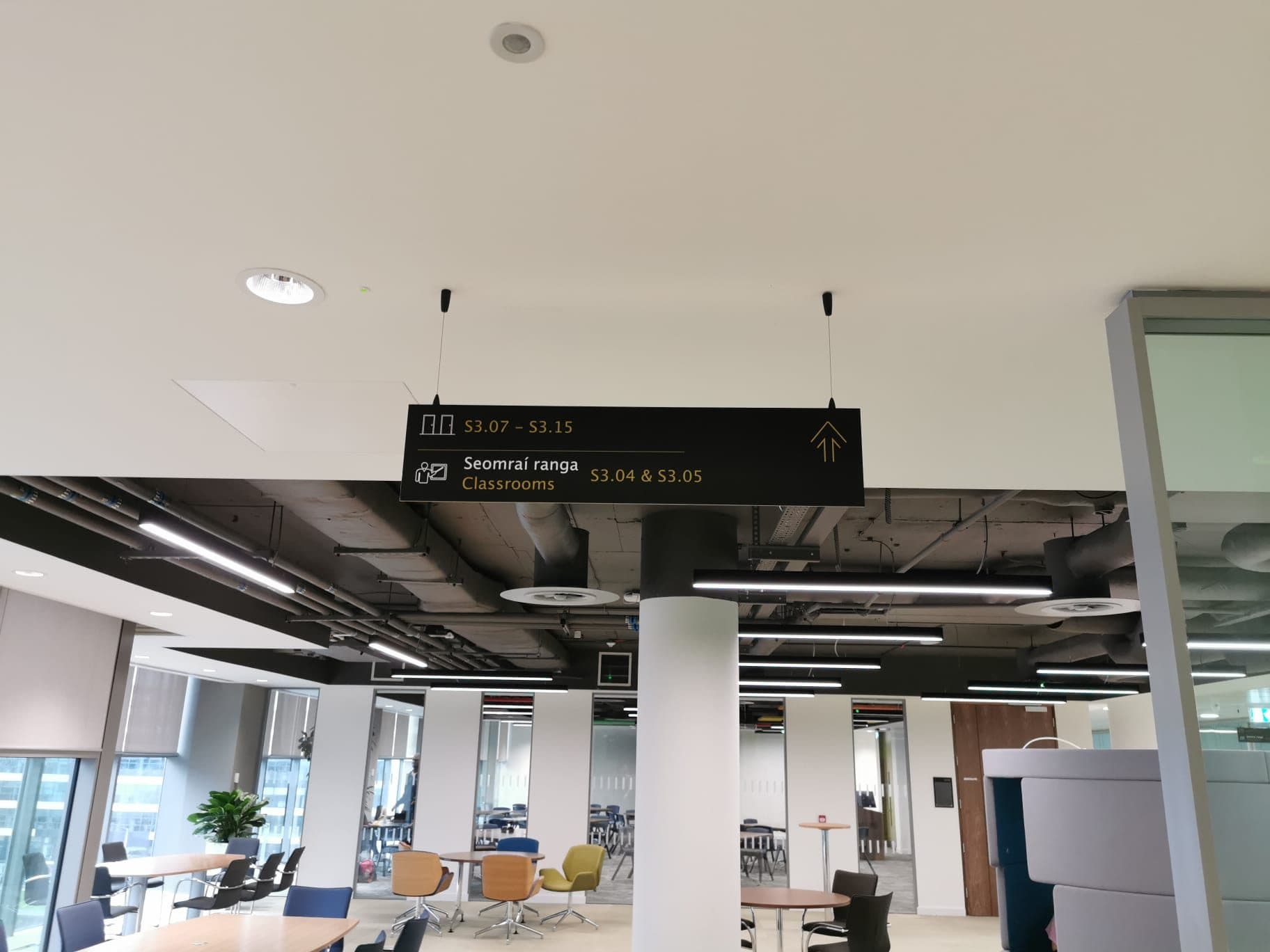
    A proven wayfinding face for the directional layer, tuned to the brand's temperature, with brand type kept for identity moments. Sizes come from viewing distance and mounting height; settings run slightly open, and bilingual panels give Irish and English equal prominence with clean space for the síneadh fada.

  4. 04

    Draw the pictograms and colour

    Safety symbols follow ISO 7010 exactly. Everything else can carry the character of the place, drawn on one grid. Colour-coding is used sparingly, kept clear of the safety colours, and always backed by a word, a number or a symbol for readers with colour-vision deficiency.

  5. 05

    Resolve materials and detail

    Stove-enamelled aluminium and other long-life materials, with embossed text, tactile pictograms and braille where a hand can find them. Lines that will change, such as tenants or departments, are detailed as replaceable slats, cassettes or inserts.

  6. 06

    Review and approve, sign by sign

    Positions and messages are reviewed together, on the plans the client recognises, through our platform. Each sign carries its approval state, comments and revision history, and the package can be exported into the BIM model for coordination.

  7. 07

    Issue for manufacture

    Approved artwork, sign schedules, quantities and setting-out drawings are issued level by level, with Irish proofed before anything is cut.

How we work, stage by stage →

03What you receive

Deliverables

What lands on your desk, ready to price, approve and build from.

  • Concept design with the sign family shown in your building
  • Sign type drawings with dimensions, materials, finishes and fixings
  • Typography, pictogram and colour specification, with every contrast pairing checked
  • Sign schedule: every sign numbered, typed, located and worded
  • Approved artwork for every sign face, bilingual where required
  • Signage chapter for the brand guidelines
  • BIM objects and model export for coordination and clash-checking
  • Quantities and tender documentation

04Standards

Compliant by default

The standards and regulations this work is designed to. Compliance is the baseline, not an upsell.

Technical Guidance Document M (Part M)
Clear and concise messages, visual contrast, tactile characters and braille at key locations, and mounting heights that work seated and standing.
BS 8300-2
The design practice behind Part M: contrast of 30 LRV points or more, lettering size and mounting bands of roughly 1,400 to 1,700 mm for wall signs.
ISO 7010
Registered safety signs, used exactly as standardised so they mean the same thing to someone who has never been in the building.
Official Languages Act 2003
For public bodies, Irish set first and no less prominent than the English, on every panel down to the smallest.

06FAQs

Common questions

Something else? Ask us directly.

What does wayfinding design include?

Wayfinding design includes the whole sign family: the sign types, sizes, typography, pictograms, colour, contrast, materials and fixings, plus the sign schedule and the artwork for every face. It sits between the strategy, which decides what goes where, and manufacture, which makes it.

Can you work with our brand guidelines?

Yes, and we often extend them. The brand leads on colour, character and materials; the standards decide contrast, case and size. Where an approved brand pairing fails the 30-point contrast rule, we keep the hues and move the tones, and we can write the signage chapter of the guidelines so the rules are settled before tender.

Is your signage design compliant with Part M and BS 8300?

Yes, by default. Everything we design is drawn to Part M and BS 8300-2 from the first drawing, with tactile and braille provision built in, and we certify on completion.

How many design rounds does approval take?

Across all our projects, approval averages 1.8 design rounds. Every sign is reviewed individually on our own platform, with comments attached to the sign, which is how approvals are cut from months to days.

Do you design bilingual Irish and English signage?

Yes. For public bodies the Irish comes first and at equal prominence under the Official Languages Act, and the convention is held on every panel, from directories to room numbers. We have also designed trilingual Irish, English and Chinese signage for the UCD Confucius Institute.

Can architects bring you in at tender stage?

Yes. We provide tender support for architects, including concept designs and quantity estimates, and we publish BIM families of our Infinity modular system and a safety-sign set so you can model with the real product from the start.

What happens when the building changes after handover?

A well-designed system takes it in its stride. We detail volatile lines as replaceable parts, and a modular system lets panels be changed without bespoke fabrication. When RTÉ rebranded, decade-old signs had their panels replaced with nothing more than a screwdriver.

07Insights

Further reading

All insights →
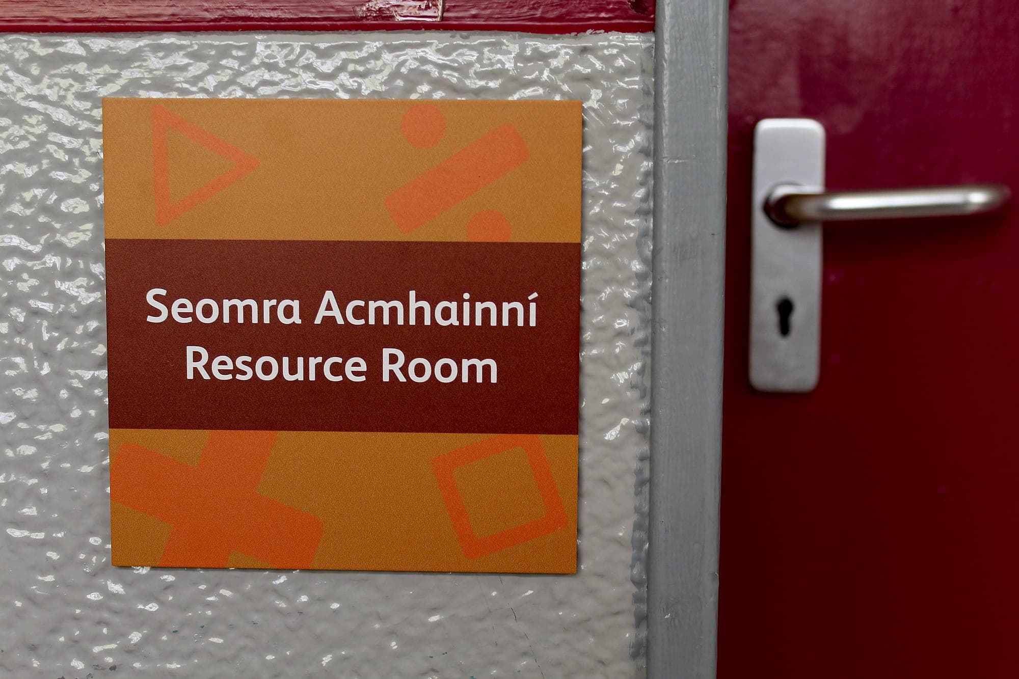
Scoil Assaim: bilingual Irish and English room identification sign reading Seomra Acmhainní / Resource Room, mounted on the wall beside a red classroom door in a school
The Craft of Wayfinding · 7 min read

The four types of wayfinding signage, and when each earns its place

Identification, directional, informational, regulatory. Every sign in a building does one of those four jobs, and knowing which is which is where good wayfinding starts.

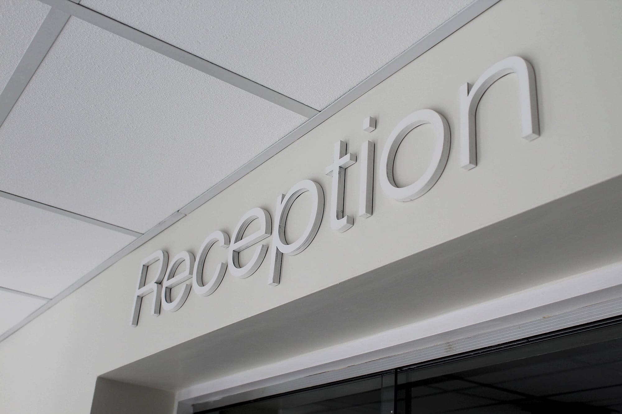
Newcastle West Primary Care Centre: built-up mixed-case lettering spelling Reception mounted above an entrance, seen from below, with generous x-height and open counters in wayfinding typography
The Craft of Wayfinding · 6 min read

Wayfinding typography: type people read at speed, at distance, under stress

A sign is read in a glance, on the move, at an angle. On x-height, case, weight, spacing and distance, and why brand fonts so often fail on walls.

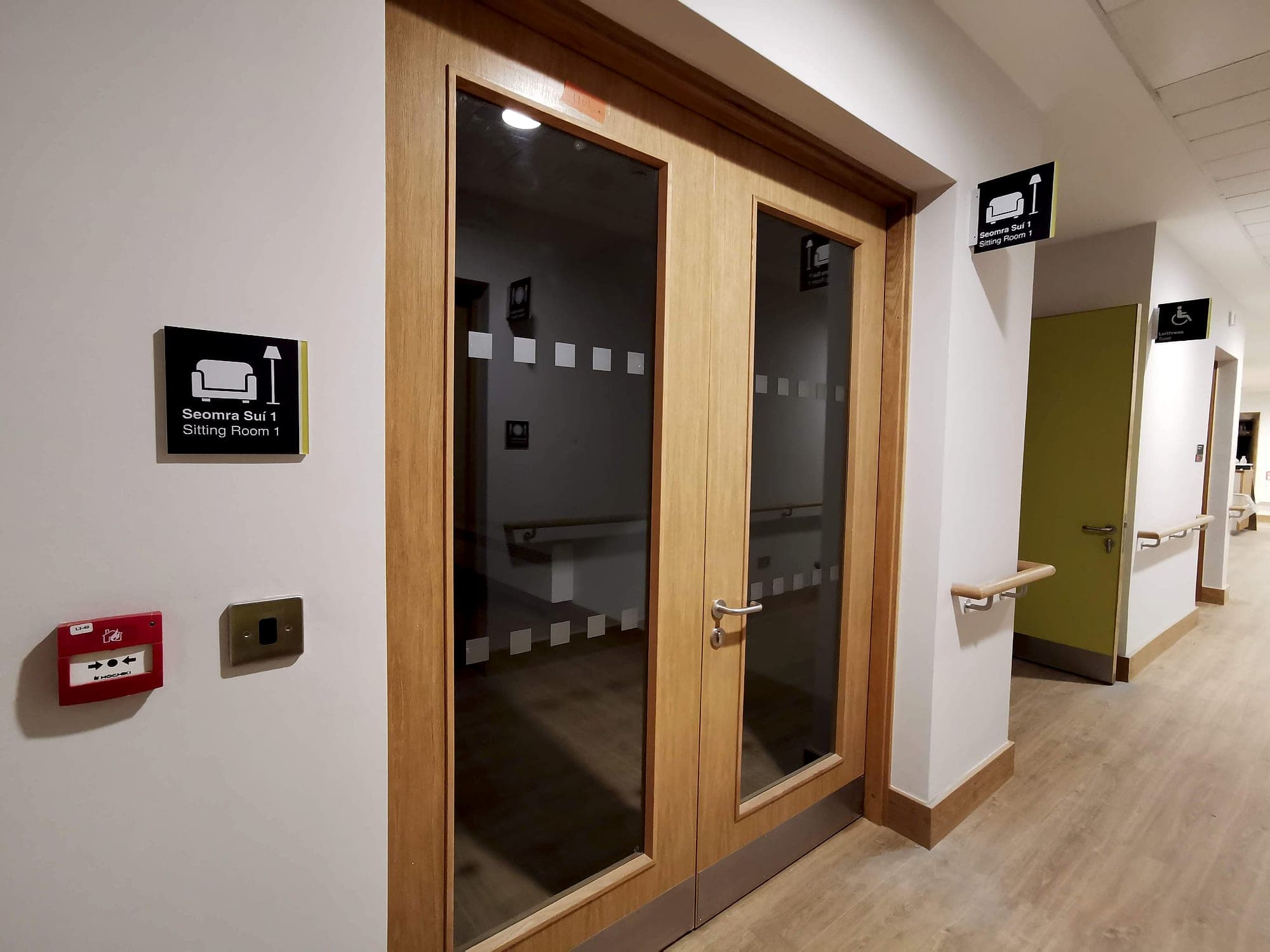
Custom wayfinding pictogram of an armchair and standard lamp on a bilingual door sign reading Seomra Suí 1 and Sitting Room 1, repeated on a flag-mounted projecting sign along the corridor with an accessible toilet symbol beyond
The Craft of Wayfinding · 6 min read

Wayfinding symbols and pictograms: the shared language of navigation

The fastest layer of any signage system is the one with no words. On ISO 7010, custom pictogram sets, bilingual buildings, and how to find out whether anyone understands your symbols.

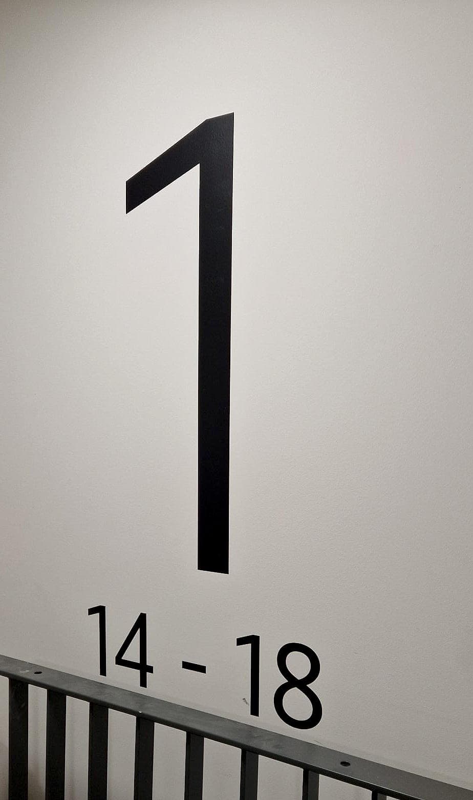
Signage colour contrast at Rathborne Wharf, Dublin: a large near-black level numeral one and apartment range 14–18 applied to a pale stair-core wall
The Craft of Wayfinding · 6 min read

Colour in wayfinding signage: coding, contrast and culture

Colour is the most seductive tool in wayfinding, and the most misused. On zone coding, the 30-point contrast rule, and why colour must never work alone.

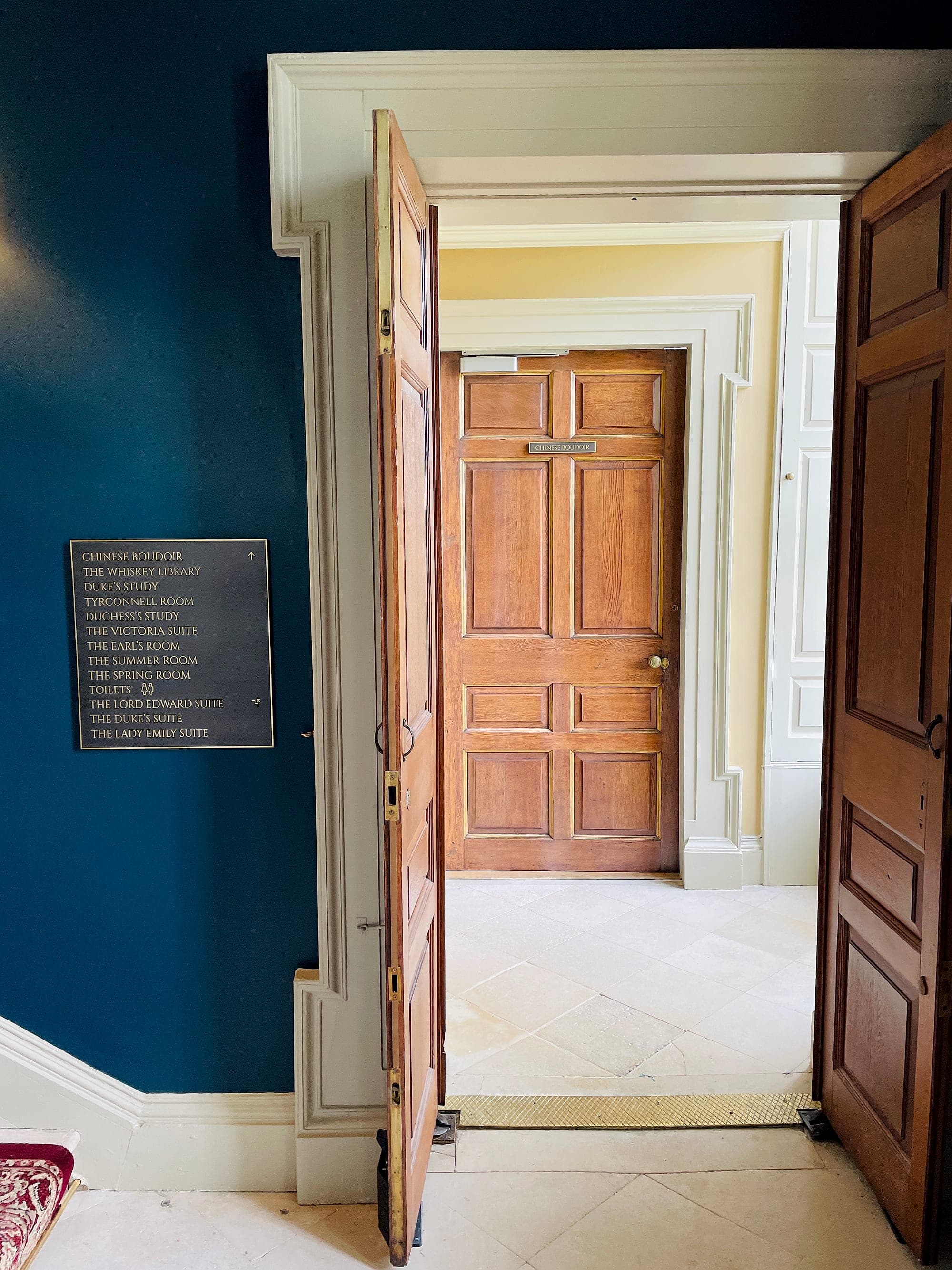
Brass-lettered directory sign on a deep blue wall at Carton House hotel, listing named suites and rooms beside a Georgian doorway
The Craft of Wayfinding · 6 min read

From brand guidelines to sign face: expressing identity in signage without breaking legibility

Every brand manual meets its hardest test on a wall. Where identity should carry a signage scheme, and where the legibility standards have to win.

Suspended directional wayfinding sign at a corridor junction in CCT College Dublin, listing three numbered destinations (1.1 Faculty Office, 1.2 Hackett Room, 1.3 Robinson Room) with an arrow, toilet and accessibility pictograms, and the matching numbered door sign on the room below
The Craft of Wayfinding · 5 min read

Progressive disclosure in wayfinding: how much should a sign say?

Most signs fail by saying too much. The craft is deciding what a person needs at each decision point, then holding everything else back.

Wayfinding & signage design

Talk to a specialist about your project.

Approvals cut from months to days, typically around 20% off the wayfinding package, and one supplier from design to installation.