
From brand guidelines to sign face: expressing identity in signage without breaking legibility
Every brand manual meets its hardest test on a wall. Where identity should carry a signage scheme, and where the legibility standards have to win.
Brand signage guidelines are the rules that carry a brand's identity onto the sign face without sacrificing legibility: its colours, typefaces, materials and tone of voice. Written properly, they answer two questions at once. Where does the brand lead, and where do the standards override it? That boundary is the whole craft. A signage scheme that ignores the brand looks bought from a catalogue, and one that ignores the standards is a liability with a logo on it.
Consider the brief at Carton House: a Georgian estate reborn as a five-star resort, with an identity built on restraint: deep blues, warm metals, and an unspoken prohibition on anything that would read as corporate plastic. Nothing in the brand book said "signage". Everything in the building said "be careful". The wayfinding had to move guests through a listed house without once breaking its voice, and stay legible for every one of them, in rooms where a modern sign panel would be the loudest object on the wall.
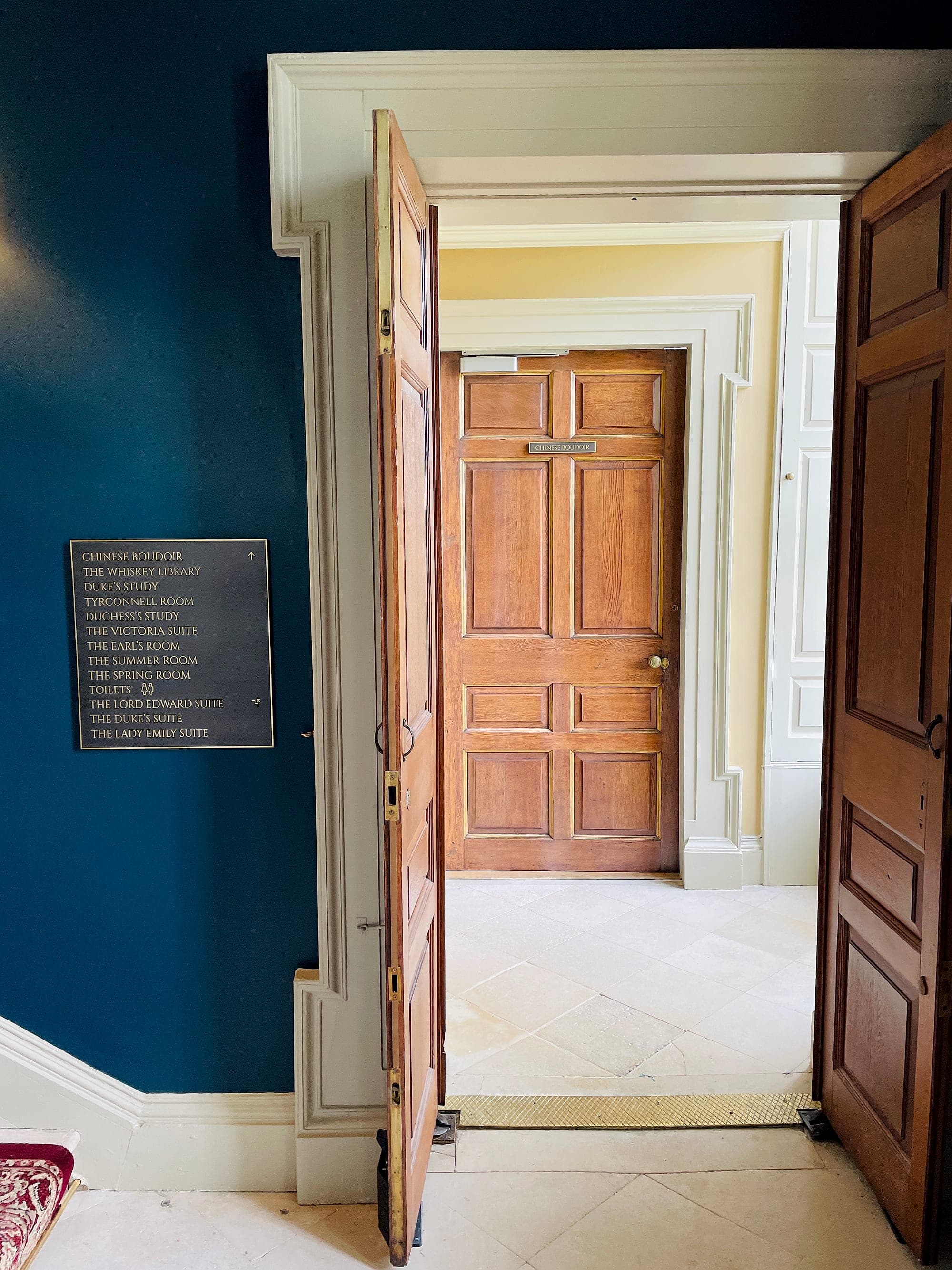
The scheme that answered that brief wears the brand in its materials: brass letterforms on panels toned to the walls, room names where numbers would have done (the Duke's Study, the Whiskey Library), letterspacing borrowed from the house's own memorial lettering. Underneath the manner, the mechanics are ours: viewing distances calculated, contrast measured, an arrow exactly where the decision happens. Guests read the result as the house speaking.
Guests read it as the house speaking. That is the translation working.
The wall is where the brand manual meets reality
Almost every brand manual is written at arm's length, for screens, stationery and slide decks, judged in a boardroom at reading distance. A sign is read at three, ten, twenty metres, on the move, at an angle, by someone who has never seen the brand book and never will. So the manual arrives on site full of confident rules about the tint palette, the display face and the clear-space diagram, and silent on every question the wall actually asks. How big must the type be at the end of this corridor? Does the accent colour hold 30 points of contrast against the approved background? What happens to the headline face when it has to carry Irish and English at equal prominence? Somebody answers all three, on site, usually at first fix and usually the wrong person. Translating identity into signage means answering them earlier, in the brand's own accent.
Where the brand carries: colour, character, materials
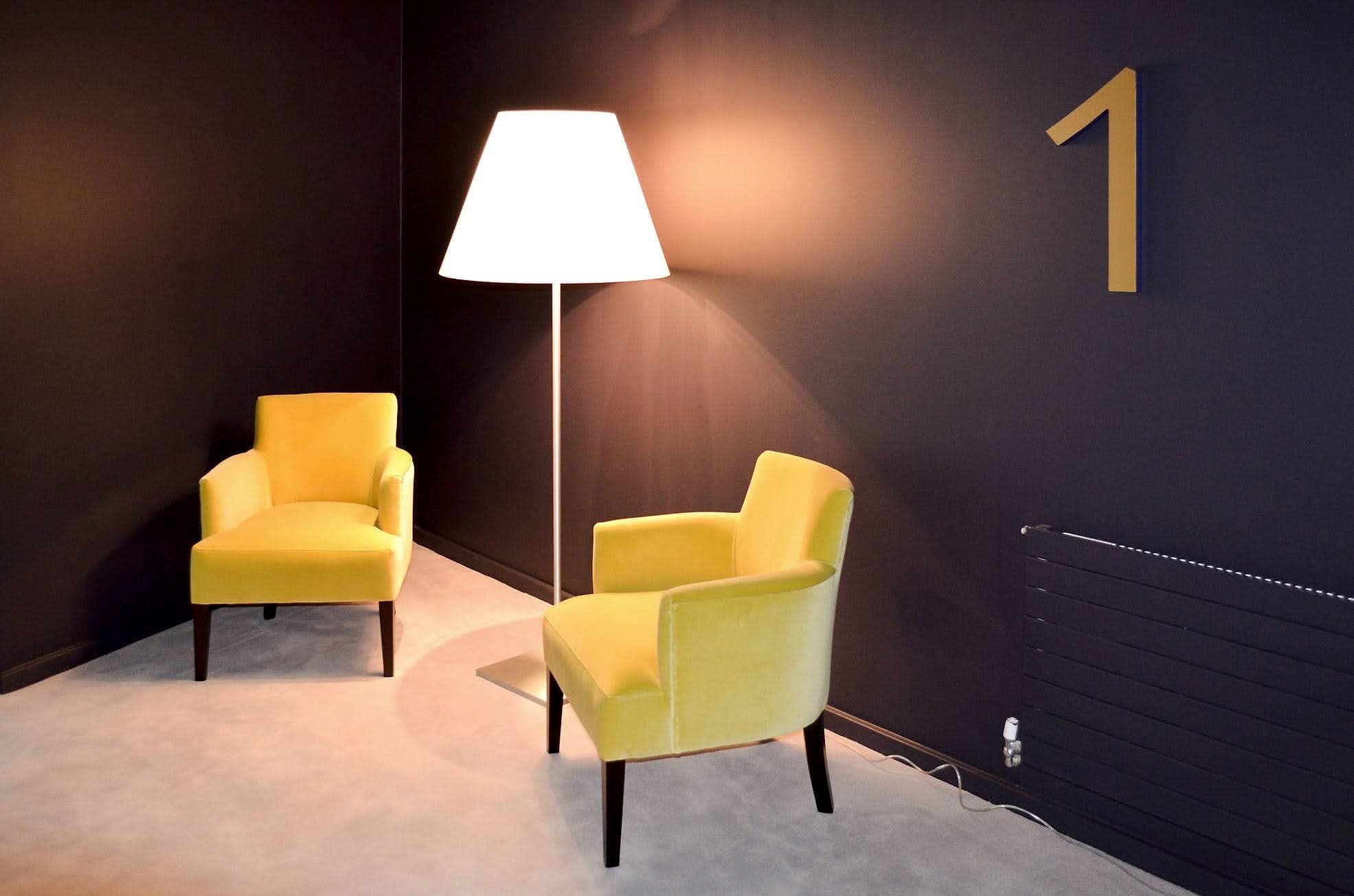
Colour is the brand's strongest carry. It survives distance better than any letterform, zones a building faster than words, and is usually what people remember when the name escapes them. At the Marker Hotel the palette does the floor identification on its own: a numeral in the house gold, tall as a door, read the moment the lift opens, echoed (not accidentally) by the velvet chairs beneath it. That is identity and wayfinding at full strength, with nothing traded between them.
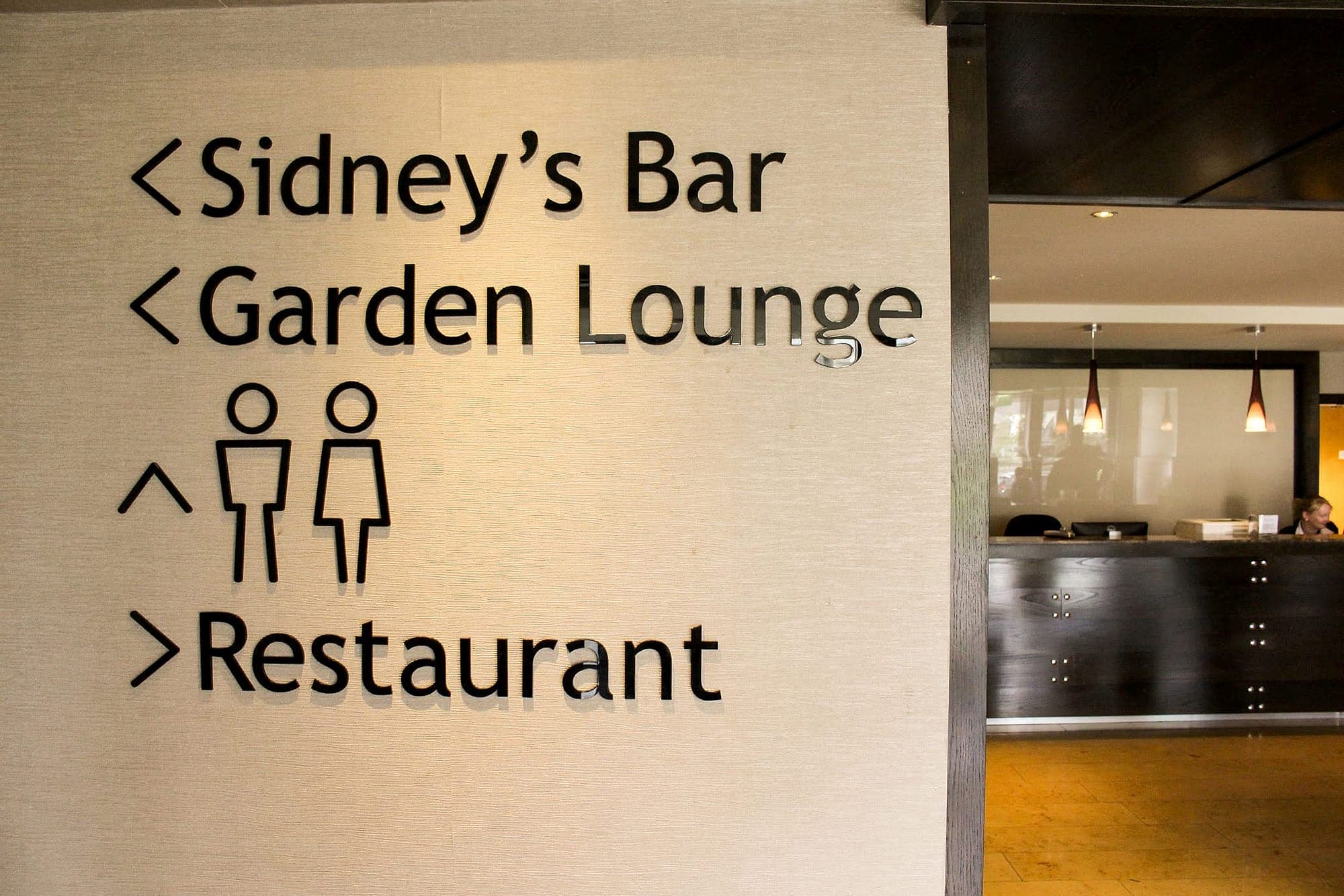
Character lives in the letterforms and the details around them. At Actons Hotel in Kinsale the directional lettering is cut as individual gloss letters applied straight to the wall, no panel at all, with arrows drawn as bare strokes in the same weight and a typeface warm enough to belong in a harbour town. The register is entirely the hotel's. The sizes, spacing and mounting heights are entirely ours.
Materials do the translation more subtly, and often more truthfully. Brass says heritage, powder-coated steel says civic, oak says care taken. A brand that never specifies a material still ends up with one, because every sign is made of something and the something speaks. Material is the most underrated brand decision on a signage scheme, and it's the one most often left to whoever prices the package. The same layout reads as five-star in etched brass and as budget retail in printed foamex.
Where the standards override: contrast, case and size
Three things on a sign face are not the brand's to decide. Contrast comes first. Lettering needs a light-reflectance difference of 30+ points against its background, the Part M baseline set out in Technical Guidance Document M, and brand palettes fail it constantly, because tone-on-tone that looks superb on a moodboard vanishes for a reader with low vision. When an approved pairing fails, we keep the hues and move the tones. The brand comes through that intact.
When an approved pairing fails, keep the hues and move the tones.
Case is second. Display faces and all-capital settings can announce a name over a door or a landmark supergraphic, but directional type reads by word shape, so destinations are set mixed-case even when the brand's headline style is caps. Size is third: type on a sign is sized from viewing distance and mounting height, never from the clear-space diagram, and no identity is well served by a beautifully proportioned word nobody can read from where they're standing. And where the Official Languages Act applies, Irish and English at equal prominence is law. Nobody at the table gets to negotiate it.
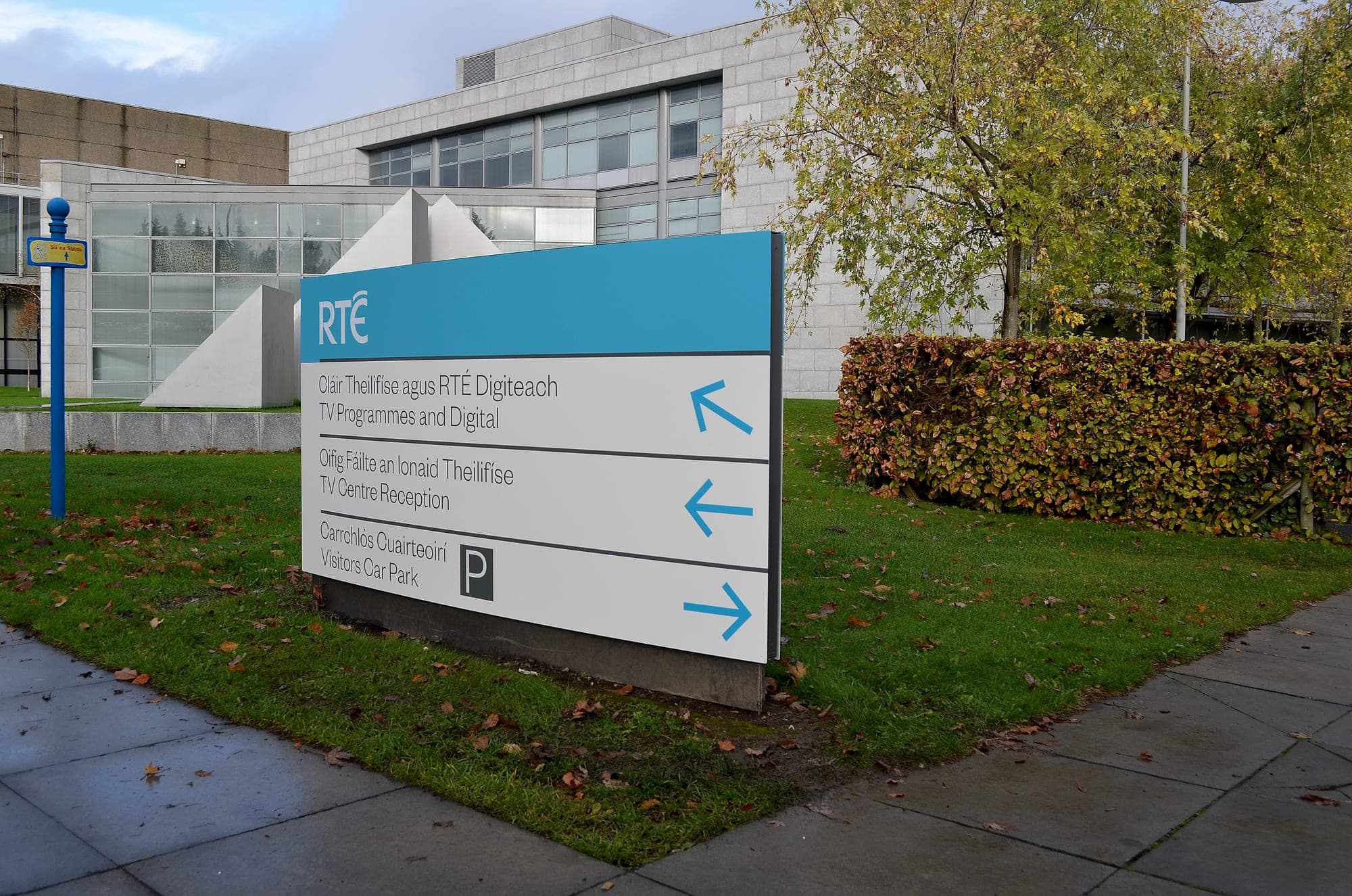
None of this is the enemy of identity. Handled properly the two layers reinforce each other. On the RTÉ campus at Donnybrook, the broadcaster's mark holds the header of every sign in brand blue, and the panel below it is pure system: bilingual, mixed-case, black on white, arrows in the house accent. Nobody stands at that sign unsure who's speaking, or where to go.
What brand signage guidelines should actually specify
The document that prevents the argument on site is a signage chapter for the brand manual, written once, before tender, by someone who has stood at the end of the corridor. The brand signage guidelines we produce alongside a scheme typically fix:
- The type pairing: which brand face carries identity moments, which wayfinding face carries direction, and the x-heights at which each is permitted.
- Approved colour pairings with measured LRV values, so the contrast arithmetic is done before anybody opens a swatch book.
- Bilingual setting: how Irish and English share a panel at equal prominence, with clearance for the síneadh fada.
- The material and finish palette by sign type, plus the finishes that are off-limits anywhere.
- Arrow style and pictogram set, drawn to the same weight and temperature as the type.
- Mounting heights, tactile provision and clearances, so the identity is never installed out of reach of the standards.
When the identity gets the whole wall
Signage carries the identity at its most disciplined; environmental graphics carry it at full volume, as part of the same wayfinding system. Supergraphics, wall wraps, feature lettering and murals are where the display face, the full-strength palette and the brand's wit belong. They become the landmarks people navigate by and remember the building for. The Marker's gold numeral is really an environmental graphic doing a sign's job. Spend the identity there, generously, and the directional layer can afford its discipline, because the building already feels unmistakably like itself.
The best compliment a wayfinding scheme can be paid is that it looks inevitable, as though the brand had always known what its signs would be. That inevitability is manufactured, in the translation. If a brand manual and a building are about to meet (a new identity rolling out across sites, a fit-out heading for tender), talk to us while the guidelines are still open. The signage chapter is far cheaper to write than to retrofit.
Planning a wayfinding project? Talk early, while the big decisions are still cheap.