
Wayfinding typography: type people read at speed, at distance, under stress
A sign is read in a glance, on the move, at an angle. On x-height, case, weight, spacing and distance, and why brand fonts so often fail on walls.
Wayfinding typography is the selection and setting of type for signs that have to be read at speed, at distance and under stress. It's judged by different measures from print or screen typography: x-height in millimetres, word shape, legibility at twenty metres. The test is blunt. Can a first-time visitor, walking, distracted and approaching at an angle, take in the word without breaking stride?
All of it rests on the type. After nearly 50 years designing, supplying and installing wayfinding for hospitals, campuses, county councils and student housing, we've learned that when a sign fails it's rarely because the arrow points the wrong way. The type gave up before the reader got close enough. What follows is what we look for: the measurements, the rules of thumb, and the reason so many brand fonts fall apart the moment they're bolted to a wall.
What makes wayfinding typography different from print
A book is read at forty centimetres, in good light, by someone sitting still. A sign is read on the move, at angles the designer never drew, in glare or shadow, often by someone late, anxious or in an unfamiliar country. And stress measurably narrows perception: people scan less and miss more. Above all, a sign isn't read the way a page is. It's glanced at, a fraction of a second at a junction, mid-stride, and the glance either lands or it doesn't. Every rule that follows comes from that one condition.
Type on a sign has one job: survive the glance.
X-height: the measurement that matters
Point size is a poor guide to how big type actually looks. Two faces set at the same nominal size can differ in apparent size by a fifth, because what the eye registers is the x-height: the height of the lowercase letters without their ascenders and descenders. So we specify sizes as x-height in millimetres, never in points, and we prove them physically. Candidate faces get printed at 1:1, taped to the wall at mounting height, and read from where the reader will actually stand. Or walk, which is the harder test. The faces that survive on signs share a family resemblance: generous x-height, open counters, even stroke weight, and no interest in fashion.
Mixed case: reading by shape
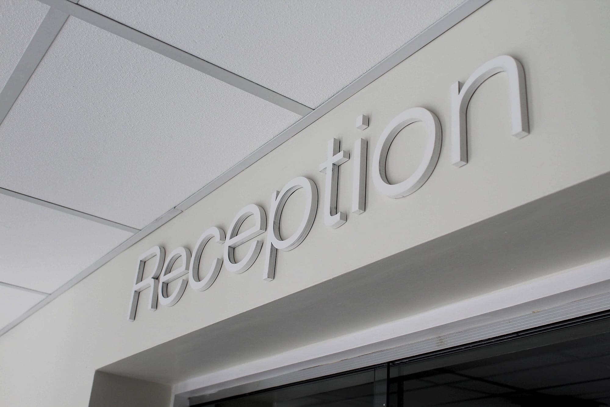
Set a destination in mixed case and the word has a silhouette. Ascenders and descenders give "Radiology" a skyline. Set it in capitals and that skyline flattens into a rectangle. At distance and at speed the eye uses every cue available, and word shape is one of the strongest. Which is why Part M guidance asks that signage avoid text set entirely in capitals, and why classic legibility research found continuous capitals slow reading by roughly 14%. Mixed case is a performance requirement, not a stylistic preference.
Capitals still have a place, as display. At Hatch student accommodation, a two-word supergraphic in confident capitals works precisely because it's a landmark: a place-making gesture, read once and remembered. Nobody is hunting for it under pressure. The rule we hold to is that capitals may announce; mixed case directs.
Weight and letter-spacing: holding up at distance
Weight is a Goldilocks problem. Too light and strokes evaporate against a busy background; too heavy and the counters, the enclosed spaces inside e, a and o, clog shut at exactly the distance where they were needed most. The working range for wayfinding sits around a true medium. Reversed settings behave differently again. Light letters on a dark ground appear to glow and thicken, an effect called halation, so white-on-black type often takes a half-step lighter weight, or a touch more spacing, to stay crisp. Contrast between letterface and panel is a discipline of its own, governed by the 30-point LRV rule and explored further in colour in wayfinding.
Letter-spacing follows the same logic. Forms that sit comfortably apart on a laptop bleed together at ten metres, so signage settings run slightly open compared with print. Space is what keeps letters legible as detail falls away. In bilingual settings under the Official Languages Act it matters twice over: Irish and English have to share the panel at equal prominence, and the síneadh fada needs clean clearance above the line. Line spacing that just about works for English will clip the Irish.
Viewing distance: the rules of thumb
Every size decision starts with a distance. Walk the route, mark where each sign is first needed, measure back to where it has to become legible, then size the type. Our working figures:
- Door and room signs, read at 1–2 metres: 15–25mm x-height, with text near eye level and tactile characters sized, raised and mounted to BS 8300.
- Corridor and directional signs, read at 3–10 metres: 30–60mm x-height, positioned for the oblique walking approach rather than the head-on elevation nobody ever experiences.
- Entrance identification and external signage, read at 10–30 metres: 100mm-plus capital height, sized up further wherever people pass at speed.
- Anything read from a moving vehicle: think in hundreds of millimetres, and cut the message to what a driver can absorb in a glance. Three items at most.
- When in doubt, the conservative rule: 10mm of capital height for every metre of viewing distance. It errs generous, and on signs generosity is cheap while squinting is expensive.
- 10mm
- of capital height per metre of viewing distance, the conservative sizing rule that rarely lets a reader down
- 30+
- LRV points of contrast between lettering and panel, the Part M baseline for type that works for low vision
- ≈14%
- slower: the reading-speed penalty for continuous capitals found in classic legibility research
Why brand fonts fail on signs
Almost every project arrives with a brand manual, and almost every brand manual contains a typeface chosen on a laptop. A face optimised for headlines and screens is optimised for precisely the conditions a sign never enjoys. The recurring failure modes:
- Fashionably light weights that thin to invisibility at ten metres. Hairlines are a print luxury.
- Tight, headline-style spacing that welds letters together as soon as the reader steps back.
- Condensed widths that save panel space and spend legibility; closed counters are the first thing distance takes.
- Ambiguous characters: an I, l and 1 drawn as the same stroke, an O that could be a zero. Set "Lift Lobby 1" and "Ill" in any candidate face before approving it.
- Quirky letterforms that read as personality at 12 points and as noise at 12 metres.
- Missing or clumsy diacritics: a fada that clips or floats is a genuine disqualifier in bilingual Ireland.
None of this means abandoning the brand. It means assigning it the right role: brand type for the identity moments (the totem, the supergraphic, the name over the door) and a proven wayfinding workhorse for the directional layer, tuned to the brand's temperature. Our view is that the directional layer should be settled before the brand manual is opened at all. When it isn't, the signs get made anyway, and the reader is the one who pays for the hairlines. On our own building the same word does both jobs: mixed case where it needs to be read, letterspaced capitals where it only needs to be recognised.
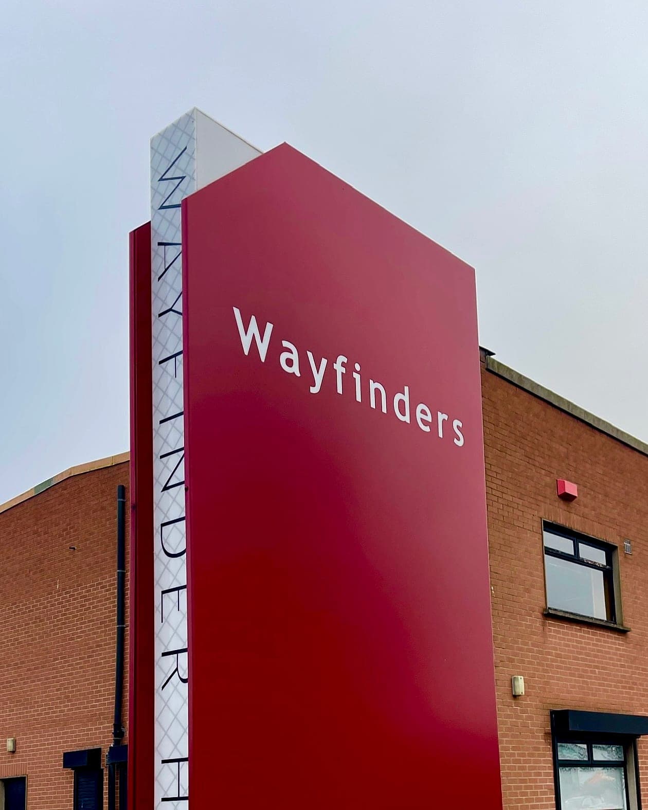
Type for a building is chosen once and read every day for twenty years. It sits at the heart of our wayfinding design work. If a brand manual and a sign schedule are heading for a collision, talk to us while the decision is still on paper.
Planning a wayfinding project? Talk early, while the big decisions are still cheap.