
Part M signage: what accessibility requires, and how to meet it
Part M sets the legal floor for accessible signage in Ireland. What it asks for, the BS 8300 detail behind it, and how to get contrast, height and touch right.
Part M signage is signage that meets Part M of the Irish Building Regulations, the requirement that buildings be accessible to and usable by everyone. Its technical guidance, TGD M, asks for signs that are clear, concise and set in mixed-case lettering, with strong visual contrast (30 or more LRV points between text and background), tactile and braille information at key locations, the International Symbol of Access on accessible facilities, and positions that work for a seated or standing reader without creating a hazard. For the detailed figures, TGD M points to BS 8300.
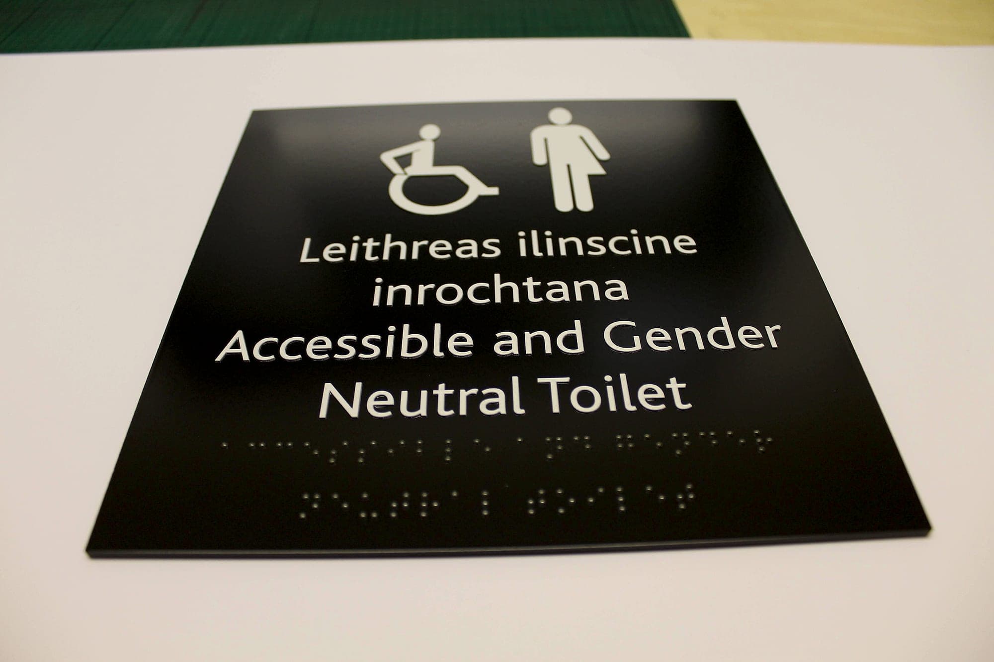
Accessibility is not an add-on. For most buildings it's a legal requirement, and for every building it's simply good design: legible, high-contrast, reachable, usable by everyone regardless of age, language or ability. Everything we supply is made to these standards by default, from a rehabilitation hospital where most readers are seated to a college with braille embossed into every door sign, and we certify it on completion. Here's what that involves.
What Part M covers, and when it applies
In Ireland, Part M is the accessibility requirement of the Building Regulations, and Technical Guidance Document M sets out how to comply with it. It applies to new buildings, to extensions and to material alterations of existing ones, and it sets out accessibility requirements in line with international standards. Those standards take precedence over brand guidelines. If a brand's colours can't hold contrast on a wall, the colours get adapted. Every so often a brand guardian digs in on that, and the regulation doesn't care. Neither, in the end, does the person who can't read the door. We've written more on when brand and law collide.
Public bodies carry a further duty. Section 25 of the Disability Act 2005 required them to bring their public buildings into line with Part M, so for a council, the HSE or a university an old building is no reason to wait for the next refurbishment.
Part M and BS 8300: the law and the detail
TGD M gives signage only a few paragraphs. For contrast values, letter sizes, tactile and braille provision and mounting positions it defers to BS 8300, the British Standard for designing an accessible and inclusive built environment. So an Irish project meets Part M by designing its signage to BS 8300, which is why we treat the two as one specification. Our guide to BS 8300 puts its signage clauses into plain English.
The key principles of Part M signage
Part M asks that signage be as clear, short and concise as practicable. On a wall that means:
- Don't set text entirely in capitals. Mixed-case words are easier to recognise by shape, and easier to read.
- Design visual signs with care for height, layout, font size and type, symbols and contrast; the guidance for these sits in BS 8300.
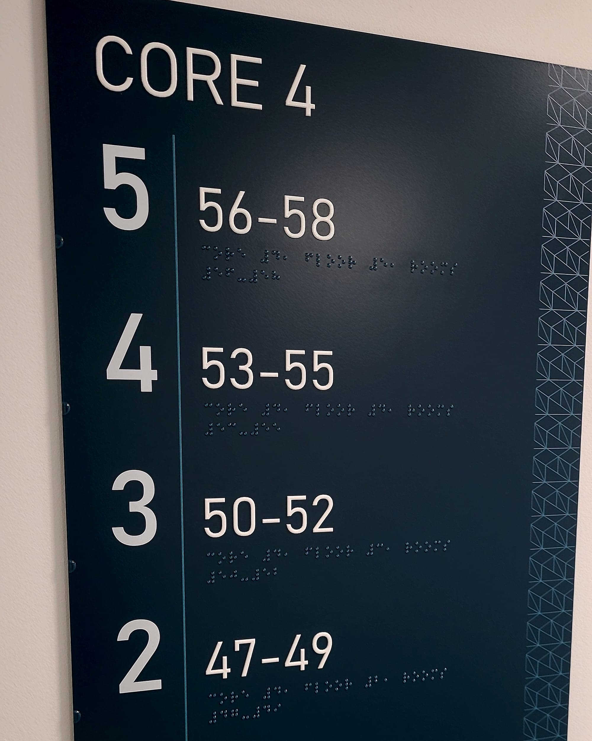
- Provide key location information (directories, orientation signs) in tactile form too where it's low enough to touch: embossed text, symbols and/or Braille.
- Use the International Symbol of Access on accessible entrances, routes and facilities.
- Use standard symbols (BS 8501) to indicate hearing-enhancement systems such as induction loops.
- Position signs so they never create a hazard in a circulation route.
Getting contrast right
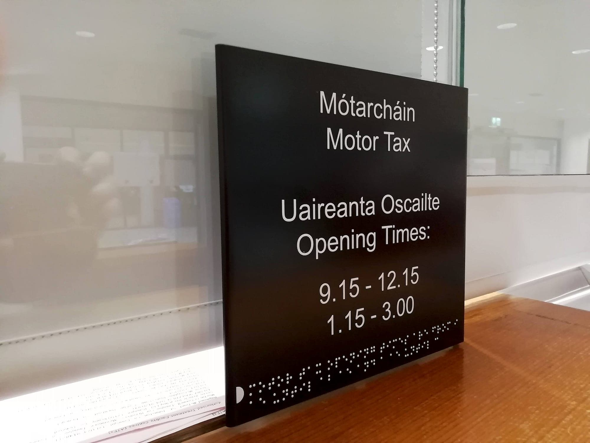
Visual contrast is measured by Light Reflectance Value (LRV). As a rule, the difference in LRV between adjacent surfaces should be 30 points or more (20 points is acceptable for large areas like walls and floors where illuminance is 200 lux or more, and 15 points for door furniture). Getting this right is the single biggest factor in whether a sign actually works for people with low vision.
It has to hold twice: between the text and the panel, and again between the panel and the wall it sits on. Two colours that look boldly different can sit within a few points of each other, so check the numbers on paper before anything is made; our LRV guide explains the measurement. Finish counts as much as colour. A glossy face under a downlight hands the light straight back at the reader and loses its contrast entirely, which is why we specify matt or low-sheen panels as standard.
- 30+
- LRV points of contrast between text and panel, and between panel and wall
- 1,400–1,700mm
- the band door and tactile signs sit in, readable standing or seated
- 15
- LRV points, the minimum for door furniture against its door
Height, position and consistency
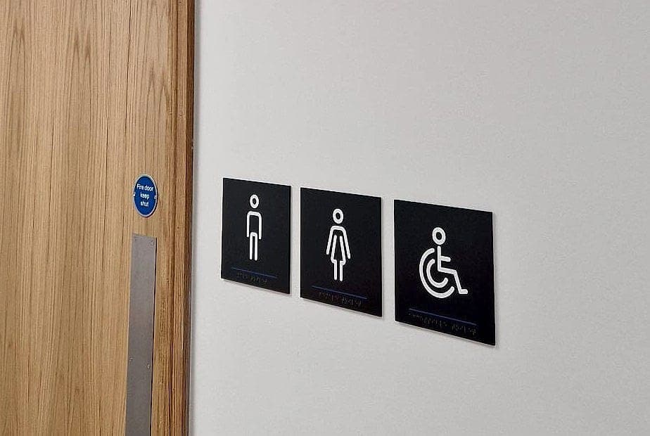
Where a sign goes is as certifiable as what it says. Guided by BS 8300, wall-mounted door and directional signs sit with their centreline roughly 1,400–1,700mm above the floor. That band reads for a standing adult and a wheelchair user alike, and it's where a hand feeling for tactile lettering will look. Door signs belong on the wall beside the latch side of the door, never on the leaf: a sign on the door itself vanishes when the door stands open, and can swing into someone reading it by touch.
Then keep it consistent. If the room sign sits beside the latch on one door, it should sit there on every door, and directories should sit at the same point past each entrance. Predictability is an accessibility feature in its own right, because it tells people where to look next time. Projecting and suspended signs need clear headroom so they never become a hazard in a circulation route, which is easy to lose when a ceiling drops late in the programme. There's more in sign placement and the decision point.
Tactile lettering, braille and symbols
Part M expects key information in tactile form where it's within reach: room and door identification, toilets and other sanitary facilities, and orientation signs low enough to touch. Raised characters need enough relief and spacing for a fingertip to trace, with braille set beneath the text it repeats. Lettering that's too shallow or too tightly spaced technically exists and practically fails, so this is a manufacturing discipline as much as a design one; see how braille and tactile signs are made.
Symbols carry the rest. The International Symbol of Access marks accessible entrances, routes and facilities, and it's used as drawn, never restyled to suit a brand. Where people read pictures more readily than words, as in dementia-friendly settings, clear pictograms sit beside the text rather than replacing it.
Compliant by default, certified on completion
Because so much of this lives in guidance rather than in the regulation itself, it's the first thing to be value-engineered away. Contrast drifts to suit a palette. Tactile signs drop out of the package. Nothing appears on the snag list, because the signs are on the wall and they look grand, and nobody notices until an access audit or a complaint.
Everything we supply is made to the most stringent accessibility criteria on the market by default, and we certify it. We check every colour pairing against the LRV figures before manufacture and sign off accessible signage certification at handover, so the paper trail exists before anyone asks for it. Compliant by default, accessible by design, certified on completion. For a building someone else signed, an accessibility audit measures what's there against Part M and BS 8300 and sets out what to fix first.
Common questions
Appendix- Q.What does Part M require for signage?
- Through Technical Guidance Document M, Part M asks for signage that is clear, concise and in mixed-case lettering; visually contrasting with its background; provided in tactile form, with braille, at key locations within reach; marked with the International Symbol of Access on accessible facilities; and positioned so it never creates a hazard. TGD M defers to BS 8300 for the detailed figures.
- Q.What colour contrast does Part M signage need?
- The working figure is a difference of 30 or more points of Light Reflectance Value (LRV) between text and background, and again between the sign and the surface it's mounted on. 20 points is acceptable for large areas such as walls and floors where illuminance is 200 lux or more, and 15 points for door furniture.
- Q.Do all signs need braille under Part M?
- No. Tactile lettering and braille are expected on key location signs read up close and within reach: room and door identification, accessible toilets and other sanitary facilities, and orientation information. Overhead directional signs are read at a distance, so contrast and letter size do the accessible work there.
- Q.Does Part M apply to existing buildings?
- It applies to new buildings, extensions and material alterations, so a significant refurbishment or re-sign brings it into play. Public bodies also had a duty under section 25 of the Disability Act 2005 to bring their public buildings into line with Part M.
- Q.What height should accessible signs be mounted at?
- Wall-mounted door and directional signs are typically centred between roughly 1,400mm and 1,700mm above floor level, a band that works for standing and seated readers and keeps tactile lettering and braille within reach. Door signs go on the wall on the latch side, not on the door leaf.
- Q.Who certifies that signage meets Part M?
- For everything we supply, we do. We design to Part M and BS 8300 by default and sign off the accessibility certification at handover. For a building we didn't sign, an accessibility audit gives a measured answer.
Specifying signage for a new building, or wondering whether an existing one would pass? See how we work with the public sector, or talk to us while the specification is still open.
Planning a wayfinding project? Talk early, while the big decisions are still cheap.