
Colour in wayfinding signage: coding, contrast and culture
Colour is the most seductive tool in wayfinding, and the most misused. On zone coding, the 30-point contrast rule, and why colour must never work alone.
Colour does two different jobs in wayfinding, and most failures come from confusing them. Signage colour contrast is the measurable difference in light reflectance between text, panel and wall, and it's what makes a sign legible at all. Colour-coding is the other job: grouping a building into zones people can hold in their heads. Get the contrast right first, then code sparingly, and never let colour carry a message on its own. For roughly one person in twelve, a distinction made only in colour isn't there at all.
The failure is easy to picture, because most of us have stood in it. A hospital proudly divided into coloured zones, and a visitor at reception who has no idea they're standing in the blue one. The colours are on the plan, in the brochure, somewhere on the walls; they're just not doing any navigational work. We think colour-coding is oversold. After years of designing, supplying and installing wayfinding, from Temple Street Children's Hospital to the National Rehabilitation Hospital, we treat colour as the sharpest tool in the box: superb in a disciplined hand, and the first thing we cut when it's only decorating.
Contrast first: the 30-point rule of signage colour contrast
Before colour can code anything it has to be seen. Contrast decides that, and hue barely comes into it. Signage colour contrast is measured in Light Reflectance Value (LRV), a 0–100 scale of how much light a surface bounces back. The working rule, set by Part M and BS 8300, is a difference of 30 points or more between text and panel, and between panel and wall. We unpack the measurement and its traps in our LRV guide. The short version: two colours that look boldly different can sit within a few LRV points of each other. Mid-green text on a mid-red panel is dramatic in a design deck and mud on a corridor wall.
So the palette for a signage system is chosen with a light meter as well as a brand book. Every zone colour we specify gets checked as a pairing: dark enough to carry white text at 30+ points, or light enough to carry near-black. Nothing stranded in the middle, where nothing reads against it. Finish matters as much as hue. A glossy panel under a downlight can surrender its measured contrast to glare, which is why we specify low-sheen surfaces as standard. One useful discipline is to convert the palette to greyscale. If the zones still separate, the system works for low vision and colour-blindness alike. If they merge, no amount of vividness will save it.
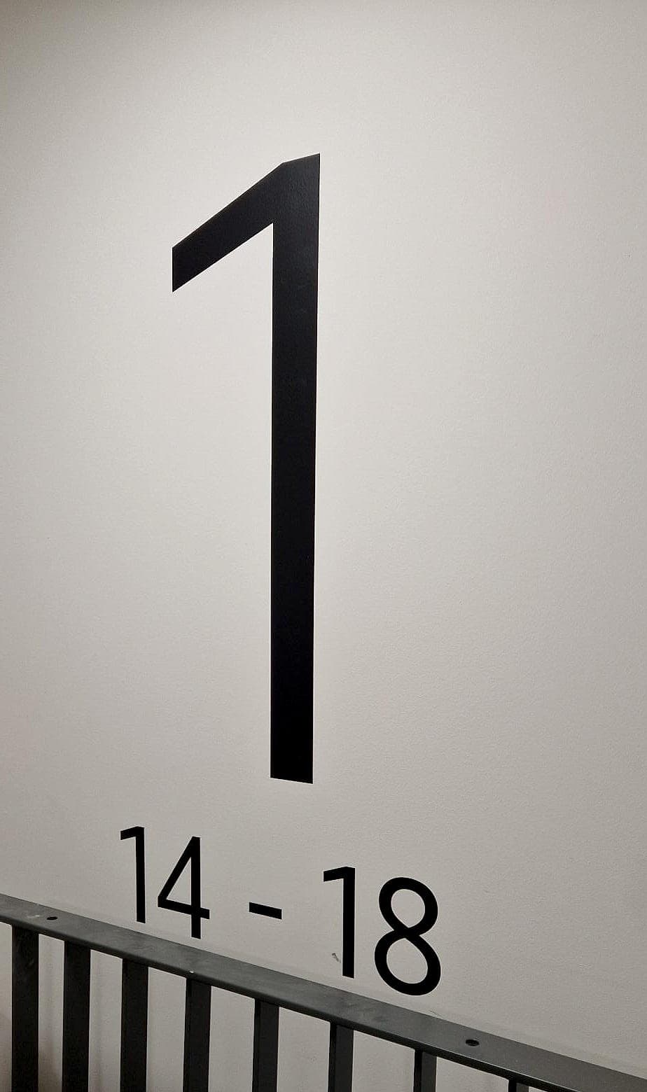
Colour-coding done right: fewer zones, working harder
Colour-coding works in buildings that have genuine structure to reveal: wings, blocks, floors, households. The rules that make it stick are unglamorous. Keep the count low, because a handful of zones is memorable and beyond that people stop trying. Name the colours out loud, "Yellow Zone, Level 2", so the colour can survive a phone call, an appointment letter and a porter's directions; an unnamed one lives only on the wall. Then commit everywhere. The zone colour has to appear at the entrance, at every lift lobby and junction, on the door plates and in the correspondence. A colour that shows up at reception and then vanishes for three corridors isn't a code; it's a rumour.
Notice what the colour is doing in that corridor: it's in the building, not just on the signs. The strongest coding is architectural. A painted lift core, a floor inlay, a wall you can see from fifty metres. Sign panels alone are too small a canvas to establish a zone; they confirm one the environment has already declared. The code should travel beyond the walls too. When the same yellow runs through the lift-car interior, the level directory and the appointment letter that said "Level 2, Yellow Zone", the system has met your visitor before the building does.
A colour that appears at reception and then vanishes isn't a code; it's a rumour.
When colour-coding is overdone
The opposite failure is just as common: colour asked to encode too much. A campus where buildings, floors and departments each have their own palette collapses into noise, because nobody can tell which layer a given colour belongs to. A system with nine zones is a memory test. Every extra colour is also a maintenance liability, since a decade of repaints, replacement panels and print batches will drift, and "roughly teal" stops matching "exactly teal". A scheme like that can look magnificent on the presentation boards. The colour question belongs after the structural one. What genuinely needs distinguishing? Usually fewer things than the first workshop hoped.
There's also a reserved shortlist to respect. Safety signage has owned certain colour-meanings for decades: red for prohibition and fire, green for safe escape, yellow for caution, blue for mandatory action. Coding your zones in strong red and green risks more than confusion. It borrows authority from systems that may one day need it in an emergency. Leave the safety colours their day jobs.
One person in twelve: designing past colour-blindness
Around one in twelve men and one in two hundred women have a colour-vision deficiency, most commonly across red and green. In any busy building that's a crowd. The remedy is redundancy, in the engineering sense: every colour-coded message must also be carried by a word, a number or a symbol. "Yellow Zone" fails a deuteranope only if yellow is the whole message. Label it and the colour turns into an extra channel: free speed for the people who can see it, and no cost at all to the people who can't. That same redundancy is what makes a system work for people living with dementia, for whom colour and landmark cues support memory that text alone can't reach.
Culture: the meanings colour brings with it
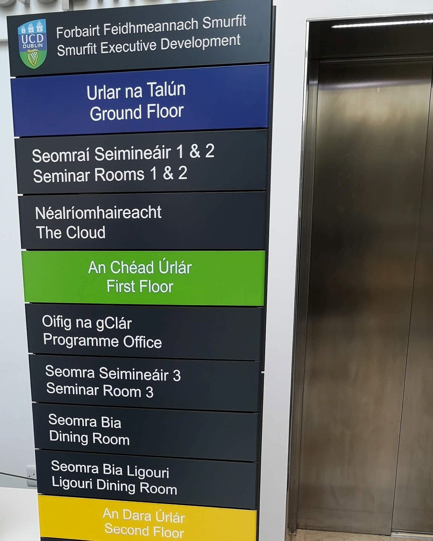
Colour is never neutral. Red reads as danger or stop across most of Europe and as good fortune in much of East Asia; white is clinical purity in one tradition and mourning in another. In an Irish hospital or civic building the audience is genuinely international, so the safe course is the same as the accessible one: let colour set mood and mark territory, and let words and symbols carry the meaning. Where a system is bilingual under the Official Languages Act, colour has one more job to do. A consistent tint distinguishing Irish from English lets readers find their language at a glance, provided both hold equal prominence and the contrast maths still passes.
Colour as landmark: when it becomes the architecture
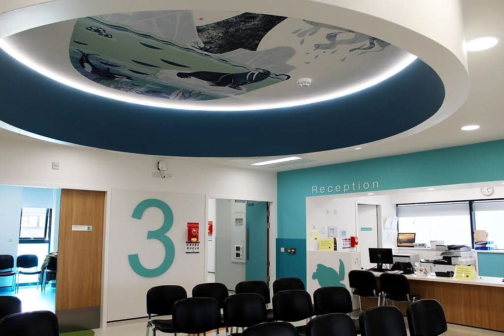
Used with discipline, colour graduates from coding to placemaking. At Temple Street, a teal supergraphic numeral and a colour-washed reception wall give families a landmark they can describe with no signage vocabulary at all: "the green desk under the round ceiling". That's the end state worth aiming for, colour doing structural work so confidently that people navigate by it without noticing they were shown the way.
The craft, in the end, is restraint: contrast measured before colours are admired, a zone palette short enough to remember, every colour backed by a word or a symbol, and the safety shortlist left alone. If you're weighing a colour scheme for a building, or untangling one that stopped meaning anything, our wayfinding design team does this daily, and a conversation costs nothing while the palette is still on paper.
Planning a wayfinding project? Talk early, while the big decisions are still cheap.