
Civic buildings and libraries: public building signage as a public service
Nobody is inducted into a council office, and nothing arrives in the post to explain it. The signage is the only briefing most visitors ever get.
Public building signage is the wayfinding system that lets any member of the public walk into a civic building, reach the right counter or room, and leave again without asking. No induction. No appointment, no assumed language, and no second visit to learn from. In Ireland it also carries duties most other buildings never meet: bilingual Irish and English provision under the Official Languages Act, accessibility obligations under Part M and the Disability Act 2005, and an audience that is, by definition, everybody.
We've designed, supplied and installed wayfinding schemes for county councils, public services centres, civic offices and branch libraries across Ireland: Tipperary County Council, Donegal County Council, Wexford Library, Bettystown Civic Centre. The same pattern turns up in all of them. These buildings are rarely difficult to navigate. The difficulty is who is doing the navigating.
The audience is everyone, which removes every shortcut
In a hospital, half the people in the corridor work there. An office gives you induction; a school gives you a full term to learn the building. A civic building gives you none of that. The person coming through the door might be nineteen or ninety-one; might be paying motor tax, registering a birth, objecting to a planning application, collecting a housing form, using a computer for an hour, or sheltering from the rain. They may have travelled forty minutes, may be on a lunch break, may not read English comfortably, may not read at all. Most will visit once or twice a year and never learn the layout.
Which is why the usual designer's shortcuts fail here. You can't lean on staff to fill the gaps: the staff are behind a counter, and the queue is the reason the visitor is lost in the first place. Internal department names are no help either, because the visitor knows the task and not the section that handles it. So everything the system needs to say has to be on the wall, in both official languages, legible to somebody standing further back than you think.
When everyone is the audience, you lose every shortcut a designer might take.
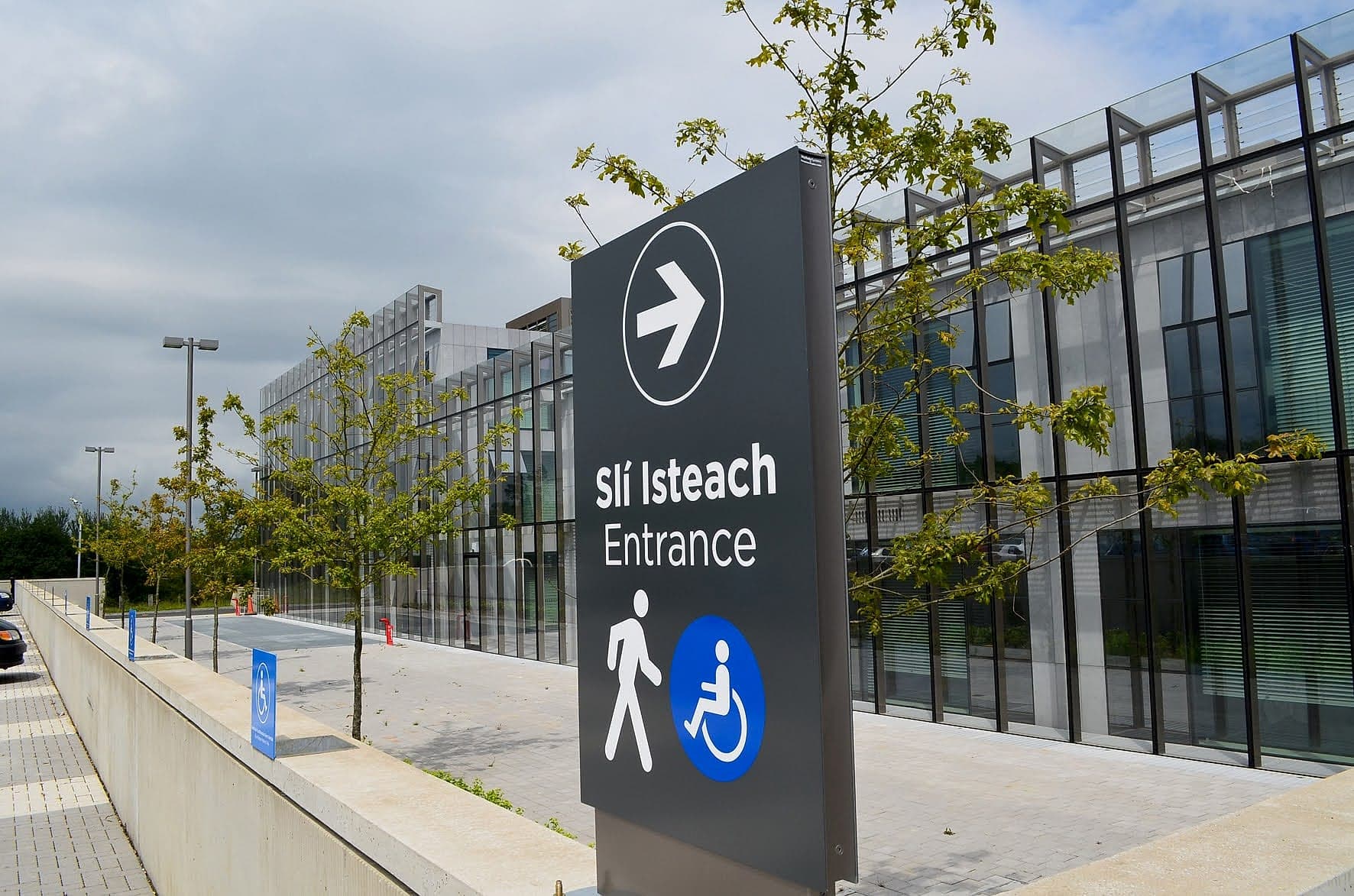
Public building signage starts at the kerb
Most people reach a civic building on foot, from a street or a square, and most have never been before. So the arrival sequence has to answer three questions before anyone touches a door: is this the right building, is it open, and is this the way in? Opening hours belong outside, at reading distance, where somebody can check them from the footpath before they cross it. Taped to the inside of a glass door, they arrive too late to help. A closed office with no hours posted is a wasted journey and a phone call to somebody's desk.
Where the accessible entrance isn't the main entrance, the main entrance has to say so, and say where the other one is. Which is common. Local authorities still occupy a great many converted courthouses, market houses and Victorian civic buildings, and in a good many of them the level entrance is round the side, past the car park, and nothing at the front door says so. A step-free route that nobody signs is not an accessible route.
A closed door with no hours posted is a wasted journey.
Two languages, one sign: the bilingual duty
For public bodies, bilingual signage isn't a courtesy. The Official Languages Act gives Irish and English equal status, and the signage regulations made under section 9 of the Act (S.I. No. 391 of 2008) are specific about how that lands on a panel: the Irish text goes first, it must not be less prominent, visible or legible than the English, and its lettering must not be smaller. The Official Languages (Amendment) Act 2021 strengthened the regime again. Local authorities, government departments, the HSE, universities and state agencies are all inside it.
The design problem is space. Two languages of equal weight will crowd a directional sign every time, and the usual reflex, shrinking the Irish until it fits, is exactly what the regulations forbid. So grow the sign. Cut the message. Or give each language its own colour and column, so the eye can find its line in one pass. And budget for proper translation. A public body's signage is one of the few places its Irish gets read by thousands of people, and a bad line stays on the wall for a decade. We'd take a plainer panel with correct Irish over a handsome one nobody proofed, every time.
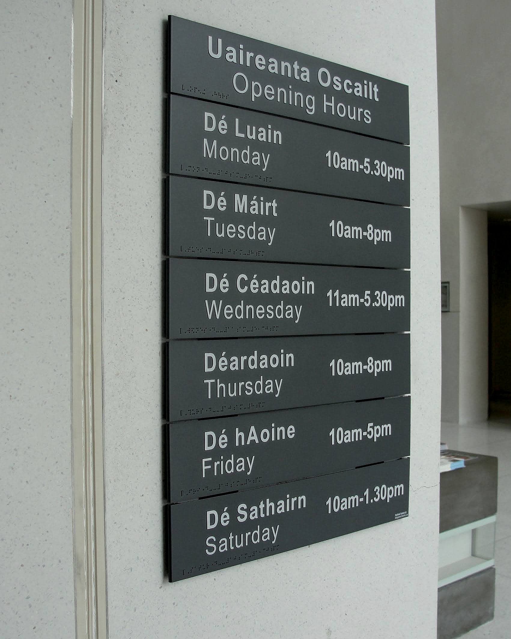
The counter is the destination
In most buildings the destination is a room. In a civic building it's a transaction: motor tax, planning, housing, rates, the register of electors. The room is incidental. That changes how the system should be written. Sign the task the visitor came to do, in the words they would use, and let the internal department name follow in smaller type if it has to appear at all. Nobody arrives looking for Corporate Services. While we're at it: we think the department directory is the most oversold object in a civic lobby. It flatters the org chart, it dates within a year, and it answers almost nothing the person reading it walked in with.
It also changes the choreography of the public office itself. A counter hall has to resolve, in order: which queue, where to wait, where the form is, and what happens when your number is called. Ticket dispensers and queue displays need signage that explains them, not just labels them. Privacy positions, meaning the discreet second counter for a housing or welfare conversation, need to be findable without asking, because asking is the thing the visitor is trying to avoid. And where a counter has an induction loop, the loop symbol belongs on the counter, at eye level, where somebody can see it before they start speaking. That is progressive disclosure applied at a metre's range.
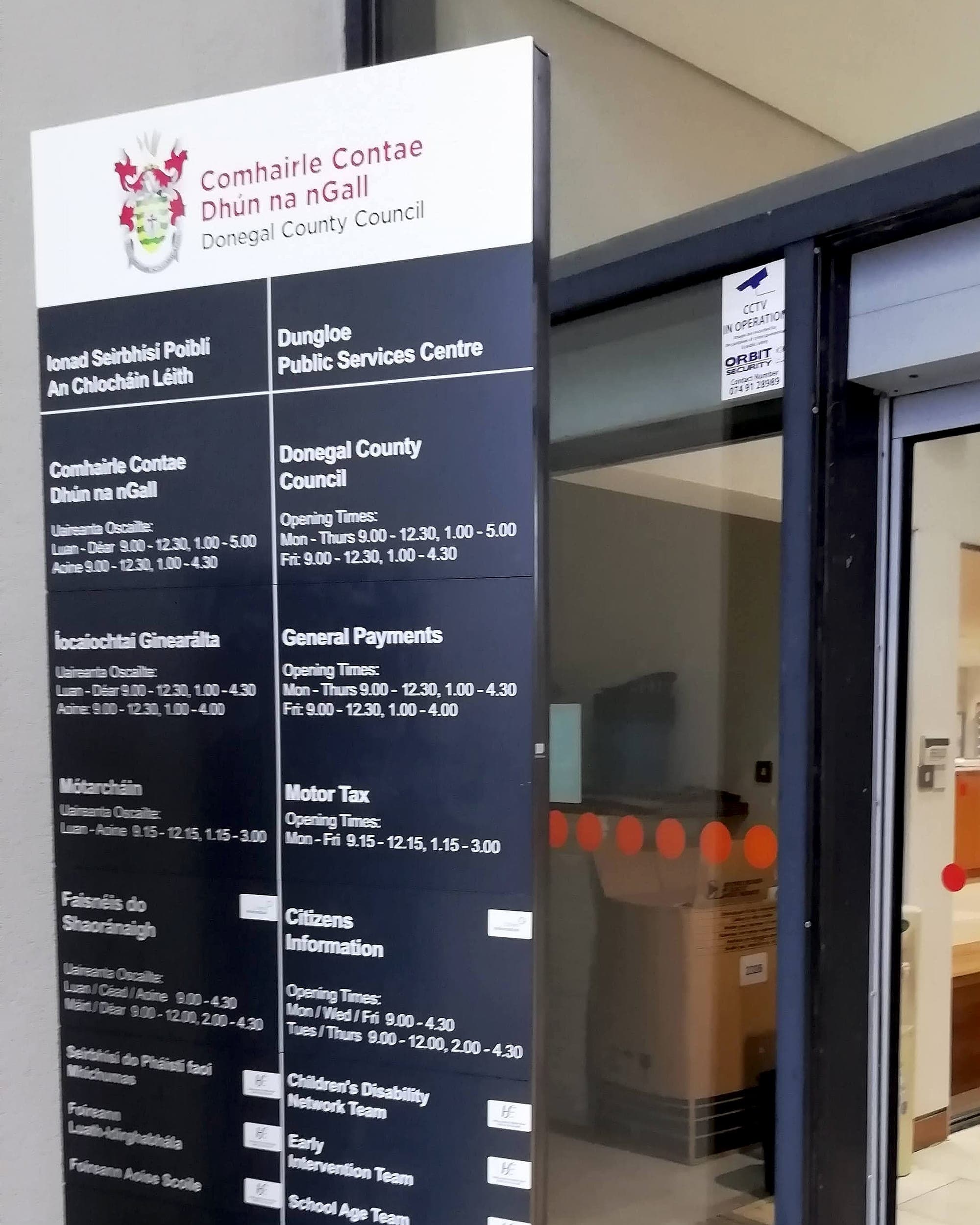
Shared buildings deserve their own line here. Public services centres now put a council, a payments office, motor tax, Citizens Information, Intreo and HSE children's disability teams behind one entrance, each with its own opening hours and its own parent brand. For a member of the public, the signage is the only thing holding that arrangement together, and it has to manage it without turning the wall into a noticeboard.
Libraries: the civic building people use most
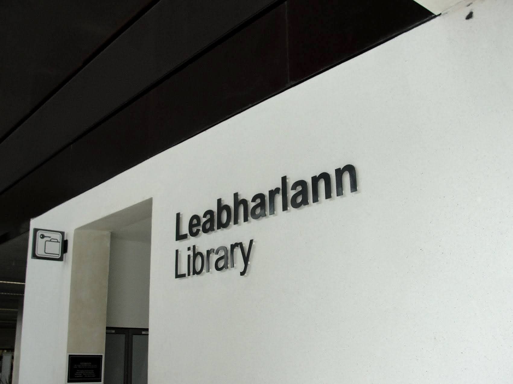
A branch library is the public building most citizens enter most often, and it asks something unusual of a wayfinding system: it has to support browsing as well as directing. People come to find a specific title, or to find nothing in particular; to study, to use a PC, to bring a four-year-old to storytime, to print a boarding pass. The zones do most of the navigational work: children's, teen, study, local studies, computers, returns. Give them a strong, calm identity overhead. A long directory at the door gets read by almost nobody.
The quiet constraint is real, though usually overstated. An under-signed library doesn't become peaceful; it becomes a place where people interrupt the desk. Suspended zone signs, high-contrast range ends and a clear returns point cut the interruptions and let staff get on with the work they were hired for. Libraries also reopen, rearrange and extend more often than almost any other civic building, so build the system for change. Slat panels, swappable inserts. When the teen section moves, somebody slides a strip out and the wall is right again by lunchtime.
Accessibility is the statutory floor, not the finish
Public bodies carry accessibility duties that private clients don't. Section 25 of the Disability Act 2005 required them to bring their public buildings into line with Part M, and section 26 requires them to appoint access officers to help people with disabilities use their services. That officer's job gets easier when the building explains itself. On the technical side, Part M and BS 8300 set the floor: at least 30 points of difference in light reflectance value between text and background, tactile lettering and braille on key rooms at a height a hand can find (roughly the 1.4–1.7 m band), mixed-case type, and non-reflective finishes under the sort of overhead lighting civic offices tend to have. Safety and escape signage sits alongside it, following the ISO 7010 pictogram set.
Everything we supply is made to those standards by default, and we certify compliance on completion, which matters more in the public sector than anywhere else: a local authority has to be able to show its work. Read the full technical guidance in TGD M.
- 31
- local authorities in Ireland, each with its own naming, brand and bilingual conventions to reconcile
- 30+
- LRV points of visual contrast, the accessibility baseline for text against its background
- ~20%
- saved when one supplier carries the scheme from design to installation
Dignity is a design output
There's a version of public building signage that is technically compliant and still feels like a warning. Laminated A4 on the counter. Arrows added by hand, in marker. A directory still listing departments that were renamed in 2014. It reads as an institution that has stopped expecting people, and a visitor takes that off the wall long before they reach the counter. The other version reads just as fast: consistent panels, correct Irish, a name on every door, hours you can trust. Somebody thought about your time before you arrived.
Specifying a civic office, a public services centre or a library refurbishment? Have a look at our public-sector work, or talk to us while the department names and counter layout are still on paper. That's when the decisions are cheap.
Building in public sector? Talk early, while the naming decisions are still cheap.