
Corporate HQ wayfinding: office signage that puts culture on the walls
Hybrid working changed what a headquarters has to explain about itself, and office signage is where the explaining happens: neighbourhoods, room names, and the brand on the wall.
Reception is the part of a headquarters everybody photographs. The corridor behind it is the part everybody gets lost in. Office signage is what joins the two: reception identity, floor and neighbourhood naming, meeting-room and door signage, the statutory signs the building is certified against, and the environmental graphics that carry the client's identity as part of the same system. Plan it once, as one thing. Five orders to five suppliers is how a floor ends up speaking in five voices. It has two jobs and they are equally serious. Get people to the right room, and tell them what kind of company they have walked into.
We design, supply and install corporate wayfinding across Ireland, from broadcast campuses like RTÉ to the working estate at Dublin Port. No sector's brief has changed faster in the last five years.
The office now has to earn the commute
The old office could rely on repetition. You sat in the same seat five days a week, and after a fortnight you navigated the floor without reading anything. Hybrid working broke that. People come in two or three days, sit somewhere different each time, and spend the first ten minutes of every visit working out where their team landed this week. Bookable desks, project neighbourhoods, lockers instead of pedestals, phone booths that were nowhere in the original fit-out drawings: the plan is now something occupants have to re-read every visit.
The consequence for signage is blunt. A headquarters has to give its own staff visitor-grade wayfinding, permanently. And because most people arrive by lift, the decision about which way to walk gets made in the four seconds the doors are open, before the coat is off and before anyone has asked anyone.
A building somebody visits twice a week is a building they never quite learn.
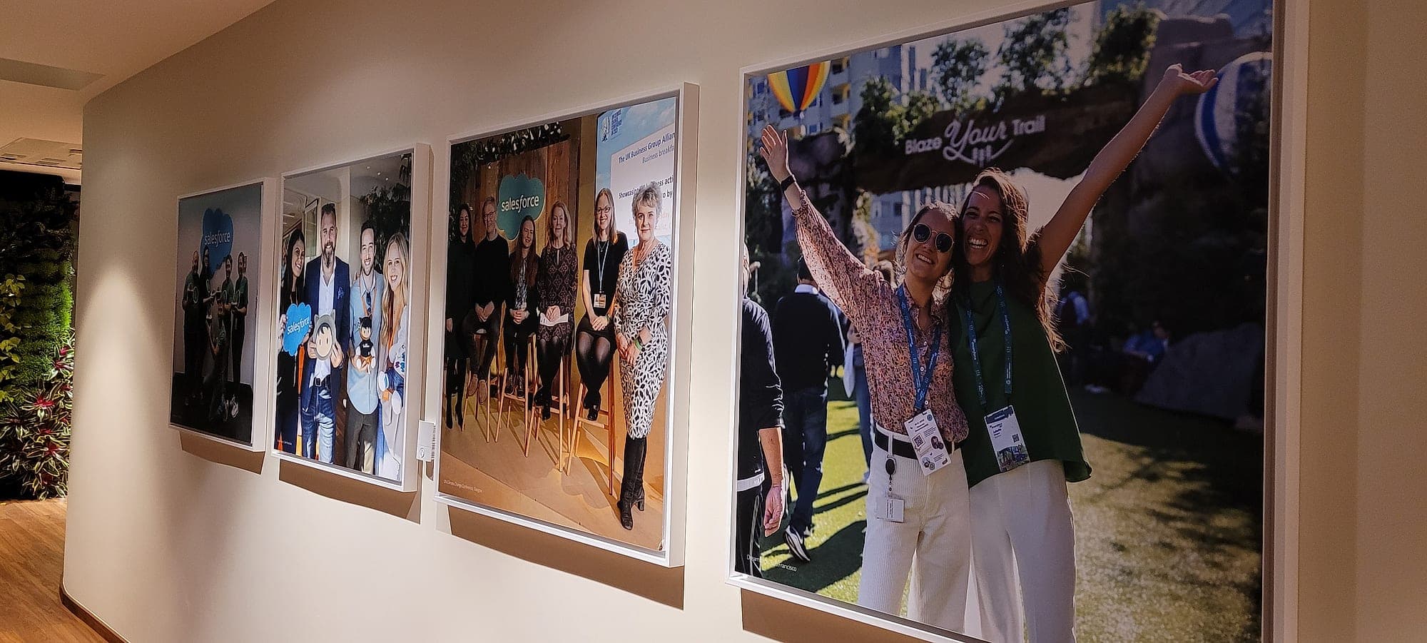
Office signage starts with the neighbourhood, not the door
The instinct in a fit-out is to start with door signs, because they are countable and they appear on the room data sheet. Start there and you will produce a floor where every room is labelled and nobody knows which end of the building they are standing in. Corporate wayfinding works the way it works everywhere else, in layers. The building announces itself, then the floor says what is on it, then the neighbourhood identifies itself within the floor. The door carries the detail last.
The hardest-working sign in most headquarters is the one facing the lift doors. In a single glance it has to answer what floor am I on, what is on it, and what is on the floors I could have pressed instead. Give the zones real names, whether that's quarters or wings or streets or whatever the building's own language will carry. A neighbourhood that exists only in the facilities team's spreadsheet isn't a neighbourhood. Four zones with dull names everybody uses will beat twelve clever ones nobody says out loud, which is a position fit-out teams rarely enjoy hearing. Then hold the names everywhere: on the directory, in the desk-booking app, in the induction pack, on the fire drawing.
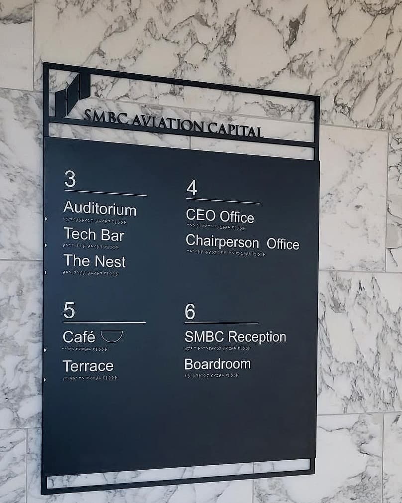
Meeting-room names are a culture document
Nothing in a fit-out gets argued about like meeting-room names, and nothing gets governed less. Rivers, mountains, city streets, founders, jazz musicians: whichever family you choose is a real expression of who the company thinks it is, and it's the one piece of wayfinding people quote to each other for years. Handled loosely, it's also the fastest way to make a floor unnavigable. A visitor sent to Kilmainham has no idea whether that's a room, a floor or a building.
The fix is a naming convention, written down before the door schedule hardens. A workable corporate scheme settles five things:
- One family, one floor logic. Pick a single set of names and map them onto the plan in an order a stranger can infer. The order they came up in the workshop is not that order.
- The number never goes away. Booking systems, fire drawings, cleaning schedules and access control all run on room numbers. The name is for people; the number is the address, and it stays on the sign.
- One vocabulary for room types. Focus room, huddle, meeting room, boardroom: decide what each word means once, then stop. A floor that calls the same thing two different things is asking visitors to translate.
- Sayable and spellable. If a name can't survive being read aloud on a bad phone line, it won't survive a visitor asking reception for it.
- One source of truth. The wording on the door, in the booking system and in the calendar invite has to be identical, character for character. Wherever they diverge, somebody gets lost.
Brand environments: the wall doing the talking
Somewhere between the directory and the door sits the work with no navigational duty at all, which does most of the emotional lifting: values walls, timelines, company photography, supergraphics, glass manifestation drawn as pattern. Done well, environmental graphics tell a new starter more in a corridor than an induction deck manages in an hour. They also hand a floor the landmarks people genuinely navigate by. Turn left at the map. We're past the tree.
Two cautions, learned the expensive way. Brand walls date faster than anything else in a building, so specify them to be changed: substrates and fixings that let a panel come off and a new one go on without redecorating the wall behind it. And keep the graphic honest about the wall it's on. A mission statement in 40mm type at the far end of an open floor is decoration. Put the same words at reading distance beside the seats where people wait and somebody will read them.
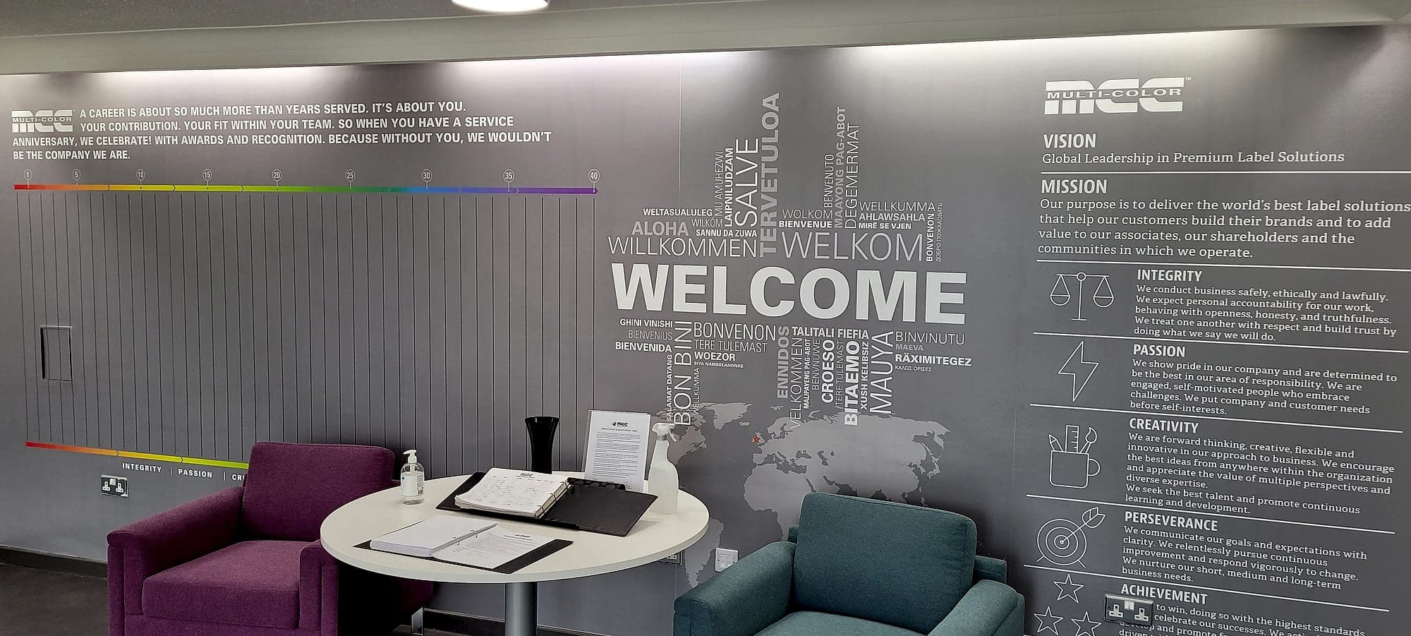
A brand wall you can't change is one you'll learn to resent.
The compliance floor nobody notices
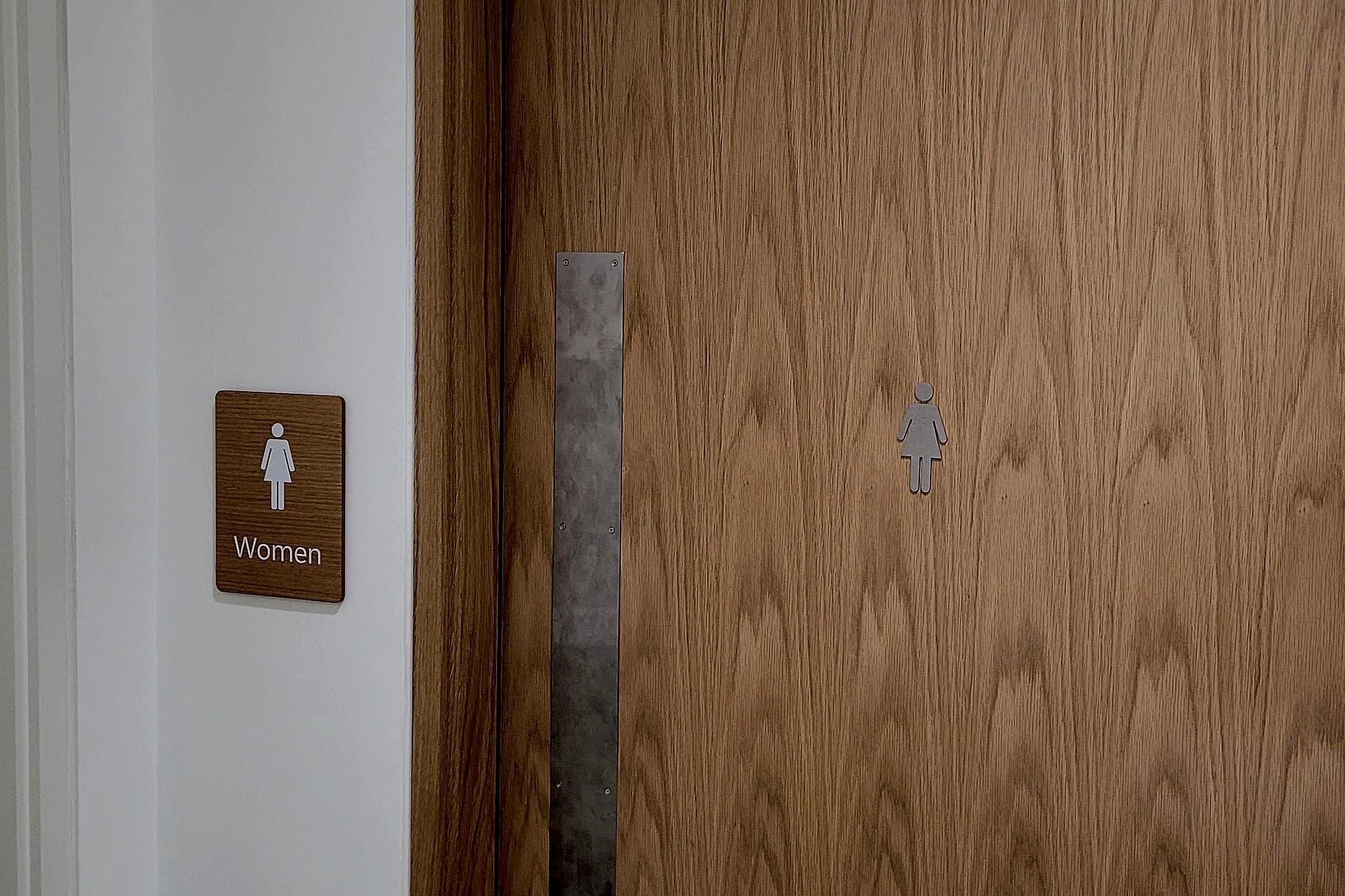
Corporate clients rarely open a briefing with regulations, but office signage is certified work, and the requirements are not optional. In Ireland, Part M of the Building Regulations and its Technical Guidance Document govern access and use, with BS 8300 the reference standard designers work to for the detail. That means strong visual contrast between lettering and background, 30 LRV points being the figure we design to; mixed-case lettering, never all capitals; mounting heights that read seated and standing; and tactile lettering with braille on the door signs that matter, toilets and core rooms included. Accessible signage is simply the specification.
Two more things catch corporate fit-outs specifically. The first is glass. An office made of glass partitions needs manifestation a person with low vision can see, which means two bands of marking, one at roughly 850–1000mm and one at 1400–1600mm above floor level. Most fit-outs treat that as a tax on the glass. It's the cheapest piece of pattern-making a floor will ever get. The second is safety signage. In a workplace, safety signs are regulated in their own right under the Safety, Health and Welfare at Work (General Application) Regulations 2007, which set the shapes and colours a safety sign must use, and the symbols themselves come from the ISO 7010 set. Escape signage has to follow the fire strategy the building was certified against, not the furniture layout it ended up with. If your organisation is a public body or a semi-state, the Official Languages Act applies to your signage too, and that is a naming decision long before it is a manufacturing one.
Landlord, tenant, and the sign nobody owns
One practical note that saves programme time. In a multi-tenant building the signage splits across three owners: the landlord's base-build and shared lift lobbies, the tenant's demise, and the statutory signage that follows the fire certificate no matter who paid for it. Building-entrance identity and lobby directory entries are almost always a licence-to-alter conversation, and the reinstatement obligations at lease end decide how signs should be fixed in the first place, whether or not anyone has thought about it yet. Settle those three boundaries before the fit-out programme starts. Left open, the signage package is the one that slips.
Where to start
Not with a sign schedule. Walk in as a visitor who has never been, and mark every point where you hesitate: the lift lobby, the first junction off it, the doorless opening into the neighbourhood, the meeting room whose name you were given and can't find. Then take a booking confirmation and check that the words in it appear, unchanged, on the wall. An hour of that produces a better office signage brief than any drawing set.
If you're fitting out a headquarters, consolidating floors or re-planning around hybrid occupancy, have a look at our corporate work, or talk to us while the naming and the neighbourhoods are still up for discussion.
Building in corporate? Talk early, while the naming decisions are still cheap.