
Signage for visually impaired people: designing wayfinding for low vision
Most people with sight loss can see your signs. They just can't see them well. On size, contrast, glare, lighting and position: the work braille can't do alone.
Signage for visually impaired people is mostly not braille. Only a small minority of people who are blind see nothing at all; the great majority retain some usable vision, and what serves them first is signage that vision can actually use: type sized for real viewing distances, contrast of 30 or more LRV points, matt surfaces that hold their legibility under light, and panels that sit in the same position at every door. Get those right and braille and tactile lettering finish the job. Get them wrong and no amount of braille rescues the building.
Take one visitor. She's seventy-eight, she has macular degeneration, and she has a hospital appointment on an upper floor she has never visited. The centre of her vision, the part that reads, is failing; the edges still work fine. She walks the corridor confidently enough. Then at each door she stops, leans in and searches. Whether the building works for her comes down to four unglamorous things: how big the letters are, how strongly they contrast, whether the panel is throwing the ceiling lights back at her, and whether this sign is where the last one was. None of the four is a design decision anybody enjoys making.
Low vision is the ordinary case, not the edge case
Sight loss rises steeply with age, and every public building in Ireland serves an ageing population. That makes low vision a mainstream design condition. It also isn't one condition. Cataract blurs and scatters light, so glare becomes disabling. Glaucoma narrows the visual field, so signs outside a shrinking cone go unseen. Macular degeneration takes the centre, precisely the part that reads. Diabetic retinopathy leaves patches. Each of them unmakes reading in a different way, and no sign can be tuned to all of them. What a designer can do is build in margin: everything bigger, bolder, calmer and more predictable than a fully sighted eye strictly needs.
Most people with sight loss can see your sign. The question is whether it helps.
Size: legibility is measured in metres, not millimetres
Type size only means something at a distance, so we size lettering from the farthest position a person will realistically read from. A suspended directional sign is read on approach down a corridor, a door sign at arm's length, a directory from wherever the queue happens to stop. Mixed-case lettering helps at every size, because readers with partial sight recognise word shapes long before they resolve individual letters; ascenders and descenders carry information that block capitals throw away. Then there's the working rule that costs nothing and saves most: when in doubt, go up a size. In nearly 50 years of designing, supplying and installing wayfinding, nobody has ever asked us to make the lettering smaller.
Contrast: the 30-point rule, and where it quietly fails
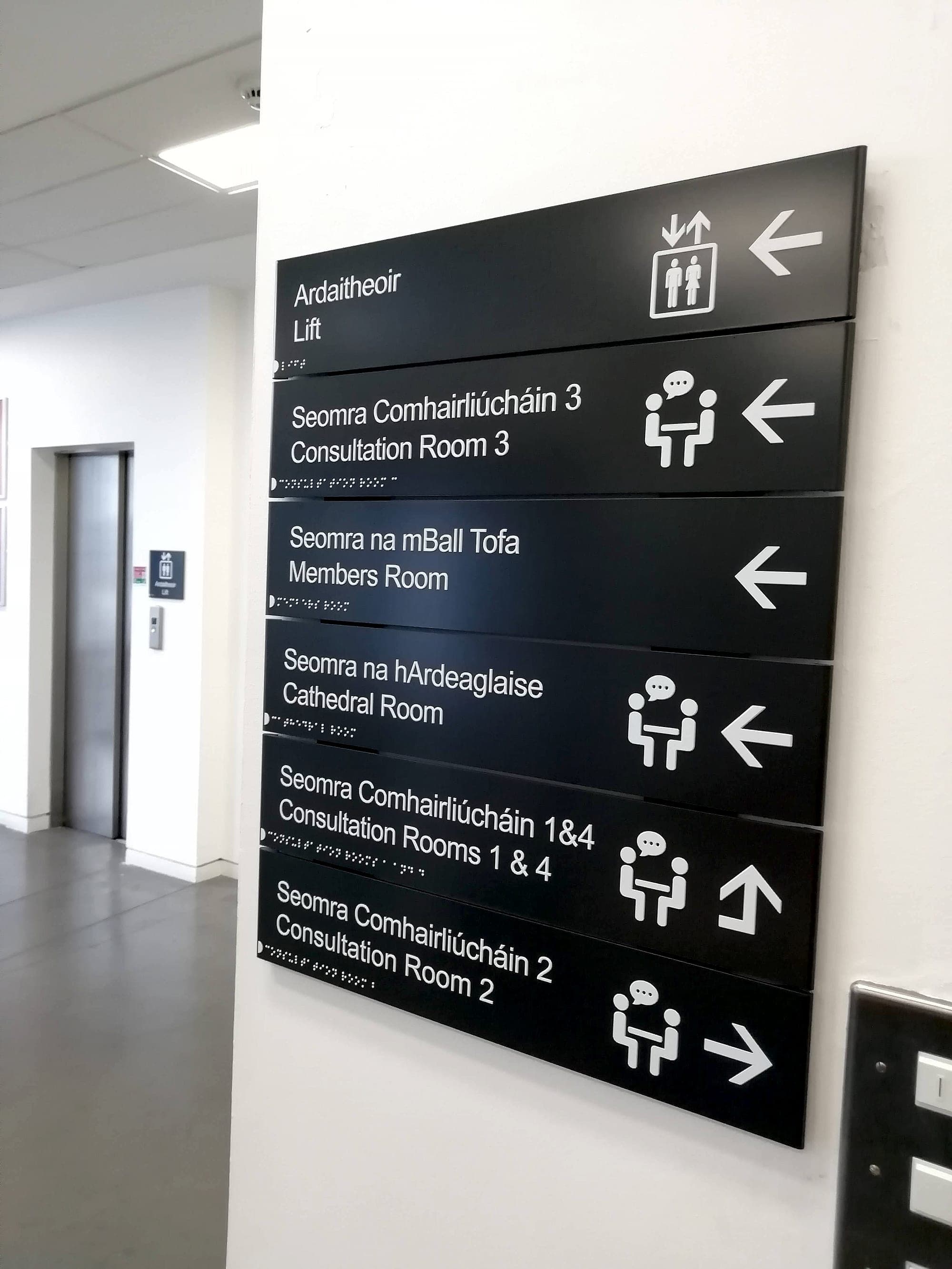
Visibility is decided by contrast, not colour: the measured difference in Light Reflectance Value between text and panel, and between panel and wall. The benchmark set by Part M and BS 8300 is a difference of 30 points or more, and it's the single most load-bearing number in accessible signage. We unpack the measurement and its traps in our LRV guide. The failures are rarely dramatic. They're fashionable. Pale grey on white. Brushed steel on stone, or a tone-on-tone palette lifted straight from a brand book that was drawn for print held at thirty centimetres and never asked to work at eight metres in a corridor. For a reader whose contrast sensitivity is already reduced, which describes most older readers, a sign at 15 points of contrast reads as a blank panel. We lose this argument more often than we win it, and it's usually lost at the interiors meeting we weren't in. The official guidance exists precisely because taste keeps drifting below the threshold sight can use.
Glare and lighting: how a compliant sign disappears
Gloss undoes contrast. So a sign can pass every check on paper and still vanish on the wall: a shiny panel under a downlight hands back a white reflection exactly where the text should be, and for a reader with cataracts that scatter stops them dead. We specify matt and low-sheen finishes as standard, then keep signs off the sightlines of windows; a suspended panel with glazing behind it reads as a silhouette, whatever its LRV arithmetic says. Lighting works the same way in reverse. An ageing eye needs far more light to read than a young one, so the sign has to sit where light actually falls, not where the corridor's average lux level suggests it might. None of this appears on a sign schedule. It's the first thing we look at on site.
Position: predictability is the quietest accessibility feature
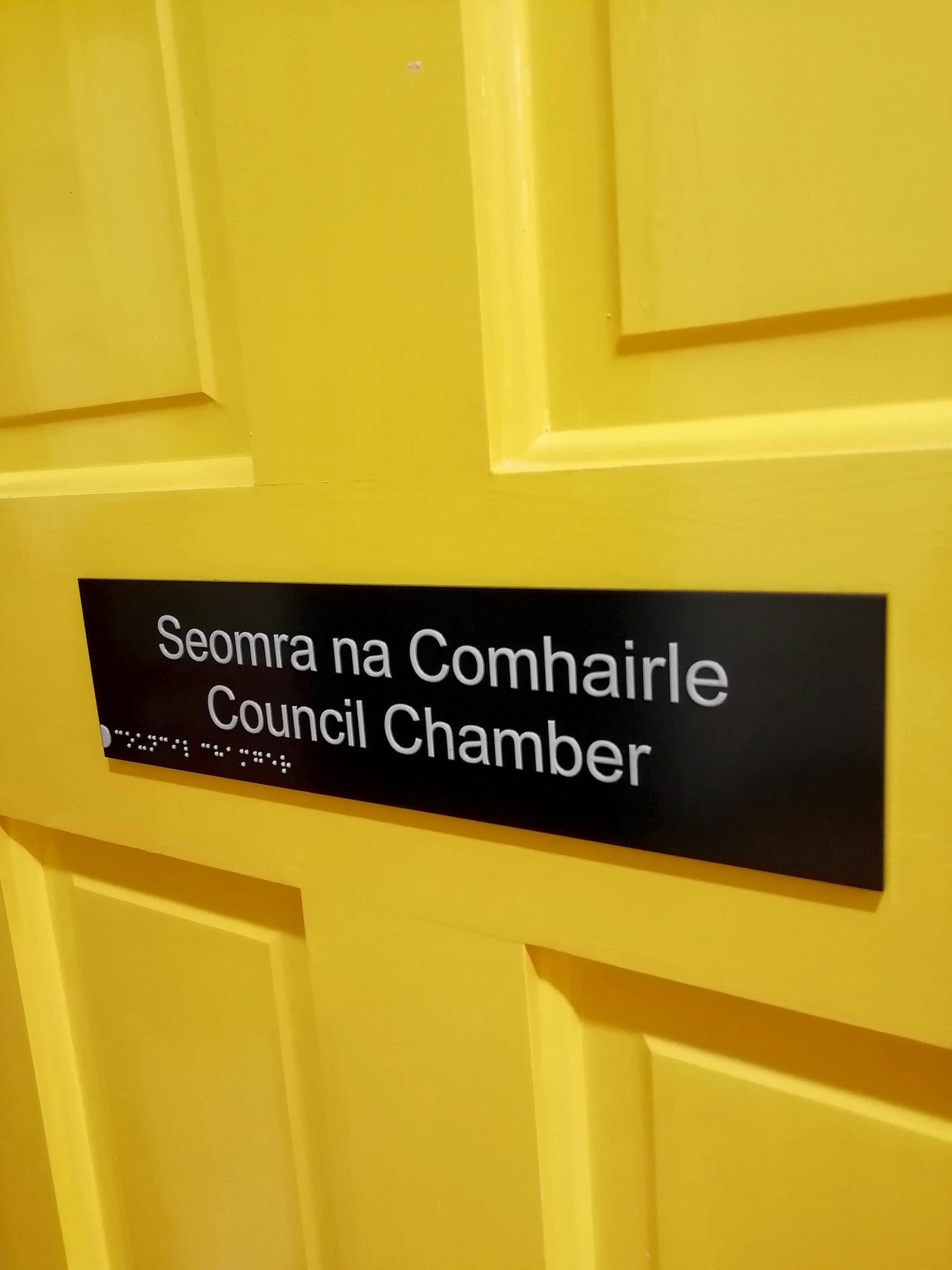
A person with low vision doesn't scan a wall. They search it, close up, one region at a time, and every sign that sits somewhere new restarts that search from scratch. So consistency of position is the whole thing: door signs always on the wall beside the door, latch side, in the 1400–1700mm band where BS 8300 expects tactile signs to live; directories always at the same point past each entrance; level identifiers always in the same corner of each lift lobby. The same discipline applies inside the panel. When the room number always sits top-left and Irish always sits above English, a reader who can only resolve part of the sign still knows what they're looking at. The layout carries information of its own.
A sign that moves from door to door is a sign that vanishes.
Signage for visually impaired readers: where braille fits
Braille remains essential; for the readers who depend on it, nothing substitutes. But it serves a minority even of blind users, which is why signage for visually impaired people can't start there. Raised mixed-case lettering reaches more hands, and braille reaches further still. Both depend entirely on the previous section, because a tactile sign only works if a hand can find it. That takes you back to consistent position and mounting height, and it rules out the glazed frames and high mounting that make touch impossible. How tactile signs are designed, made and mounted is its own subject. What matters here is the order of operations. Touch completes a system that vision-first design has already made findable.
Test with the sight your visitors actually have
The habits that keep a system honest are cheap. Convert the artwork to greyscale; if the hierarchy survives without colour, it will survive most sight loss. Walk the building with simulation glasses, or just squint, and watch which signs dissolve first. Put a light meter on the finished surfaces. A swatch under an office window and a cured coating under a corridor downlight are two different numbers. That's the core of our accessibility audits, and it's why we certify contrast, tactile provision and mounting heights on completion. Drawings do not always survive procurement. Working with the National Rehabilitation Hospital, where many patients are relearning navigation itself, taught us to treat that verification as part of the sign itself.
If your building serves the public, it already serves people with low vision. The only question is how well. An accessibility audit will tell you honestly, and a conversation costs nothing while the specification is still open.
Planning a wayfinding project? Talk early, while the big decisions are still cheap.