
Light reflectance value in signage: the 30-point rule that decides if a sign works
Two colours can look boldly different and measure nearly the same. LRV is how signage contrast is really specified, and 30 points is the line that matters.
Light reflectance value (LRV) is the proportion of visible light a surface reflects, measured on a scale running from 0, a theoretical perfect black, to 100, a perfect white. In signage it's how contrast actually gets specified. What counts is not how different two colours look but how far apart they sit on that scale. The working rule, set by Part M and BS 8300, is a difference of at least 30 points: between the text and its panel, and between the panel and the wall behind it.
That one number decides more than any other whether a sign works. Hue is a poor witness. Two colours can look boldly different to a designer with sharp eyes in a bright studio and still sit within a handful of LRV points of each other, and for a reader with low vision in a dim corridor that sign has effectively vanished. We measure LRV pairings on every system we design and supply, from Hatch student accommodation to civic buildings and hospitals. Contrast is where handsome schemes fail. It is also the one failure that costs nothing to prevent at design stage.
What light reflectance value measures, and what it ignores
LRV measures luminance. A surface with an LRV of 60 reflects sixty per cent of the light falling on it, whatever its hue, and that indifference to colour is the whole point. Human reading is driven overwhelmingly by luminance contrast, which is why a red and a green of similar LRV, vivid opposites on a colour wheel, merge into one mid-tone for a reader with colour-blindness, or cataracts, or simply forty more years of retina than the designer has. Convert the pair to greyscale and you find they were never really different at all.
The scale's extremes are theoretical. The blackest sign finish measures around LRV 5 and the whitest paints top out near 85, so black on white, the strongest pairing available, delivers roughly 80 points. Every other combination spends down from that budget.
The 30-point rule
Part M's technical guidance (TGD M) and BS 8300 converge on the same threshold: surfaces that need to be told apart should differ by at least 30 points of LRV. For signage that means three pairings. Text against panel. Panel against wall. And the doors and fittings the signs support against their own surroundings. A white-on-charcoal sign hung on a charcoal wall passes the first test and fails the second.
A sign can be perfectly legible and still undiscoverable.
The number isn't arbitrary. The research behind BS 8300 found that people with low vision could reliably distinguish surfaces around 20 points apart under good, even lighting of 200 lux or more; 30 builds in a margin for shadowed corridors, ageing lamps and glare. It also serves readers the regulations don't name. Contrast at this level is one of the load-bearing elements of dementia-friendly signage, where a high-contrast door or WC sign does work that text alone can't.
- 0–100
- the LRV scale, perfect black to perfect white. Real sign finishes span roughly 5 to 85
- 30+
- points of difference Part M and BS 8300 expect between text, panel and wall
- 200 lux
- the bright, even lighting at which 20 points can suffice, which is the margin the 30-point rule builds in
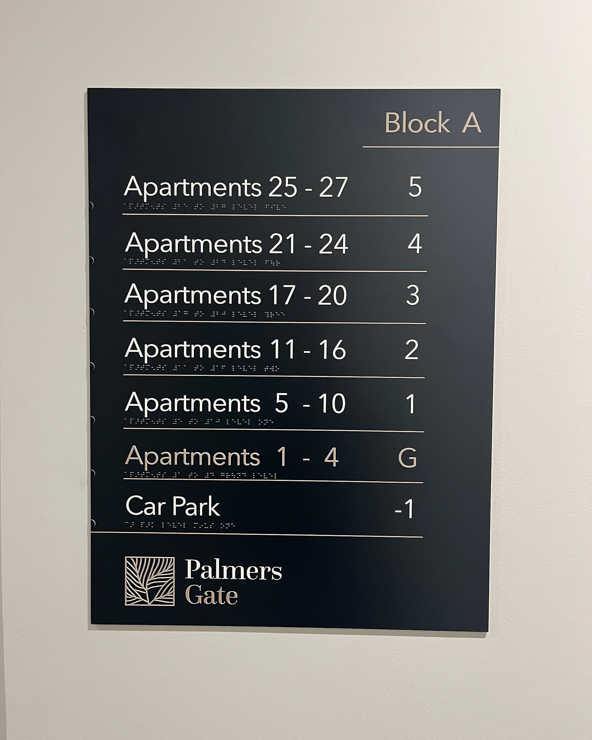
The exceptions: where 30 points isn't the whole story
- Lighting changes the maths. The rule assumes reasonable illumination. In a dim stair core or a car park at night, 30 points is a floor, and where the lighting is poor and can't be fixed you push the contrast up until it carries.
- Sheen can spend your contrast. LRV is measured on matt surfaces; a glossy panel under a downlight trades its measured value for glare. We specify low-sheen finishes as standard for exactly this reason.
- Size buys tolerance. A supergraphic numeral two metres tall survives contrast that a 15 mm line of text cannot. The smaller and more critical the text, the further above 30 the pairing should sit.
- Metallics and glass have no honest LRV. Brushed steel lettering on limestone reads crisply at ten o'clock and disappears at noon, because its "colour" is whatever it happens to reflect. Prestige lettering deserves a measured backdrop, not a hopeful one.
- Illuminated signs play a different game. An internally lit panel emits its own light, so LRV stops describing it. The honest test is how it reads with the lamps off.
How to measure light reflectance value
For most specified finishes, somebody has already done the measuring. Paint manufacturers print LRV on datasheets and most colour cards, laminate and vinyl suppliers publish values on request, and RAL and NCS references map to published figures. So a signage palette can be contrast-checked at the desk before anything is printed. That is when we do it. Checking afterwards is a rescue, and rescues cost money.
Where a surface is unlisted, as existing walls, brick, timber and stone usually are, it gets measured with a spectrophotometer on site or on a sample. Two field disciplines matter here. Measure the wall the sign will actually hang on, not the paint that was specified for it a decade ago. And take the reading under the building's own lighting; a sample room flatters every pairing you bring into it. A first filter is free. Photograph the pairing, convert it to greyscale and squint. If it survives that, the meter usually agrees.
When the brand book and the light meter disagree
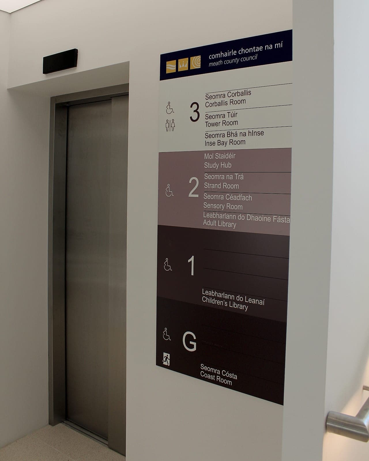
Every organisation arrives with a palette, and palettes get chosen in workshops. Nobody picks a brand grey standing in a corridor at four on a January afternoon, which is where it will spend the next fifteen years. The commonest conflict is two mid-tones asked to share a sign: a corporate blue on a corporate grey that measure twelve points apart and photograph beautifully. The fix is rarely to abandon the brand. Redeploy it. Flood the panel with the brand colour and set the text in white or near-black, whichever clears 30 points. Recruit the darkest or lightest member of the palette for the pairings that have to be read. Keep the awkward mid-tones for bands, rules and accents, where nothing depends on reading them.
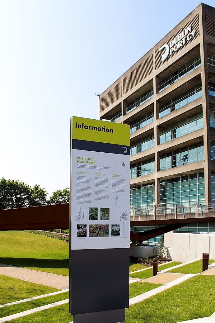
Done well, the constraint reads as confidence. At Dublin Port, near-black text sits on a sharp lime field, and the brand's accent colour is carrying the legibility. Our own identity runs near-black on yellow for the same reason. Where a palette genuinely can't yield a compliant pairing, that becomes a conversation with the brand guardians. Carry it with numbers. They win more of those arguments than taste ever does. Colour has other jobs in wayfinding, from zoning to memory to cultural association, and our guide to colour and contrast takes them up.
The 30-point rule is that rare piece of compliance that is also just good design. Signs that measure well read faster for everyone, in every light, for the life of the building. If you're specifying a palette, or inheriting a building where the signs have started to disappear into the walls, an accessibility audit will put numbers on it, and a conversation costs nothing while the colours are still on paper.
Planning a wayfinding project? Talk early, while the big decisions are still cheap.