
Braille signage: how tactile signs are designed, made and mounted
Braille signage only works if a hand can find it. The grades, the millimetres, the mounting heights and the manufacturing methods behind signs read by touch.
Braille signage is signage you read with your fingertips: raised braille cells, almost always paired with raised tactile characters, on a panel mounted where a hand can reach it. In Ireland and the UK the detail comes from BS 8300. Characters embossed 1 to 1.5mm above the face, braille set below the text it translates, and the whole sign fixed to the wall beside the door.
It's the element of a signage package most often drawn correctly and made badly. Two words in a schedule is all it takes to specify braille, and it is remarkably easy to get wrong: mistranslated, embossed so shallow a fingertip finds texture and no language, or mounted at a height no reading hand would ever search. We design, supply and install tactile and braille signage as standard. It has never been a line anyone has to ask us for. What follows is the whole chain, from the cell to the wall.
Tactile, braille, or both?
The two words get used interchangeably and shouldn't be. Tactile describes anything raised enough to be read by touch: characters, numerals, pictograms, arrows. Braille is the six-dot code specifically, two columns of three, one cell per character. A sign can be tactile without braille, like a raised floor numeral in a lift lobby, and it can carry braille without being usefully tactile in any other way.
Good practice is both, because they serve different readers. Most people who lose their sight in adulthood never learn braille, but they can trace a raised letterform they already know. Braille serves fluent readers, who are typically faster and more confident with it than with any raised alphabet. Put both on the panel and you have covered the whole room, which is what BS 8300 asks for at key locations.
Grade 1 or Grade 2: which braille goes on a sign
Braille comes in two forms. Grade 1, uncontracted, spells every word letter for letter. Grade 2, contracted, compresses common words and letter groups into single cells. That's the form most braille books are printed in, and it's considerably more compact.
For signage in Ireland and the UK the working convention is Grade 1. Sign legends are short, so contraction saves very little space, and not every braille reader is fluent in Grade 2, particularly people who came to braille late and learned enough of it to read labels, lift buttons and door signs. Uncontracted braille is the version everybody can read. The American standard runs the other way. ADA signage mandates contracted Grade 2, which is why imported artwork sometimes turns up with the wrong braille on it entirely.
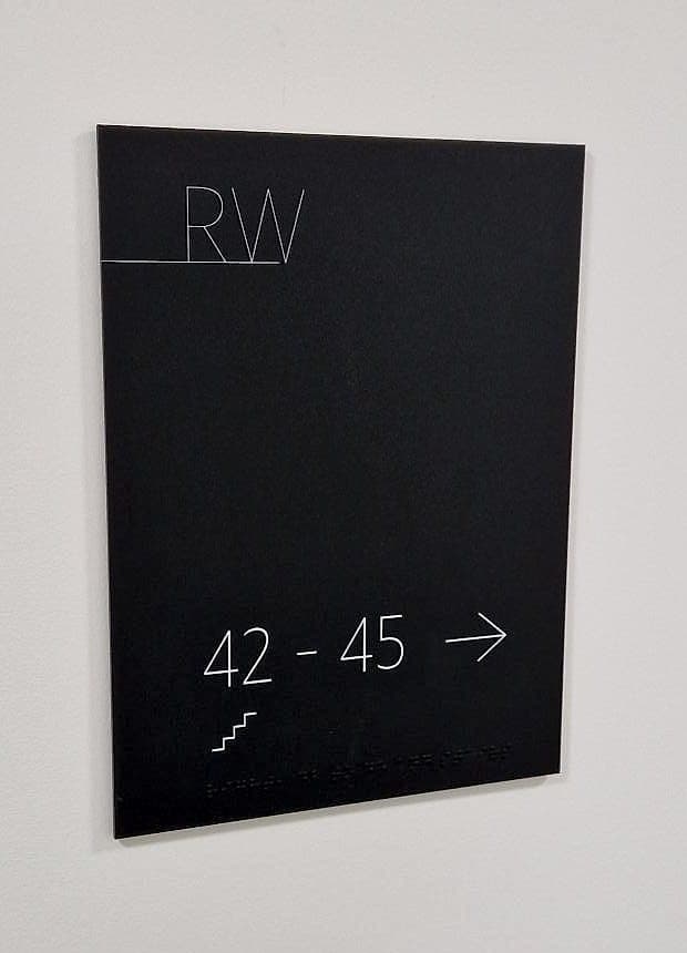
Two details catch people out. Digits aren't separate braille characters. They're the letters a to j preceded by a number indicator, so a room called "1.4" runs to three cells, and a range like "51 – 53" produces a braille line noticeably longer than the printed one. Capitals need their own indicator cell as well. Neither is optional, and both change the panel layout.
The specification, in millimetres
Braille is a dimensioned component. The cell geometry is standardised, Marburg Medium being the reference most European sign work uses, and it has to be held exactly, because a fingertip reading a badly spaced cell reads nothing at all.
- Dot base diameter of approximately 1.5mm, and domed. A sharp conical dot is uncomfortable, and it wears a fingertip out over a long legend.
- Dot height of 0.6 to 0.9mm above the face. Below that it vanishes under a fingertip. Above it, the cell begins to feel like six separate objects instead of one character.
- Dot spacing within a cell of 2.3 to 2.5mm centre to centre, so the six dots read as a single shape under one fingertip.
- Cell to cell around 6mm, line to line around 10mm. Those two numbers set the depth of the braille band, and therefore the depth of the whole sign.
- Position: braille sits below the text it translates, ranged left with it, never above and never interleaved.
- A locator, meaning a notch, chamfer or radius at the lower left of the panel, so a hand finds the start of the first braille line without searching across the face.
A fingertip reading a badly spaced cell reads nothing at all.
Raised text: the other half of the sign
The tactile characters are the part most people actually use, and they do two jobs at once: readable by eye at a metre, readable by hand at zero. That means a plain sans-serif face, generous letter spacing, and a relief of 1 to 1.5mm, enough for a fingertip to feel an edge without the character turning into a ridge. Cap heights of roughly 15 to 50mm keep a letter within the sweep of a single fingertip.
Visual contrast is a separate requirement and doesn't come free with relief. The raised text still needs 30 or more LRV points against the panel, and the panel needs the same against the wall behind it, all of it in a matt finish. A glossy tactile sign under a downlight can be technically compliant and practically invisible. The braille dots themselves are usually left the colour of the panel; nobody reads them by eye, and picking them out in white just advertises them.
Where braille signage goes
Placement decides whether any of the above matters. A sign read by touch has to be found by touch first, which makes position less negotiable than it is for a sign read across a lobby.
- On the wall on the latch side of the door, 50 to 100mm clear of the architrave. Never on the door leaf, which can swing away while it is being read.
- Centred between roughly 1400 and 1700mm above finished floor level: within the comfortable reach envelope, and readable standing or seated.
- Consistently. If the room sign is to the right of the door on one floor it is to the right of the door on every floor, because a braille reader working along a corridor is reaching for the position as much as for the panel.
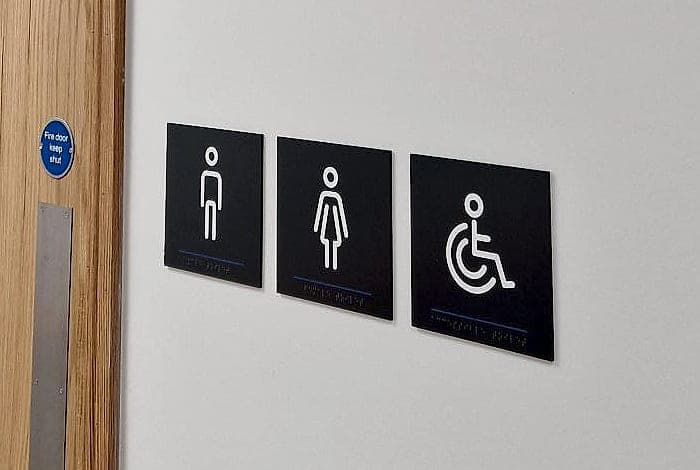
- At the destinations that need it: room and door identification, accessible WCs and sanitary facilities, lift lobbies and stair cores, and any orientation information mounted within reach.
- Not on overhead or long-distance directional signage, which is read at ten metres and does its accessible work through contrast and letter height instead.
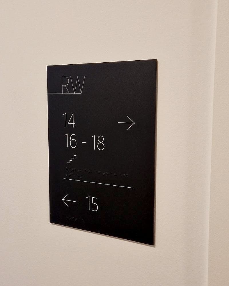
The exception worth noticing is the corridor sign at reading height. In an apartment building, the panel telling you which way flats 51 to 53 lie sits at around 1500mm, well within reach, so it works as a directional sign and a touch-readable one at the same time. Braille belongs on it.
How braille signage is made
Four methods dominate, and the choice is a durability decision as much as an aesthetic one.
- Drilled and inserted. Cells are CNC-drilled into the face to the exact geometry and hemispherical beads pressed in. The most precise of the four and by far the most robust, since the dots can't be scrubbed off. It's our default.
- Photopolymer. The face, raised characters and braille are cured as a single piece from a negative. Seamless and economical at volume, but the whole panel is the component: damage one dot and you remake the sign.
- Rotary engraving. Text engraved into the face and infilled, with braille formed by a braille cutter or inserted separately. Fast and cheap; the least crisp of the four.
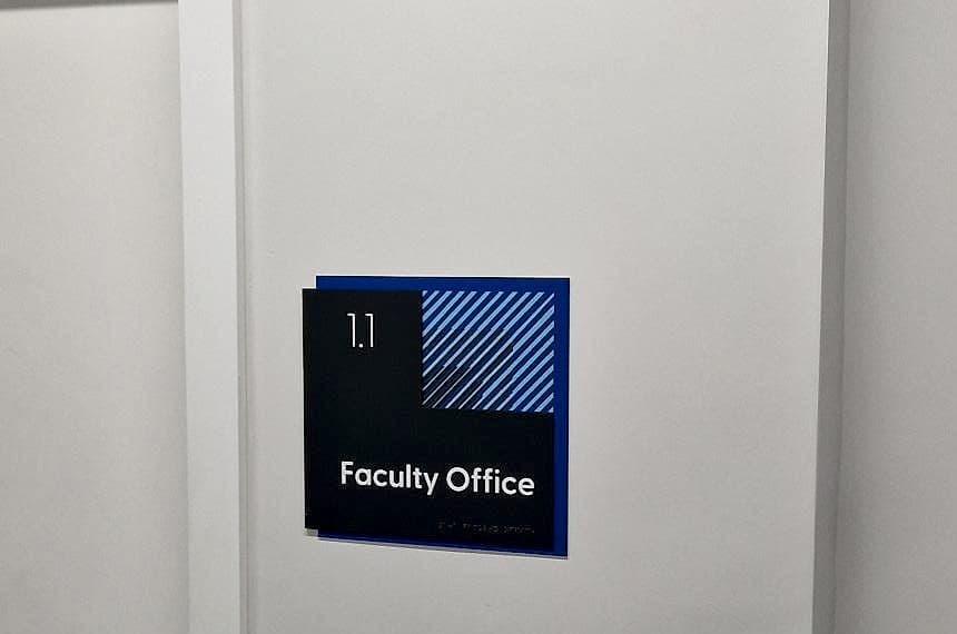
- Appliqué relief. Characters laser-cut from acrylic and bonded to the face, braille inserted. Gives a true 1.5mm relief and lets a brand palette run through the layers, which is what the door signs above are doing.
Whichever route you take, the finishing matters: matt faces, radiused corners, eased edges. These are the only signs in a building people touch on purpose, and a sharp arris at 1500mm is a hazard nobody catches on a drawing. It turns up at snagging, when every panel is already made.
One process step is non-negotiable: braille has to be proofed by somebody who reads braille, before manufacture and again on the sample. Translation software will transpose a number indicator or drop an accent without complaint, and the error is invisible to everyone checking the artwork by eye. That is the whole argument for a sample. Our approval workflow puts the tactile sample in front of the client with the rest of the package, which is a large part of why sign-off takes days rather than the months the email-and-PDF alternative can run to.
- 1–1.5mm
- relief on tactile characters: enough for a fingertip to find an edge, not enough to become a ridge
- 1400–1700mm
- the mounting band for touch-readable signage: within reach, readable standing or seated
- 30+
- LRV points of visual contrast still required (relief does not replace contrast)
What goes wrong
Almost every failure we find on an accessibility audit is one of five things: braille mounted above 1700mm where no hand will look; door signs fixed to the leaf instead of the wall; shallow dots on a printed or vinyl-applied panel that never had relief at all; contracted braille imported wholesale from an American template; and bilingual panels where the Irish and English lines were laid out first and the braille squeezed in afterwards.
That last one is worth deciding early. Under the Official Languages Act a public building carries Irish and English at equal prominence, and if both languages are to be readable by touch the panel needs two braille lines, which is roughly 20mm of extra depth on every door sign in the building. Sort it at design stage and it costs nothing. Sort it at manufacture and it costs you the whole schedule.
Compliant on the drawing and unreadable on the wall: the commonest kind of failure.
Everything above is standard on the signage we supply, and we certify it at handover. Nobody has to take it on trust. The technical baseline sits alongside Part M and TGD M, which the Department publishes in full here. If you're specifying tactile signage now, or you suspect an existing building wouldn't survive an audit, talk to us while the drawings are still open.
Planning a wayfinding project? Talk early, while the big decisions are still cheap.