
Wayfinding for ageing populations: designing signage for elderly people
Our buildings are ageing along with the people in them. What changes in the eye, the memory and the hand, and what that asks of every sign on the wall.
Ageing does predictable things. The eye focuses more slowly and needs several times more light than it once did, contrast sensitivity drops away, and an unfamiliar route sits less firmly in memory under pressure. So the design answers are predictable too. Larger mixed-case lettering. Contrast well past thirty LRV points, matt surfaces, the same sign in the same position at every door, and a building that offers landmarks to navigate by instead of lists to memorise.
Getting it wrong shows up more often in the quiet buildings than the loud ones. In a nursing home or a retirement scheme, a resident who can't find the lounge doesn't complain; she stops going. A visitor who can't find the right corridor doesn't ring the office. He asks a care assistant, who puts down whatever she was doing. None of that reaches a snag list.
Ageing is the design case, not the edge case
It's tempting to treat older users as a group to be accommodated once the design is settled. The arithmetic says otherwise. The over-65 share of the population is rising in every county in Ireland, and rising fastest among the over-80s, who are also the people most likely to be in a hospital, a day service or a residential scheme on any given morning. Design a building's signage for a fit forty-year-old and you have designed for a shrinking minority of the people who will actually use it. Size it instead for a woman of eighty-two with reading glasses, a hearing aid and a walking frame, and everybody else is carried along for free. That's the argument for age-friendly wayfinding, and it has more to do with hit rate than with virtue.
The eye at seventy: light, focus and glare
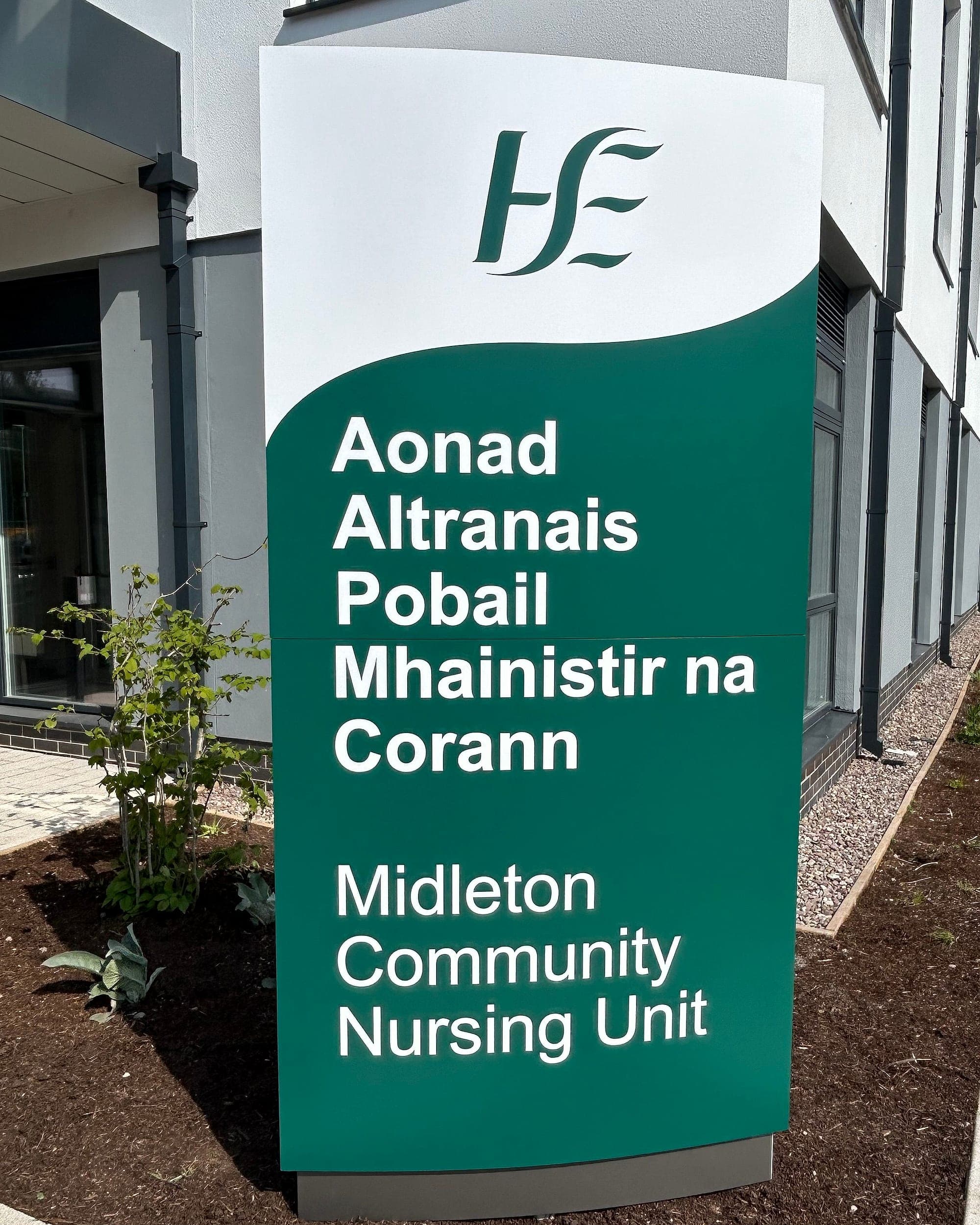
Four things change, and they compound. From the mid-forties the lens stiffens (presbyopia), so near focus slows and reading distance drifts outward; by seventy the eye is largely accommodating through spectacles that may well be in a coat pocket. The lens yellows too, flattening the difference between blues and greens, which turns any colour-coded scheme built on those hues into guesswork. Contrast sensitivity falls, so the pale grey on white that a young eye reads as text an older eye reads as a blank panel. And the pupil admits far less light: a reader of sixty typically needs around three times the illuminance a twenty-year-old needs for the same page. Then there's glare. Any clouding of the lens scatters the light that does get in, so a gloss panel under a downlight hands back a white veil exactly where the words should be. Same territory as designing for low vision, reached by a different road. It's why we specify matt and low-sheen finishes as standard, and why we hang signs where the light actually falls. A corridor's average lux figure won't tell you that.
Pale grey on white reads, to an older eye, as a blank panel.
Signage for elderly readers: size, case and the reading distance
Type size means nothing in the abstract. It's a function of the distance a person will realistically read from, and for older readers that distance is longer than the drawing assumes, because stopping to peer at a sign is neither dignified nor, with a frame or a stick, always safe. So we size lettering from the far position and then go up a step. Case matters as much as size. Mixed-case words are recognised by their shape, with ascenders and descenders carrying information long before the individual letters resolve, which is precisely why Part M asks that signage not be set entirely in capitals. The biggest legibility gain of all costs nothing: say less. Two destinations on a panel read at twice the distance of five. Nobody has ever asked us to make the lettering smaller.
Contrast is the number that decides everything
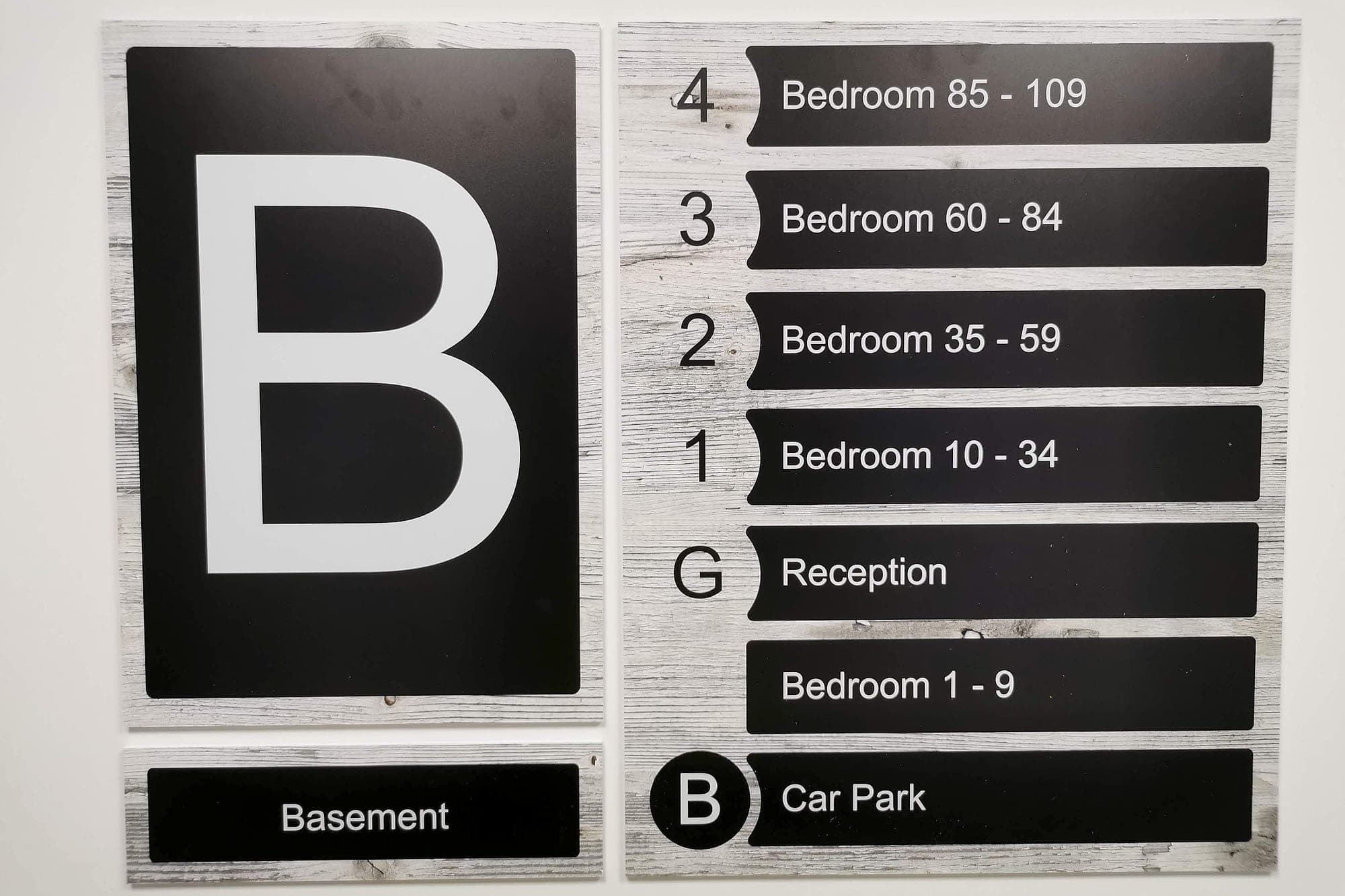
If one figure has to survive value engineering, make it contrast. The measure is Light Reflectance Value, and the benchmark set out in the official Part M guidance and BS 8300 is a difference of thirty points or more: between text and panel, and again between panel and wall. In older-person settings we design past it as a matter of course, because the interiors that read as homely are the ones that fight you. Oak, taupe, warm greys, tone-on-tone palettes chosen by an interior designer at arm's length from a mood board under bright studio light. A sign at fifteen points has failed. This is where most age-friendly schemes come apart, and it happens late: the palette gets signed off, the signage is a line item nobody is looking at, and the contrast goes with it. We'll concede the alternative isn't free. Finding a palette that keeps the room domestic and still puts the words thirty points clear of the wall takes longer than not bothering, and that time gets billed to somebody.
- 30+
- LRV points of contrast, the Part M baseline between text, panel and wall
- ×3
- the light a sixty-year-old eye needs to read what a twenty-year-old reads comfortably
- 1400mm
- typical sign centre height, legible standing, seated and from a wheelchair
Memory support: landmarks beat lists
Older navigators lean less on remembered sequences and more on recognisable places. That habit strengthens as recall for new information weakens, and strengthens again where cognitive impairment is present. So the most useful thing a building can offer at each turn is a distinct place. A clock, a picture, a coloured door, a view of the garden, a named lounge instead of Dayroom 2. At Phyllis Jane Court, a retirement housing scheme we designed and supplied wayfinding for, the whole system runs on that logic: one warm palette across every floor, generous pictograms for the destinations residents actually seek (lounge, laundry, hairdresser, quiet room), and floor directories that say what is on each level and stop there. Where memory is more seriously affected the principles tighten, and we set them out in our note on dementia-friendly wayfinding, including the trick of running the logic backwards: low contrast to make staff doors and service areas politely disappear.
Where older people actually live
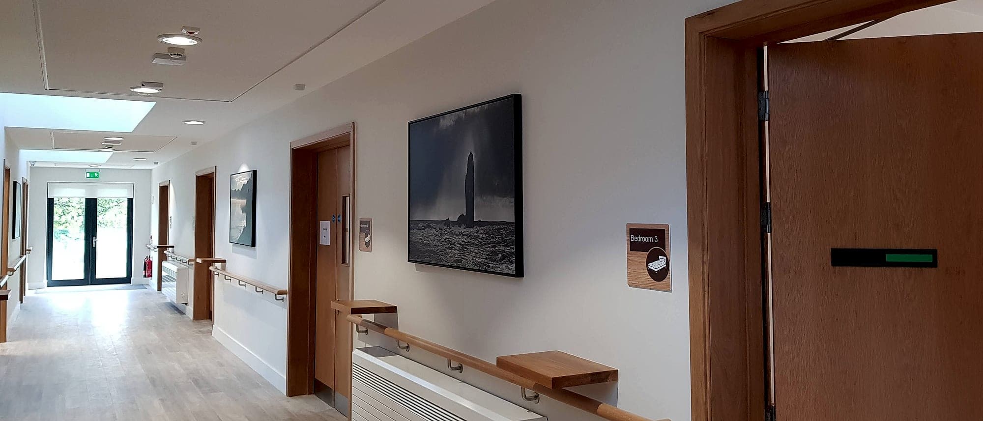
Most people grow old in ordinary housing, which makes signage for elderly residents a mainstream residential question: apartment blocks, retirement schemes, sheltered housing. It's also the sector where signage gets treated as a snagging item. In residential buildings the whole system usually reduces to three moves done well: identify the block from the street, identify the level unambiguously at the lift and stair core, and resolve flat numbers at every corridor junction so nobody walks a floor twice. Get all three right and an eighty-year-old visitor arrives at the right door. Miss the last one and a resident's family learns the building by trial and error. The same discipline runs across the care and health estate with rather more at stake, from Clearbrook to Moycullen, where a sign has to keep a nursing home feeling like a home while meeting a healthcare provider's standards for hygiene, contrast and cleaning.
Reach, touch and the hand that steadies
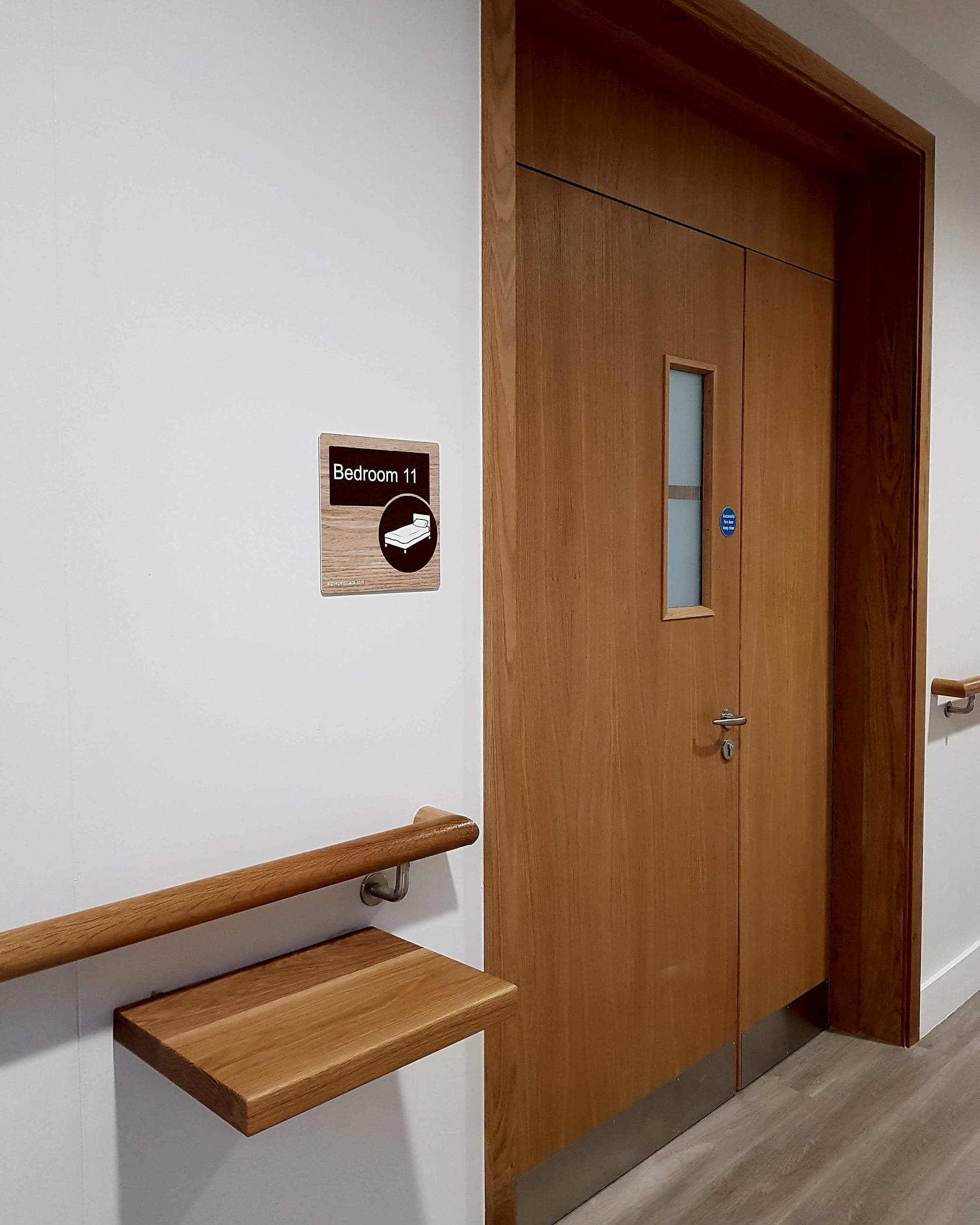
Two ergonomic details close the gap. The first is height. A sign centred around 1400mm reads standing, seated and from a wheelchair, and it puts tactile lettering and braille where a hand can find them without stooping; a body that no longer bends easily can't read a sign mounted for a photograph. The second is position, repeated. Door signs always on the latch side, level identifiers always in the same corner of the lift lobby, directories always at the same point past the entrance. Nobody writes predictability into a specification. Everybody in the building uses it.
A short specification for age-friendly signage
- Size from the far reading position, then go up one step. Older readers shouldn't have to stop and lean in.
- Mixed case, never all capitals: word shape is what a tired eye recognises first.
- Thirty LRV points minimum between text and panel, and again between panel and wall. Measure it; don't eyeball it.
- Matt or low-sheen finishes only, and no sign placed against a window or directly under a downlight.
- Two or three destinations per panel. Everything else belongs at the next decision point.
- Sign centre around 1400mm, tactile and braille within reach, and the same position at every equivalent location.
- Pictograms for the destinations people seek daily (toilet, lounge, dining, laundry), sized generously and used consistently.
- Landmarks and names before numbers. A place is remembered; a code is not.
Design for eighty-two, and everyone else is carried along for free.
None of this is expensive. Almost all of it is decided early, in the naming and the palette, long before a single panel is cut. Planning a care setting, a retirement scheme, or any building whose users are getting older? Have a look at our health-sector work, or talk to us while the decisions are still cheap.
Building in health? Talk early, while the naming decisions are still cheap.