
Dementia-friendly signage: designing for memory and perception
Dementia-friendly signage for care homes and hospitals: contrast, pictograms, landmarks and placement, designed so a home still feels like home.
Dementia-friendly signage is signage designed for people whose memory, perception and sense of direction are affected by dementia. It uses strong contrast between text, panel and wall; large, literal pictograms beside plain words; the same mounting position every time, around 1400mm to the centre; and landmarks, colour and familiar images that help a resident recognise where they are. It works as part of the building, alongside layout, lighting and décor, rather than as a layer of signs on top.
Wayfinding for nursing and care homes is among the most challenging there is. It calls for an understanding of residents, staff and visitors, and particular care for people who don't read signs or recall routes in a typical way.
It's also a balancing act. A care home is, above all, a home: the design has to feel warm and domestic while still meeting a healthcare provider's standards for hygiene and accessibility. The answer is signage that's highly accessible and beautifully designed, tailored to the interior it sits in.
How dementia changes the way people find their way
People living with dementia often don't see or remember the way others do. Contrast can be unsettling, objects can appear distorted, and disorientation is common and frightening. Good wayfinding considers the whole experience: the building's layout, its landmarks, textures, graphics and signs. Colour coding, on its own, gets more credit than it has earned. A colour tells a resident they've moved. It doesn't tell them where they are.
Some of the difficulty is simply the ageing eye, which most residents also have. Contrast sensitivity falls, the lens yellows and flattens the difference between blues and greens, and glare gets harder to see past. Dementia layers its own problems on top: depth perception can falter, peripheral vision narrows, and a route learned last week may be gone this morning. A sign that relies on remembering a sequence (third door on the left, past the lift) asks for exactly what's failing. A sign that lets someone recognise a place on sight asks for far less.
BS 8300 now reflects this. Its 2018 edition widened the standard to take in older people and people with dementia or sensory and cognitive differences, which puts dementia-friendly design inside the accessibility baseline. Our essay on wayfinding for ageing populations covers the eye and memory in more depth.
Three principles of dementia-friendly signage
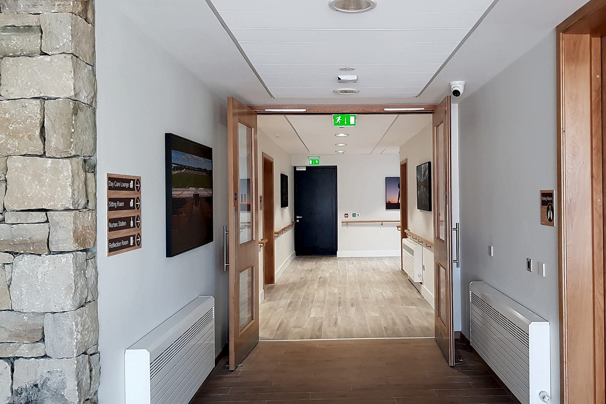
- High contrast where it matters. Reduced contrast sensitivity, peripheral vision and depth perception mean key signage needs strong contrast. We target an LRV difference above 70% between text, panel and mounting surface.
- Low contrast where it doesn't. Things you don't want to draw attention to, like staff doors and service areas, can be de-emphasised with low contrast and larger graphics.
- Orientation through landmarks. Clocks, paintings, colour coding and wall or door graphics aid recollection. Imagery of local landmarks, a coastline or a recognisable building, can be especially powerful.
Contrast is the one to protect when the budget tightens. The LRV baseline under Part M and BS 8300 is 30 points, between text and panel and again between panel and wall, and in care settings we design well past it. The warm, tone-on-tone interiors that make a home feel homely are the very ones that swallow a sign, so the panel often needs a deliberately stronger colour behind it to stand off the wall.
Words and pictures together
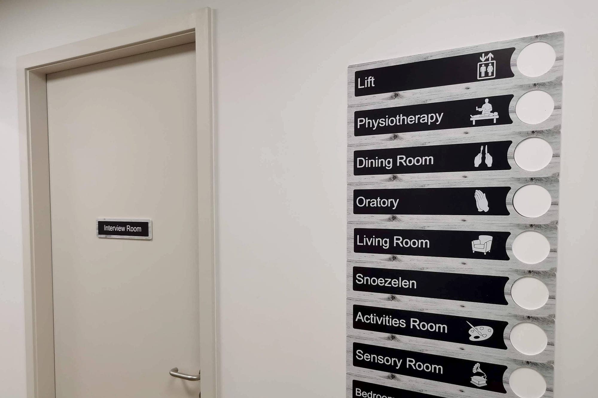
Many residents read pictures more readily than words, and some no longer read words at all. So every destination residents look for, the toilet, the dining room, the lounge, their own bedroom, gets a large, literal pictogram beside its name, and the same pictogram everywhere it appears. Literal matters here. A care home has rooms no airport symbol set was ever drawn for, a sitting room or an oratory or a hairdresser, and those need pictograms drawn for the purpose: an armchair and a lamp, say, rather than an abstract icon. We've written about drawing them in wayfinding symbols and pictograms.
Names matter as much as pictures. A named lounge gets remembered where Dayroom 2 doesn't. At Clearbrook Nursing Home, now operated by Mowlam Healthcare, the wings carry names (Marino, Tolka, Claremont and Hampstead) with a symbol for each, and the scheme uses bright colour and plenty of icons, with braille and tactile, to bring a touch of homeliness to a modern interior.
Types of sign in a dementia-friendly scheme
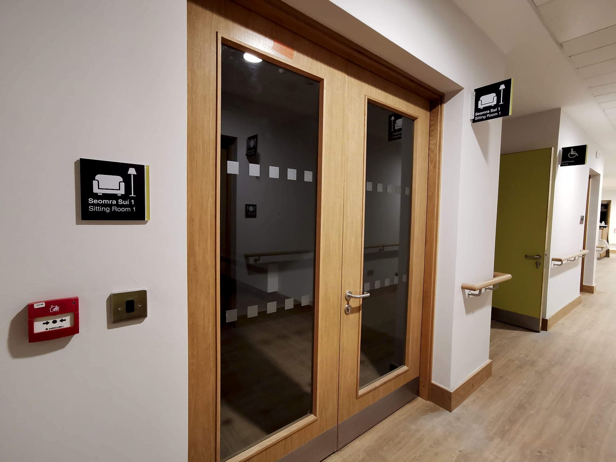
- Bedroom signs, fixed or flexible. Flexible signs let the home personalise with a photo or a meaningful image, while keeping fixed information like the room number for consistency.
- Identification signs: high contrast and large icons for resident spaces (mounted around 1400mm to centre), subtler medium contrast for staff-only areas.
- Wayfinding signs, prioritised by how often a space is sought. Bathrooms, dining and lounges need prominent, frequent direction; rarely used spaces need less.
- Warning signs: clear and high-contrast where they protect residents, medium-contrast and understated where they're for staff and visitors. Part M and fire-safety requirements always apply.
Placement, finish and light
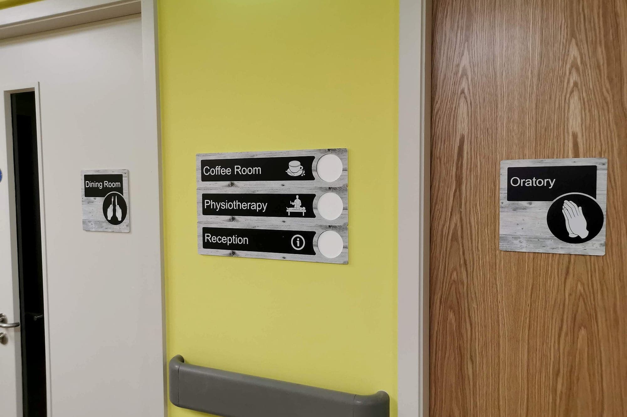
Position is a memory aid in itself. Mount signs at the same height, around 1400mm to the centre, and in the same place relative to every door, on the latch side, so residents learn where to look once and never have to search for it again. That height reads standing, seated and from a wheelchair, and it keeps tactile lettering and braille within easy reach of a hand.
Finish and light do the rest. Use matt or low-sheen faces only, because glare is far harder for an older eye to see past, and never hang a sign against a bright window or directly under a downlight. In the lift lobby, a directory should say what's on each floor rather than list every room, with the level shown large enough to read from inside the lift as the doors open.
- 260+
- healthcare institutions we've delivered wayfinding for
- 1400mm
- to the centre of identification signs in resident spaces
- 30+
- LRV points: the Part M baseline we design well past in care settings
A home first, and compliant
The hardest part of the brief isn't any single sign. It's meeting a healthcare provider's standards for hygiene, accessibility and fire safety in a building that still has to feel like somewhere people live. Clinical white panels and hospital pictograms fail that test the moment they go up. Warm timber faces, local imagery and a palette drawn from the interior pass it, as long as the contrast is still there when you measure it.
The regulatory side doesn't bend. Part M and BS 8300 set the accessibility floor, fire and escape signage follows its own rules, and residential care is inspected by HIQA against national standards. At Moycullen Nursing Home, also part of Mowlam Healthcare, the key requirements were HIQA compliance, dementia-friendly signage and a better-looking building. A modular sign system, colour coding for wayfinding and dementia-friendly graphics met all three, which is the combination we'd argue every care setting should ask for.
Common questions
Appendix- Q.What makes signage dementia friendly?
- Strong contrast between text, panel and wall; large, literal pictograms beside plain mixed-case words; consistent mounting at around 1400mm to the centre; matt finishes that don't glare; and landmarks and familiar images that help people recognise where they are instead of having to remember a route.
- Q.What colours work best for dementia-friendly signs?
- Contrast matters more than hue. Aim for a large LRV difference between text and panel, and between the panel and the wall, well past the 30-point Part M baseline. Avoid relying on blues and greens to tell destinations apart, because the ageing eye finds them harder to separate.
- Q.Is colour coding enough for dementia wayfinding?
- No. A colour can tell a resident they've moved into a different area, but it can't tell them where they are. Colour works best alongside named places, pictograms and landmarks such as clocks, artwork or images of local scenes.
- Q.Where should signs be placed in a care home?
- Identification signs for resident spaces are typically mounted around 1400mm to the centre, beside the door on the latch side, in the same position every time. Directional signs belong at the junctions where residents choose a way, with the most-used destinations (toilets, dining, lounges) signed most often.
- Q.Do dementia-friendly signs still have to meet Part M?
- Yes. Part M, BS 8300 and fire-safety signage requirements apply to care homes as to any other building. The 2018 edition of BS 8300 includes guidance for people with dementia, so a well-designed dementia-friendly scheme meets the regulations and then goes further.
Planning a care home, a community nursing unit or a ward for older patients? See our health-sector work, or talk to us while the palette and the names are still being chosen.
Building in health? Talk early, while the naming decisions are still cheap.