
Beyond the sign: lighting, surfaces and acoustics in accessible wayfinding
A compliant sign in the wrong light is a blank panel. Accessible wayfinding takes in lighting, surfaces, floors, acoustics and rest points, not just signage.
A sign can pass every accessibility check on the drawing and still be unreadable on the wall. Accessible wayfinding is the whole environment a person navigates: the light falling on a sign, the finish of the wall behind it, the floor underfoot, the acoustics of the room where they would have to ask, and whether there is anywhere to sit before the next decision. Signage is one layer of that, and usually the only layer anyone specifies.
The pattern is easy to see once you look for it. A door sign with fifty points of contrast, mounted in the band BS 8300 asks for, in a corridor where the nearest downlight is four metres back and the wall behind it carries a slight sheen. On the schedule it is compliant. To a seventy-eight-year-old with cataracts it is a pale rectangle with something written on it. Somebody designed the sign. Nobody designed the environment it landed in.
The specification was met and the journey still failed.
Light: the variable that never reaches the sign schedule
An ageing eye needs several times more light to read than a young one, and it recovers from glare far more slowly. That makes lighting the first thing that decides whether a sign works for a reader with low vision. Yet lighting layouts and sign schedules are drawn by different people and coordinated, if at all, by the ceiling. Corridors end up lit in pools, bright under each fitting and dim between, while signs go in at the intervals the wayfinding plan wanted. Where the light actually falls is on somebody else's drawing. Two habits fix most of it, and both are free at design stage. Put the sign schedule and the lighting layout on the same drawing before either is issued. Then walk the route at the dimmest hour the building is in use, not at eleven on a bright Tuesday. If we could change one thing about how accessible signage is procured, it would be that: the ceiling and the walls decided in the same room.
Surfaces: the wall and the panel are one system
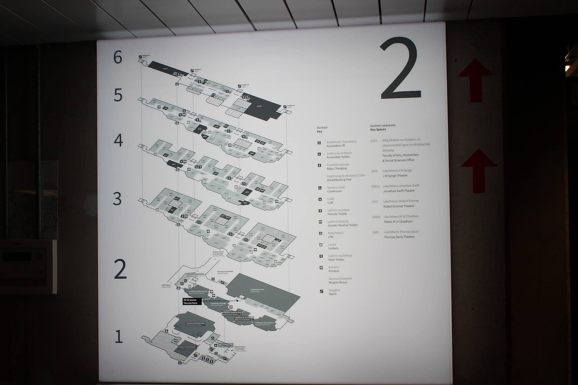
Contrast is measured between text and panel, under the 30-point LRV rule. But people see the panel against the wall, and that second contrast is just as load-bearing. A dark panel on a white wall announces itself from twenty metres; the same panel on a charcoal feature wall has vanished at five. Finish decides the rest. Gloss hands a downlight straight back into the reader's eye, and for anyone with cataracts that is simply a blank, so matt and low-sheen faces are the default in everything we supply. The wall's own finish counts too: polished plaster, glazed tiling and mirrored lift doors all throw light back, and all of them sit exactly where signs want to go.
Floors: the plane people read with their feet
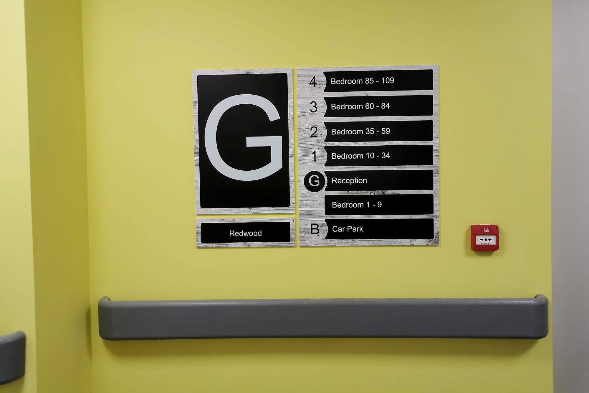
Anyone navigating with reduced sight or unsteady balance watches the floor, which makes flooring a wayfinding surface whether it was designed as one or not. Strong pattern reads as texture and can register as a step. A dark inset mat can read as a hole. A sudden change of tone at a threshold makes a cautious walker stop, and a dozen such stops turn a short route into an ordeal. Where floors change material, carpet to tile or corridor to lift lobby, the transition should be flush, tonally gentle and consistent. Or used deliberately: a single change of floor at the point a route changes zone is one of the cheapest orientation cues a building owns.
Sound: accessible wayfinding's missing layer
Every building has a place where you go to ask, and it's usually the worst acoustic in the building: a hard-surfaced, double-height lobby with a desk in the middle of it. Reverberation of that kind doesn't make speech quieter for a hearing-aid user. It makes it unintelligible, and no amount of signage repairs that moment. So accessible wayfinding carries an acoustic specification. Absorbent surfaces where conversation actually happens. A hearing loop at reception that somebody has tested, and signed with the correct symbol. And a quieter alternative for anyone who can't cope with the main route, which is the same sensory logic that calmer buildings are already designed around. Older-person housing teaches it fastest: at Phyllis Jane Court, the Quiet Area is a named destination on the directory.
The place you go to ask is usually the worst acoustic in the building.
Rest points: distance is an accessibility dimension
A route a fit adult reads as short is, for someone with a heart condition or a walking frame, a sequence of stages between places to sit. Where there is nowhere to stop, the honest length of the journey is the distance to the first seat. If there is no seat at all, the destination is out of range whatever the signage promises. Seating therefore belongs on the wayfinding drawing beside the signs: at intervals along long corridors, in sight of lift lobbies, and never in an alcove behind the decision point. Best of all is a bench you can rest on and still read the next sign from.
Testing the environment, not just the sign
None of this appears on a sign schedule, which is why we walk buildings. An accessibility audit covers the panel first: contrast, tactile and braille provision, mounting heights against Part M and BS 8300, the technical floor set out in the official guidance. Then it keeps going:
- Read every sign from where a visitor actually stands, at the dimmest hour the building is in use.
- Photograph each sign with the flash off, and look for veiling reflections from windows, downlights and glazed doors.
- Measure the wall's Light Reflectance Value as well as the panel's, because the second contrast is the one people see first.
- Walk the route with a wheeled bag: every transition that catches a wheel will catch a frame, a stick or a castor.
- Stand at reception and try to hear a name called from the far side of the lobby.
The signage is the layer we supply, and it works because of the layers around it. Those get decided long before a sign schedule exists, by an architect choosing a floor finish and a services engineer setting out a ceiling. That table is the cheapest place to raise accessible wayfinding. An audit will tell you honestly where a finished building stands; a conversation costs nothing while the specification is still open.
Planning a wayfinding project? Talk early, while the big decisions are still cheap.