
Wayfinding for neurodiversity: autism-friendly signage and calmer, clearer buildings
The busiest buildings are also the loudest. For autistic and neurodivergent visitors, calm, predictable signage is the difference between coping and leaving.
Autism-friendly signage is designed to reduce sensory and cognitive load: plain, literal language in mixed case, one message per sign, consistent symbols, predictable placement, and calm matte finishes that don't glare or crowd the visual field. No special product is involved. It is an ordinary wayfinding system, tuned so the people most affected by noise, ambiguity and surprise can navigate with the least effort. Tuned that way, it works better for everyone else too.
One of the smallest projects in our archive is the one we think about most often. Temple Street Children's Hospital asked us to deliver signage for its Autism POD, a dedicated space where autistic children and their families are assessed and supported. The sign count was modest. The brief was not. Every choice was weighed against a single question, from the wording and the symbols down to the sheen of the panel: will this add to a child's load, or lighten it?
Will this sign add to a child's load, or lighten it?
The question scales. Neurodivergent people, which includes autistic people and people with ADHD, dyslexia or sensory processing differences, are a meaningful share of every building's users, in every sector, every day. So how much of any given building was designed on the assumption that attention is unlimited and noise is free? Most of it. Wayfinding is one of the few disciplines positioned to push back.
Finding your way is cognitive work: hold a destination in mind, scan for the next cue, decide, repeat. Every competing stimulus taxes that work. Over-bright or flickering lighting, reflections off gloss surfaces, tannoy announcements, walls silted up with posters and laminated notices and contradictory arrows. For an autistic visitor who experiences sensory input more intensely and filters it less automatically, the tax compounds until the journey stops being difficult and becomes impossible, and not because the route was complex. The environment had already spent their capacity before the second decision point.
That's why the first act of autism-friendly wayfinding is subtraction. When we audit an existing building, we usually remove signs before we add any: strip the redundant notices, silence the walls around each decision point, and let the few signs that remain do their work against a quiet background. A calm sign in a cluttered corridor is still part of the clutter. Every laminated notice on a corridor wall was put up by somebody with a reason, and asking a ward manager to take forty of them down isn't a design conversation.
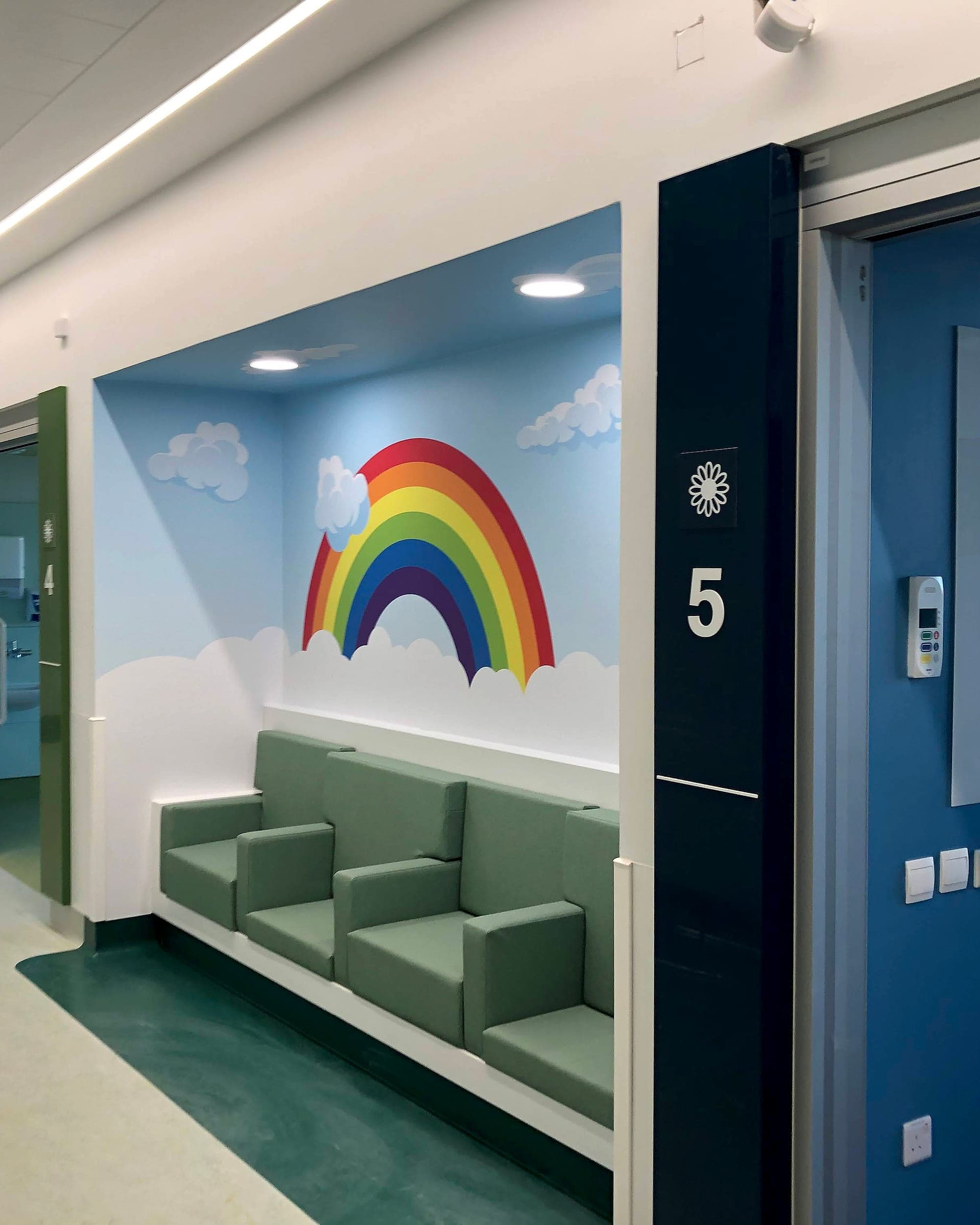
Subtraction has one important exception, and that's the escape route. More buildings now provide a quiet room or sensory space, and knowing a retreat exists is half of being able to stay in the building at all. So the signage has to carry it before it's needed: on the directory, at reception, in the pre-visit guide, so a parent walking in already knows where it is. A quiet room nobody can find is a room that doesn't exist. Plenty of them are signed only on the door they're behind.
Predictability is a design material
Much of the distress an unfamiliar building causes comes from not knowing what happens next. Predictability answers that, and in wayfinding predictability is buildable. Signs of the same type sit in the same position and the same format every time. The same information is offered at every equivalent decision point. Names never mutate between the letter, the website, the directory and the door, which is the same consistency hospitals depend on. After two or three encounters the system becomes familiar, and familiarity is exactly what an anxious visitor is short of. None of it shows off.
Predictability is the kindest thing a building can offer.
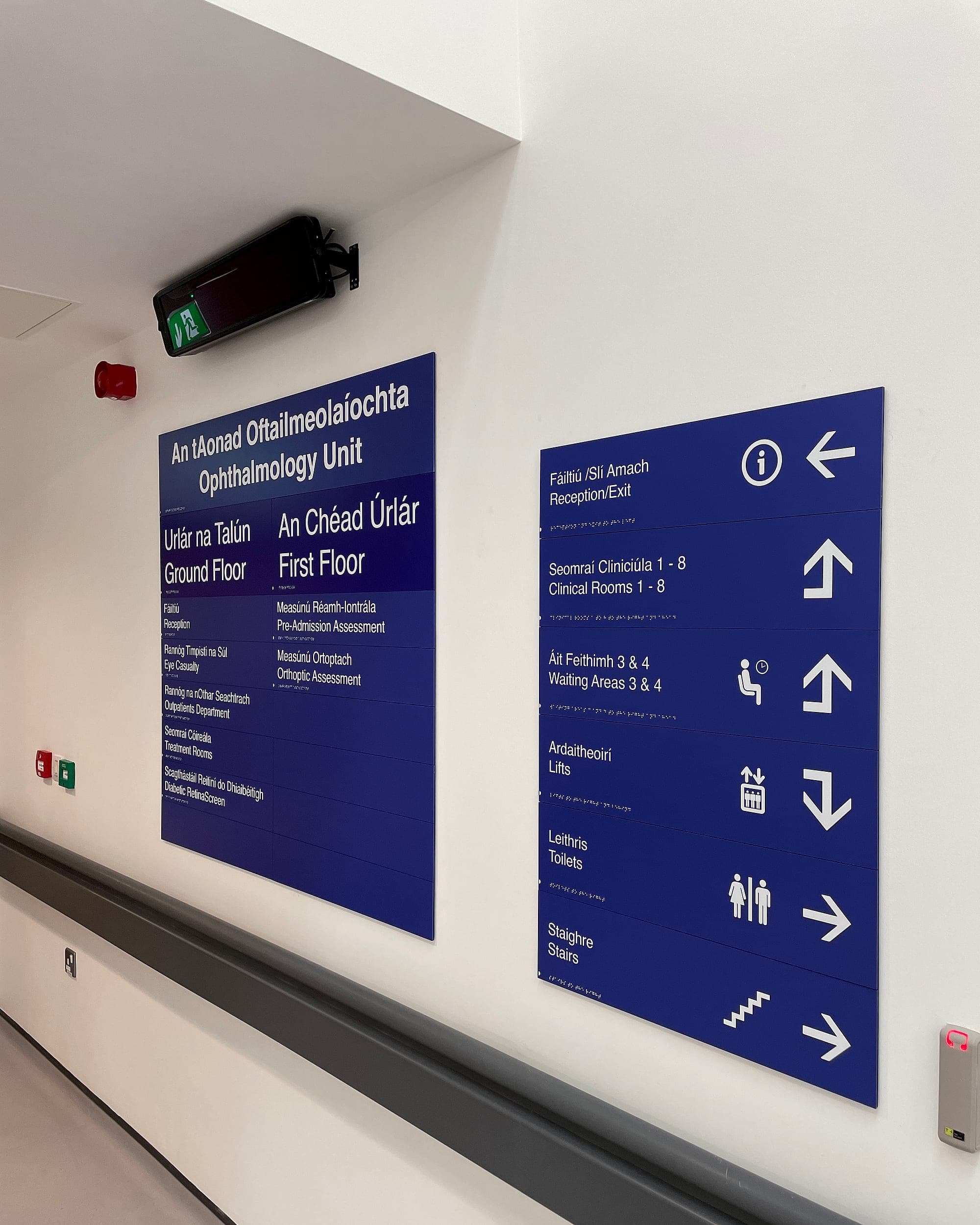
Symbols make predictability portable. At Temple Street, each level of the outpatients building holds one colour and one illustrated creature, repeated from the directory to the lift lobby to the department threshold. A child can carry "the horse floor" in mind all the way from the front door, and so can an adult who processes pictures faster than words. The pictogram discipline matters here: one symbol per meaning, drawn once, used identically everywhere. A symbol that shifts style between signs is, to a literal mind, a different symbol.
Plain language, plainly set
Autistic readers tend to take language literally, and everyone takes it literally when stressed. So the words on the sign should be the plainest true ones available: say what the room is, in the same words the appointment letter used, and stop. No idioms, no wit, no institutional euphemism. "Discovery Zone" helps nobody who was told to find the library. Set it the way accessible signage is always set, in mixed case, with generous spacing and strong contrast between text and panel, and resist the urge to add a second message while you're there. One sign, one job.
In public and healthcare settings that restraint has to survive two languages. Irish and English at equal prominence can double the reading load on a sign face, unless the layout keeps each language visually distinct and lets a reader lock onto theirs at a glance. The discipline is the one that governs the whole system: fewer messages, more space, and a format so consistent that by the second sign nobody is reading the panel, only the words that concern them.
Visual timetables, and knowing what comes next
Many autistic children run their day on a visual timetable, a strip of pictures that turns an unpredictable day into a known sequence. Wayfinding can extend the same courtesy to a whole building. A pre-visit visual guide (photographs of the entrance, the reception desk, the corridor and the room, sequenced like a storyboard) lets a family rehearse the journey before they make it. That only works if the building keeps its promises: guide, letter and corridor have to use the same names, the same symbols, the same images. An agreed schedule of names and a consistent visual vocabulary is what makes those materials possible to produce, and what keeps them true as the building changes.
Landmarks that calm rather than shout
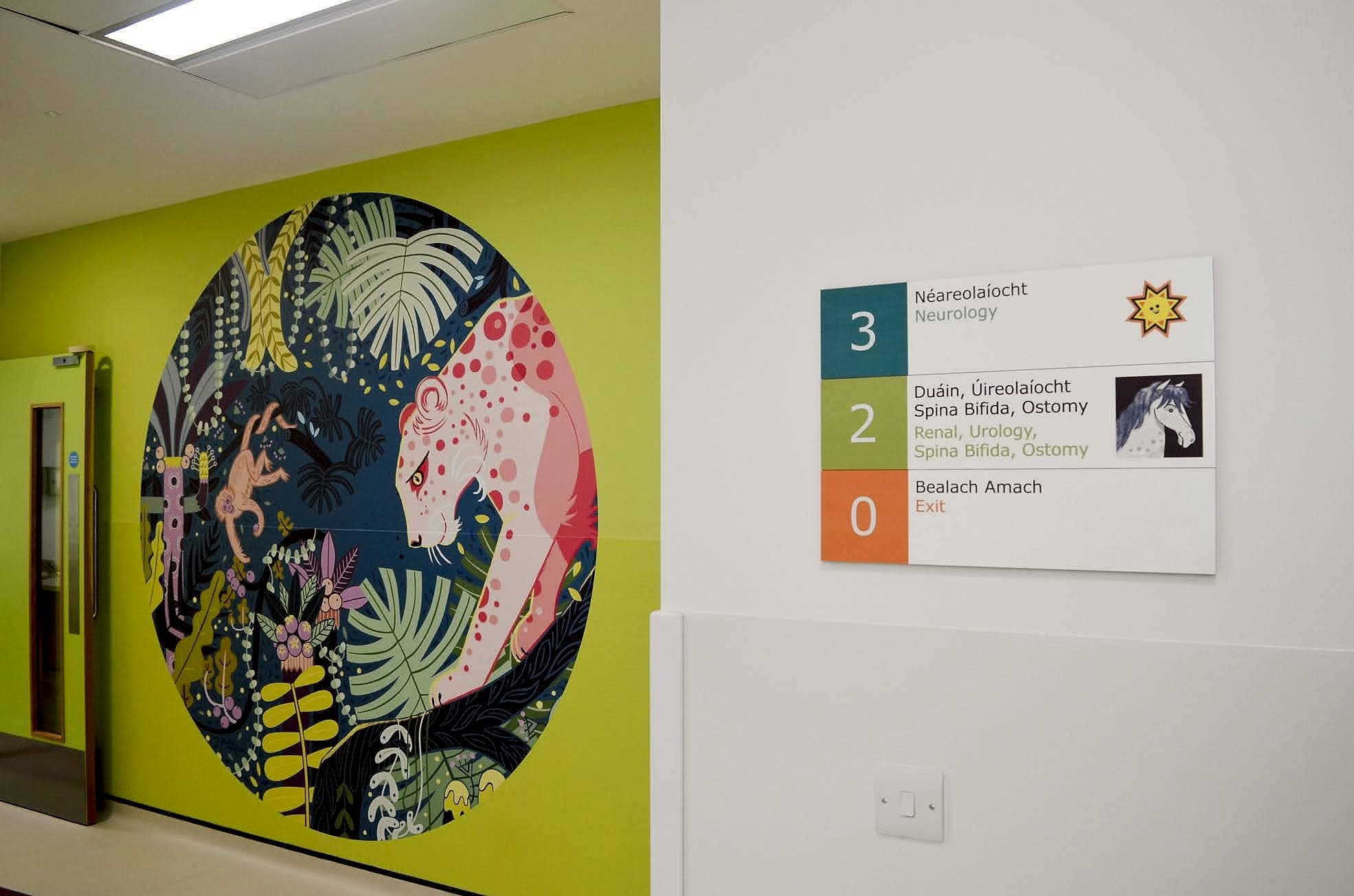
Signs aren't the only navigational objects in a building. Murals, colour fields and sculptural forms do wayfinding work of their own, and for visitors who navigate by scene they may do most of it. The craft is in the register. A landmark should be distinctive without being loud: soft natural imagery, matte surfaces, a palette pitched close to the interior it sits in. At Temple Street a jungle mural marks a junction a child will remember, and the directory beside it carries the detail. Each medium works at its own volume. We take the same care designing for dementia. Different condition, same discipline: reduce what confuses, strengthen what orients.
Autism-friendly signage is just good signage
None of this sits outside the rulebook. Part M and BS 8300 already require the contrast, the mixed case and the sensible mounting heights. An autism-friendly system takes the same logic further, into language, sensory load, predictability and the spaces between the signs. Which is why we don't offer it as a variant or an upgrade. Every system we design is built to be certified accessible by default, and the calmer, clearer thinking this essay describes is folded into the same drawings. Stress narrows everyone's perception. A building tuned for the people it affects most works better on everybody's worst day.
If you're planning a school, a clinic, a hospital or any public building where calm matters, have a look at our healthcare work, or talk to us early, while the decisions that lighten the load are still cheap to make.
Planning a wayfinding project? Talk early, while the big decisions are still cheap.