
BS 8300 explained: the standard behind accessible signage
The British Standard behind accessible signage: what BS 8300 covers, how it pairs with Part M, and the clauses that decide whether a sign works.
BS 8300 is the British Standard for designing an accessible and inclusive built environment, and it's the rulebook behind accessible signage in Ireland and the UK. When a specification calls for BS 8300 signage it means signs designed so that everyone can use them: visual contrast of 30 or more LRV points, mixed-case lettering sized to its viewing distance, tactile and braille provision at key locations, and mounting positions that work whether you're standing, seated, or reading with your fingertips.
It matters because BS 8300 is where the vague ambition of "accessible signage" becomes measurable. A sign either carries 30 points of contrast or it doesn't; braille is either where a hand expects it or it isn't. Everything we supply is made to BS 8300 by default, and we certify compliance on completion, from university teaching buildings to nursing homes. Here is the standard in plain English.
What BS 8300 is, and what it isn't
BS 8300, current edition 2018, is titled Design of an accessible and inclusive built environment. It comes in two parts. Part 1 covers the external environment: routes, gradients, street furniture. Part 2 covers buildings, which is where nearly all the signage guidance lives. It's a code of practice, published by the British Standards Institution, and no inspector will prosecute you under BS 8300 itself.
It binds all the same, by three routes. Building regulations lean on it: in Ireland, Technical Guidance Document M points designers to BS 8300 for the detail the regulations don't spell out. Specifications cite it, and "signage to BS 8300" is contractually enforceable. Equality law looks to it as the benchmark of good practice when a building's accessibility is challenged. Treating it as optional is a risk nobody prices honestly.
What BS 8300 covers for signage
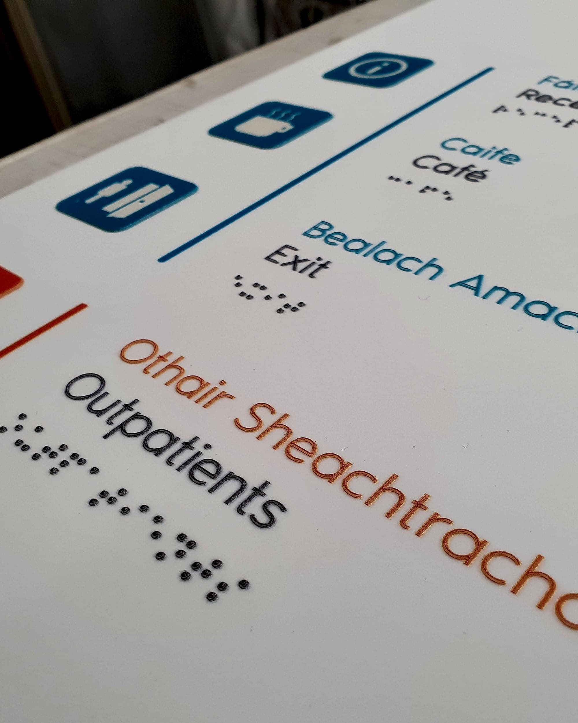
Within Part 2, signage sits inside a broader chapter on wayfinding and information, and the standard is explicit that signs are one channel among several. For the signs themselves, the guidance covers:
- Visual contrast: the light reflectance value (LRV) difference between text and panel, and between the panel and the surface it's mounted on. The working figure is 30 points or more; our LRV guide unpacks the measurement.
- Letterforms: mixed-case text in a clear sans-serif face, never all capitals for running text, because readers recognise words by shape.
- Letter size, scaled to viewing distance, so a directory read at arm's length and a directional sign read across a lobby are sized differently, on purpose.
- Tactile provision: embossed characters and symbols that can be read by touch, with braille, at key locations such as door signs and sanitary facilities.
- Position and height. Consistent locations at decision points, mounted within comfortable sightlines for standing and seated users alike, and never projecting into a circulation route.
- Surface finish: matt, glare-free faces, because a perfectly contrasted sign under a downlight can vanish behind its own reflection.
- Symbols: standard pictograms, the International Symbol of Access for accessible routes and facilities, and symbols indicating hearing enhancement such as induction loops.
Just as importantly, BS 8300 treats signage as part of an environment. Lighting levels, surface materials, acoustics and landmarks all carry wayfinding information, and the 2018 edition widened the lens further, taking in older people and people with dementia or sensory and cognitive differences, not only wheelchair users. A compliant sign in a badly lit, echoing corridor is half a solution.
BS 8300 and Part M: the law and the how-to
The two get constantly confused, and the relationship is simple. Part M of the Building Regulations is the legal requirement: buildings must be accessible, and Technical Guidance Document M describes how to show compliance. But TGD M gives signage only a few paragraphs, and for the working detail it defers to BS 8300. One sets the obligation, the other supplies the craft.
Part M says the sign must work. BS 8300 shows you how.
So an Irish project meets Part M by designing its signage to BS 8300, which is why we treat the two as a single specification. Where a public-sector building is involved the Official Languages Act adds bilingual provision on top, and the contrast and letter-height arithmetic has to survive two languages sharing one panel.
BS 8300 signage requirements: the key clauses in plain English
Standards prose is dense, so here is what the signage guidance asks for, translated into decisions a designer or specifier actually makes:
- Contrast is measured, not judged by eye. Specify the LRV of text, panel and wall, and check the differences on paper before anything is printed. Two colours that look boldly different can sit within a few points of each other.
- Set text in mixed case. "Radiology" is read by word-shape; "RADIOLOGY" has to be spelled out letter by letter, which is slower for everyone and slowest for partially sighted readers.
- Size text to the journey. Decide where each sign will actually be read from, across a foyer, along a corridor or at a door, and let that distance set the letter height.
- Put signs where hands and eyes expect them. Door signs belong on the wall beside the leading edge of the door. Put one on the leaf and it can swing into the person reading it by touch. Mount them in the band a standing or seated reader can reach and see, typically around 1400–1700mm.
- Keep locations consistent. If the room sign sits beside the latch on one door, it should sit there on every door. Consistency is itself an accessibility feature; it tells people where to look next time.
- Choose matt over gloss. Glare is a contrast thief; a low-sheen finish under real lighting outperforms a glossy panel with better numbers in the studio.
Tactile and braille: reading by touch
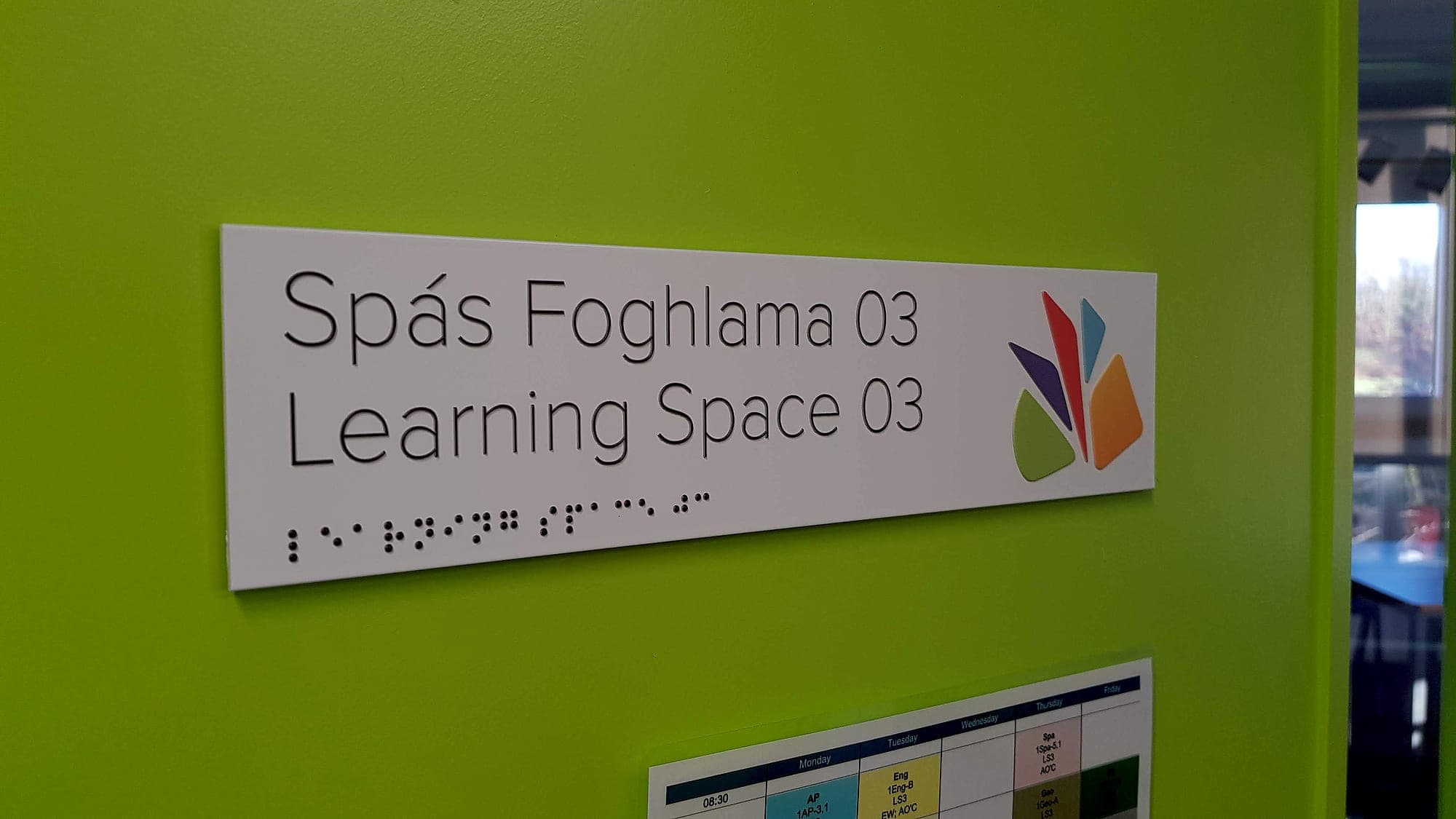
The clauses people know BS 8300 for are the tactile ones. Key location signs should be readable by touch: room and door identification, sanitary facilities, and orientation information mounted low enough to reach. Characters are embossed in relief, raised roughly 1–1.5mm, generous enough for a fingertip to trace. Braille sits below the corresponding text, with a locator notch at the sign's edge so a reader can find the line without hunting across the panel. Getting this right is a manufacturing discipline as much as a design one. Raised lettering that's too shallow, too sharp-edged or too tightly spaced technically exists and practically fails. How tactile and braille signs are designed, made and mounted is a subject of its own. The point here is that BS 8300 expects touch-readable provision to be planned, not sprinkled.
Where it matters most in a building
BS 8300 doesn't ask for braille on every panel. It asks for the right provision at the right locations, and these are the places that carry the load:
- Entrances and reception: the orientation moment, where an accessible entrance has to announce itself with the International Symbol of Access.
- Sanitary accommodation: accessible WCs and changing facilities, identified with tactile, braille and symbol provision. The most-searched-for rooms in any building.
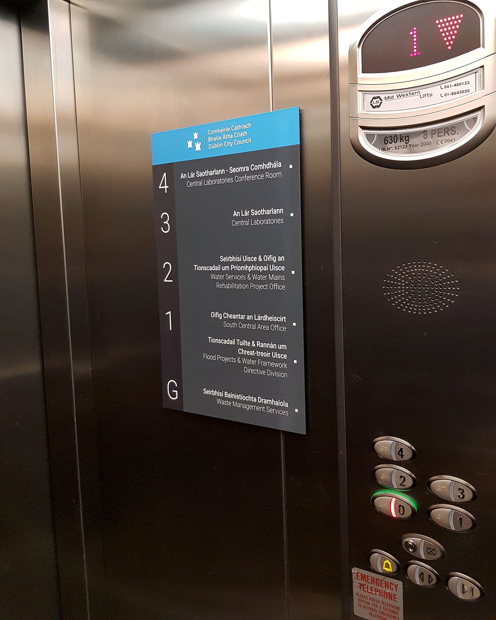
- Lifts and stairs, where floor identification re-anchors people who have lost their bearings between levels.
- Room and door signs: the destination end of every journey, and the sign type most often read by touch.
- Directories and directional signs, the decision-point network, where contrast, letter height and consistent placement decide whether the system works.
Compliant by default, and certified
Because BS 8300 is guidance, it gets value-engineered away routinely. Contrast drifts to suit a brand palette, tactile signs are trimmed from the package, and none of it ever appears on a snag list, because the signs are there and they look grand. Nobody notices until an access audit, or a complaint. Contrast is the clause that comes under most pressure, usually from a brand palette. So our position is simple: every sign we supply meets BS 8300 as standard, we audit existing buildings against it, and we certify compliance at handover, so the paper trail exists before anyone asks for it. Handled that way, accessibility costs almost nothing extra. Retrofitting after a failed audit costs a signage package twice.
Common questions
Appendix- Q.Is BS 8300 a legal requirement?
- Not in itself. It's a code of practice. But Irish and UK building regulations point to it as the way to satisfy their accessibility requirements (Part M in Ireland), specifications make it contractually binding, and equality law treats it as the benchmark of good practice. Functionally, it's the standard you'll be measured against.
- Q.What is the difference between BS 8300 and Part M?
- Part M is the legal obligation: buildings must be accessible, with Technical Guidance Document M showing how to comply. BS 8300 is the detailed best-practice standard TGD M defers to for signage specifics: contrast values, letterforms, tactile and braille provision, mounting positions. Meet BS 8300 and you've met Part M's signage expectations with room to spare.
- Q.Which signs need braille under BS 8300?
- Key location signs that people read up close: room and door identification, accessible WCs and other sanitary facilities, and orientation information mounted within reach. Overhead directional signage doesn't need braille, because it's read at distance, where contrast and letter height do the accessible work.
If you're specifying signage against BS 8300, or wondering whether an existing building would pass, an accessibility audit answers the question with measurements rather than opinions, and a conversation with us costs nothing while the specification is still open.
Planning a wayfinding project? Talk early, while the big decisions are still cheap.