
Build-to-rent signage: navigation as resident experience
In build-to-rent the building is the product, and the signage is part of it. What changes when the landlord never leaves the asset.
Build-to-rent signage is the naming, wayfinding and identification system inside a rented residential building held and operated by a single owner: block identity, level and apartment numbering, amenity naming, and the statutory signage sitting underneath all of it. It differs from for-sale apartment signage in one decisive way. The developer never leaves. Whoever pays for the signs also re-lets against them, repairs them, and looks at them every day for the next thirty years.
That one fact is why so much of it disappoints. Signage gets specified late, off an apartment-scheme template, by a team whose job ends at handover. Year eight is somebody else's problem. And it shows the first time a prospective tenant is walked from the front door to a show unit past a laminated A4 sheet taped to a fire door. In a sector that competes almost entirely on experience, that's a strange place to economise.
We design, supply and install residential wayfinding across Ireland and the UK: apartment schemes, student accommodation such as Hatch, and build-to-rent blocks where the operator's brand is on the door and on the lease. Build-to-rent asks for things the other two don't.
Why build-to-rent signage is a different brief
Four things separate it from a standard apartment scheme. Tenure comes first: residents turn over every year or two, so the building has to stay legible to a complete stranger permanently. Not just on the day the main contractor hands it over. Then there's brand. The operator's identity is the product, and signage is the most-touched piece of brand estate they own, seen more often than the website and the app combined. Amenity is the third: gyms, lounges, co-working, parcel rooms and roof terraces are what the rent is justified by, and a facility nobody can find is a facility nobody values. Last, the tour. Every letting decision gets made on a ten-minute walk through the building, and that walk is a wayfinding brief whether anyone wrote it down or not.
In build-to-rent, every resident is a first-time visitor for a fortnight.
Amenity naming is the product
The naming decisions matter more than the panels do. The marketing suite calls it the Residents' Lounge, the app calls it Social Space, the door calls it Amenity 2, and every mismatch is a small tax on a resident's confidence in the building. Fix it the way any good destination schedule is fixed: agree one vocabulary before anything is drawn, then hold it across the brochure, the lease pack, the app, the concierge's script and the door. If it's a parcel room on the sign, it's a parcel room in the tenancy handbook.
Restraint matters as much as consistency. Ordinary names, strict hierarchy: the panel at the lift carries only the destinations residents actually go looking for, and everything else waits until they're closer. A building that lists twelve facilities on one panel has told a visitor nothing except that it's complicated.
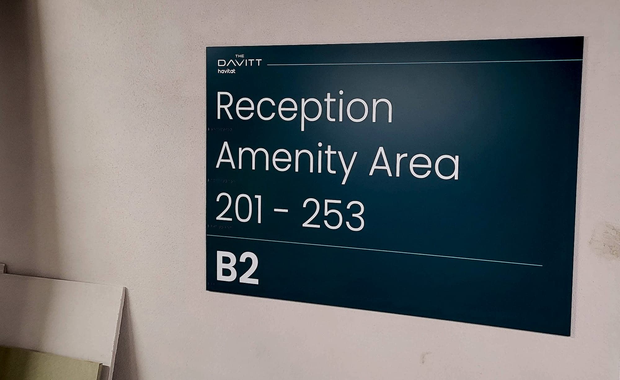
Materials: the sign is furniture, not fit-out
Residential signage is read from 300mm, touched daily and lit by whatever the interior designer chose. It has to be made to the standard of the door furniture beside it. Where a resident's hand will reach, that means dimensional lettering: solid substrates with finished edges, matt faces that don't bounce a downlight back into the reader's eye, and finishes drawn from the same palette as the ironmongery. Anodised aluminium, brushed brass, matt acrylics, timber veneers.
It also means being honest about what fails. Digitally printed vinyl on a painted wall looks immaculate for two years, then peels at the corners where trolleys clip it. Thin acrylic bonded to MDF delaminates in a humid stair core. Anything that needs a specific paint colour behind it becomes unmaintainable the moment the decorator changes. We specify and supply with the replacement in mind, because in build-to-rent there will always be a replacement.
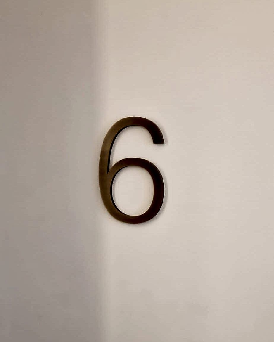
Level identification does more work than any other sign
In a residential tower, the single highest-value sign is the one that tells you which floor you're on. Residents step out of a lift on autopilot, visitors arrive with a number and nothing else, and couriers and carers work dozens of near-identical corridors a day. A level numeral big enough to read from inside the lift car as the doors open resolves all three at once. It carries no words, so renewing it costs a print run. Those numerals are easy to under-size: they look generous on an elevation at 1:50 and vanish the moment a lift door frames them.
Increasingly it's a legal question as much as a design one. In England, high-rise residential buildings over 18 metres carry a duty under the Fire Safety (England) Regulations 2022 to display floor identification in stairwells and flat numbers in the lobbies they serve, visible in low light or when illuminated. Any UK build-to-rent asset of scale is inside that regime, and retrofitting it after handover costs several times what designing it in would have.

Compliance is the entry ticket, not the differentiator
None of that earns any credit if the baseline isn't there. In Ireland the baseline is Part M: Technical Guidance Document M, with BS 8300 supplying the technical detail: lettering set in mixed case and never all capitals, visual contrast of 30 LRV points or more between text and panel and between panel and wall, tactile lettering and braille on key location signage low enough to touch, mounting heights that work seated and standing, and the International Symbol of Access where facilities are accessible. Escape and fire-safety signage answers to TGD B, using ISO 7010 pictograms so the meaning survives every language spoken in the building. Everything we supply is made to those standards by default, and we certify on completion. In residential work that's simply the specification.
The genuine tension in build-to-rent is that contrast and interior design pull in opposite directions. Tone-on-tone brass on oak photographs beautifully and fails a resident with low vision. The resolution is to separate the decorative from the informational: let the frame, the trim and the surround carry the palette, and hold the contrast where the words and numerals are. Nobody has ever complained that a floor number was too easy to read.
Have the tone-on-tone brass anywhere you like. Just not on the floor numbers.
- 30+
- LRV points of visual contrast between text and panel, the accessible-signage baseline
- 18m
- building height at which England's high-rise wayfinding signage duty applies
- 10 yr
- warranty we carry on signage we supply and install
Designing for the rebrand you can't predict
Build-to-rent assets trade, and operators refresh their identity every few years. A signage system that hard-codes the current brand into every component guarantees a full replacement on the day that happens; one that separates the carrier from the face turns the same event into a print run. So fix the trays, the frames and the dimensional numerals in neutral, durable finishes, and confine the brand to replaceable insert panels, applied vinyls and glass manifestations. Level numerals, apartment numbers and statutory signage should be designed never to change at all.
Documentation is the other half. Every sign we supply is held as live artwork against a sign schedule, so a rebrand two operators from now begins with a file and a quantity. Nobody has to walk the building counting panels. That is also what makes phased student accommodation and residential rollouts repeatable across a portfolio. Block two is a reprint.
Maintenance: thinking in decades, not defects
Build-to-rent signage lives a harder life than any other residential tenure's. Move-ins and move-outs run continuously, and trolleys, mattresses and bicycles hit corridors at exactly sign height. Amenity spaces get re-purposed as demand shifts. Concierge desks move. None of that is a snag in the defects-period sense. It's what an operated building does, and a signage package that treats it as an exception will look tired inside three years.
So we plan for it: matched substrate and finish records held for every sign, a small stock of the panels most likely to go, and a maintenance arrangement that keeps the system whole. The economics aren't complicated. Keeping the system correct costs a rounding error against the cost of a resident deciding the building isn't looked after.
If you're bringing a build-to-rent scheme through design or taking over an operating one, the naming decisions are the cheap ones and they come first. See our residential work, or talk to us while the amenity plan is still a drawing.
Building in residential? Talk early, while the naming decisions are still cheap.