
Student accommodation signage: branded living, clear navigation
Purpose-built student housing empties and refills every September, and takes a decade of ordinary wear in about three years. What the signage has to survive.
Student accommodation signage is the whole navigational layer of a purpose-built residence: bedroom and cluster numbering, level identification, amenity and back-of-house signs, the statutory fire and accessibility provision, and the environmental graphics that carry the operator's identity as part of the same system. It answers a harder brief than most residential work for one structural reason: the building empties and refills completely every September, and takes a decade of ordinary wear in about three years.
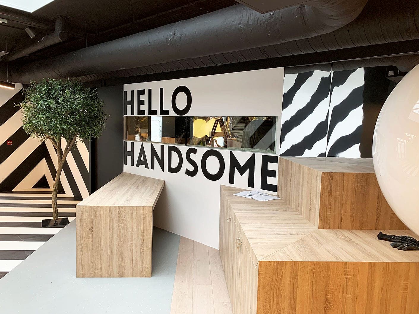
We learned most of what we know about that on Hatch, where we were appointed by John Paul Construction to work alongside Kingston Lafferty Design. The interior was built on angles: chevrons running out of the floor and up the walls, graphics wrapping corners, nothing meeting anything at ninety degrees. The signage was achieved largely in vinyl and manifestation, cut to exacting measurements so the wayfinding reads as part of the architecture.
Why student accommodation signage is its own discipline
The audience changes the design. Most residents are eighteen, living away from home for the first time, arriving on the same weekend as several hundred others, and plenty of them have just landed in the country. For about ten days the building is full of strangers under mild stress; for the other 355 it's full of people who could find their room blindfolded.
So the system has to be legible to a first-time visitor and more or less invisible to a resident. That argues for wayfinding built into the fabric: numerals at architectural scale, and graphics that make one identical corridor distinguishable from the next. Nobody reads a directional sign after Freshers' Week.
The brand does the wayfinding, up to a point
Operators compete on feel, and the interiors show it: student housing is now some of the most brand-forward work in Irish construction. We think that's mostly to the good. All that brand does real navigational work. A numeral two metres tall, a wall of pattern at the lift lobby, an amenity room with a name on it. These are landmarks, and landmarks are what people navigate by.
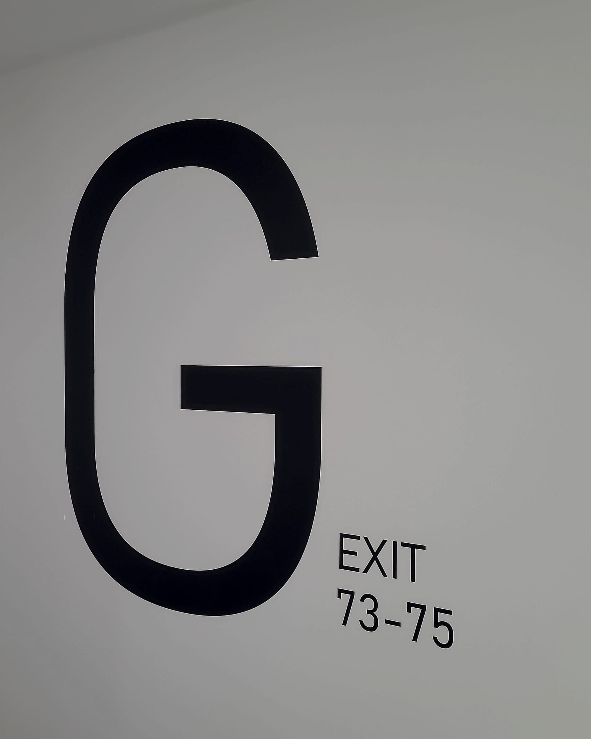
The failure mode is treating the graphic as the sign. A three-metre numeral at the stair core is a superb orientation device and a hopeless identification sign. No tactile text, nowhere near hand height, nothing a person with low vision can verify by touch. So we draw two layers. Environmental graphics do the orientational work at scale, and a quieter compliant sign family does the legal work at eye and hand height. They should look like one system, because they were drawn as one.
Treating the big graphic as the sign is the commonest mistake in student housing.
Numbering is the system
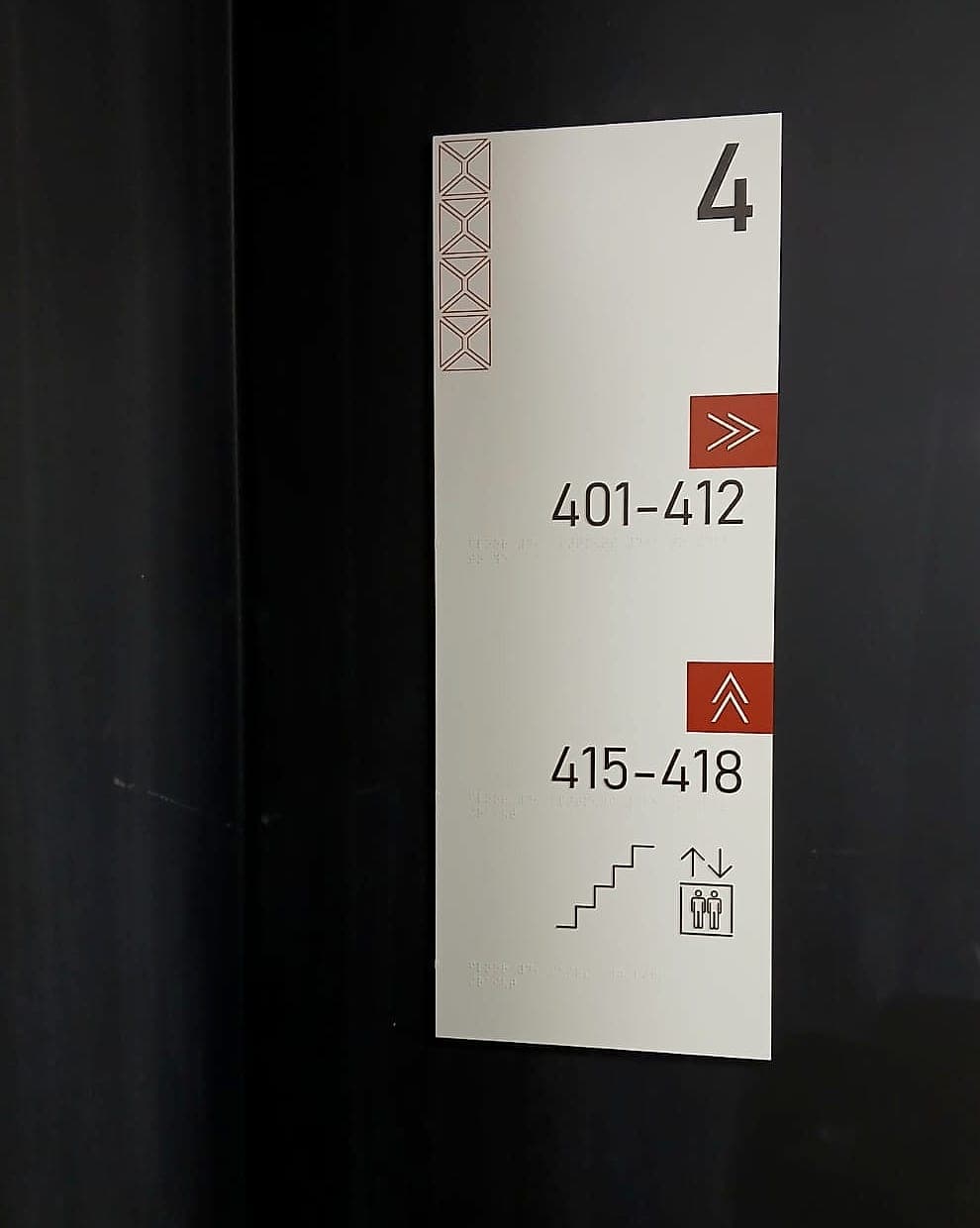
In a residence the numbering scheme is the wayfinding strategy, and almost every avoidable problem traces back to it. Room numbers should encode the level. Ranges should run in one direction and never wrap. Clusters should be numbered so a resident standing at 401 can predict where 412 is. Get that right and the level signs write themselves: a floor number, two ranges, an arrow each.
The harder part is that the number on the door has to match four other places: the housing-management system, the key or fob allocation, the welcome email, and the fire strategy drawings. When those drift apart the signage takes the blame, and the fix after handover is re-cutting panels for several hundred doors. Agreeing it once, in a destination schedule before manufacture, costs a morning.
Designed for the September handover
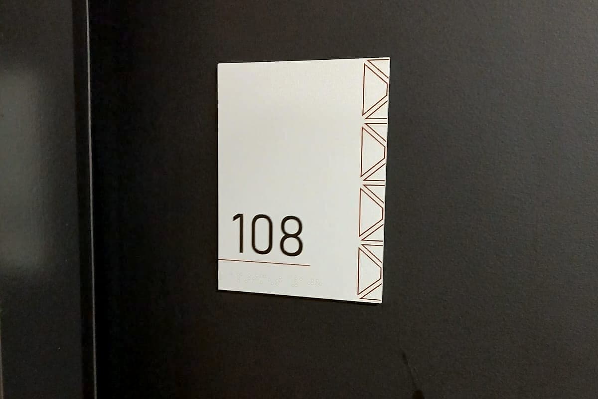
Annual turnover has a direct consequence: nothing on a wall should carry a person's name. Rooms are identified by number, staff areas by function, amenity spaces by what happens in them. What does change between years is the estate around the numbering. A room reallocated as accessible, a study lounge turned into a gym, an operator rebrand three years in. A system built for that uses a modular family: common panel sizes, replaceable faces, and one typographic rule that a new colour can be poured into. We hand over the sign schedule as a live document alongside the ten-year warranty, so a change in July is a panel order, not a redesign.
A decade of wear in three years
Student corridors take a beating. Suitcases at shoulder height, bikes through the bin store, laundry doors opened forty times a night, and a wet cloth over everything at waist level every week. The material specification has to answer that honestly, and most of the honest answers are unfashionable.
- Keep applied vinyl above the wear line. Cut graphics are economical on a large clean wall, but at suitcase height they lift at the edges within a year.
- Below about 1.5 metres, and on any door, use a panel sign with a mechanical or hybrid fixing. It survives cleaning chemicals, knocks and picking.
- Give the abused doors the most robust sign in the family, not the cheapest: laundry, bin store, bike store, plant.
- Specify surfaces that clean. Matt faces beat gloss for legibility and for marks; printed and encapsulated faces outlast painted ones.
- Plan for replacement, not repair. An attic stock of the ten most vulnerable sign types is cheaper than a call-out.
Fire, escape and the statutory layer
A residence full of young people asleep is a fire-safety brief before it is a design brief. In Ireland escape signage follows TGD B and the safety-sign rules: the running man drawn to ISO 7010, fire-door signage on every rated door, and evacuation plans posted where residents actually stand, which is the lift lobby.
There is a second duty in England. The Fire Safety (England) Regulations 2022 introduced a wayfinding-signage requirement in residential buildings over 11 metres: floor and flat identification on every landing of a protected stairway, visible in low light or smoke. Most student blocks clear 11 metres comfortably, so whether a given scheme is caught, and on what classification, is a question to settle at design stage. It's a miserable one to have at handover. See the 11-metre rules.
Accessibility, and the language question
Here, accessible signage is simply the specification. Part M and BS 8300 set the technical floor: around 30 LRV points of visual contrast between text and background, mixed-case lettering, tactile characters and braille on room identification, and mounting heights that work seated and standing. Technical Guidance Document M is explicit that signage should be as clear, short and concise as practicable. In a residence that reaches the accessible bedrooms, the accessible WCs and every route between them.
Language is worth checking early, because the answer depends on who owns the building. A hall run by a university or technological university sits inside the Official Languages Act, and its signage needs Irish and English at equal prominence; a privately owned block on the next street generally doesn't. Schemes change hands, though, and retrofitting a second language into panels sized for one is an expensive way to find that out.
- 30+
- LRV points of visual contrast, the accessibility baseline for text against its background
- 11 m
- the height above which English residential buildings need floor and flat identification in protected stairways
- ~20%
- saved when one supplier carries the scheme from design to installation
The schemes that work are the ones where brand and compliance were drawn by the same hand. Somewhere a nineteen-year-old wants to live, which still navigates for the person arriving at midnight with two bags. All of it is easiest while the numbering scheme is still a spreadsheet. Have a look at our residential work, or talk to us.
Building in residential? Talk early, while the naming decisions are still cheap.