
Hotel signage: luxury means never having to ask
In a hotel the test of the signage is simple: how rarely does a guest have to stop someone and ask where they are?
Hotel signage answers a guest's questions before they've had to ask one. Room numbering and floor identification, direction to the bar, the restaurant, the spa and the meeting suites, and a controlled back-of-house layer for staff. Success gets measured oddly here. It's how rarely anyone has to stop a member of staff to find out where they are.
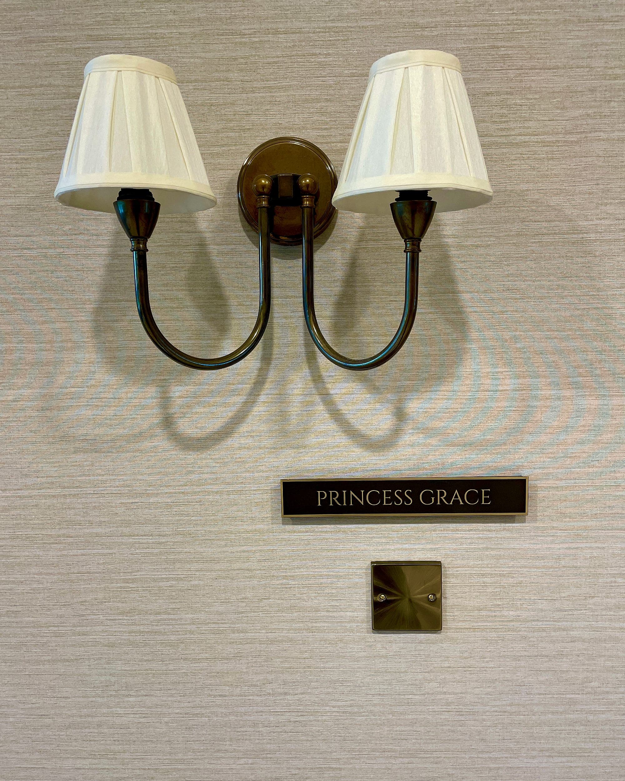
Walk the bedroom corridors at Carton House and you pass sconces, silk-weave wallcovering and framed prints. Then, at reading height beside a door, a brass plate the length of a hand with a room name engraved into it. Easy to overlook, impossible to misread. The answer sits exactly where the question occurs, in the material language of the building.
Discretion is the brief
Hotels are the one building type where the client's opening instruction is usually to make the signage less visible. They're mostly right, and we'll say so: most hotels we're handed do carry more signs than the building needs. It's a trap all the same. The reflex answer is smaller signs, lower contrast, fewer words, and it produces a system that photographs beautifully and then fails at eleven at night with a key card in one hand and a suitcase in the other.
The answer is fewer signs, better placed. A guest gets exactly the information their next decision requires, and nothing that belongs to a decision further along. Get the hierarchy right and the sign count falls on its own, which is what the designer wanted in the first place, arrived at from the other direction.
Every extra sign is an admission that the last one didn't work.
Materials, and the trap inside them
In hospitality the sign gets specified like ironmongery: brushed brass, bronze, oiled timber, back-painted glass, flat-cut acrylic sprayed to a bespoke colour, foil-blocked or engraved and hand-filled. It should match the door furniture and the lighting temperature it sits under. It should also age the way the rest of the interior ages. A warm brass patina is an asset; a laminated panel curling at the corner in year three is not.
The trap is contrast. Polished brass characters on a polished brass plate, or a tone-on-tone plaque under a warm 2700K downlight, can read as blank to an older eye. So we specify by light reflectance value. Mood boards get looked at under studio light; corridors don't have any. We keep a meaningful contrast step between the lettering and its plate, and again between the plate and the wall behind it, which is the Part M and BS 8300 baseline that Irish and UK practice both work to. Almost every luxury palette has a version that clears it: antique bronze with a light infill, dark plate with satin brass lettering, timber with a pale engrave. The constraint sharpens the design far more often than it spoils it.
Room numbering is the hotel signage that works hardest
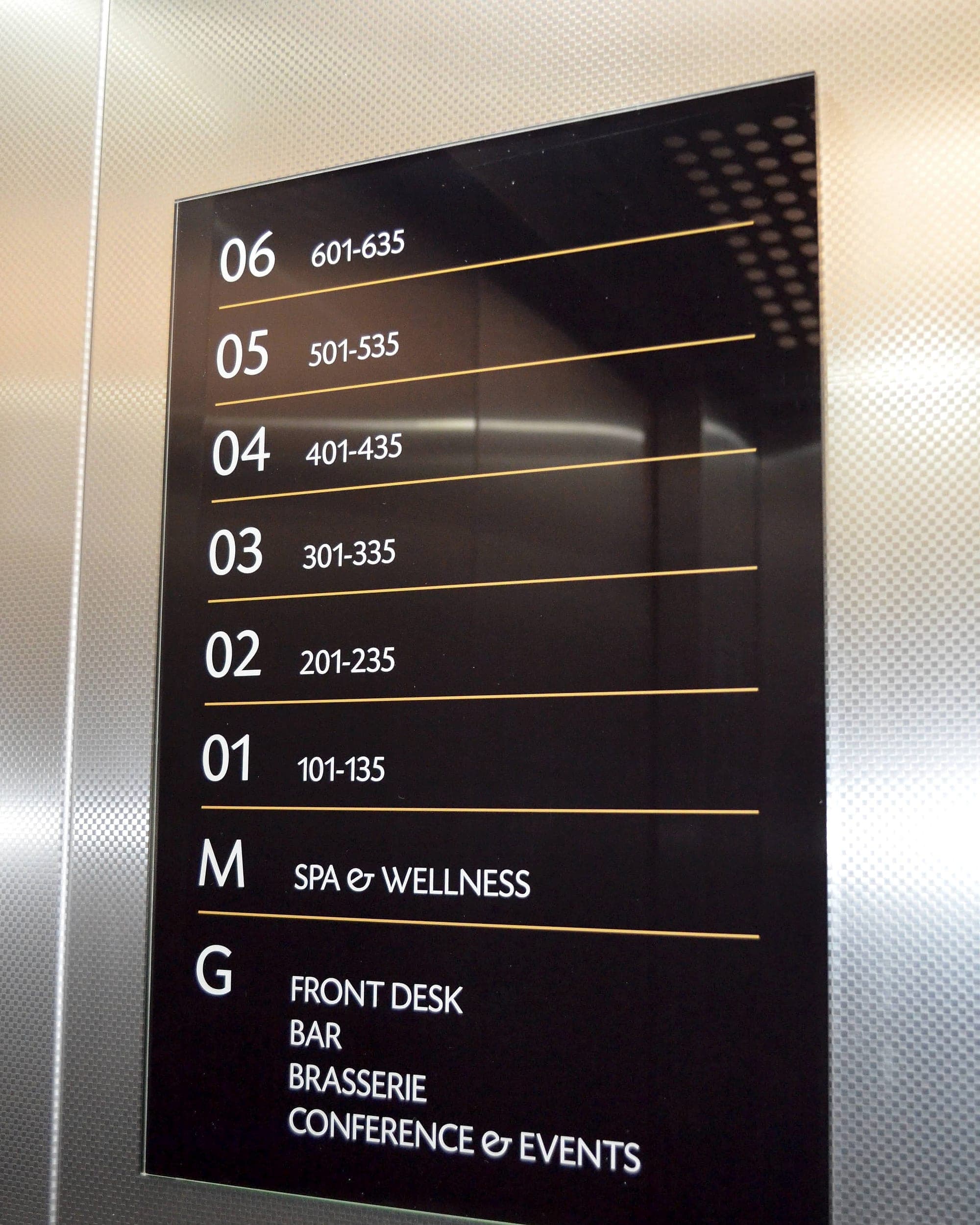
Nothing in the building is read more often than a bedroom number, and nothing is more often designed last. The rules are unglamorous. Number from the floor, so 418 announces its own level. Keep odds and evens on consistent sides of the corridor, and hold that through every wing. State the range at every decision point (the lift lobby, the fire door, the corner where the corridor turns) so nobody walks the length of a floor to discover they went the wrong way. And make the numeral legible at arm's length in low, warm, decorative light, because that's the only condition it will ever be read in.
Naming, where a hotel uses it, needs the same rigour as numbering: one agreed name per room, used identically on the sign, the reservation, the function sheet and the website. Rooms called one thing in the corridor and another in the diary are the commonest cause of a guest standing in the right place and asking whether they're in the right place. That's a room-naming problem more than a signage one, and it's cheapest to fix before anything is made.
Floor identification: re-orienting people as the doors open
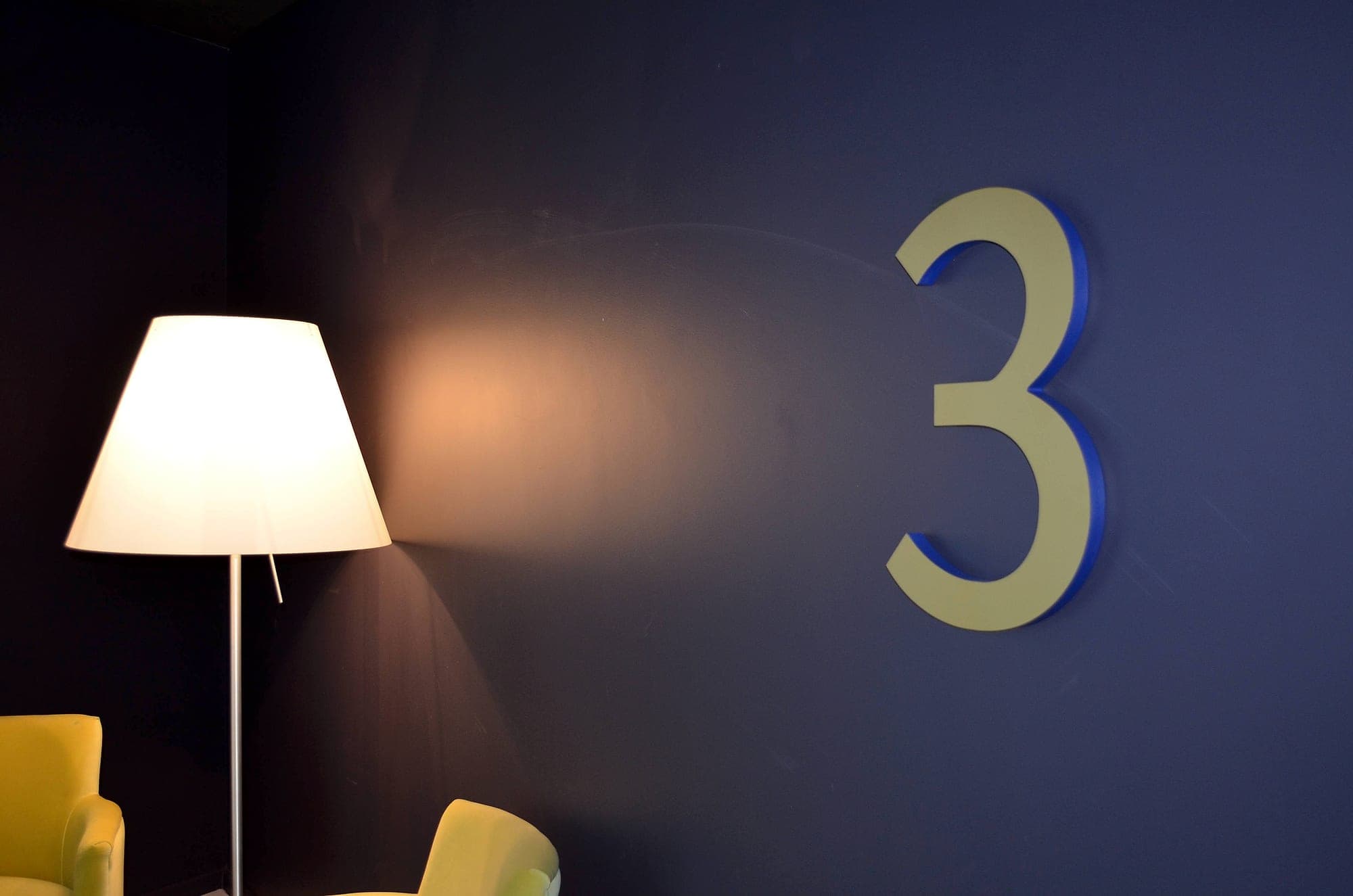
The lift lobby is where orientation gets lost and has to be handed back. A guest steps out facing a direction the building chose for them, having stopped thinking about the plan two floors ago. One oversized numeral, placed to be read from inside the car as the doors open, resets everyone at a glance. And because it reads as architecture, it usually gets an easier ride from the interior designer than a modest plaque would.
The public layers: food, drink, spa and events
A hotel is three or four businesses sharing an address, and each has a public who never uses the others. The restaurant and bar have to be findable by someone who came in off the street and has never seen the lobby, as well as by a resident coming out of a lift. The spa is a threshold as much as a destination, so the signage marks the change of register and then goes quiet. Meeting and event guests arrive in a single wave at ten to nine, all needing the same answer at the same moment. Event floors reward one confident directional read from the front door.
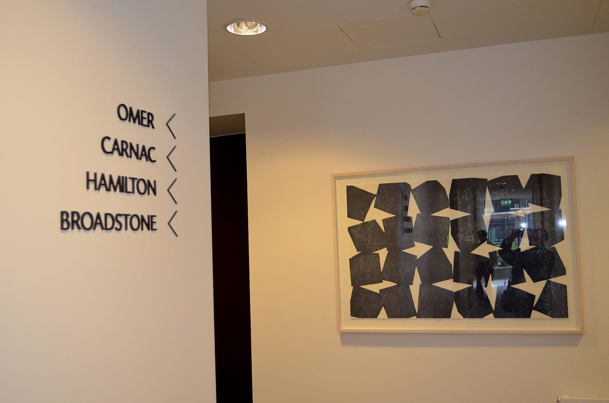
At Actons Hotel in Kinsale the bar, garden lounge and restaurant are resolved on a single wall in flat-cut lettering with chevrons and a WC pictogram: one stop, three answers, no panel. At The Marker on Grand Canal Square, named rooms are set directly on the plaster at a size that holds its own beside the artwork. Both come from the same decision, which is to size the sign to the wall instead of sizing the wall to a sign.
Back of house: the half a guest never sees
Behind the staff door the design language changes completely and the obligations get heavier. This is the half of the system an inspector looks at first:
- Escape routes, final exits and fire-fighting equipment identified to TGD B, using the pictogram forms of ISO 7010, adopted in Ireland as I.S. EN ISO 7010, so the symbol means the same thing to a night porter, a contractor and a guest.
- A fire-action notice in every bedroom and a plan showing the route from that door, which is standard practice in Irish and UK hotels and among the first things a fire officer asks to see.
- Plant rooms, risers, intake cupboards, roof access and isolation points labelled permanently and consistently, which is the difference between a five-minute fault and a two-hour one.
- Kitchen, laundry, chemical store and housekeeping signage: hygiene and allergen notices, hazard marking, and clean-to-dirty flow that reads at a glance to seasonal staff on their first shift.
- Staff-only thresholds treated as part of the wayfinding. A guest who wanders through a service door was failed by the public layer a few metres earlier.
Behind the staff door, the rules stop being about taste.
Where compliance meets discretion
Accessibility isn't a separate scheme running alongside the elegant one. Part M of the Building Regulations and its technical guidance set the floor for Irish hotels, with BS 8300 used throughout Irish and UK practice for the detail: adequate visual contrast, mixed-case lettering, mounting heights that work seated and standing, and tactile and braille identification where it does real work: accessible WCs, accessible bedrooms, lift lobbies, stair cores. Accessible rooms in particular need signage a guest can find and confirm without asking at the desk, which is the entire point of booking one.
One clarification worth having early. The Official Languages Act binds public bodies, not private hotels, so bilingual provision in a privately owned hotel is a brand decision. It becomes an obligation the moment a venue is state-owned or operated by a public body, and plenty of conference and event venues sit on exactly that line. Everything we supply is made to Part M and BS 8300 by default, and we certify compliance on handover, which turns the accessibility conversation into a document instead of an argument.
The systems guests praise are the ones they never consciously used. Fitting out, rebranding, or repairing a hotel that has been re-signed four times by four suppliers? Have a look at our hospitality work, or talk to us while the room names, the numbering logic and the finishes schedule are all still on paper.
Building in hospitality? Talk early, while the naming decisions are still cheap.