
Multi-sensory wayfinding: touch, sound and light as navigation
Navigation that reaches more than one sense: tactile, audio and luminous. Which layers are already required, which are cheap, and which are worth the spend.
Multi-sensory wayfinding is navigation designed to reach more than one sense: raised lettering and braille for touch, audio beacons and app-free markers for hearing, and light, colour and surface texture for the eye and the foot. It exists because printed words are a single fragile channel. They fail anyone who can't see them, can't read them at speed, or isn't looking in the right direction at the moment they need them.
It's really two conversations. Most of a multi-sensory system is already required, already cheap, and routinely done badly. A smaller part is genuinely expensive, needs an owner and a maintenance budget, and gets specified for the wrong reasons. Telling the two apart is most of the skill.
Each sense has a range
Think about the three channels physically. Each works at a different distance and carries a different amount of information. Touch works at zero distance and is unambiguous: a hand on a sign either finds the word or it doesn't. Light works the length of a corridor and carries almost nothing precise. It can say here, not there. Out, not in. That's the end of its vocabulary. Sound works at distance, can be directional and carries the most information of the three, but it's the only channel that usually needs the visitor to be carrying something.
Ask a channel to work outside its range and it will fail, however well it's made.
Systems fail when a channel is pushed outside its range: a tactile map that expects a stranger to plan a route by fingertip, or a lighting scheme asked to distinguish Ward 4B from Ward 4C. Layer them by what each is good at and the building itself starts carrying some of the load.
Touch: the layer that is already required
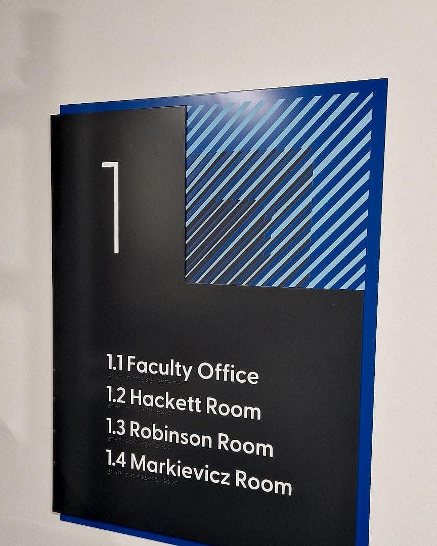
Tactile provision is the part of multi-sensory wayfinding that isn't optional. Part M and BS 8300 expect raised lettering and braille at doors and key locations, mounted in the 1400–1700mm band, on the latch side, in matt finishes a hand can read without glare fighting the eye. The technical rules are their own subject: relief depth, character height, uncontracted braille set beneath the text. What matters strategically is simpler. A tactile sign only works if a hand can find it, which makes consistency of position more load-bearing than any detail on the panel.
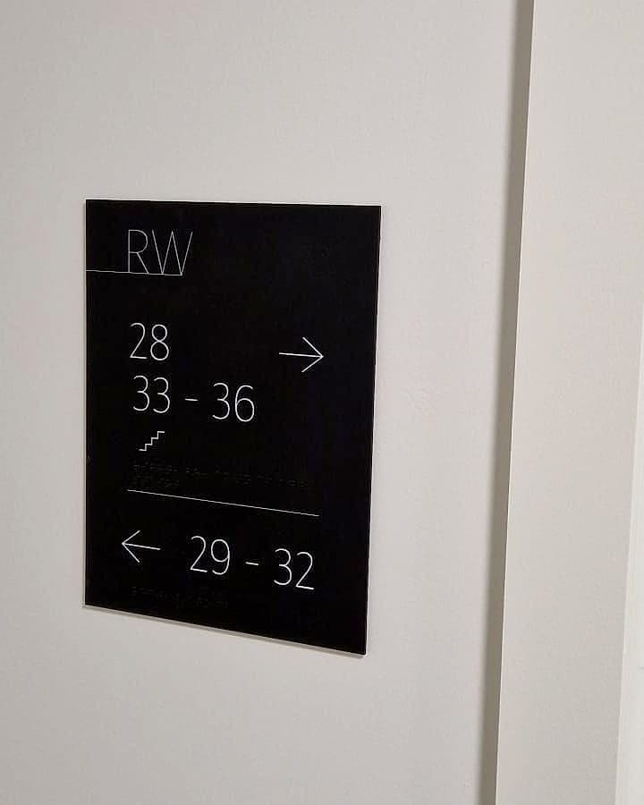
The more interesting move is to carry touch beyond the door. At Rathborne Wharf, the corridor directionals in the apartment blocks carry braille under every destination line, not only on the flat numbers at each door, so the sign answers which way as well as which room. Small manufacturing decision, disproportionate effect. It turns a set of tactile labels into a tactile route.
Tactile maps: most requested, least used
Raised-line plans are the first thing clients ask for when accessibility comes up, and the layer we most often talk them out of. A tactile map asks a great deal: a fixed body position, a legend learned in advance, and the patience to build a plan of a building through a fingertip aperture the size of a coin. Most people who read braille navigate by remembered routes and by speech. Cartography doesn't come into it. That said, there are conditions in which tactile plans do work: a simple, symmetrical building, a fixed position at the main entrance, a short spoken route description alongside. Meet those and they're worth doing properly. In a complex building the same money buys far more navigation spent on a well-lit, well-named route with tactile confirmation at every decision point.
Sound: beacons, markers and the maintenance question
The audio layer splits on one question. Must the visitor install or carry something? Bluetooth beacons broadcasting to a building's own app are powerful and almost always under-used, because they serve only the people who already have the app, and in a hospital or a civic building that's close to nobody arriving for the first time. Camera-read markers are the more honest answer for public buildings. They can be read at several metres, off-angle and on the move, and NaviLens and app-free navigation is where that technology has gone. Either way, audio is the only layer with a running cost. Batteries, firmware and content all age, and a spoken direction that has gone stale is worse than silence, because it is believed.
Light: the cheapest channel, and the one nobody specifies
Light moves people before anything is read. A corridor with daylight at its end pulls. A lift lobby lit a stop brighter than the corridor says a decision happens here. A dim recess reads as private whatever the sign on it says. None of this appears on a signage drawing, and all of it is free if the lighting layout and the wayfinding strategy are coordinated at design stage. Leave it and it surfaces at snagging, when the electrician is long gone. That coordination protects the signs themselves too: a compliant panel under a badly aimed downlight throws the light straight back as glare and vanishes, particularly for the ageing eye, which is most of the argument for low-vision design. Light the sign, not the corridor average.
Where multi-sensory wayfinding is worth the spend
In nearly 50 years of designing, supplying and installing wayfinding across hospitals, campuses and residential schemes, the sequence that holds up is dull and consistent. Do the tactile layer everywhere it's required, and do it properly: same height, same side, matt, checked on completion by somebody with a tape. Coordinate light at every decision point, early, while it still costs nothing. Use a change of floor finish or texture to mark thresholds where a level or a zone changes. Then, and only then, consider audio, and only where there's a named owner, a maintenance budget and enough repeat traffic to justify both. That test rules audio out of most single buildings and rules it firmly into transport interchanges, large public campuses and hospitals with an app already in patients' hands.
Layers, not alternatives
The failure mode worth naming is substitution: braille specified as though it discharges the duty to make signs legible, or an app specified as though it excuses a building that can't be read. Multi-sensory wayfinding is additive. Each channel confirms what the others have already suggested, and a person using any one of them alone should still arrive. Redundancy is what lets a system survive a burnt-out lamp, a flat battery, or a visitor who has never been here before.
If you're specifying now, the cheap decisions are still open: mounting heights, lighting coordination, whether the tactile layer follows the route or only the doors. An accessibility audit will tell you which of your layers is doing real work, and a conversation costs nothing while the drawings can still absorb the answer.
Planning a wayfinding project? Talk early, while the big decisions are still cheap.