
Sign placement: the science of the decision point
Most signs that fail, fail by geography. Where people pause, what they can see from the approach, and the walk that finds the right walls.
Sign placement is the discipline of putting wayfinding information where people actually make decisions: at junctions, lift lobbies, thresholds and stair cores, at heights and on sightlines their eyes will find without being asked. It decides whether a signage scheme works, and it gets a fraction of the attention the graphics get. Most signs that fail in use fail by geography. The panel is handsome. It's on the wrong wall. Given the choice we'd take a plain sign in the right place over a beautiful one six metres past the turn, and it isn't close.
You can verify this in any large building. Stand in the lobby for ten minutes and follow a first-time visitor. Nobody flows. People travel in bursts: walk, stop, look, decide, walk again. And the stops happen at the same handful of places for everyone, where the route forks, where the lift doors open, where a corridor turns and surrenders its view. Those pauses are the whole game. Nearly everything we know about placing signs we learned by watching them in hospitals, on campuses and in hotels.
Where people decide
Wayfinding research calls these pauses decision points, and the idea does most of the heavy lifting in how wayfinding actually works. A building has a finite set of them: the entrance threshold, every junction where routes divide, the lift lobbies and stair cores where people change level and lose their bearings, and the door itself. Between decision points, people need reassurance at most, and often nothing at all.
The corollary is strict. Every panel that isn't answering a question at a decision point is diluting the ones that are. So when we plan a scheme, each message in the destination schedule is assigned to a decision point first and to a wall second. The question is never “where is there space for a sign?” It's “where does the journey hesitate?”
A sign at a decision point is navigation. Anywhere else, it's decoration.
Sightlines: seen before it is needed
The decision point tells you roughly where a sign belongs; the sightline tells you exactly. A sign only exists if it's visible from the line of approach, which usually means set perpendicular to travel or on the surface that faces you as you arrive, and it has to appear early enough in the approach to be acted on. At the Marker Hotel, the bedroom directions sit on the corner itself, on the face guests see as they walk towards the turn. The choice gets resolved in stride, without a stop.
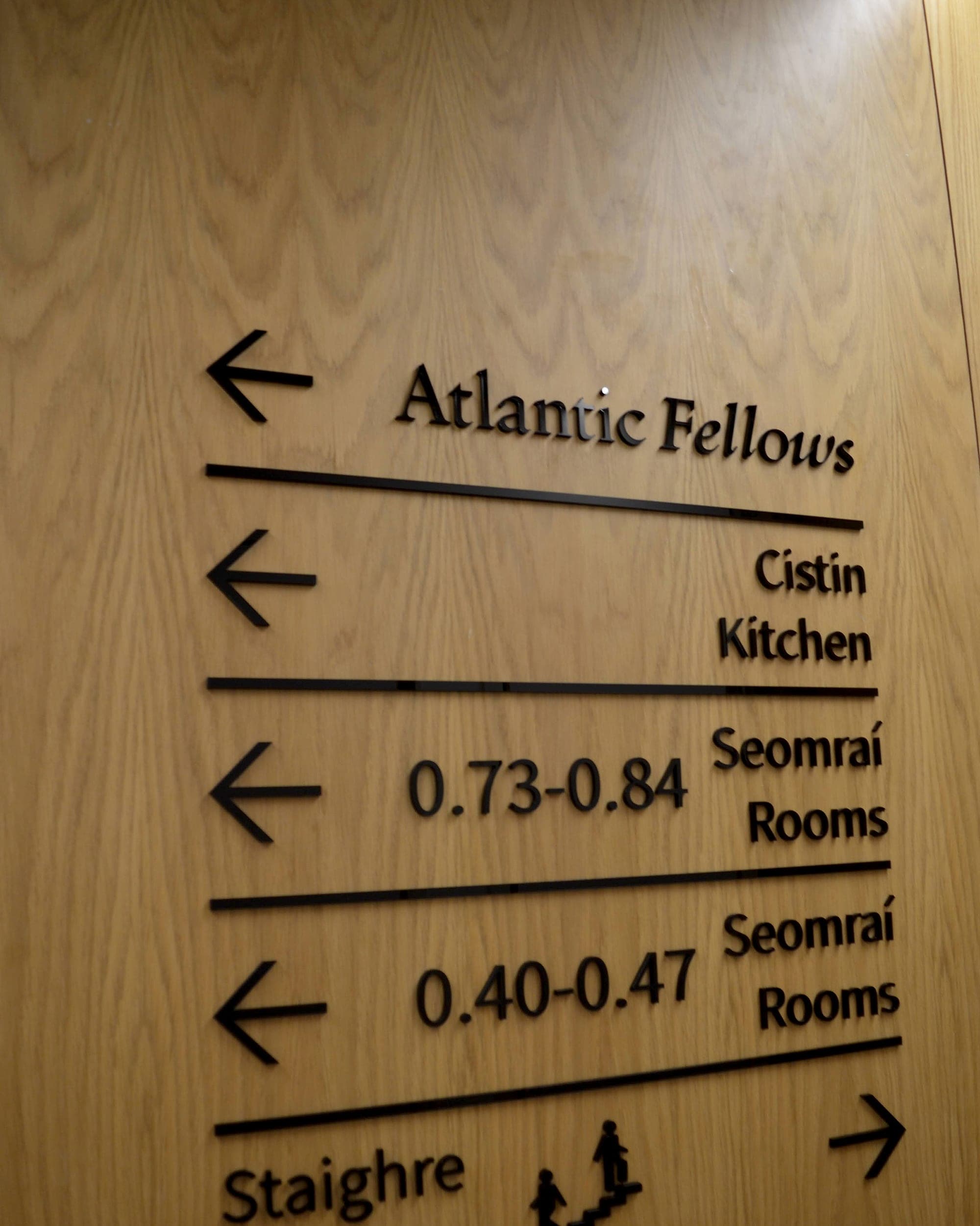
Sometimes no wall faces the approach at all: long straight runs, wide circulation, glazing where a panel would drown in glare. Then the sign comes off the wall and into the sightline, as a projecting blade read along the corridor or a panel suspended overhead, clear of doors and display walls. Height buys reading distance only if the lettering keeps pace; as a conservative working rule, allow 25 mm of capital height for every 3 metres of viewing distance. And a sign competes with everything around it. A junction crowded with notices, artwork and fire equipment is a junction where the one panel that matters has to shout.
Mounting heights: a range, not a number
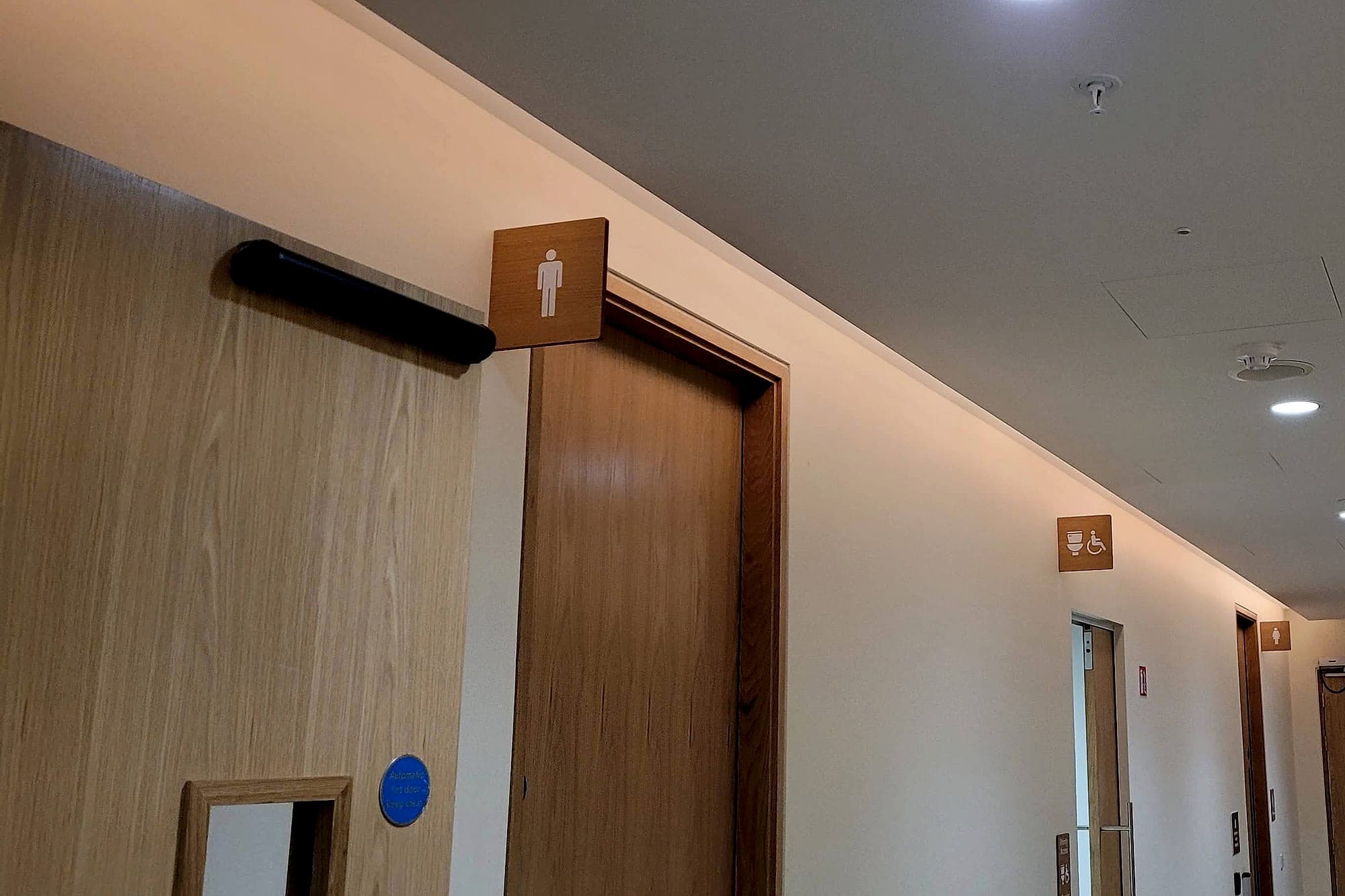
Height is where sign placement meets accessibility, and the standards are usefully blunt. Guided by BS 8300 and Part M, wall-mounted directional and door signs sit with their centreline roughly 1,400–1,700 mm above the floor, a band read comfortably by a standing adult and a wheelchair user alike. Signs meant to be touched drop to where a hand naturally falls; suspended panels need at least 2.1 m of clear headroom, and more in new work. The Irish guidance is set out in Technical Guidance Document M.
The numbers matter less than the habit of thinking in ranges. Eye level isn't a point; it spans a child, a seated adult and a standing one. Consistency matters as much as the band itself, because height teaches people where to look for the next sign. A scheme that keeps its promises about position gets read; one that wanders up and down the wall gets ignored by the second junction.

Sign placement is decided on your feet
This is why our method is almost embarrassingly analogue: we walk the building. Every project starts where a visitor's day starts, at the car park or the street, and we walk each journey as strangers with the draft schedule in hand:
- Walk every major journey from true arrival: the gate and the car park, not the front door.
- Mark each hesitation: forks, lift lobbies, thresholds, long blind runs.
- At each one, stand on the approach line and record what a stranger can actually see, including the daylight, the clutter and the fire doors the drawings omit.
- Assign messages from the destination schedule to those points and nowhere else.
- Only then choose sign types, sizes and exact fixing heights.
A floor plan will not show you the glazing that turns a panel into glare at three in the afternoon, the services hatch in the middle of the perfect wall, or the corridor that feels twice as long on foot as it scales. At the National Rehabilitation Hospital, the walk is what told us where a corridor needed reassurance and where it needed silence. Existing buildings get the same discipline as new ones; this walk is the heart of every wayfinding audit we run. It costs a day that a tight programme would rather spend elsewhere, and it's the first thing squeezed when the programme tightens. That day comes back in return visits.
Drawings don't get lost. People do.
What good placement buys
A scheme placed at decision points, on true sightlines and inside the accessible height band needs fewer signs, and gets more out of each one. Fewer panels to design, manufacture, install and maintain is the least of it, though it is real money. The bigger return is a calmer building: staff interrupted less often for directions, visitors arriving on time, signage that recedes into the architecture because it only speaks where it's needed. That economy is designed in at the wayfinding design stage. No installation crew can rescue a schedule drawn on the wrong walls.
If a building you run, or one you're still drawing, has signs that people walk past while lost, the fix rarely starts with new graphics. It starts with a walk. Talk to a wayfinding specialist and we'll bring the method.
Planning a wayfinding project? Talk early, while the big decisions are still cheap.