
Wayfinding design beyond signage: landmarks, sightlines and desire lines
The most navigable buildings barely need signs. On landmarks, sightlines, light and desire lines: the layer of wayfinding that lives in the architecture.
Wayfinding design is the shaping of a whole journey through a place. Landmarks, sightlines, light and surface graphics let a building explain its own layout. Signage comes at the end of that, to confirm it. In the most navigable buildings the architecture has answered the question before anyone reads a sign, and if you stripped the signs out of a genuinely well-planned building most visitors would still, somehow, arrive.
The proof we keep coming back to is a corridor in Dún Laoghaire. At the National Rehabilitation Hospital, a corridor is not simply a route between departments; for many patients it is the day's work, the place where walking is relearned metre by metre. A plain corridor gives that effort nothing to hold on to: no destination, nothing to measure against. So the walls were given a job. Sports-themed graphics run the circulation routes at full wall height, colour gathers at each ward hub, and the corridor stops being a distance and becomes a sequence of places. As far as the swimmer today. Past the sprinter by Friday.
Nobody would call those graphics signage. No arrow, no department name, nothing that needs certifying. But they are wayfinding in its fullest sense: they give a long, repetitive building a memorable structure, and they let a patient, a visitor and a physiotherapist agree on where to meet without anyone quoting a room code. This essay is about that layer, the one underneath the signs.
The building speaks first. Signage only confirms what the place has said.
Wayfinding design begins with the building
Kevin Lynch mapped how people hold cities in their minds in The Image of the City, still the discipline's foundation stone, and found five elements doing the work: paths, edges, districts, nodes and landmarks. Signs appear nowhere on the list. We navigate by the shape of a route, the boundaries we cross, the character of the area we're in, the junctions where choices happen and the objects we remember. Good wayfinding takes that seriously. It treats the building itself as the primary medium, and asks what the architecture, the light and the surfaces can say before a single panel is specified.
There is a hard commercial edge to this. Every question the environment answers is a sign that never has to be designed, manufactured, installed or maintained. The most expensive schemes we come across are the ones compensating for a building that says nothing: arrows multiplying through corridors that all look the same, each new sign an apology for the last. Do the wayfinding design early and you spend less. We have also been the supplier adding those arrows, more than once, and it is only fair to say that it never worked. The building was still silent. It just had more signage on it.
Listen to anyone giving directions indoors: past the big mural, left at the red desk, the lift beside the fish tank. People steer by landmarks and always have; room numbers arrive last, if at all. A landmark only works if it is visible from the routes that matter, easy to describe over the phone, and singular. Two identical murals are worse than none, because a landmark that repeats stops being a place and becomes a pattern.
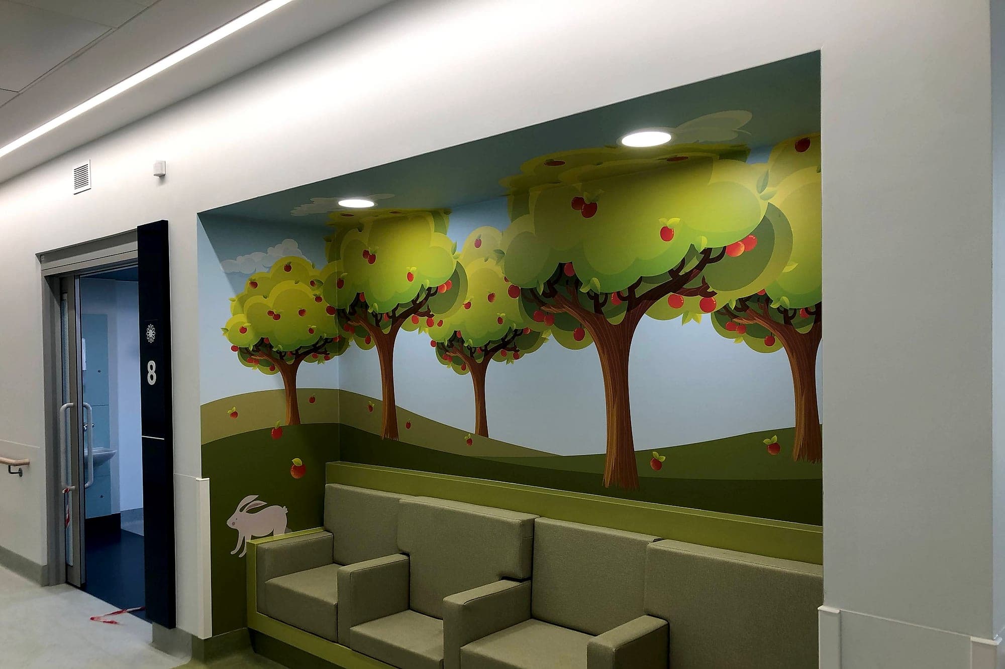
At Temple Street Children's Hospital the landmarks were designed in deliberately: murals, characters and colour-washed walls, each one nameable by a child. "We're beside the jungle" is a wayfinding instruction, and it works for a five-year-old, a grandparent and a porter alike, in any language. The same logic reaches well beyond paediatrics. For people living with dementia, a memorable object at a decision point does work no amount of text can do. For everyone else it simply makes the building describable.
Sightlines and light
The cheapest wayfinding device in architecture is a clear line of sight. A reception you can see from the front door needs no directional sign. A stair visible on arrival gets used; a stair tucked behind a fire door becomes a rumour, and the lift queue grows. Every destination that advertises itself, whether that is the desk, the stair or the courtyard beyond the glazing, removes a decision from the journey. Lose a key destination from view and the signage system inherits the debt. Given the choice, we would trade a floor's worth of directional signs for one stair you can see from the door.
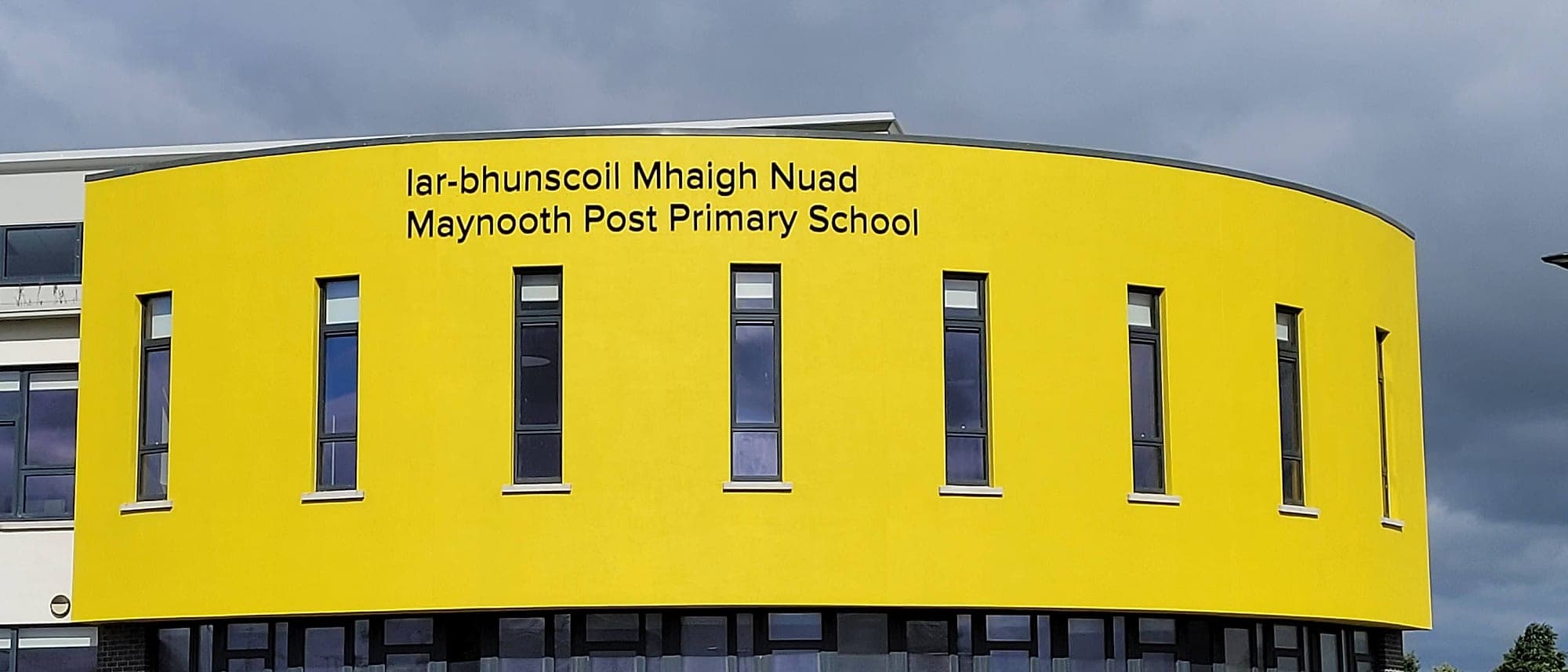
Light does the same work, less visibly. People drift toward brightness. Daylight at the end of a corridor pulls movement toward it, and the best-lit route reads as the main route whether or not it is. A lighting plan and a wayfinding plan are rarely drawn by the same hand, though they describe the same journeys, and when they disagree the light usually wins. It starts before the front door: a building whose entrance announces itself in form and colour has done the first job of arrival signage without a letter being fixed to a wall.
Desire lines: the routes people take anyway
Every campus has one: the worn diagonal in the grass where the paving insisted on a right angle. Landscape architects call them desire lines, and they are the most honest drawing a building will ever produce, the users' own plan recorded by their feet. Fighting a desire line rarely works. A rope, a hedge, a Keep Off sign: the line reappears a metre to the left. The wiser move, indoors and out, is to read it as evidence and design with it.
A worn line in the grass is user research nobody commissioned.
Indoor desire lines are subtler but just as real: the corner everyone cuts across a lobby, the goods lift staff use because it's nearer, the spot where visitors stop dead and look up. That last one is precisely where the few signs you do make should hang. When we survey an existing building we walk it at its busiest, watching for hesitation, doubling-back and the routes people invent for themselves. Signage that ignores the desire lines ends up beautifully placed on journeys nobody takes.
Floors and walls: the graphic layer
Between architecture and signage sits environmental graphics, the layer that can still be added once the concrete is poured. A floor inlay tracing the route to a main stair. Zone colour applied to the building itself, to a painted lift core or a bulkhead, at a scale no small panel can reach; we've unpacked that discipline in our essay on colour. Then supergraphics: names and numerals at a size no sign could carry, turning a wall into landmark and label at once.
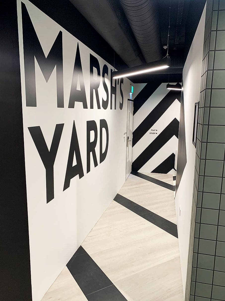
At Hatch Student Accommodation in Dublin, the shared courts and social spaces name themselves at full wall height: Marsh's Yard in letters a metre tall, chevrons carrying the movement around the corner, the floor joining in underfoot. Ask a resident three weeks into their first term where they live and you won't get a door number. You'll get the black-and-white yard. Navigation, identity and placemaking arrive in a single gesture, which is why supergraphics are so often the highest-value line in a wayfinding budget.
Where signage still earns its place
None of this retires the sign. Statutory and fire-safety signage isn't optional, tactile and braille information for blind and low-vision users can't be a mural, and at a genuine decision point a well-placed directional sign is still the most efficient instruction ever devised. What changes is the proportion. Where the architecture, the landmarks and the graphics are doing their share, the signage system can stay small and calm, confirming what the visitor has largely worked out already.
Mostly it comes down to the order of operations. Landmarks, sightlines and desire lines are cheap to shape on a drawing and expensive to retrofit around. Signage can be added at any point, which is exactly why it becomes the default patch for every environmental silence. If you're planning a building, or trying to coax one that says nothing into speaking, the best time for that conversation is while the walls are still drawings. We're happy to have it early.
Planning a wayfinding project? Talk early, while the big decisions are still cheap.