
Wayfinding symbols and pictograms: the shared language of navigation
The fastest layer of any signage system is the one with no words. On ISO 7010, custom pictogram sets, bilingual buildings, and how to find out whether anyone understands your symbols.
Wayfinding symbols are the pictograms a building uses to communicate without words: the figures, arrows and icons that tell any visitor, in any language, where to find the toilets, the stairs, the lift, the way out. They're the fastest layer of a signage system. A well-drawn pictogram is recognised in a fraction of the time a word takes to read, and it keeps working for the visitor who can't read the language at all.
That speed isn't a nicety. In nearly 50 years of designing, supplying and installing wayfinding for hospitals, universities, hotels and county councils, we've watched symbols do work no amount of text can: carry one meaning across two languages on a single small panel, survive a glance from the far end of a corridor, reassure a visitor with no English. What follows is how that shared language works. Some of it is fixed by standard, some of it allows real character, and all of it should be tested on somebody who wasn't in the room when it was drawn.
When a symbol beats a word
Words are precise but slow. Reading is a learned decode, letter shapes into sounds into meaning, and it degrades quickly with distance, speed, stress and unfamiliarity with the language. A pictogram skips the decode. The figure of a person, the outline of a shower, an arrow: the eye matches these against memory, and the match lands faster and from further away than any word set at the same size. So the symbol goes at the top of the sign. The word goes on the line beneath it.
The clearest demonstration is the one every building needs: the toilet sign. At the Marker Hotel in Dublin, a black cube projects from the corridor wall carrying two figures and nothing else. There's no language on it to translate and nothing to squint at. A guest from any country reads it in a glance from fifty metres, at an angle, walking. No word could do that job at that size.
Nobody reads a good pictogram. They recognise it, and recognition is faster.
It's worth being honest about why this works, because it shapes everything else here: most pictograms succeed by convention. The male and female figures don't look like toilets. They work because generations of airports, stations and public buildings, from the celebrated DOT/AIGA symbol set of the 1970s onward, have taught the whole travelling world what they mean. A symbol's value sits in that shared training. Redraw one too freely and you're drawing down an account you didn't open.
ISO 7010: where symbols are fixed by standard
At one end of the spectrum sit the symbols nobody is allowed to restyle. ISO 7010 registers the safety signs: the green running man of the emergency exit, fire-fighting equipment, prohibition, warning and mandatory-action signs. It registers them so they mean the same thing in every building on earth. The whole point of the standard is the absence of creativity. A fire exit symbol that has been made more elegant, more on-brand or more minimal is a worse fire exit symbol, and in Ireland and the UK it's a non-compliant one. We treat the ISO 7010 families as fixed type: specified, never redrawn.
Close behind sits the International Symbol of Access, the wheelchair symbol, which carries statutory weight in accessible provision and the same rule of thumb: use it exactly, in the standard form, or not at all. The lesson generalises. The more critical the message, the less room there is for character.
Custom pictogram sets: where character is allowed
Everything else is governed by convention alone: toilets, showers, lifts, stairs, cafés, classrooms, prayer rooms, bike stores. This is where a wayfinding designer earns their keep. A custom set can carry the character of a place, rounder and warmer for a children's hospital, finer for a five-star hotel, plainer and more robust for a campus. Custom never means arbitrary, though. A set that works is drawn as a family: one grid, one stroke weight, one corner radius, one level of abstraction, so the symbol for a shower and the symbol for a lecture theatre are recognisably siblings. The moment icons are gathered from three sources, the eye reads the inconsistency before it reads any single symbol.
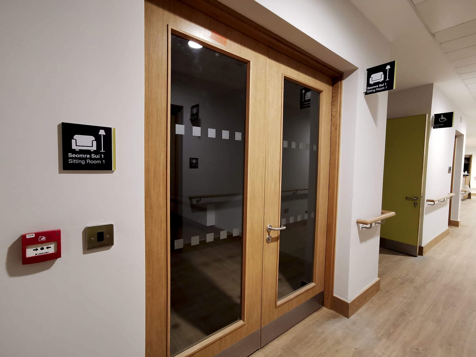
The second discipline is humility about novelty. A pictogram for a classroom or a changing place has no airport heritage behind it, so it starts with an empty account and has to borrow its clarity from composition and context. For the University College Dublin estate we drew room-function pictograms on a single grid, each paired with its bilingual name and room number, with tactile and braille provision built in. The symbol gives the glance, the words give the certainty, and after a few corridors the visitor has learned the symbol. Most buildings commission more custom symbols than they need. A set of a dozen, drawn well, will outperform forty.
The bilingual case: one symbol, two languages
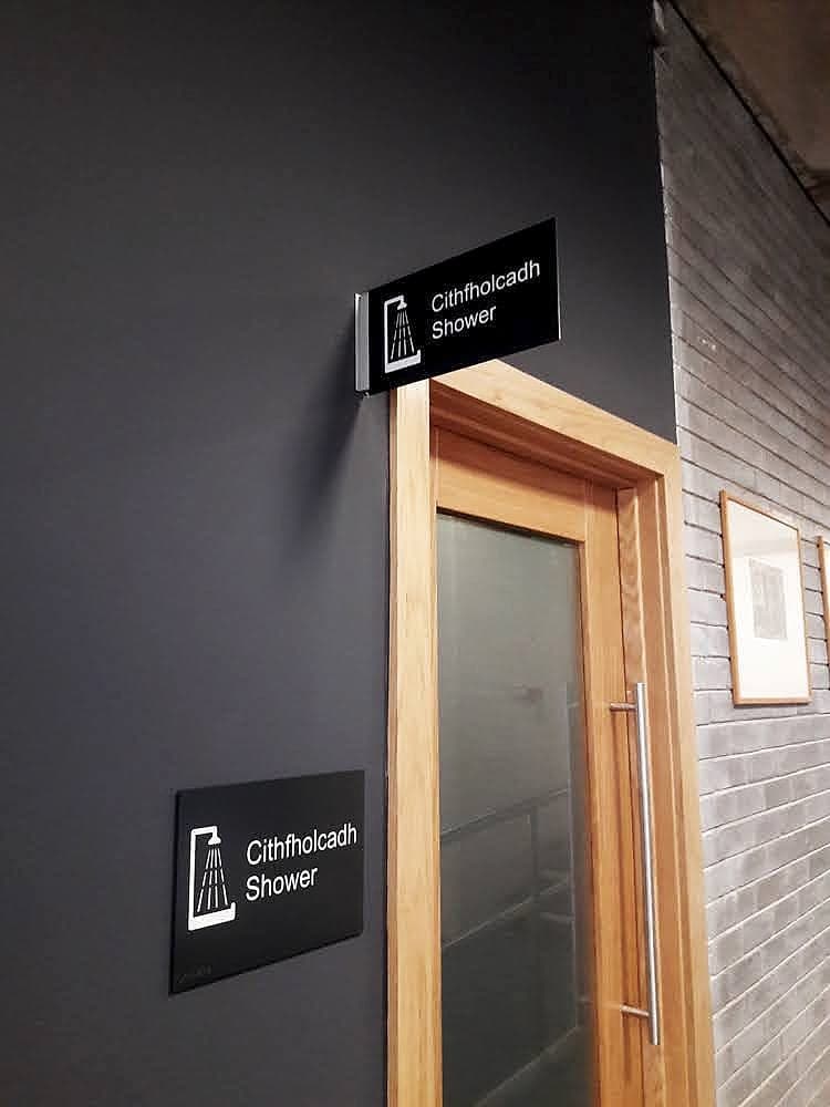
Ireland gives pictograms a job they rarely get credit for. Under the Official Languages Act, public bodies sign in Irish and English with equal prominence, which on a small panel means twice the text competing for the same area. A pictogram is the release valve. It carries the meaning once, above both languages, so neither has to shout, and the visitor who reads Irish, the visitor who reads English and the visitor who reads neither all take the message from the same symbol. In the Tierney Building at UCD, a shower room announces itself as Cithfholcadh and Shower. The pictogram does the finding; the words confirm it.
Testing wayfinding symbols: the two-thirds rule
Because pictograms work by convention, the only way to know whether one works is to ask people who have never seen it. There's a formal method for this. ISO 9186 sets out comprehension testing for graphical symbols, with the working benchmark that at least two-thirds of respondents should correctly state what a public-information symbol means before it can be trusted to stand alone. Nobody commissions the full study for a single building, but the discipline scales down honestly:
- Test cold. Show the symbol at final size to people who had no part in designing it, whether that's reception staff, students or a contractor's apprentice, and ask one question: what does this mean? Explaining it first invalidates the answer.
- Test the set, not just the star. Comprehension errors are usually collisions: the lecture theatre read as the cinema, the multi-faith room read as the library. Show symbols in pairs and watch for the confusions.
- Test at distance and in place. A symbol that's charming at arm's length can dissolve into an ambiguous blob at eight metres; counters close and details vanish exactly as they do in wayfinding typography.
- Believe the failures. If a symbol needs its word to be understood, keep the word permanently. A pictogram that scores badly has told you something useful, so don't argue with it.
The rules we hold to
Our working rules for symbols, distilled. Never redraw a safety symbol or the wheelchair symbol; specify the standard forms exactly. Draw everything else as one family, on one grid, at one weight. Pair every symbol with its word at first encounter, and let a symbol stand alone only where the building has already taught it, which the toilet cube has and a new classroom icon hasn't. Size and contrast symbols with the same rigour as lettering, because a pictogram is subject to the same optics. Then test on strangers before anything is committed to metal. The designer is the one person in the building who can no longer see the symbol with fresh eyes, which is how a set that reads perfectly to the people who drew it stops a first-time visitor dead at the door.
A symbol set is a small thing that touches every sign in the building, which is why we draw it early, inside our wayfinding design work. Clip-art gathered at the end never survives the corridor. If your project has two languages, an international audience, or a brand with opinions, talk to us while the vocabulary is still being written.
Planning a wayfinding project? Talk early, while the big decisions are still cheap.