
ISO 7010: the safety symbols every building must speak
The registered symbols that have to mean one thing in every building, whatever the language: prohibition, mandatory, warning, safe condition, fire equipment, and how to specify each of them.
ISO 7010 safety signs are the registered graphical symbols the international standard fixes so that a safety message means the same thing in every building, in every country, to a person who can't read a word on the panel: the green running man, the blue disc, the yellow triangle, the red circle with a bar through it. What the standard hands you is a catalogue. Each symbol has a reference code, one drawn form, and no permitted variations.
In nearly 50 years of supplying statutory signage alongside wayfinding, this is the line of the schedule most often filled in from habit: "fire exit sign", "no smoking". Habit is exactly what the standard replaces. The families below are the whole vocabulary.
The four families of ISO 7010 safety signs (and the fifth, for equipment)
Shape and colour do the first half of the communicating, before the eye has resolved the symbol at all. They come from ISO 3864-1, the design-principles standard sitting behind the register of safety signs, and each symbol carries a letter prefix naming its family. The percentages below are from the Irish workplace regulations, which govern how much of a sign the safety colour must occupy.
- Prohibition, prefix P. A circle, black symbol on white, red band and a diagonal bar at 45 degrees, red covering at least 35% of the sign. It means do not, and nothing softer. P002 is no smoking.
- Mandatory, prefix M. A blue circle, white symbol, blue at least 50%. It means you must: eye protection here, ear protection there, this fire door kept shut. M001 is the general mandatory-action sign.
- Warning, prefix W. A yellow equilateral triangle, black border and black symbol, yellow at least 50%. It means take care: a hazard you can't always see. W001 is the general warning sign.
- Safe condition, prefix E. Square or rectangle, white symbol on green, green at least 50%. Escape, first aid, refuge, assembly. E001 and E002 are the running man to the left and to the right.
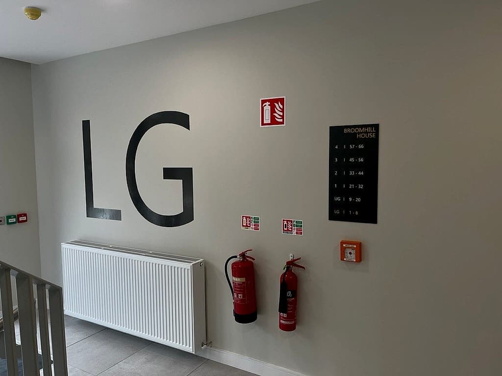
- Fire equipment, prefix F. Square or rectangle, white symbol on red, red at least 50%. F001 marks an extinguisher, F002 a hose reel, F005 a call point. It doesn't warn of fire; it says where the equipment is.
One rule catches most errors: red does two jobs, forbidding in a circle and locating equipment in a square, so shape rather than colour tells you which.
Why standardisation is the entire point
A safety symbol works by convention. Nothing about a stylised figure in a doorway inherently means escape. It means escape because airports, stations and factories have taught two generations that it does. The standard protects that shared training. Before it, incompatible sets circulated across Europe, and a worker who moved building moved vocabulary.
Which is why safety symbols are the one part of a signage system with no design brief. A restyled running man, a brand-tinted green, a triangle with its corners softened to suit the architecture: each of those draws down an account the building never opened and can't top up. Symbols with no registered form are a different job entirely, and they belong to the discipline of custom pictogram sets. Nobody designs an ISO 7010 sign. You specify it.
Every safety symbol you redraw is one the reader has to learn twice.
Where the standard sits in Irish and UK law
ISO 7010 is a standard. What makes it binding is the legislation pointing at it, and two regimes reach signage from different directions.
- In Ireland it is adopted as I.S. EN ISO 7010, and the duty is in the Safety, Health and Welfare at Work (General Application) Regulations 2007: where a risk cannot be avoided or adequately reduced, the employer provides safety signs. Their schedule fixes shape, colour and proportion; the registered symbols are what satisfy it.
- Building control arrives from the other side: TGD B asks that escape routes be indicated and exits marked where they are not obvious, but does not draw the sign.
- In the UK the same document is BS EN ISO 7010, and many buildings still carry escape symbols drawn to the older BS 5499 family. Existing signage isn't automatically wrong; mixing the two in one sightline is. Pick a family per building and convert by area.
- Text is separate from symbol. These signs carry no words, which is their great virtue in a bilingual building. Where a public body adds supplementary wording, the Official Languages Act applies as to any other sign, and Ireland's smoke-free legislation carries its own prescribed notice that a P002 disc doesn't replace.
- The International Symbol of Access sits outside the five families but follows the same rule: the standard form exactly, or not at all.
The legacy signs we still find on audit
Non-compliance is rarely a decision; it accumulates. The same handful of items turn up on nearly every audit we carry out.
- Green panels reading EXIT or FIRE EXIT with no pictogram. Text is supplementary; the symbol is the sign, and words fail the visitor the sign is for.
- Two families of running man in one corridor, one BS 5499 and one ISO 7010, facing each other across a fire door.
- Home-printed A4 notices: laminated, taped, drawn with an empty red circle that prohibits nothing in particular.
- Brand-corrected symbols: a running man redrawn at the house stroke weight, safety green nudged towards the corporate. These are specified colours, not a palette.
- Warning triangles carrying words instead of a symbol, which fail at exactly the distance a warning needs to work.
- Extinguisher signs fixed behind the extinguisher, invisible along the corridor until you are standing at it.
- Faded green. Ultraviolet light takes the pigment first, and a sign drifting towards grey is no longer the safety colour. Nor is a photoluminescent sign that nobody has checked is still charging.
Specifying safety symbols properly
The specification is short, which is the mark of a standard doing its job. The line we still get caught by is arrow direction, because it gets settled on a walk, late, with a handover date in the diary.
- Schedule by reference code, not description. "I.S. EN ISO 7010 E002" is unambiguous; "fire exit sign, left" is an invitation.
- Never redraw, recolour or crop. Scale is the only permitted change.
- Size from the viewing distance. The working rule for escape signs is 100 times the sign height, or 200 times internally illuminated.
- Decide arrow directions on a walk of the route, fire strategy in hand. The same panel means two things from opposite ends of a corridor.
- Draw the statutory and wayfinding packages on one plan. Where the green signs and the building's own signs disagree, habit wins under stress, which is why safety signage and wayfinding belong to one team.
- Hand over an as-installed schedule quoting the codes, certificates attached. An inspector should be able to read the building from the paperwork.
We draw both packages together and supply them as one package, which is the dependable way to end up with a building where the green signs, the red squares and the blue discs agree with the signs carrying the brand. Inherited two generations of running man in one corridor? An hour on the escape routes settles which to keep.
Planning a wayfinding project? Talk early, while the big decisions are still cheap.