
The International Symbol of Access: using it correctly
The wheelchair symbol is the most recognised access mark on earth, and one of the most casually misused. Where it belongs, and how we specify it.
The International Symbol of Access is the white wheelchair figure on a blue field that identifies accessible entrances, parking bays, toilets, lifts and routes. It is one of the standardised public-information symbols maintained under ISO 7001, and in Ireland and the UK its use is directed by Part M of the Building Regulations and BS 8300. Where a building provides an accessible facility, the symbol is how people find it, which makes getting it right matter more than almost any other mark a building carries.
It's also, by some distance, the most recognised piece of information design ever produced, and among the most casually misused. We specify and install it on nearly every project we deliver, from hospitals to hotels, and the same handful of errors turns up on nearly every building we audit. So this is a short guide to getting a very small symbol right.
A symbol with one meaning
The symbol was designed in 1968 by a Danish design student, Susanne Koefoed; the head was added a year later, turning an abstract mark into a person. Adopted by Rehabilitation International and later standardised internationally, it has carried one precise meaning ever since: the thing this sign marks is accessible. It isn't a general emblem for disability, or shorthand for "assistance available", or decoration for an accessibility policy. It's a promise. Whatever it marks, a wheelchair user can use.
The symbol is a promise: whatever it marks, a wheelchair user can use.
Where the International Symbol of Access is required
In Irish practice, Technical Guidance Document M and BS 8300 point to a consistent set of locations:
- Accessible entrances. Where not every entrance is accessible, the accessible one carries the symbol and the others carry directions to it.
- Designated accessible parking bays, and the route from those bays to the entrance.
- Accessible WCs and Changing Places facilities, on or beside the door.
- Lifts, where the lift is the accessible route between floors.
- Junctions where the accessible route diverges from a stepped route, with an arrow, so the symbol points somewhere.
There's a corollary worth noting. Where every entrance and every route is accessible, the guidance doesn't ask you to badge them all. A building designed to universal-design principles needs the symbol only at the points of difference: parking, WCs, the lift. Restraint is what keeps the mark meaningful.
The common misuses
The worst misuse is the false promise. The symbol on a WC a wheelchair can't turn in, on an entrance with a step, on a route that dead-ends at a locked door. It fails someone at the exact moment they've committed to the journey, and it's depressingly common in buildings that were signed once and altered many times since. If a facility no longer complies, the sign has to change with it. That drift is what an accessibility audit exists to catch.
The second is the redraw. The figure gets restyled to match a typeface, slimmed to fit a panel, or replaced with an illustrator's improvisation, at which point it stops being the symbol. Like every standardised pictogram, its value is instant recognition, and recognition depends on the form staying exact. Brand translation is legitimate; a change of colour or material can sit beautifully within an interior. The geometry isn't negotiable.
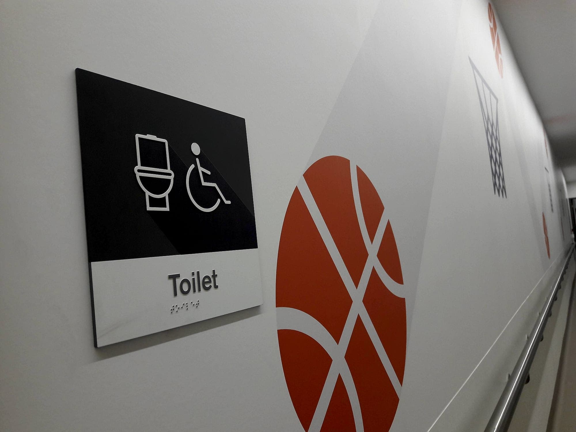
The third is contrast. A symbol that can't be seen might as well not be there, and the same 30-point Light Reflectance Value rule that governs sign text governs the symbol, both against its panel and panel against wall. The conventional white-on-blue passes easily. A subtle tone-on-tone treatment usually doesn't, however handsome the mock-up.
The dynamic-symbol debate
Since 2011 an alternative mark has been in circulation: the Accessible Icon Project's forward-leaning figure, elbow back, pushing its own chair. The argument is about agency, replacing a passive occupant with an active person, and it has real momentum, including official adoption in New York State. The counterarguments are practical. The dynamic figure isn't the standardised symbol referenced by ISO, Part M or BS 8300, and it keeps the wheelchair at the centre of a mark that must also stand for people who never use one.
Our position is sympathetic and unsentimental. On regulated buildings we specify the standard form, because recognition is the entire point of a standard symbol, and a person navigating an unfamiliar building in a hurry should never have to stop and interpret one. The agency argument is a good one. We think a building makes that statement better through provision that honours the promise the ordinary symbol already makes.
Not every disability is visible
The symbol's dominance has a side effect: it teaches the public that access equals wheelchairs. Most disabilities aren't visible, which is why accessible WC signage increasingly carries supporting text, and why the wider signage system matters as much as the badge on one door. Ambulant-accessible cubicles have their own convention, hearing-enhancement systems are marked with the BS 8501 induction-loop symbol, and key signs carry tactile characters and braille so the information reaches people the visual layer misses. The wheelchair figure is one instrument among several.
Our default specification
On every project, unless a client's access strategy dictates otherwise, we hold to the same defaults. The symbol appears in its exact standardised form, never redrawn. It is paired with mixed-case text naming the facility, because a symbol plus a word is faster than either alone. Contrast meets the 30-point LRV threshold in whatever palette the scheme uses. WC identification signs sit on the latch side of the door with tactile and braille provision, at a height that works seated and standing. Directional instances carry arrows; identification instances don't. And it appears everywhere the guidance asks, and almost nowhere else. All of that is the discipline BS 8300 describes, applied by default and certified on completion.
If you're unsure where the symbol belongs in your building, or suspect it's currently making promises the building can't keep, an accessibility audit will tell you quickly. Or talk to us at the design stage, while the fix is still a drawing.
Planning a wayfinding project? Talk early, while the big decisions are still cheap.