
Accessible signage certification: what it means, and why we do it by default
Certification is evidence, not assurance. Contrast, tactile relief and mounting position: measured, recorded, and handed over with the building.
Accessible signage certification is a documented statement that a signage system meets the accessibility requirements of Part M of the Building Regulations and BS 8300, as designed, as manufactured and as installed. It records measured facts: the light reflectance values of the finishes actually used, the character heights, the tactile and braille provision, and the height and position each sign was fixed at. It is issued at handover and belongs in the building's file alongside the fire certificate and the O&M manual.
That last point is where most projects come unstuck. On the majority of jobs, “compliant signage” exists as a line in a specification and a sentence in a quotation. Nobody measures it. Panels arrive, an installer fixes them where the wall allows, the account is closed, and the client inherits a claim they can't prove. Two years later an access auditor or a solicitor asks the question, and there is nothing in the file but a delivery docket. The word compliant, in a signage quotation, is worth about as much as the paper.
A claim you cannot prove is a liability you already own.
Compliance is lost in three places
It is rarely lost all at once. The first loss happens at specification, where a designer picks a colour pairing from a brand palette nobody has tested for contrast. Manufacture takes another slice: a finish comes out gloss when the drawing said matt, or lettering gets printed to look embossed. Then the wall, where a compliant sign is fixed at the wrong height, on the hinge side of a door, or behind a swing.
Each of those failures is invisible to a sighted person walking past. All three are trivially detectable with a light reflectance meter, a set of callipers and a tape measure. Certification is the discipline of using those three tools and writing down what they said.
What we certify
A certificate that says “complies with Part M” and nothing else is worth very little. Ours enumerates, sign type by sign type:
- Visual contrast: the LRV difference between text and panel, and between panel and the wall behind it, measured on the finished production batch. Thirty points or more.
- Letterforms and size. Mixed-case text in a clear sans-serif, with character heights scaled to the viewing distance each sign was designed for.
- Tactile provision: raised characters and symbols at the locations the standard calls for, with the relief depth and profile recorded.
- Braille. Grade, dot geometry and placement, set where a reading hand expects to find it.
- Mounting height and position: the fixing height of every tactile sign, the side of the door it sits on, and the clear headroom beneath anything projecting or suspended.
- Surface finish, matt and glare-free, because a perfectly contrasted sign under a downlight can disappear behind its own reflection.
- Symbols. Standard pictograms, and correct use of the International Symbol of Access on the routes and facilities that actually are accessible.
Contrast is a number, not an opinion
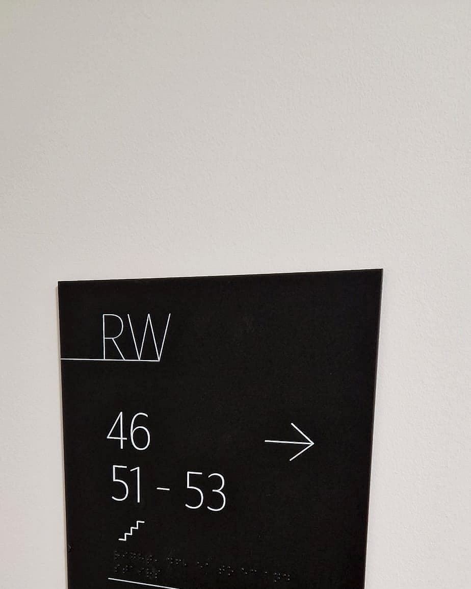
The single most common failure we audit is a sign whose contrast was judged by eye. Dark grey on mid grey looks assured in a rendering and reads as nothing at all to someone with reduced contrast sensitivity. Light reflectance value turns that judgement into arithmetic: measure the panel, measure the text, subtract. Below thirty points the sign is decoration.
It has to be measured on what was made, not on what was drawn. Powder coats drift between batches and a colour signed off on screen can arrive several points adrift. Certifying from the specification instead of the product is how compliant drawings become non-compliant buildings.
Tactile and braille fail quietly
Tactile and braille signage has the awkward property that almost nobody who signs it off can read it. A sighted approver checks the dots are present and moves on. But braille that is too shallow, too closely spaced, or set flush against a border is just a texture, and raised lettering below the minimum relief can't be traced by a fingertip. These are pass-or-fail dimensions, checkable in seconds by anyone holding the right gauge.
The wall is where most compliance is lost
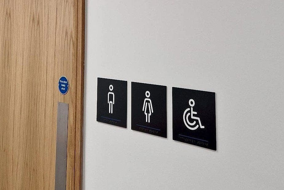
A sign is only accessible in the position it was designed for. A tactile door sign belongs on the latch side, clear of the swing, in a consistent band around 1.4 to 1.6 metres so a hand can find it without hunting. Projecting signs need clear headroom beneath them; directories need to read seated as well as standing. None of it is expensive, and all of it is routinely undone by an installer working from a box of panels and no setting-out drawing.
Because we install our own work, setting-out is part of the design, and the as-installed position is photographed and logged against each sign in our approval software. The certificate falls out of a record we were keeping anyway, so it never becomes a separate exercise at the end.
A sign is only accessible in the position it was designed for.
Why accessible signage certification matters at handover
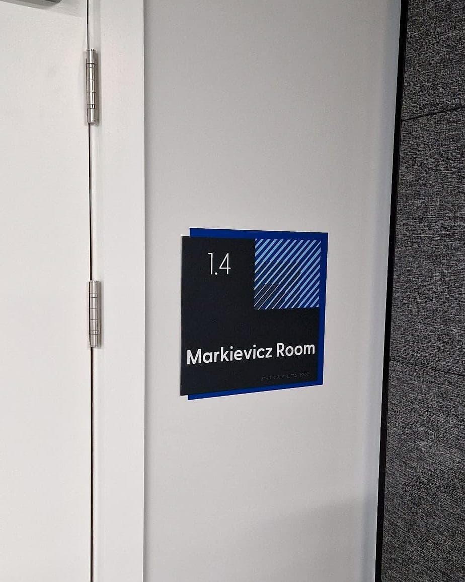
Irish building control runs on paper. A project with a Disability Access Certificate is asserting, on the record, that the completed building meets Part M, and the assigned certifier signing the Certificate of Compliance on Completion relies on ancillary certificates from the specialists who did the work. Signage is one of those specialisms. If nobody issues a certificate for it, the certifier is either signing on trust or chasing you for a letter three weeks after your team has left site.
Handing over a signage certification pack closes that loop on the day: schedule, measured values, product data and as-installed photographs. It also leaves the building owner a baseline. When a department moves and somebody orders replacement panels locally, the pack tells them the specification they have to match.
- 30+
- LRV points of visual contrast, measured on the production batch, not the swatch
- 1.4–1.6 m
- the band we mount tactile and braille door signage to, so a reading hand finds it
- 10 yr
- warranty on every sign we supply (the certificate and the guarantee travel together)
The liability that arrives later
Accessibility obligations do not expire at practical completion. Equality legislation applies to the building in use, and a complaint about an inaccessible facility lands with the occupier, who then looks upstream to the design team and the supply chain. At that point the only useful document is the one recording what was installed and what it measured. We've written separately about where the liability actually sits; the short version is that it sits with whoever cannot produce evidence.
Why it is the default, not an extra
We certify every project because the alternative is worse for everyone, including us. Measuring at the point of manufacture costs minutes; retrofitting a floor of door signs because the contrast was judged by eye costs a fortnight and someone's reputation. And because design, supply and installation stay with one supplier, the measurements exist already. Nobody has to commission a survey at the end, which is why certification adds paper and not price. One caveat, in fairness: a certificate doesn't make a building navigable. Every panel can measure and the place can still be a maze. All the certificate tells you is that the sign is readable once you find it.
If you're specifying signage for a building going through building control, or you've inherited one where nobody can find the evidence, an accessibility audit will tell you where you stand in a day. Talk to us before the panels are made. It's the cheapest moment to be certain.
Planning a wayfinding project? Talk early, while the big decisions are still cheap.