
Hospital wayfinding: designing for people under stress
Nobody visits a hospital to admire the signage. Most arrive anxious, many for the first time, and the wayfinding has to work anyway. Here's how it's done.
Hospital wayfinding is the practice of helping patients, visitors and staff navigate a hospital without confusion, through a planned system of naming, signage, landmarks and accessible design. It matters more in healthcare than anywhere else for one simple reason: almost nobody in a hospital is at their best. They're anxious, late, unwell, or all three. A missed turn becomes a missed appointment.
We've designed, supplied and installed wayfinding for Irish hospitals for years, from Temple Street Children's Hospital to the National Rehabilitation Hospital and St Vincent's Private Hospital. This is what that experience has taught us.
Why hospitals are the hardest brief in wayfinding
A hospital combines every difficulty a wayfinding designer can face. The buildings are large and have usually grown in phases, so the floor plan rarely follows one logic. The audience is everyone: every age, every language, every level of mobility and sight. Many visitors are there for the first time, under stress, and stress measurably narrows perception. People scan less, read less, and miss signs they'd normally see. The destinations themselves are often unfamiliar words (phlebotomy, radiology, orthopaedics) met at the very moment concentration is weakest.
That's why hospital signage that merely looks correct so often fails in use. Design it for a person having a bad day: that's the real standard.
Design for a person having a bad day. That's the real standard.
Start before the signs: naming and the destination schedule
The biggest wayfinding decisions happen before any sign is drawn. What is each department called? Which name goes on the appointment letter, and do the letter, the website, the directory and the door all say the same thing? A patient told to attend "Clinic 4, Outpatients" will not find "Suite 4B, Ambulatory Care". Consistency between correspondence and corridor is the single cheapest improvement any hospital can make. If we could change one thing across Irish hospitals it wouldn't be the signage at all. It would be the appointment letters.
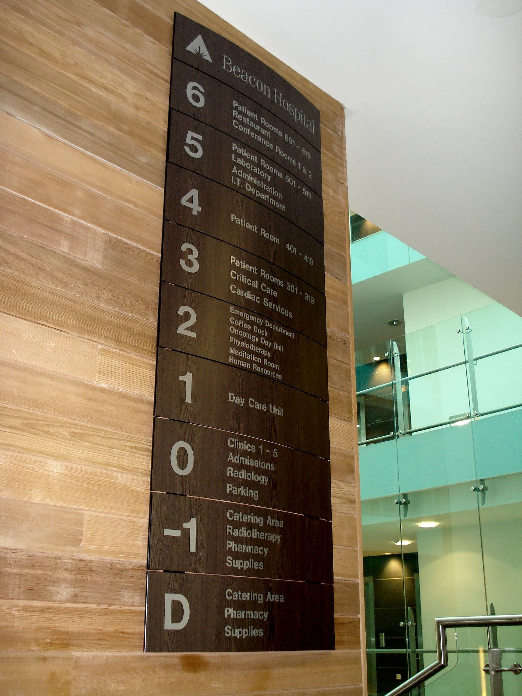
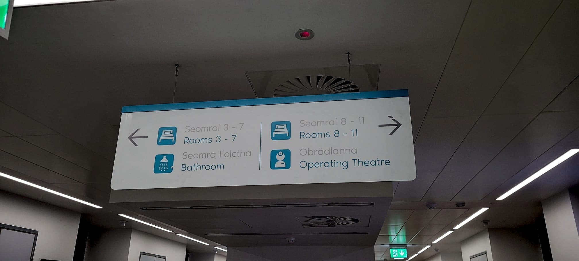
From the agreed names comes the destination schedule, the master plan of what appears on every sign and when. In a hospital this hierarchy works hardest: main entrances carry the major zones, corridors disclose departments as you approach them, and door signs carry the detail. Nobody should meet the word "phlebotomy" until they're nearly there.
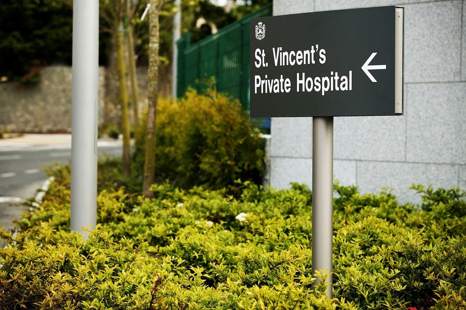
The arrival sequence: gate, car park, door
A hospital journey starts on the road, not in the lobby. External signage has to resolve three questions in order: am I at the right place, where do I park, and which entrance do I need? Emergency and outpatient routes should separate as early as possible, ideally at the first junction on site. Get that right and the pressure on internal signage drops immediately. Get it wrong and reception spends the day redirecting people who parked at the far end of the campus.
Decision points, lifts and floor identification
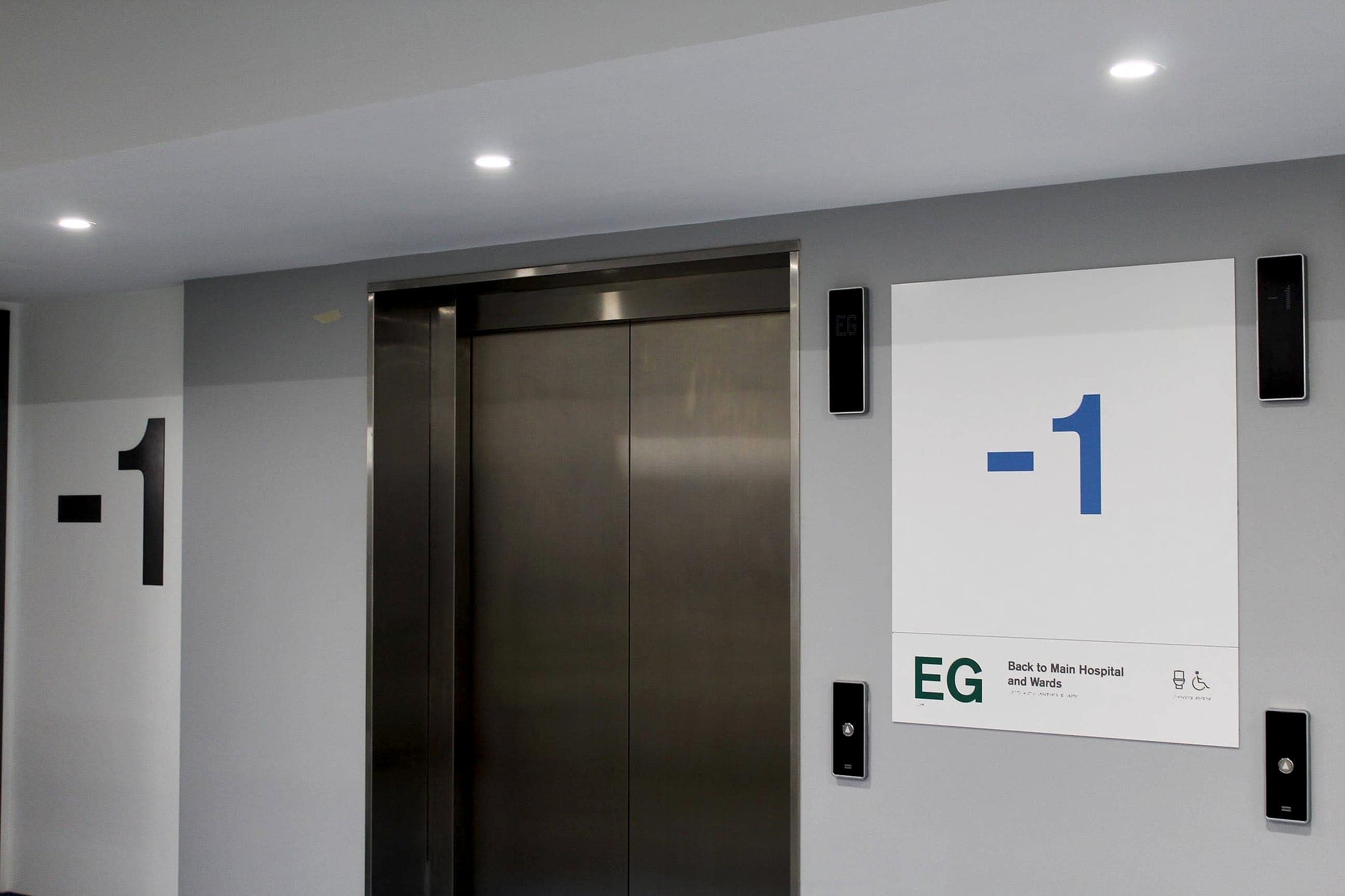
Inside, people navigate from decision point to decision point: junctions, lift lobbies, stair cores. Each one needs exactly the information the journey requires there, and no more. Lift lobbies deserve special care. They're where people change floors, lose orientation, and step out unsure which way to face. Oversized floor numerals, big enough to read from inside the lift car as the doors open, re-anchor everyone in a glance and give porters, staff and visitors a shared reference that survives a phone call: "Level 2, turn left at the lift."
Nobody should meet the word “phlebotomy” until they're nearly there.
Accessibility isn't a layer, it's the baseline
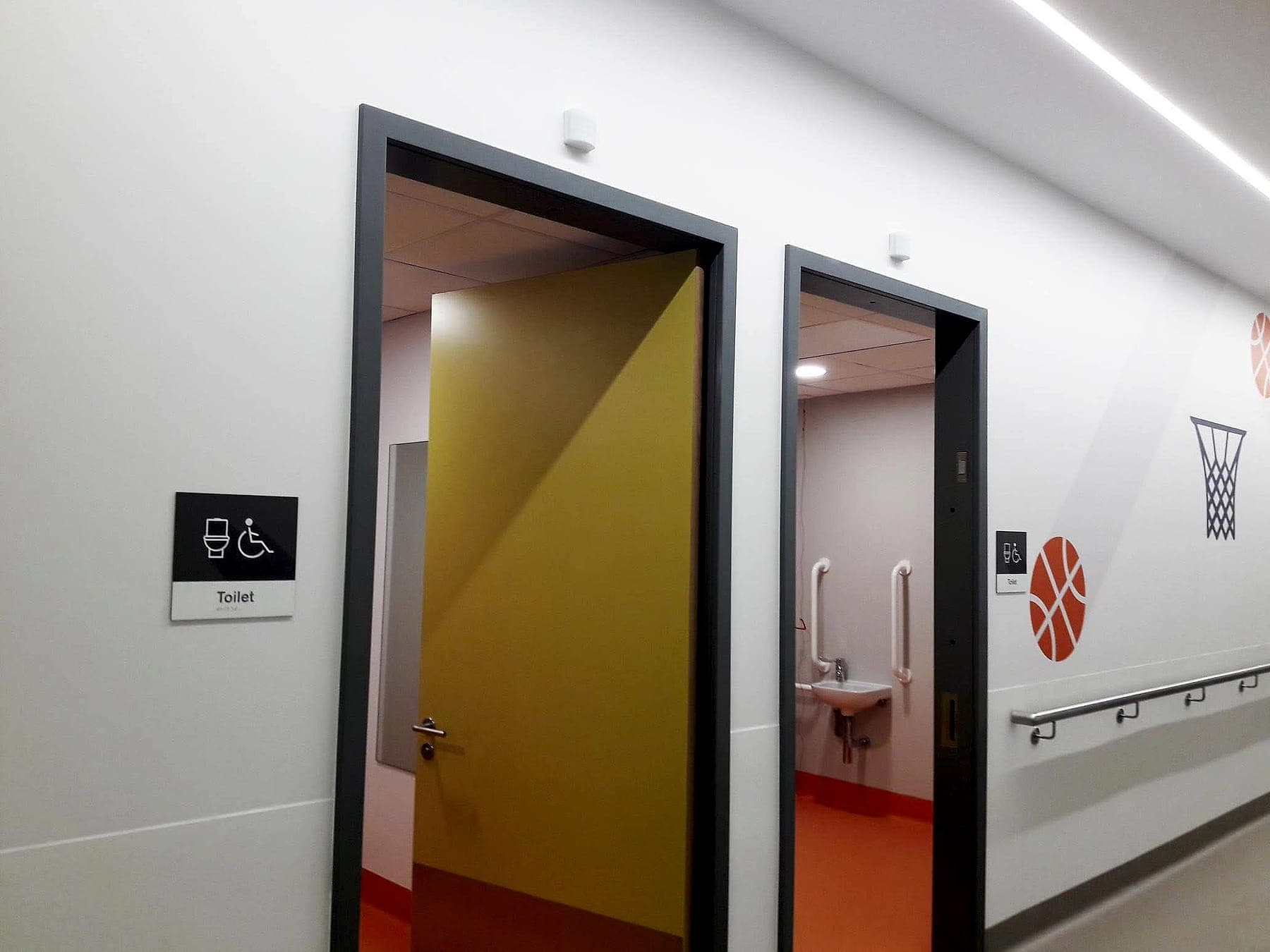
Hospital populations skew precisely toward the people standard signage fails: older eyes, low vision, wheelchair users, cognitive impairment. In Ireland, Part M and BS 8300 set the technical floor: visual contrast of 30+ LRV points, tactile and braille provision for key locations, mixed-case lettering, mounting heights that work seated and standing. In HSE and public healthcare settings, the Official Languages Act adds bilingual provision with equal prominence for Irish and English. Where care extends to dementia and older patients, contrast and landmark strategies do work no sign alone can do. Everything we supply is made to these standards by default, and we certify compliance on completion. In a hospital, that's simply the specification.
- 30+
- LRV points of visual contrast, the Part M baseline for signage that works for low vision
- ×2
- languages, equal prominence: Irish and English, required across HSE and public healthcare
- ~20%
- saved when one supplier carries the scheme from design to installation
Children's hospitals: a different kind of legibility
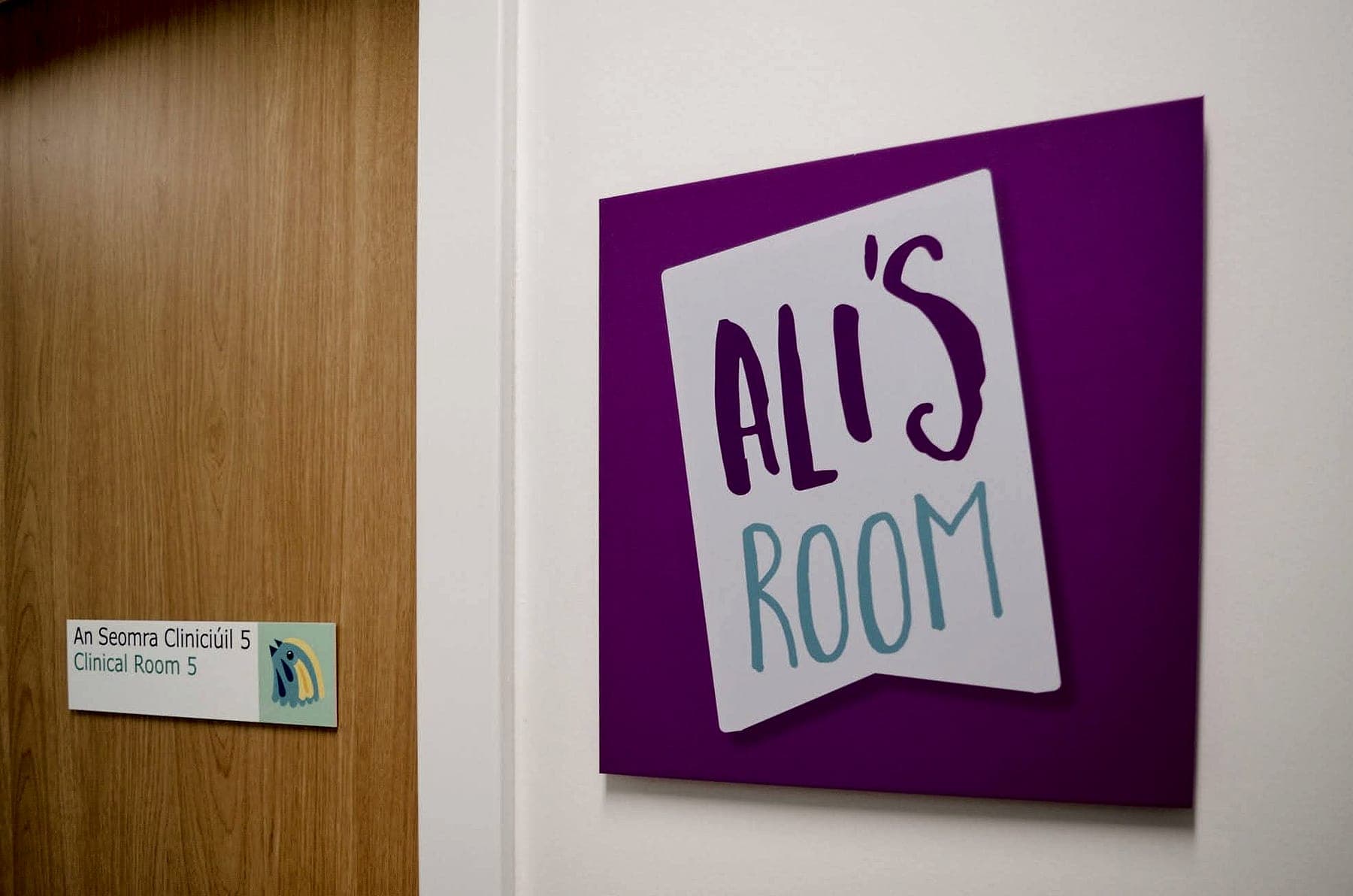
Paediatric wayfinding has two audiences at once: the anxious parent who needs clarity, and the child who needs the building to feel like somewhere good things happen. At Temple Street that meant pairing fully compliant bilingual room signage with murals, characters and named rooms, landmarks a child remembers and a family can navigate by. The compliance work and the joy work aren't in tension; the best children's hospitals do both on the same wall.
What good hospital wayfinding looks like
Well-designed hospital wayfinding shows up in the operational numbers: fewer missed and late appointments, fewer staff interruptions for directions (studies put the cost of staff giving directions at hundreds of hours a year in a large hospital), calmer waiting areas, and better patient-experience scores. It also future-proofs: a signage system built on a proper destination schedule absorbs department moves with panel changes, not redesigns. None of which builds a business case as tidily as we'd like. The savings are real and they're spread across a hundred people's days.
Common questions
Appendix- Q.What are the signage requirements for hospitals in Ireland?
- Hospitals must meet Part M of the Building Regulations (accessible signage: contrast, tactile/braille provision, mounting heights, mixed-case lettering, guided by BS 8300), fire-safety signage under TGD B, and, for HSE and public bodies, bilingual Irish/English signage with equal prominence under the Official Languages Act.
- Q.What does hospital wayfinding cost?
- It varies with building size and sign count, but the biggest cost driver is rework from poor planning. A destination schedule agreed before manufacture keeps the sign count lean. In our experience an end-to-end process (design through installation, with one supplier) delivers a compliant system for up to 20% less than fragmented procurement.
- Q.Where should a hospital start with a wayfinding upgrade?
- Not with signs. Start with naming: audit what departments are called across letters, website and building, fix the inconsistencies, then walk the main patient journeys to map decision points. The signage plan falls out of that work.
Planning a healthcare building, or untangling an existing one? See our health-sector work, or talk to a wayfinding specialist early, while the naming decisions are still cheap.
Building in health? Talk early, while the naming decisions are still cheap.