
Children's hospital signage: wayfinding families can follow
Two audiences, one wall: the parent who has to read it and the child who can't. What paediatric wayfinding has to do that adult hospital signage never does.
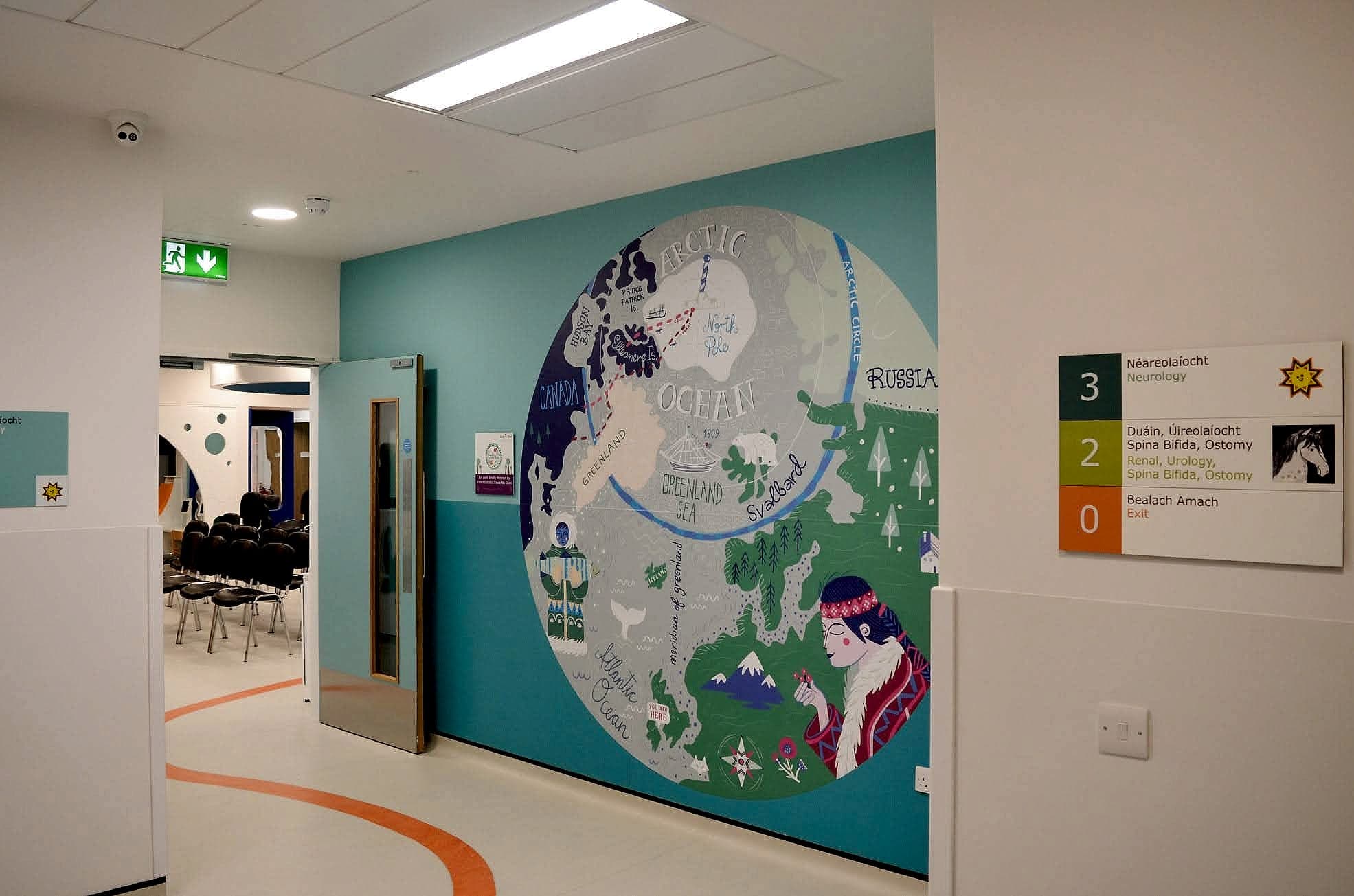
Children's hospital signage has to serve two people at the same moment: an adult reading under real stress, and a child who may not read at all. So every wall ends up carrying two systems. One is compliant, bilingual and high-contrast, and it belongs to the parent. The other is made of landmarks, colour and character, and it's the one the child will recognise and repeat back. Design only one of them and the family gets lost together.
We designed, supplied and installed the wayfinding for Temple Street Children's Hospital in Dublin, an old and tight city hospital that has been extended more times than anyone can comfortably count. The general rules of hospital wayfinding all still apply there. What follows is the part that only applies when the patient is six.
Two audiences, one wall
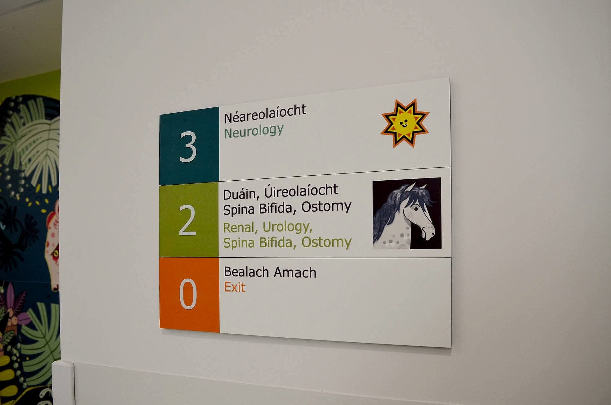
An adult in a hospital navigates by text. A four-year-old navigates by things: the deer, the jungle room, the yellow door. You don't trade one off against the other. They run as parallel layers of the same system, and the discipline is keeping them apart on the wall so that neither degrades the other. A directory panel stays a directory panel, with mixed-case type, one destination per line and strong contrast. The character work goes beside it, above it or on the floor, never inside it competing for the same square millimetres.
The test is what a parent says on the phone. "We're on Level 2, beside the horse" survives a bad signal and a crying child. "Renal and Urology Outpatients, third door past the lift lobby" doesn't. If the second sentence is the best a hospital can give a family, it's asking too much of them.
The parent reads the sign, and the child remembers the horse.
The child's eye level, and the view from a trolley
Signage guidance is written for adults. The mounting heights that BS 8300 and everyday accessible practice settle on, with tactile signs centred somewhere around 1400–1600mm and directional signage read from standing or seated adult eye level, are calibrated for a body between about 1.2 and 1.8 metres tall. A six-year-old's eye line is roughly a metre off the floor. Nothing in the guidance stops you adding a second register below the first. In paediatric buildings we do it as a matter of course: the room's animal, its colour and its number, set at a height where a child meets them head-on.
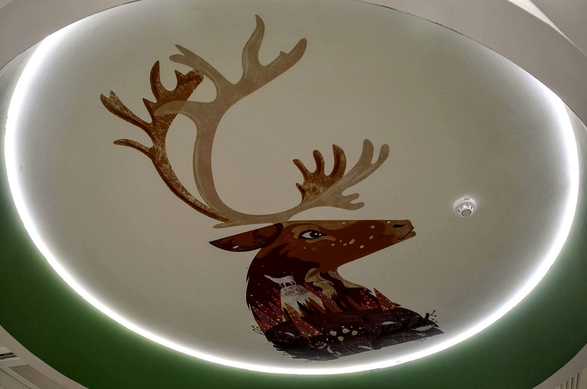
Then there's the register nobody plans for. Children in hospital spend a great deal of time horizontal: on a trolley, in a bed being wheeled between departments, lying on a parent's shoulder. Their field of view is the ceiling. Put something worth looking at up there, a stag in a lit recess or a run of colour along a bulkhead, and the ceiling starts doing wayfinding work. It's the surface telling a child the corridor has changed.
Landmarks a child can hold on to
Landmark navigation isn't a paediatric novelty. It's how all of us find our way when text fails, and it does the heaviest lifting for people who read slowly, read anxiously, or don't read the language at all. The same mechanism sits behind dementia-friendly wayfinding and much of the thinking in neurodiverse environments. We'd take one well-placed landmark over a floor's worth of colour-coding, and we'd say the same on an adult ward. In a children's hospital the rules are strict, and worth stating plainly:
- One landmark per decision point, not per wall. If a child has to choose between two memorable things, neither is memorable.
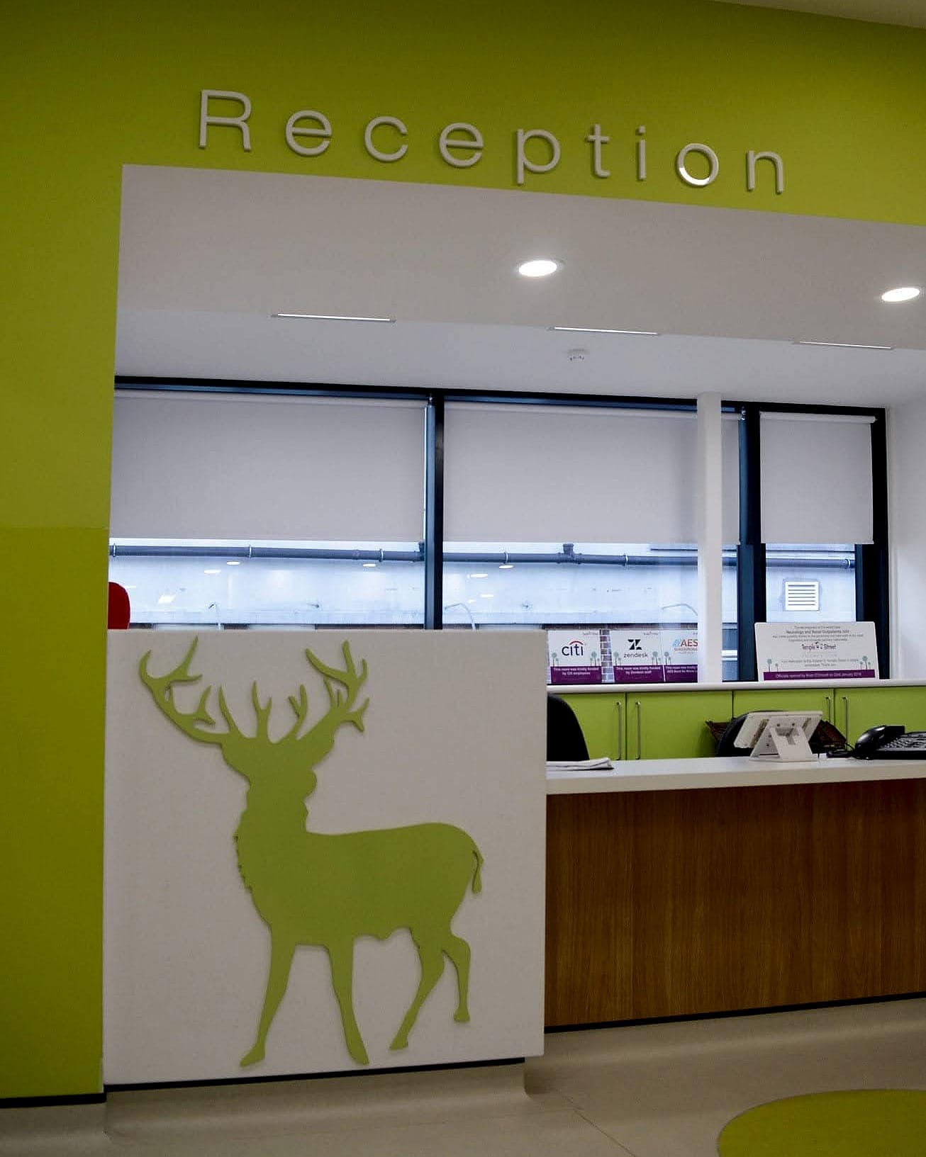
- Nameable in one word. Horse. Deer. Jungle. If staff and family don't land on the same word without thinking about it, the landmark isn't doing its job.
- Distinct from its neighbours. Six varieties of woodland animal spread over three floors get remembered as "an animal", which is no help to anyone.
- Carried down to room level. Whatever motif identifies a floor should reappear on the doors of that floor. The repetition is how a child learns the connection.
- Repeated in correspondence. If the appointment letter says "Level 2, the horse", the landmark is useful before the family has even arrived.
Bilingual by law: what children's hospital signage must carry
Irish public healthcare bodies sign in two languages, and the requirement is more specific than most specifiers expect. Under the Official Languages Act and the regulations made under it, where a public body's sign carries both languages the Irish text must come first, above the English or to its left. It must not be less prominent, visible or legible, and its lettering can't be smaller than the English. That's a layout constraint long before it's anything to do with translation: it sets the height of every panel before a single word has been chosen.
In a paediatric building that constraint bites hardest, because two languages, a pictogram, a level colour, a landmark motif and a tactile register are all competing for one small panel. The answer is never to shrink the Irish. Shorten the destination, push a line of detail on to the next sign down the corridor, and give the panel another 40mm of height. Alongside all that, Part M and TGD M set the accessibility floor: mixed-case lettering, at least 30 LRV points of visual contrast between text and background, tactile and braille provision at key locations, and mounting heights that work seated and standing. All of it applies in full. If anything a children's ward is the stricter compliance environment, because so many more of its visitors start out at a disadvantage.
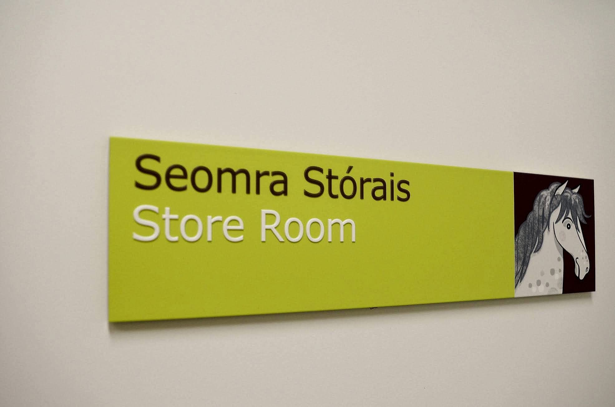
Where the theme has to stop
The most common failure we get called in to correct is a well-meaning one: the theme swallowing the statutory signage. Somebody has redrawn the fire exit man as a cartoon, set the escape route text in a rounded display face, or given a final exit sign a jungle background. Escape signage sits outside the decorative system altogether. It's governed by fire-safety guidance under TGD B and by the safety-signs requirements in the Safety, Health and Welfare at Work (General Application) Regulations, using the standard graphical symbols harmonised in ISO 7010. Green, white, unmistakable, and identical to the ones that same child would see in a shopping centre. Familiarity is the entire point of a harmonised symbol, and redrawing it throws that away.
Decoration stops where the statutory signage starts.
The same line applies to hygiene, hazard and restricted-access signage. Draw it once, at destination-schedule stage. Then the split stays uncontroversial for the life of the building: this family of signs is themed, that family is standard, and nobody is arguing about it on site at eleven o'clock the night before handover.
The playful palette problem
Children's hospitals are painted in strong colour, and strong colour is where signage contrast goes to die. A directory that reads beautifully as artwork can fail the moment it's mounted on a lime wall. The text has to contrast with its panel, yes, but the panel also has to be findable against the surface behind it. Two habits keep this honest. Test every sign against the wall it will actually hang on; a white studio background flatters everything, and contrast is a relationship, not a property. It is an easy thing to miss at drawing stage. Then give the wayfinding family a restrained field of its own, usually a white or near-white panel with colour doing the coding at the edges, which leaves the murals and supergraphics free to be as loud as they like on the surfaces in between.
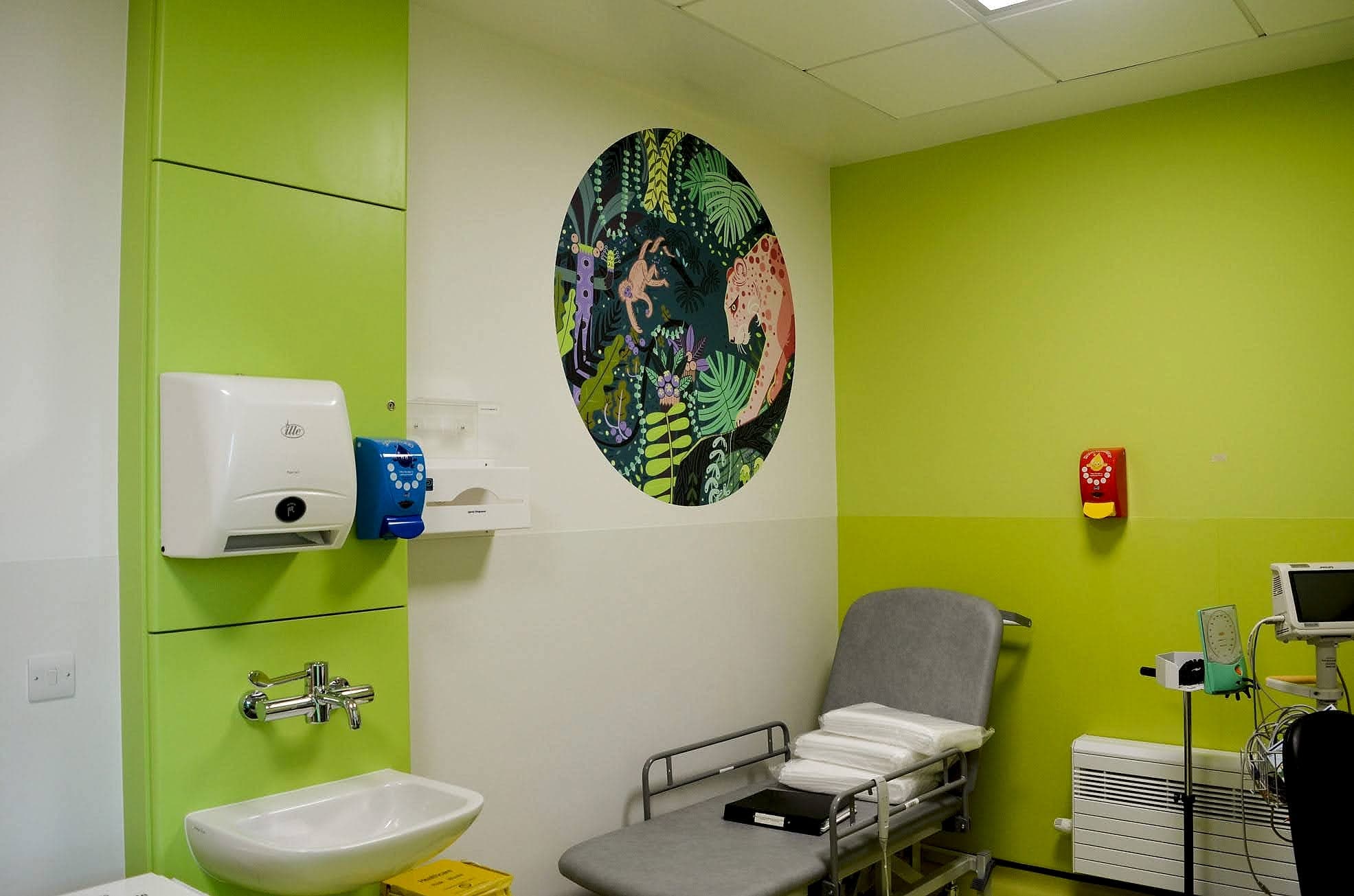
Naming: the words a family actually meets
Paediatric naming has one problem adult hospitals don't: the public signage is read by the person being treated, who may be eight. So the destination schedule needs an explicit policy on which clinical words appear in circulation space and which are held back to staff-side doors. That policy is a clinical decision, and it gets made with the hospital. What a designer can insist on is consistency. The words on the appointment letter, the text message, the website and the door have to match exactly, because no parent is going to translate "Ward 3B" into "St Frances Ward" while managing a frightened child and a car park ticket.
Where we'd start on any children's hospital: walk one real patient journey, car to couch, at a child's height. Then walk it again lying down. Most of what needs fixing shows itself in those two walks, and it's far cheaper to fix in the naming than in the signage. If you're planning or untangling a paediatric building, have a look at our health-sector work or talk to us while the destination schedule is still a document. Once it's on the wall, changing a name means changing a sign.
Building in health? Talk early, while the naming decisions are still cheap.