
When brand and law collide: adapting brand colours for signage compliance
A brand book is a policy; Part M and the safety-sign regulations are law. What to do when the approved palette cannot legally carry the sign it has been given.
When a brand palette and a building regulation disagree, the regulation wins. Signage compliance isn't a brand decision. A brand manual is an organisation's policy about itself, while Part M, the safety-sign regulations and the Official Languages Act are law, and each sets a floor no house colour is allowed to sit under. So the real question is never whether to comply. It's how to adapt the brand colours so that the identity survives the adaptation intact.
We meet this argument most often about three weeks before manufacture, when a scheme that has passed brand approval reaches the people who will have to certify it. The palette is signed off, the artwork is signed off, and two of the pairings measure eleven points of contrast. Nobody in that room is wrong. They have simply been working to two different rulebooks, only one of which is enforceable.
A brand manual is a policy. Part M is law.
In Ireland, accessible signage sits under Part M of the Building Regulations, with Technical Guidance Document M showing how compliance is normally demonstrated and BS 8300 supplying the detailed guidance behind it. Work done in accordance with that guidance is taken as compliant; work that departs from it has to be argued on its merits, by someone, in writing, later. What the standards ask of a sign doesn't soften because a colour was approved at group level: contrast, mixed-case setting, legible sizing, and tactile provision where it is reachable.
That asymmetry matters when something goes wrong. A brand approval is not a defence: the non-conformance attaches to the building, and to whoever signed the completion paperwork, not to the guideline that caused it.
Where signage compliance and brand actually collide
The conflict is narrower than designers fear. Four places account for nearly all of it:
- Contrast. The working threshold is a difference of at least 30 points of light reflectance value between text and panel, and between panel and wall. Corporate palettes are full of mid-tones chosen to sit together harmoniously, which is precisely the property that makes them fail.
- Safety-sign colour. Green, red, yellow and blue are reserved on safety signage, along with the prescribed shapes. They are not available to a brand at any strength.
- Bilingual provision. Where the Official Languages Act applies, the Irish text comes first and in lettering no smaller and no less prominent than the English. It is a layout requirement, and most brand grids have never been asked to carry one.
- Statutory content and format. Some signs are specified for you, down to what they say and where they go. Under the Fire Safety (England) Regulations 2022, high-rise residential buildings must carry wayfinding signage identifying the floor and the dwellings on every stairway landing and lift lobby, visible in low light or by torchlight, one of several UK duties tied to building height. There is no brand-compliant variant of a sign whose form is written into regulation.
Five adaptations that keep the brand
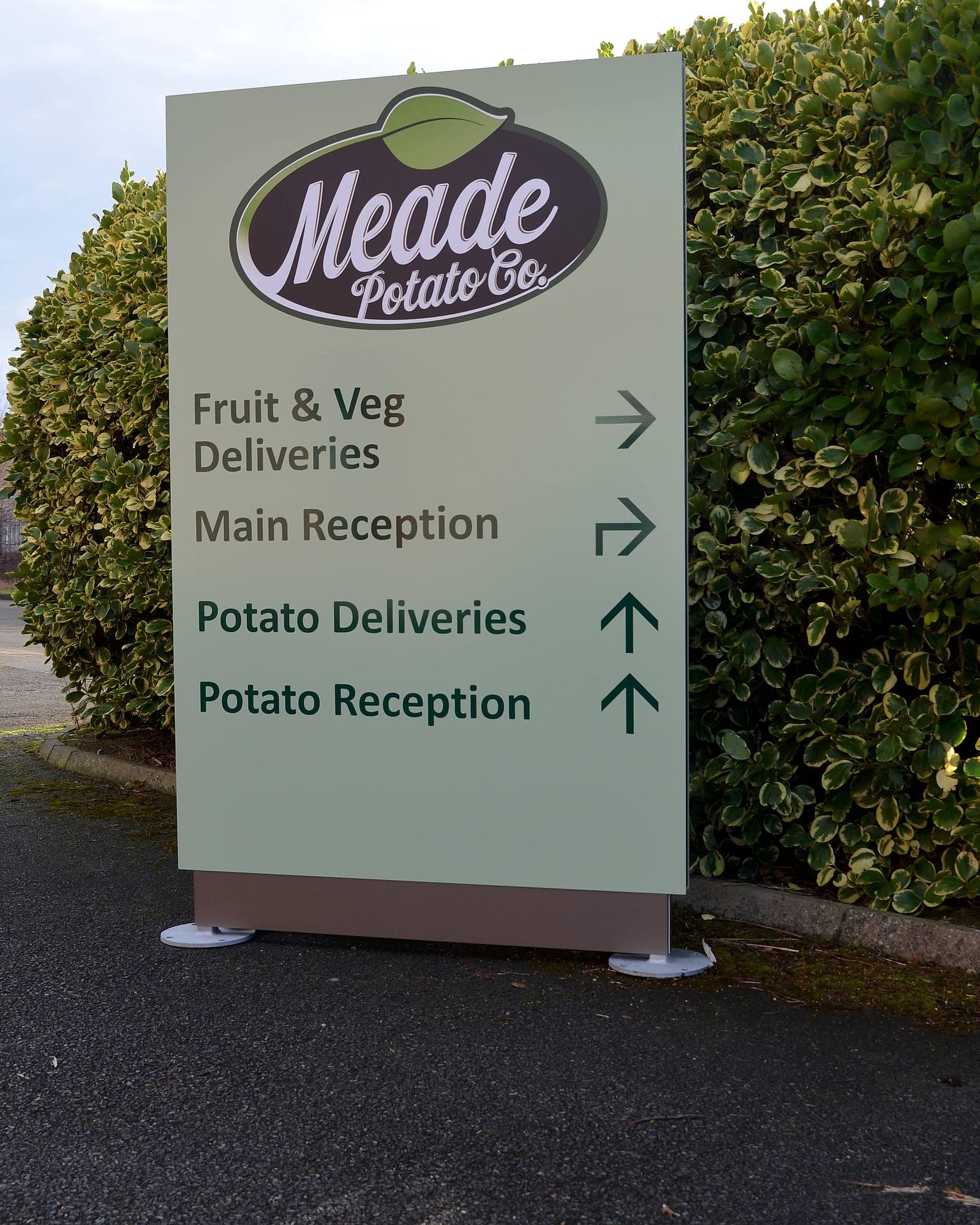
None of these change the identity. They change which member of the palette is asked to do the reading. Most brand manuals we're handed were written by people who have never seen the palette at ten metres in a car park on a wet afternoon, and it shows in the mid-tones.
- Darken the tint. Most palettes contain a display version of a colour and no dark version at all. Specify a signage-grade darkening of the same hue, the brand blue taken to a depth that clears 30 points against white, and it reads instantly as the brand while still measuring.
- Reverse the panel. Where the brand colour is mid-toned, stop asking it to be text and let it be the field, with the lettering in white or near-black. The colour occupies more of the sign than it would have, not less.
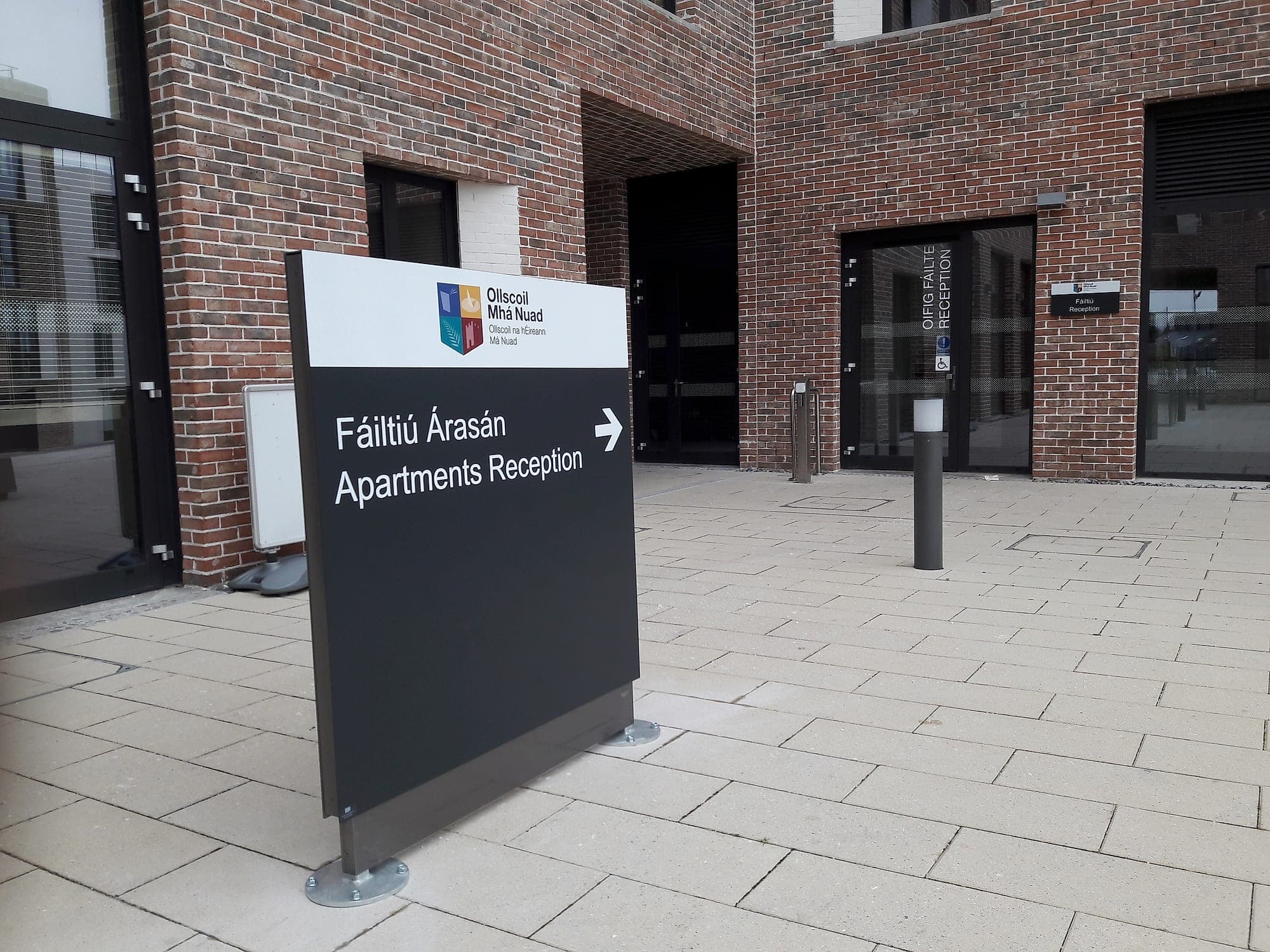
- Give the mark its own zone. A full-strength logo in a header band, at brand colours, above a reversed information panel: the identity is unmistakable and the reading layer is never asked to compromise. This is the single most useful move in civic and campus work.
- Relegate the mid-tones. Awkward colours make excellent rules, bands, edge returns and pictogram fields, jobs where nothing depends on reading them at ten metres.
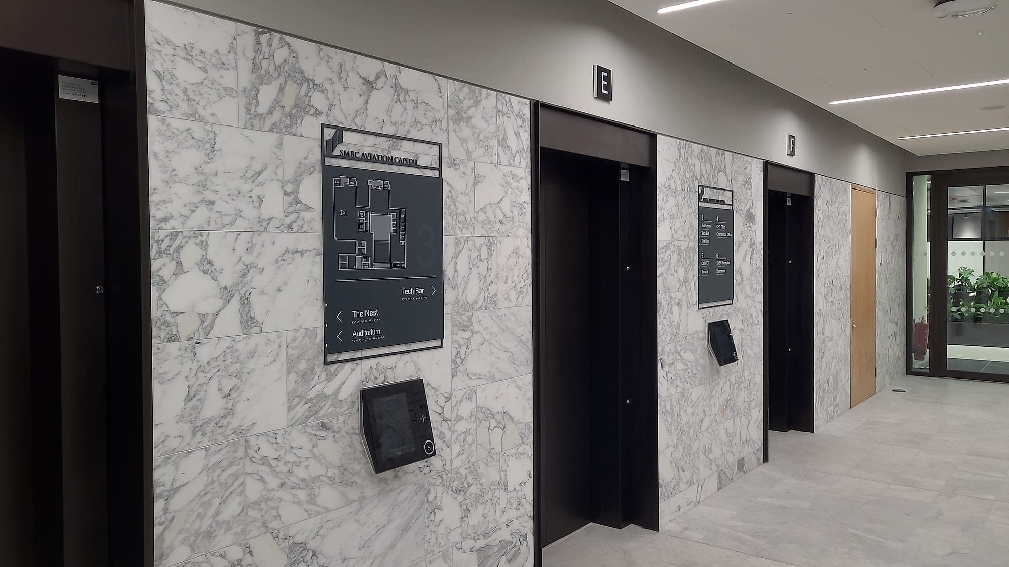
- Measure the wall, not just the sign. A compliant panel hung on a wall of similar tone is legible and undiscoverable. The building's finishes are part of the palette whether the brand manual mentions them or not.
The palette need not change. What changes is which colour does the reading.
The signs a brand may never touch
Safety signage is a separate legal system that happens to share a wall with wayfinding. The Safety, Health and Welfare at Work (General Application) Regulations 2007 prescribe its colours and shapes: green for emergency escape and safe condition, red for prohibition and fire-fighting equipment, blue for mandatory instructions, yellow for warning. The symbols themselves are registered in ISO 7010. Recolour an escape sign to the house green, or redraw the running figure in the brand's own line weight, and you don't get a branded safety sign. You get a sign that has left the standard, and with it the presumption of compliance. Worth knowing before anyone offers to tidy the escape signage up.
The productive answer is to draw the boundary early and hold it: the statutory layer is standard, the wayfinding layer is yours. Buildings where that line is explicit tend to look more coherent, because the branded signage has stopped trying to look statutory.
Bilingual is a legal requirement, not a layout preference
For public bodies, the Official Languages Act settles questions brand grids usually leave open: Irish above or to the left of English, in lettering no smaller and no less prominent. The design consequences are real. Panels grow, line breaks change, the síneadh fada needs clearance a tight display face may not offer, and a headline typeface that was never drawn with Irish accents turns into a liability. Far cheaper to discover all this in the brand manual than in the second-fix programme.
Fix it in the brand manual, not on the wall
Every one of these conflicts is cheap on paper and expensive in aluminium. The document that prevents them is a signage chapter in the brand guidelines: approved colour pairings with their measured LRV values, the signage-grade darkened tints, a written carve-out for statutory signage, and the bilingual rules with real examples. We write that chapter alongside the scheme, then supply and certify to it, which is the only version of this argument that ends well. It has a cost worth admitting. A scheme adapted this way looks less like the brand book than the marketing team hoped it would, and they're entitled to be disappointed about that on the day they see it up.
If a palette is about to meet a building, whether that's a new identity rolling out across sites or an existing estate where the signs have begun to disappear into the walls, an accessibility audit will put numbers on it. A conversation costs nothing while the colours are still on paper.
Planning a wayfinding project? Talk early, while the big decisions are still cheap.