
Identical buildings, instant orientation: data centre campus wayfinding at hyperscale
A hyperscale campus is the same building constructed five times on one estate. At three in the morning, something has to tell a driver which one is which.
Data centre campus wayfinding is the system that tells a driver, a technician or a fire crew which of several near-identical buildings they're looking at, and how to get to it: building identification, a code of letters and colours, external directional signage sized for vehicles, legibility after dark. It's needed because a hyperscale campus deliberately removes the cues people normally navigate by.
Stand at the gatehouse of one at three in the morning. Six halls, one cladding specification, one roof line, one door detail, repeated across the estate because repetition is the business model: the same shell built five times, so the fifth is faster and cheaper than the first. Superb industrial logic. It also leaves a navigational vacuum, because the architecture that would orient you anywhere else has been engineered out on purpose. Nothing on that estate is a landmark.
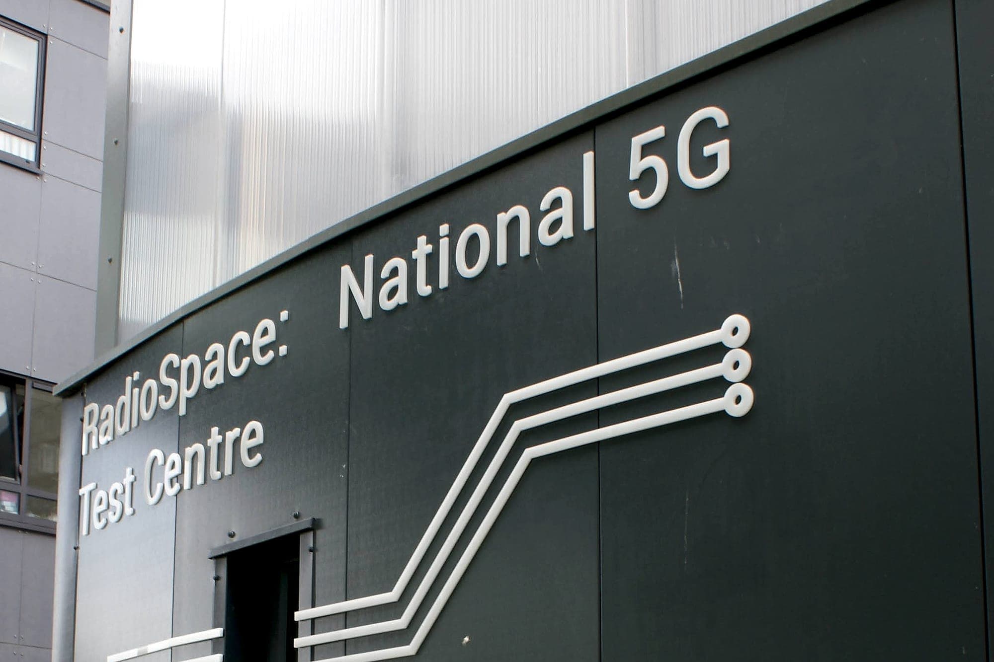
Why data centre campus wayfinding is a repetition problem
Three audiences use the outside of a campus, and none of them is the public. Hauliers arrive with generators, switchgear and chillers on articulated trailers, usually at night, usually for the first time, and usually against a delivery slot they're already behind on. Technicians come for one item of plant in one hall, badged for that hall and nowhere else. The emergency services may come once in a decade, at speed, looking for a building by the name on the fire safety drawings.
The cost of failure out here isn't embarrassment. Picture a sixteen-metre articulated vehicle discovering its mistake in a live yard, reversing between a substation and a chiller compound with a banksman it doesn't have. On a campus, wayfinding is a safety control before it's a courtesy. Which is why it belongs in the masterplan. By the time it reaches the fit-out package, the roads are poured and the only thing left to argue about is what colour the panel is.
Give every building a name, a letter and a colour
The system that works runs three channels at once and leans on none of them. First, a short alphanumeric code that matches every other record in the estate: ticketing, access control, the fire safety drawings. Then a spoken name, because people give directions out loud and over a radio. Then a colour, which is the fastest of the three and the least dependable.
Colour has earned that caution. Around eight per cent of men have some colour vision deficiency, hues desaturate under low light, and colour can't be spoken precisely: "the blue building" fails the moment two people disagree about blue. As a fourth confirmation, on top of a letter, a name and a position, it's superb. On its own it's a single point of failure. We'd go further: colour-coding is oversold generally, and on a campus of identical shells it's the first thing everyone reaches for and the last thing that should be trusted.
Colour is the fastest channel and the least reliable. Never let it carry the message alone.
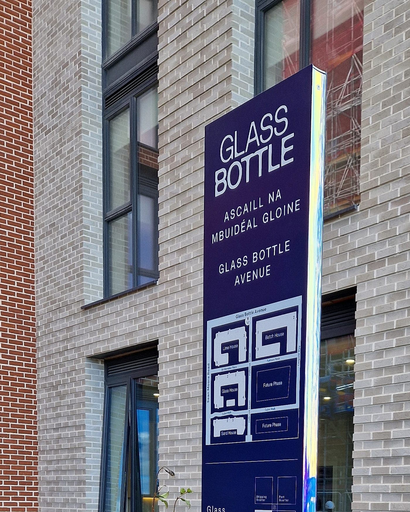
The code has to survive the next phase
Campuses grow, and the code is usually what breaks first. Buildings named in the order they were built, Hall A then Hall B then Hall C, stop making sense the day phase four appears between A and B. The fix is boring and permanent. Allocate letters by geography on the masterplan, so the sequence a visitor drives is the sequence the names read in. Build order doesn't come into it. And reserve codes for the plots that are still fields, with their colours.
A code is only worth having if the hall letter, the level, the room number and the plant reference agree with one another and with the asset register. Those are naming decisions, made long before anyone draws a sign.
Where a colour code meets the safety palette
Here's the constraint brand-led colour systems miss. In safety signage the primary colours are already spoken for: red for prohibition and fire equipment, yellow for warning, green for safe condition and escape, blue for mandatory instruction. Those meanings are standardised in the symbols drawn to ISO 7010. Give green to Hall C and you have put an identity colour in competition with the escape system on the same wall; see two systems, one wall.
So the palette comes out of what's left, and it still has to hold its contrast. BS 8300 asks for roughly 30 points of difference in Light Reflectance Value between characters and their background, a threshold that rules out most mid-tone corporate colours as sign faces. Sorting that out at design stage costs a conversation. Sorting it out after a handover inspection costs a re-manufacture.
- 30+
- LRV points of contrast between characters and background, the accessible-signage baseline
- ~8%
- of men have some colour vision deficiency, which is why colour never carries a message alone
- ~20%
- saved when one supplier carries the scheme from design to installation
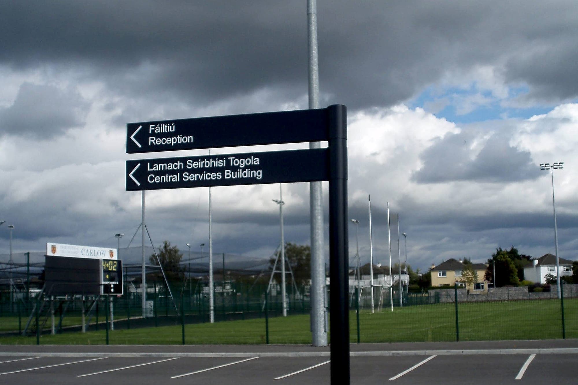
External circulation: trucks, technicians and turning circles
A campus carries two circulation networks, vehicles and people, and they have to be signed separately. The vehicle network is the one that hurts when it's wrong. Size external signs by the speed of the reader: a driver passing at 30 km/h has about two seconds, which means fewer words and much larger characters than the same instruction needs indoors.
- Sign the decision, not the directory. At the gate, the fork and the building approach, offer the choices that exist there and nothing else.
- Separate the goods route from the visitor route at the first junction inside the fence. Drivers should never have to interpret.
- Confirm arrival. A building identification sign readable from the approach is what stops a truck circling, and it's usually the first thing value-engineered away.
- Warn before the point of no return: turning restrictions, height limits, no-through routes.
- Sign the way out. Exit is a destination on a campus, especially for a driver working against a curfew.
The pedestrian network carries a legal duty. Technical Guidance Document M covers access to and use of a building from the site boundary in, meaning approach, parking and entrance, and asks for signage that is clear and legible along the way. BS 8300-1 covers the external environment in more detail. A private campus isn't exempt because its visitors arrive by appointment.
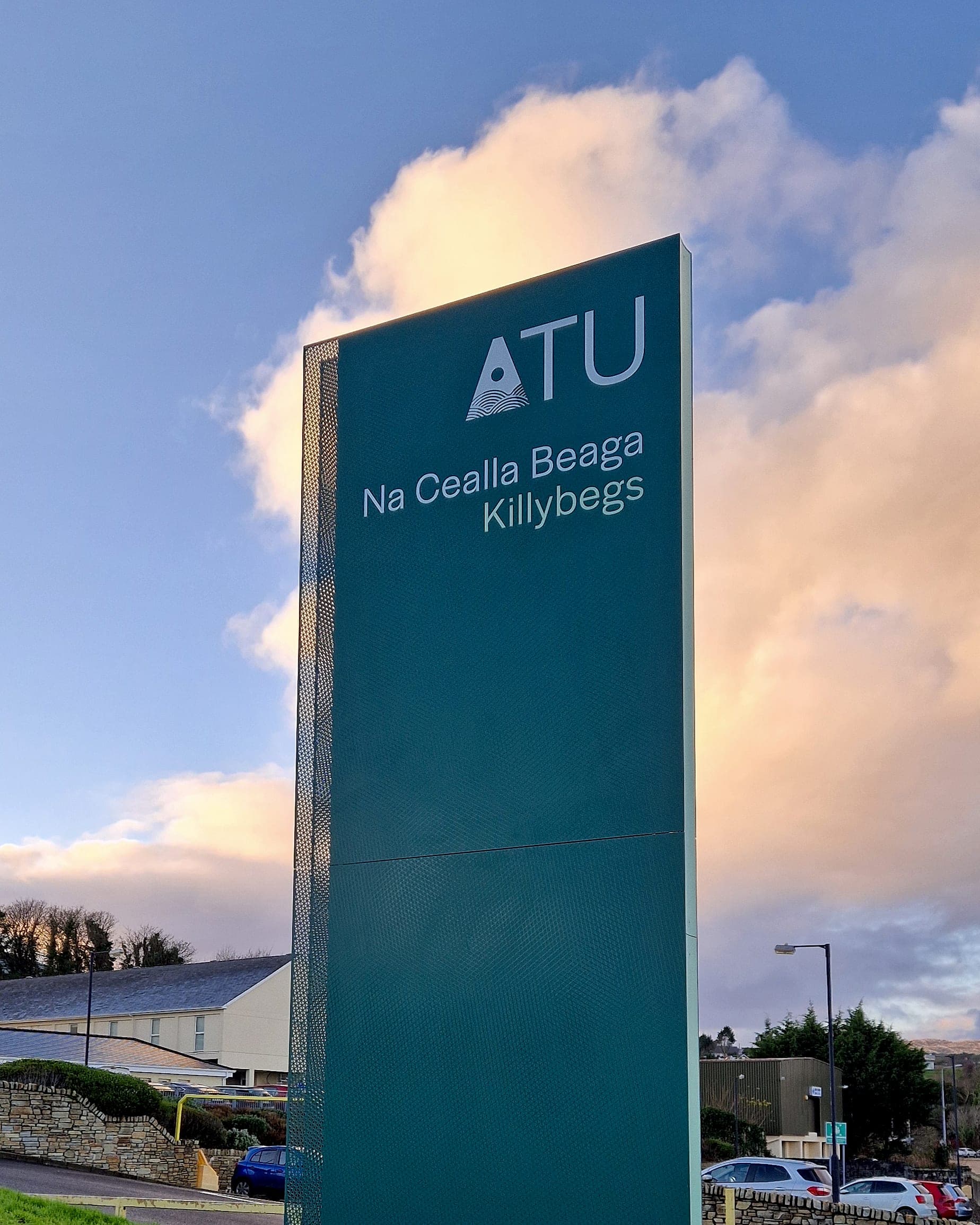
Designing for the dark
A data centre runs continuously, so most arrivals happen in the dark, and almost all the stressful ones do. Perceived contrast is set by luminance. A pairing that looks emphatic at noon collapses into two similar greys under a low-output lamp, and colour discrimination falls away at low light levels in any case. That's the physiological reason the letter and the name carry the identification, with the colour only agreeing.
The answers are unglamorous. Choose illumination or retroreflective faces sign type by sign type, check each one against the lighting design, and walk the campus after dark before anything is manufactured. An hour on a wet January night will tell you more than a week of renders.
What the sign is allowed to say
One last constraint separates this sector. Most operators won't let the tenant's identity, the capacity or the location of critical plant appear on anything visible from a public road, hence the neutral codes. That tension has an article of its own: naming without disclosing.
It never overrides the statutory layer. Safety signs at a place of work follow the Safety, Health and Welfare at Work (General Application) Regulations, and escape provision follows the fire strategy set out under TGD B. The most valuable half-hour on any campus is the one where somebody reads the building names on the signage, on the fire safety drawings and in the emergency plan aloud, side by side, and finds the differences before an incident does.
Planning a campus, or trying to make an existing one legible to people who have never set foot on it? See our data centre work and the wider data centre campus wayfinding brief, or talk to us while the buildings are still letters on a masterplan.
Building in data centres? Talk early, while the naming decisions are still cheap.