
Safety signage vs wayfinding: two systems, one wall
Safety signage is prescribed by law; wayfinding is commissioned. They share every corridor in the building, and the trouble starts where they meet.
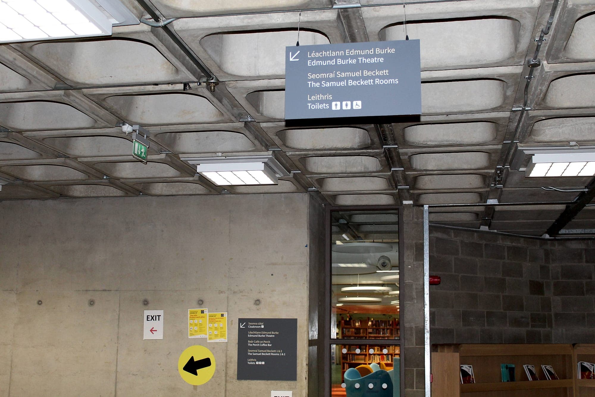
Every corridor carries two signage systems. One of them is prescribed: the green escape signs, the blue fire-door discs and the red equipment markers have their colours, shapes and pictograms fixed by law, and nobody may redraw them. The other is commissioned, and that's where the names, the hierarchy, the typeface and the building's own voice live. They share the same walls, and almost every cluttered corridor we're asked to fix is one where nobody decided how the two would sit together.
The failure is rarely dramatic. It looks like a green luminaire hung fifty millimetres from a directional blade, a fire-action notice screwed over a room number, and, the giveaway, a taped A4 with an arrow drawn on it. Every item was correct on its own drawing. Nobody drew them on the same one.
What counts as safety signage
In Ireland, safety signs at a place of work are governed by Part 7 of the Safety, Health and Welfare at Work (General Application) Regulations 2007. The Regulations leave nothing to taste. They fix the shape and colour of each category, and set how much of the sign face the safety colour must occupy.
- Green squares and rectangles: emergency escape and first aid. White pictogram, green covering at least half the sign face.
- Blue circles: mandatory instruction. Fire door keep shut; keep clear.
- Red circles with a diagonal bar: prohibition. No smoking; do not use the lift in the event of fire.
- Red squares and rectangles: firefighting equipment. Extinguishers, hose reels, call points.
- Yellow triangles: warning. Black pictogram, black border, yellow covering at least half the face.
The pictograms inside those shapes are not free either. They come from I.S. EN ISO 7010, the international register of tested safety symbols ISO maintains so that a running man means the same thing in Galway, Ghent and Gdańsk. Hence the first rule of coexistence, and it's absolute: you may not restyle a safety sign to match the building.
You can redraw the building's typeface. You cannot redraw the running man.
Different rules, different logic
The two systems answer different questions, which is why they behave differently on the wall. Wayfinding answers where do I want to go and how do I get there: voluntary, unhurried, hierarchical, showing only what the decision point requires. Safety signage answers what must I do here, now, possibly in smoke and possibly without reading at all. That is why one is designed to be read and the other to be recognised.
From that split come two opposite instincts about repetition. Good wayfinding is thrifty. Every extra sign costs attention, so the destination schedule works the count down. Escape signage is deliberately redundant: TGD B expects the route indicated at every change of direction and wherever an exit isn't obvious, whether or not the last sign is still in view. Apply wayfinding economy to the escape package and you produce a beautiful, non-compliant building.
Where the two systems contradict each other
The visual clash is the mild problem. The serious one is directional. In most buildings the daily route out and the escape route aren't the same: people leave through the lobby past reception, while the escape route from that floor runs the other way into a protected stair nobody uses from one year to the next. Wayfinding that has spent two years teaching a building that out means left is training a habit the fire strategy contradicts. Under stress, habit wins.
A green panel reading Way Out in the house typeface is a wayfinding sign, however green. It's legitimate and useful; it simply carries none of the statutory weight, and it can't be left arguing with the sign that does. Reconciling the two is a strategy-stage job, done on plan with the fire consultant. Nobody wants that conversation at snagging.
How to keep safety signage and wayfinding coherent
Coherence is a scheduling problem more than a styling one, and five decisions settle it:
- Draw both packages on one set of plans. Statutory signs left off the sign schedule arrive last and go wherever there's room, which is why they end up over the room numbers.
- Give each system its own height band: escape signage at and above the door head, directional blades on their own line beneath, identification and tactile information at hand-and-eye height. Consistent bands read as order even on a busy wall.
- Never combine the two on one panel. Dropping a green pictogram into a house-styled directional sign breaks the colour-area rule and costs the pictogram the instant recognition that is its whole value.
- Let the statutory sign win the position. Where a wayfinding sign sits in the sightline to an exit sign, the wayfinding sign moves. That gets decided on a walk, not at a desk.
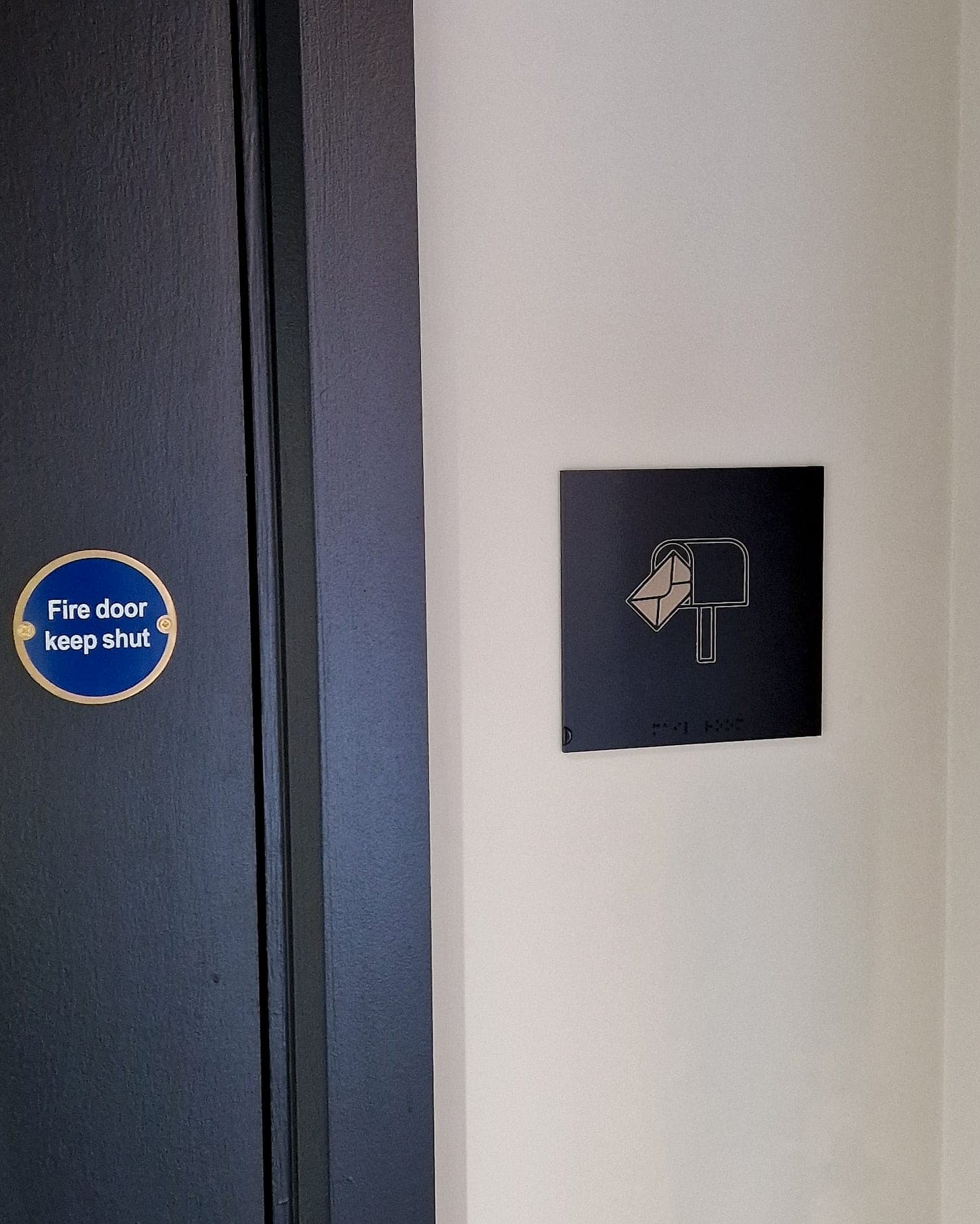
- Specify the statutory package to the same standard as the rest. A fire-door sign can be a stamped sticker or a made disc in a brass ring; both comply, and only one looks like it belongs to the building.
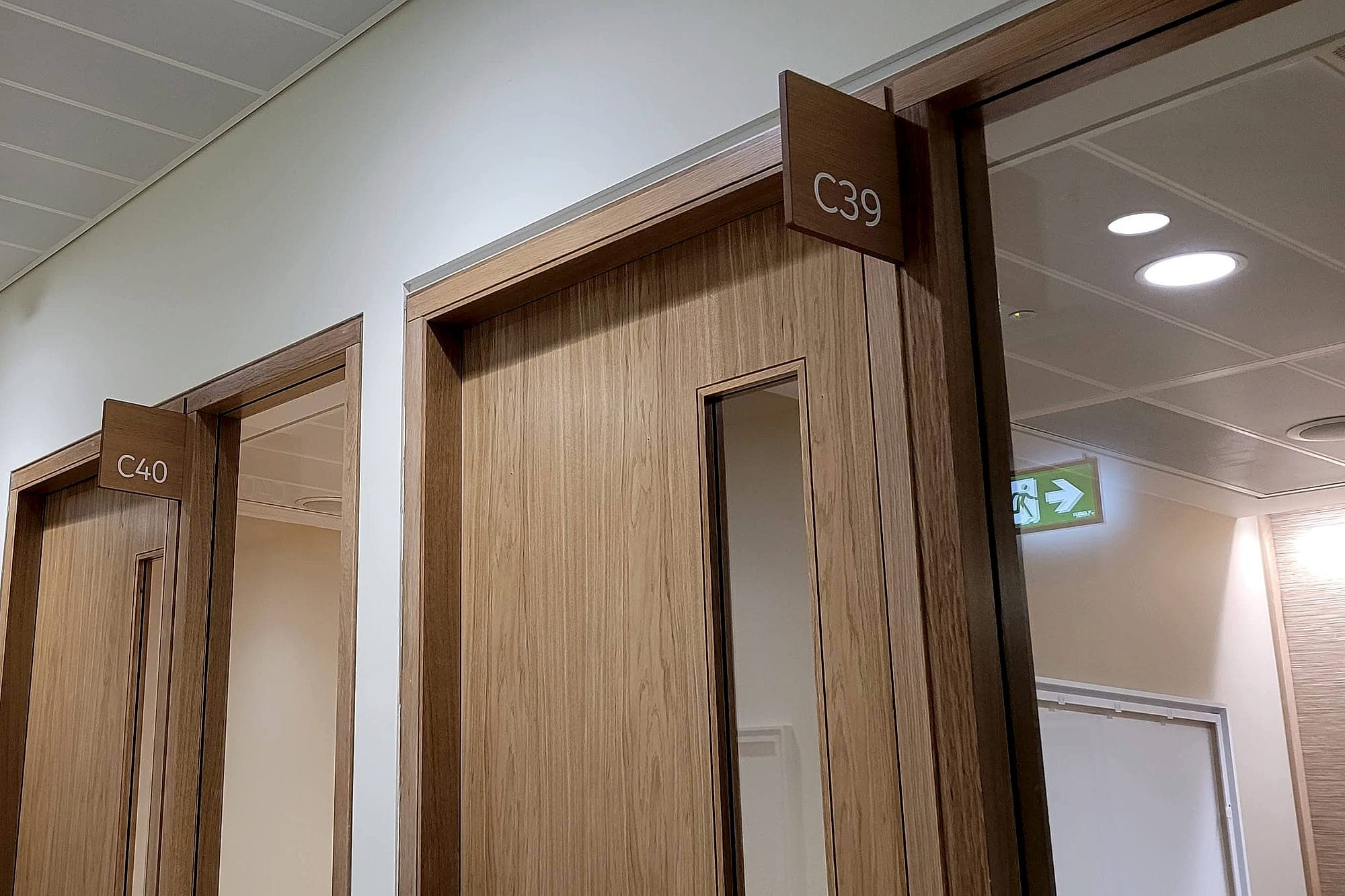
The sixth decision is the one clients find hardest to hear: design out the laminate. Every taped A4 is a question the system failed to answer, whether that's a room renamed, a door locked or a route changed. Even a well-run job produces one, when a department moves between survey and install and there is a fortnight to fill. Give the system a way to absorb those changes and the wall stays clean. Refuse, and the building will improvise on top of your artwork within a month.
Every taped-up A4 is a question the signage system failed to answer.
The boundary is moving
The line between the two systems isn't fixed, either. Wayfinding keeps being drawn into law. In England, the post-Grenfell rules made floor and flat identification a statutory duty in high-rise residential buildings: pure wayfinding content, now enforceable, designed to be read in smoke by a firefighter. Evacuation plans sit in the same territory.
The accessibility side does the same. Part M and BS 8300 turn parts of the identification package into requirements: contrast, mixed-case lettering, tactile and braille at key locations, mounting heights. And in public bodies the Official Languages Act makes the wayfinding text bilingual with equal prominence, while the statutory pictogram beside it stays exactly as ISO drew it. You can see the whole relationship in one lift lobby: the sign that must speak two languages, next to the sign that speaks none.
One schedule, one hand
We draw the statutory and wayfinding packages together, on the same plans, by the same people, then supply and install both. It's the only way we've found to guarantee that the green signs and the grey ones agree about which way is out, and to settle in week one whose scope the fire-door discs were in. Left until week 46, that question delays more handovers than any design decision on the job.
The test when specifying is simple: can somebody hand you one drawing showing every sign that will be on that wall, designed and statutory alike? If not, the wall will decide for you. See how we approach wayfinding design, run the statutory signage checklist, or talk to us while the schedule is open.
Planning a wayfinding project? Talk early, while the big decisions are still cheap.