
Where wayfinding goes next: AI, personalisation and the disappearing sign
AI routing, personalised directions, signage that dissolves into the architecture. What the next decade genuinely changes, and the part of it that can't.
The future of wayfinding isn't a screen replacing a sign. Expect a thinner, better-made physical layer, a digital layer that finally justifies itself for the minority who open it, and underneath both, one maintained set of names feeding every channel at once. The interesting change of the next decade happens in the database.
A version of the same question comes up in almost every tender interview now: in ten years, will we still be buying signs? Fair question. It deserves a straight answer, so here's ours, after nearly 50 years designing, supplying and installing the physical layer while specifying the digital one that sits over it.
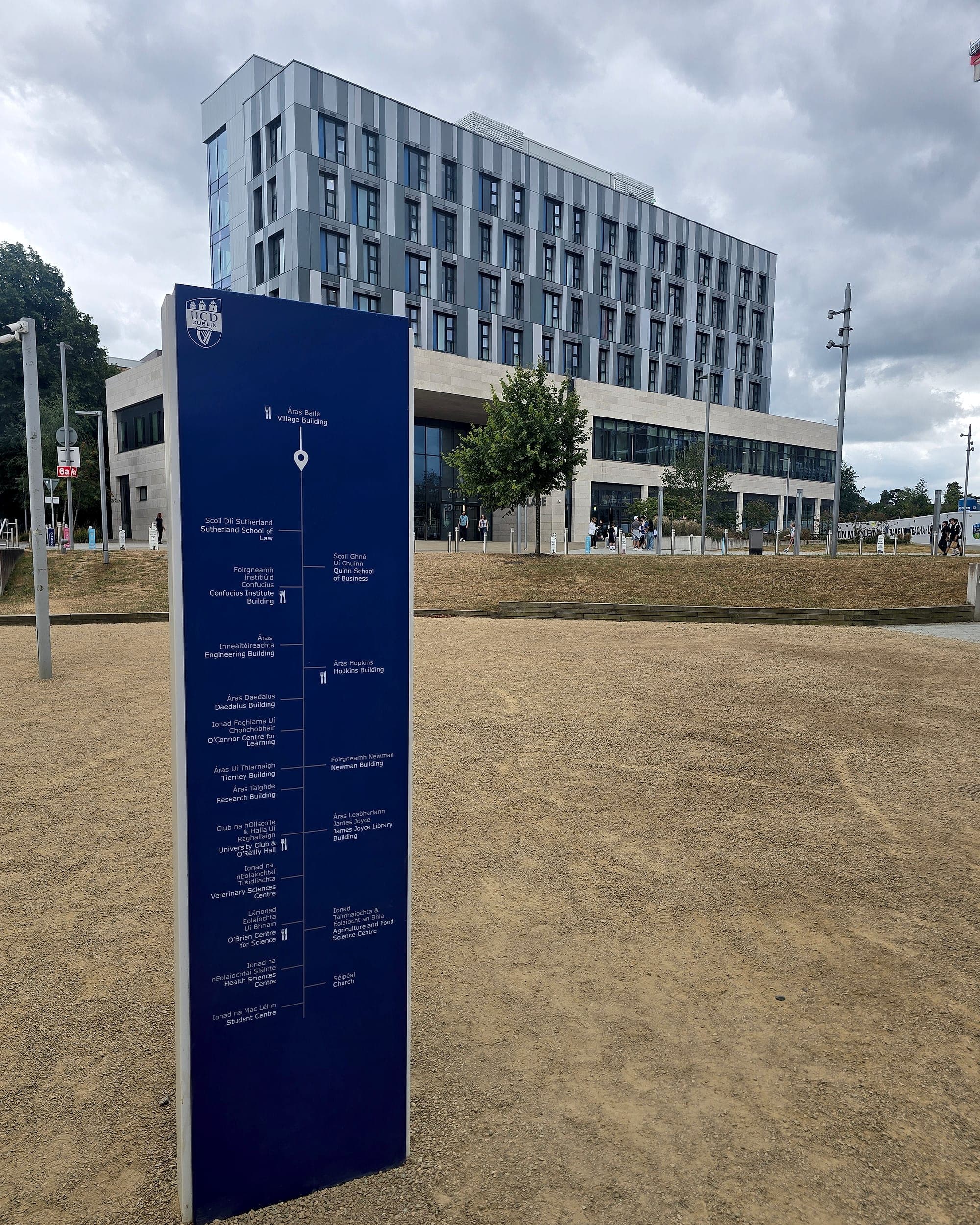
The future of wayfinding is a content problem
Every technology in this article, from routing engines and personalised journeys to live screens and digital twins, consumes the same input: an agreed, current, unambiguous list of what the places in a building are called. That list is the destination schedule, and in most organisations it doesn't exist. Names live in a facilities spreadsheet, a room-booking system, an appointment letter template and a set of architect's drawings, and no two of them agree.
Nothing downstream survives that. An AI router that sends a patient to "Ambulatory Care Suite 4B" when the letter says "Clinic 4" hasn't helped anybody; it has produced the wrong answer faster and with more confidence. So the first genuinely modern thing a client can do is unglamorous. Hold the naming in one place, version it, and let the signs, the screens and the app draw from it. We built our own software around exactly that, and it's how we cut approval times from months to days. No cleverness in it. Everyone is simply arguing over one list instead of five.
- Days
- not months, for sign approvals through our own software
- ~20%
- lower cost when design, manufacture and install are one contract
- 10 yr
- warranty on what we supply and fit
What AI actually changes
The demonstrations focus on routing: ask a question, get a blue line. Routing is the least valuable part of it, because in a well-planned building the route is already legible from where you're standing. The changes we expect to matter sit further back, out of sight.
- **Translation between vocabularies.** A person says "blood test"; the department is called Phlebotomy; the letter says "Clinic 2". A language model is genuinely good at bridging those three, which is a real problem that signage alone has never solved.
- **Drawing-set comprehension.** Reading a revised architectural package and flagging that a room has been renamed, split or moved. Historically that is the change that reached the signage contractor last, and after manufacture.
- **Generation, then human judgement.** Producing a first-pass sign schedule and artwork set from the plan and the naming, so designers spend their time on hierarchy and placement instead of typing. That is design automation applied to the boring 80%.
What AI does not do is agree anything. It will not persuade the estates team, the clinical director and the communications office that a department has one name. That remains a meeting.
A model can draw the route. Only the organisation can agree the name.
Personalisation, and what it costs
Personalised wayfinding is the strongest argument for the digital layer. A step-free route for a wheelchair user; audio turn-by-turn for someone with low vision; a route in Polish, Ukrainian or Irish; a journey that already knows which clinic you're due at and at what time. A sign can't do any of that, and pretending otherwise would be dishonest. This is exactly where indoor navigation is worth its budget.
The cost is data. Indoor location is personal data, and inside a hospital it comes close to health data by inference: a system that knows which corridor you walked knows roughly why you came. That's a GDPR question before it's a technology question, and the honest answers are the dull ones. Minimise what's collected. Keep the positioning on the device where you can. Set a retention period and actually enforce it. Never repurpose a navigation dataset for footfall analytics on the quiet. Having to explain a wayfinding system to a data protection officer is no bad thing; it means somebody thought about it.
There's a second cost, less discussed. Personalisation serves one person at a time. A sign serves everyone in the corridor at once, including the visitor who will never appear in any system: the eighty-year-old, the contractor, the relative who flew in this morning. App-free approaches are interesting precisely because they sit between the two, readable at distance, no download, nothing retained.
The disappearing sign
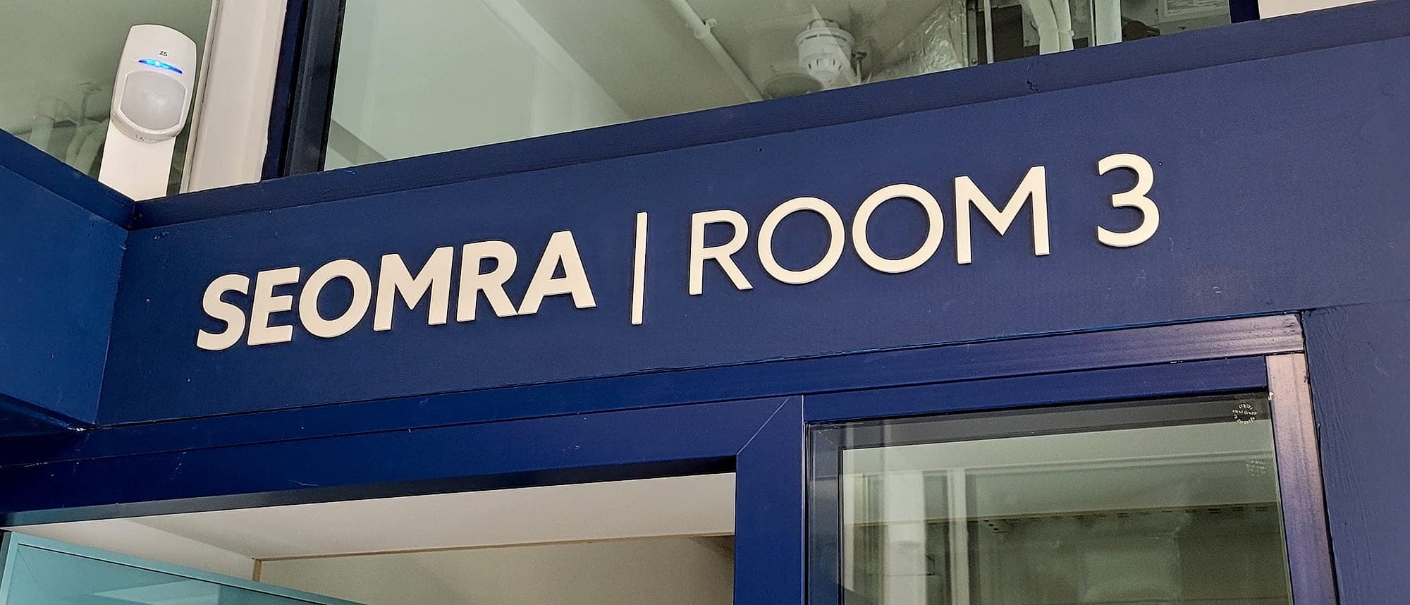
The most visible trend of the last five years has nothing to do with software. Signage is being absorbed into the architecture: numerals drawn at two metres tall in a tone barely off the wall colour, pictograms cut flush into oak panelling, floor finishes and lighting doing work a projecting sign used to do. Architects want the information without the object, and when it's done well the building simply reads.
That's what "the disappearing sign" actually means, and we're for it. It's also the hardest version to get right, because tone-on-tone graphics have to clear the same contrast thresholds as any other sign; Part M and BS 8300 don't relax because the architect specified a quieter palette. So the wayfinding designer has to be in the room during interior design. Handed a finished palette, you're negotiating LRV points against a colour somebody has already fallen in love with, and you'll lose.
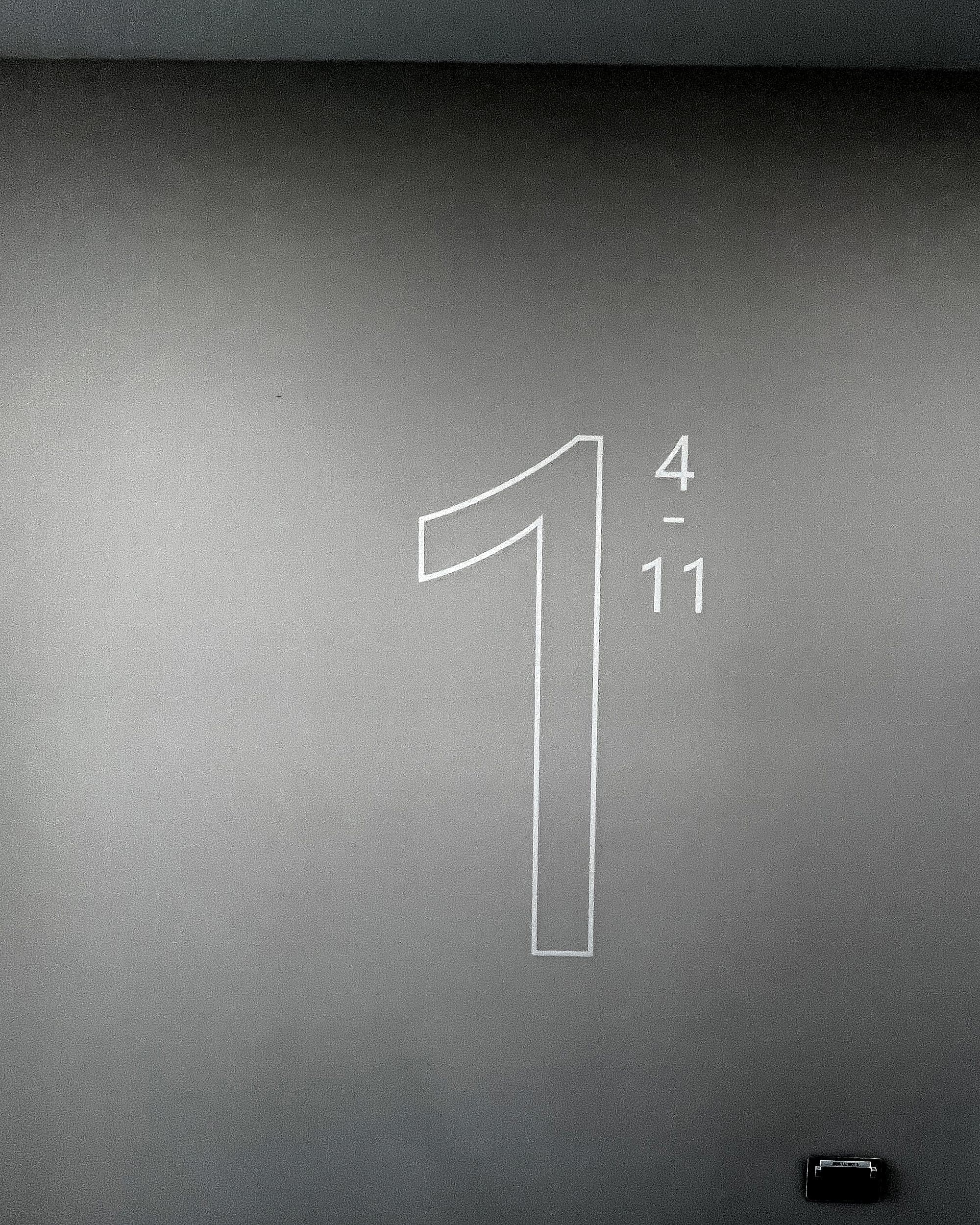
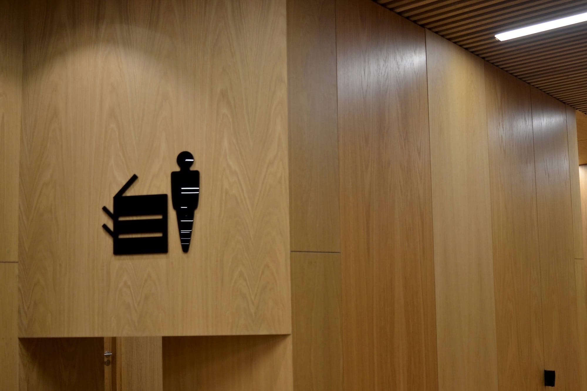
The sign hasn't gone anywhere. It has stopped looking like a sign.
Why the physical layer stays
Predictions of the all-digital building tend to be made by people holding a charged phone in good lighting. Five things keep the physical layer in place, and none of them is nostalgia.
- **Power and battery.** A sign is the only part of the building that works during an outage, and the only part that works when the phone died on the way in. In an evacuation both conditions are likely at once.
- **The download.** Every app-based system loses most of its audience between "there is an app" and "the map is open". Buildings whose visitors already have the app are the exception, not the plan.
- **Inclusion.** Tactile characters and braille, symbol-led information for people who don't read the local language, and large legible type all reach people a smartphone route never touches. That is the Part M baseline, not an upgrade.
- **The law.** Statutory safety signage has to be physically present and correctly specified: escape routes and fire equipment to the ISO 7010 symbol set, and in England regulation 8 of the Fire Safety (England) Regulations 2022 requires floor and flat identification in high-rise residential buildings, meaning at least 18 metres or seven storeys, readable in low light or by torch. No app satisfies that duty.
- **Permanence.** A well-made sign is a twenty-year asset with no licence fee, no operating system deprecation and no vendor. Very little software bought in 2006 is still running; a great deal of signage fitted in 2006 is still working.
How to build for the next ten years
- Fix the naming first and give it an owner. Everything digital is downstream of it.
- Design the physical system to be excellent on its own, then add the digital layer for the jobs it genuinely does better: change, personalisation, accessibility.
- Buy digital where the content actually moves, meaning timetables, clinic lists and event programmes, and print where it doesn't.
- Treat location data as personal data from the first workshop, not at the security review.
- Keep the quiet, integrated signage honest: contrast, height and character size are not stylistic choices.
- Assume every system you specify will outlive the people who specified it, and document accordingly.
None of this is a hedge. The future of wayfinding really is more digital, more personal and better integrated than what we built ten years ago. The digital layer just keeps failing at the download, and the physical layer keeps working in the conditions that matter most. If you want the two designed together, and not bolted to each other six weeks before opening, that's the work: see digital wayfinding, or talk to us.
Planning a wayfinding project? Talk early, while the big decisions are still cheap.