
QR code signage: cheap, powerful, usually misused
A QR code costs nothing to print and quite a lot to keep alive. Where codes belong on a sign, and the four ways they reliably fail.
QR code signage works when the code opens a door to something the panel physically cannot hold: a floor plan you can pinch and zoom, a translation, a fault report, the maintenance record behind the sign itself. It fails, almost without exception, when the code is asked to be the wayfinding. If a visitor has to take out a phone to learn whether to turn left or right, the sign has already lost.
The appeal is mostly financial. A code is a few square centimetres of print on a panel you were making anyway, and the content behind it can change without touching the building. That's also the trap, because what a code really costs is the ten years of somebody keeping the link alive. We supply several thousand signs a year and specify codes on a small fraction of them, deliberately.
Four ways QR codes on signs go wrong
In rough order of how often we walk into them on survey:
- The code as destination. Somebody decided the wayfinding could live on a website, so the sign became a poster for it. Unlock, camera, focus, tap, load, cookie prompt: six actions to answer a question an arrow answers in a glance, and it fails hardest for anyone hurried, older, without data, or holding a child in one hand.
- The wrong moment. Codes get scanned by people who are stationary and unhurried: at a plaque, a bay, a bedside, a lift lobby you're waiting in anyway. Not at a junction with a queue behind you, not at a held-open door, not in the rain.
- Nobody owns it. A code is a link, and links are somebody's job. We've seen codes outlive the manager who commissioned them, the agency that hosted the page, and the domain itself. A dead code is worse than none: it teaches people the next one isn't worth scanning.
- Nobody measures it. Without analytics on the destination, nobody can say whether the code has ever been used, and a code nobody scans still occupies the panel, dates the design, and gets faithfully reprinted at the next refresh.
Four jobs QR code signage does well
- Depth the panel cannot carry. Interpretive and orientation signs are always fighting for room: the history, the species list, the full site plan. A code lets the panel stay legible and hands the long version to whoever wants it. This is the strongest case by far, and note what it actually delivers. Content. The route stays on the panel.
- Translation and alternative formats. One code, a page that renders in the reader's own device language, with audio and easy-read versions behind the same link. In Ireland it sits on top of bilingual provision (see the Official Languages Act and your signage), but for the fifth and the twentieth language it's the only affordable answer.
- Fault reporting. The most under-used and highest-return code we specify: a small one beside a lift, a bin store, a bay or a plant room, opening a form with the location already filled in. Facilities teams stop guessing where the building is failing.
- Asset records. Every sign we supply has an identity in our system: drawing, finish, install date, warranty. A code on the back of a panel ties the object to that record, which turns a refurbishment survey from a fortnight of photography into an afternoon, and makes maintenance a matter of looking something up.
A code costs nothing to print and quite a lot to keep alive.
Placement, size and the physics of a scan
Most codes that fail in use fail for mechanical reasons, decided by a designer who has never watched anyone try to scan one. Five rules we hold to:
- Height. Put codes where a person can stand square to them and hold a phone comfortably, roughly 1,000–1,600 mm. Overhead and suspended signs are the wrong host entirely: you can't steady a phone above your head, and a wheelchair user can't get the angle at all.
- Size against distance. A workable rule of thumb for phone cameras is ten to one: a 30 mm code reads from about 300 mm, a 100 mm code from about a metre. Keep the URL short, too, because a longer address means a denser symbol at the same size.
- Quiet zone. The QR symbology specification, ISO/IEC 18004, calls for a clear margin of four modules around the symbol. Designers routinely crop it to tuck the code into a corner; it then fails on older cameras and in poor light.
- Contrast and colour. Dark symbol on a light field. Inverted codes, brand-coloured codes and codes with a logo punched through the middle all scan less reliably, and the drawing won't tell you which phones refuse them.
- Glare and weather. Gloss laminates, anti-graffiti films and glazed faces bounce light straight into the lens, so specify matt. Outdoors a code fades and greens over like any other printed graphic: give it the same UV-stable print as the panel, and put it on the inspection round.
The link is the sign
A printed code is permanent; the internet is not. Link rot kills most QR programmes. It's entirely preventable once the destination is treated as part of the signage system, and it happens whenever nobody on either side has that job written down.
- Own the domain the code points at. Never a free shortener: that's somebody else's business model sitting between your sign and your visitor.
- Point every code at a stable redirect you control, one URL per sign, so destinations can be retargeted centrally without a single panel changing.
- Print a short human-readable address beside the code, so the sign still works for someone whose camera won't cooperate.
- Record the URL in the sign schedule with an owner and a review date, like any other coordinated building data, and check the codes on the same annual walk as the fixings.
What QR code signage can never do
This is where a cheap idea meets a regulated one. Three boundaries hold:
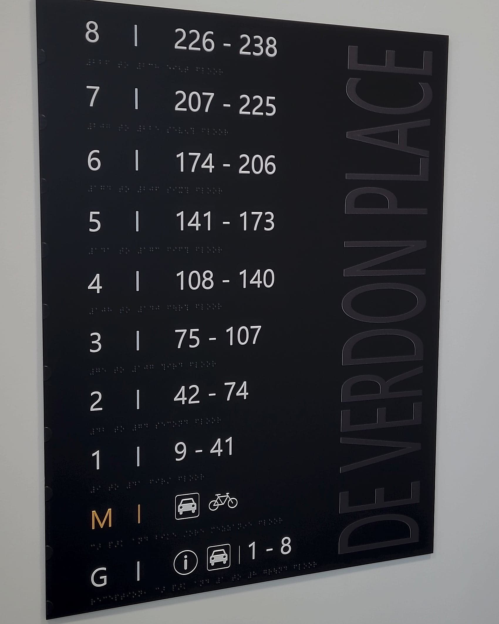
- Accessible information. Part M and BS 8300 expect key information legible on the sign and, in the right locations, available by touch. A QR code is neither, and no accessibility standard treats it as an equivalent; see accessibility and Part M. Markers that genuinely serve people with sight loss are a different technology, built for distance and low vision: the NaviLens case, which sits alongside tactile and braille.
- Bilingual duty. For public bodies in Ireland the linked page is published material, not an exemption. Irish and English keep equal prominence on the sign face. If the code leads to an English-only page, the obligation has simply moved somewhere harder to inspect.
- Safety and fire signage. ISO 7010 safety signs and statutory fire signage carry legal meaning in their shape, colour and pictogram, so never add a code to one or crowd it alongside. In England the Fire Safety (England) Regulations 2022 require wayfinding signage in higher-rise residential buildings to be legible to firefighters in low light and smoke. A phone is not a wayfinding device in those conditions.
Used with that discipline, a code is one of the cheapest real improvements you can make to a building: a hinge between the physical layer and the digital one. Used carelessly it's a square of print that stops working eighteen months after handover, and nobody notices. If you're specifying codes now, talk to us while they're still on the drawing.
Planning a wayfinding project? Talk early, while the big decisions are still cheap.