
The ten most common wayfinding mistakes, and what they cost
A lost visitor is rarely the victim of one bad sign. What's missing is the system behind it. Ten wayfinding mistakes we meet everywhere, and the fix for each.
The most common wayfinding mistakes are system failures. A building gets signed with no agreed naming scheme and no destination schedule. Panels go up where there happens to be free wall space, not where people stop to decide. Legibility is traded away for branding, accessibility left as a retrofit. The panel is usually the last thing to go wrong. By the time a sign fails a visitor, several decisions upstream have already failed them.
Seven-plus years of designing, supplying and installing wayfinding across hospitals, campuses, county councils and hotels means we've met every mistake on this list in the wild, and been called in to undo most of them at someone's expense. A few we made ourselves, early on. That's how we know what they cost. Here are the ten we see most often, with the fix for each, running roughly in the order a project makes them.
Almost every mistake on this list is made before anyone draws a panel.
Starting with signs instead of a system
The brief arrives as a shopping list: "we need new signs." But signage is the output of decisions nobody has made yet. What is every place called? Which journeys matter most, and where along them do people actually hesitate? Skip all that and you get a handsome scheme that faithfully reproduces the existing confusion, in better materials. It looks finished. That's what makes it the most expensive failure of the lot: the whole budget, spent once, buying the old problem back. The fix is to treat wayfinding as the system and signs as its output: agree the naming, walk the journeys, and only then draw panels.
No destination schedule, so nobody agrees what the signs say
Ask three departments what a room is called and you'll get four answers. Without one master document listing every sign, its location and its exact wording, each sign ends up negotiated separately: by email, late, during installation. Then come the change orders. Remade panels, revised artwork, an installation crew standing down while someone decides between "Boardroom" and "Meeting Room 1". The fix is the destination schedule, agreed before manufacture and owned by one named person. It's the least glamorous document in the project and the one that saves the most money. Run through a schedule in our own software, approvals come down from months to days, because there's a single document to sign off.
Signs that try to say everything, everywhere
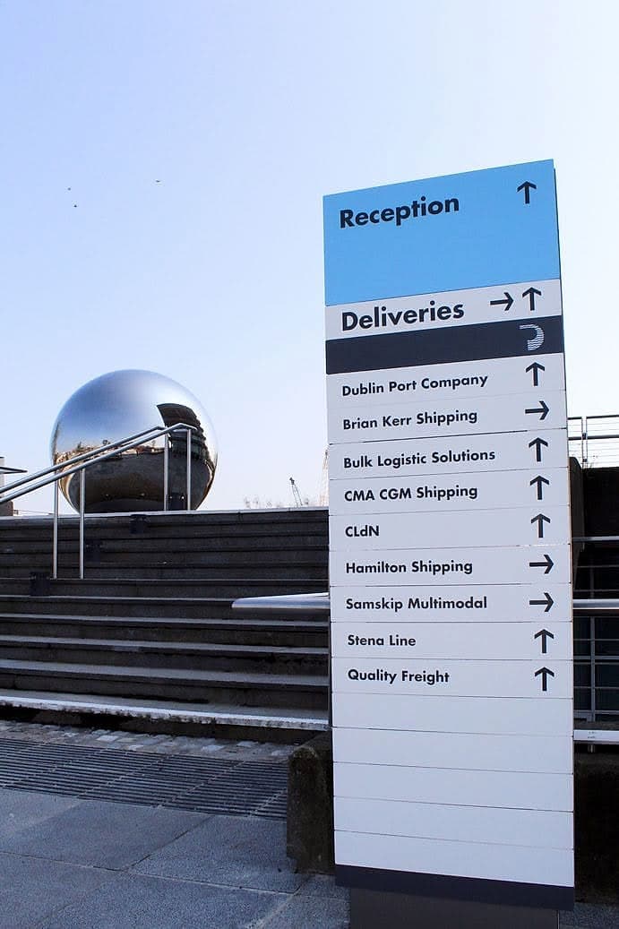
This one is committee-made. Every stakeholder wants their destination on the main directory, then on every directional after it, and the panels swell until nobody reads them at all. People scan signs for about two seconds; a list of eighteen lines fails everyone equally. The cost compounds: bigger panels, more of them, and worst of all, visitors who have learned that the signs don't help. If a destination has to fight for a line on the top-level directory, it probably doesn't belong there. The fix is hierarchy and restraint. A three-tier structure names zones first and rooms last, and progressive disclosure keeps each sign to what that one decision needs. At Dublin Port the main monolith serves a dozen tenants, but the two questions almost everyone arrives with, reception and deliveries, are answered first, at the top, in the largest type.
Handsome signs on the wrong walls
Most signs that fail in use fail by geography. They get mounted where the wall happened to be free, between the fire extinguisher and the noticeboard. They arrive after the junction, when the decision was made ten metres back. A perfectly designed panel three metres past the turn costs exactly as much as a well-placed one and does nothing. The fix is to plan placement from decision points and sightlines, and to do it on foot. Drawings don't show you the glare, the clutter, or the way a corridor reads at walking pace. A scheme placed properly usually needs fewer signs, so the discipline pays for itself.
Forgetting the journey starts at the gate
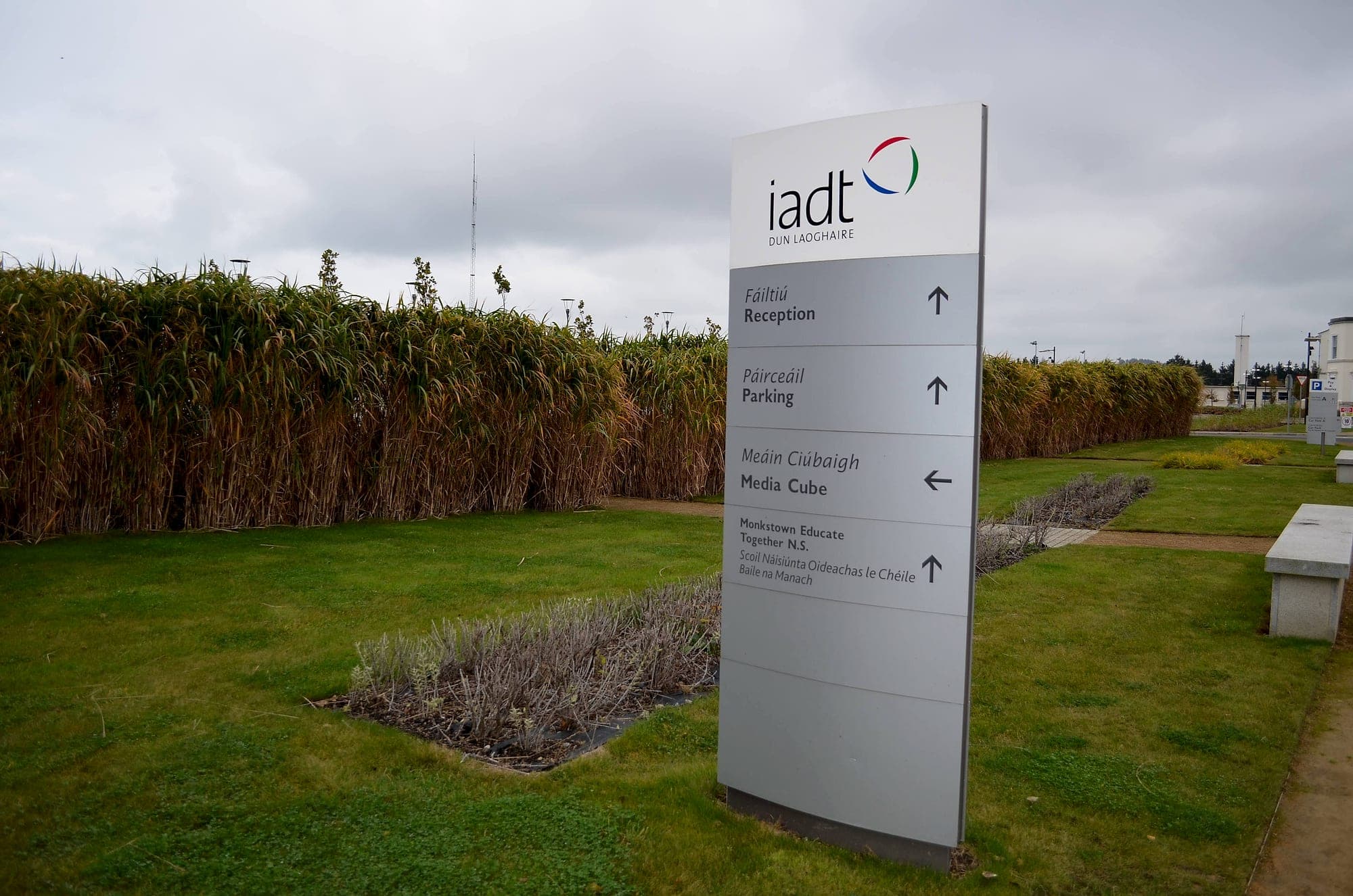
Wayfinding budgets concentrate indoors. But a visitor's journey starts on the road: am I in the right place, where do I park, which door do I need? Buildings that ignore the arrival sequence push all of that confusion through the front door, where reception absorbs it one interruption at a time. In a large building that is a real, recurring staff cost, hundreds of hours a year spent giving directions, plus the late arrivals nobody logs. The fix is to sign the site in the order the visitor meets it: entrance, parking, on-foot route, door. The first question gets answered at the kerb.
Letting the brand outvote legibility
A typeface chosen for a website is auditioned on a screen at arm's length, approved at boardroom distance, and then asked to work at fifteen metres for a seventy-year-old in a hurry. Light weights, tight spacing, all-capitals settings and tasteful grey-on-grey all pass on paper and fail on the wall. Sometimes the scheme has to be remade. Worse is when it stays up and simply doesn't do its job. The fix is typography chosen for distance, speed and stress: mixed case, generous x-height, tested at true viewing distance before anything is cut. The brand survives that process; it just stops making the decisions.
Treating contrast, height and braille as afterthoughts
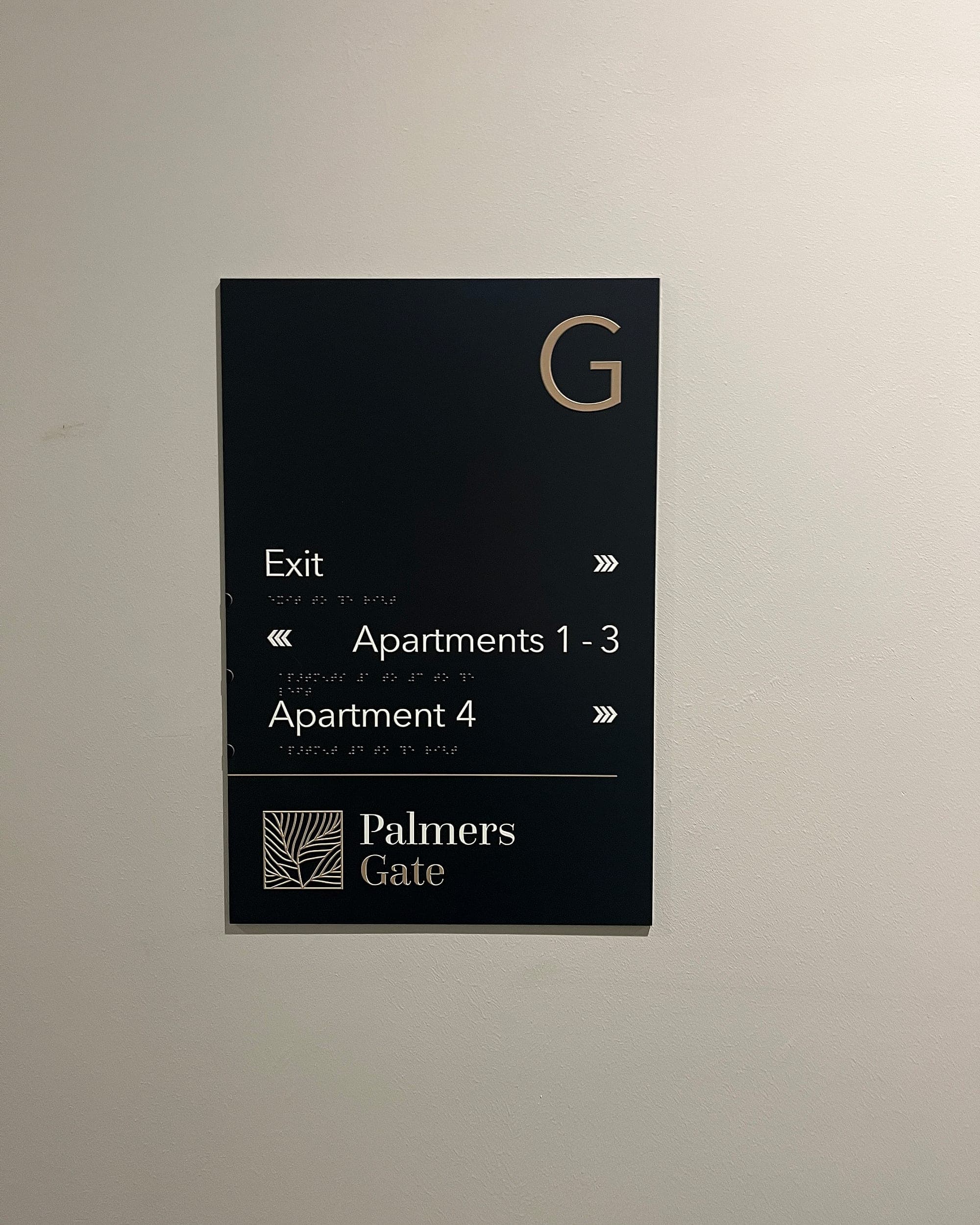
Accessibility retrofitted is accessibility paid for twice. Signs mounted too high for a seated reader, panels without tactile or braille provision where it's required, text at 10 LRV points of contrast against its background: every one of those means a remake, because in Ireland Part M and BS 8300 are the legal floor, set out in Technical Guidance Document M. You pay for the retrofit, you carry the compliance exposure until it's done, and in the meantime the scheme excludes people. None of it costs anything at design stage: 30+ points of light-reflectance contrast, mounting heights that work seated and standing, tactile and braille drawn into the face of the panel itself. Everything we supply is made to that baseline by default, and we certify it on completion.
Speaking the organisation's language, not the visitor's
The appointment letter says "Clinic 4". The door says "Ambulatory Care Suite 4B". The directory says something else again, and half the signs use acronyms only staff understand. Internal language on public signs is one of the commonest wayfinding mistakes because it's invisible from the inside; everyone who approves the artwork already knows what OPD means. The cost lands on the people least able to pay it: first-time visitors, anxious ones, anyone reading in a second language. So name rooms and buildings for the people looking for them, keep the letter, the website and the door saying the same thing, and let pictograms carry meaning across languages. Nobody should meet a word like "phlebotomy" until they're nearly there.
Bolting the second language on at the end
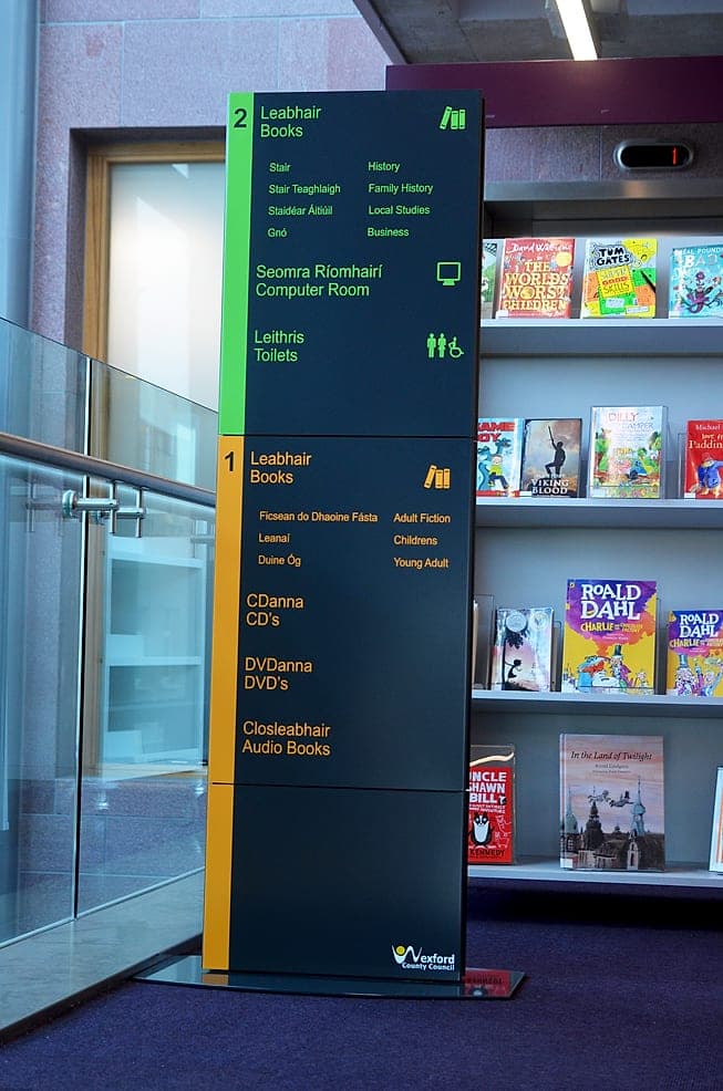
For Irish public bodies, bilingual signage is a legal requirement. The Official Languages Act requires Irish with equal prominence, and schemes designed English-first almost never comply once the Irish is squeezed in afterwards: smaller, italicised, tucked below. The cost is remaking signage that was compliant on no day of its life, sometimes across an entire estate. The fix is to design bilingual from the first artwork, giving both languages their space in the layout grid before a single panel is priced. Done that way it costs nothing extra. At Wexford Library the Irish and English share the directory as equals, and the panel is better organised for it.
No owner, so the wayfinding mistakes accumulate
The scheme is installed, photographed, handed over and then orphaned. Departments move, rooms get renamed, and because signage sits in nobody's job description, every change arrives as a laminated A4 page taped beside the panel that now lies. Each one is small. Together they dismantle the system, because the moment the official signs and the taped notices disagree, people trust neither. The eventual cost is a full re-survey and partial re-fit that maintenance would have made unnecessary. The fix is ownership: one person responsible for the schedule after handover, and a maintenance arrangement that keeps panels current. Our signs carry a 10-year warranty, so the hardware outlasts most reorganisations; it's the information on them that needs looking after. A periodic wayfinding audit catches the drift early.
Every taped-up notice is the building filing a bug report.
Read the list again and the pattern is hard to miss: not one of these mistakes is made by a sign. They're made in briefs, committees, approval chains and handovers. Caught up there, a mistake costs an hour in a meeting. Caught at snagging, it costs a remake and a delayed handover. That's also the honest case for keeping design, compliance, supply and installation with one supplier. When the same team owns the schedule and the spanner, the mistakes have nowhere to hide between contractors, and the end-to-end cost typically comes in up to 20% lower than fragmented procurement.
Taped notices, an interrupted receptionist, a directory nobody reads: if your building already shows the symptoms, start with a walk. Talk to a wayfinding specialist and we'll bring the method.
Planning a wayfinding project? Talk early, while the big decisions are still cheap.